Willkommen bei den Top‑Schriften – hier treffen Beliebtheit und Qualität aufeinander. Das sind die in diesem Jahr am häufigsten heruntergeladenen und genutzten Fonts. Wenn Sie sichere Optionen für Logo, Web oder Social suchen, starten Sie hier.
Jeder Top‑Font überzeugt durch Balance, Lesbarkeit und Vielseitigkeit. Sie finden moderne Sans‑Serifs, elegante Scripts, Vintage‑Serifs und minimalistische Displays.
-
 Herunterladen 236 Downloads@WebFont
 -
( Fonts by Allouse Studio )
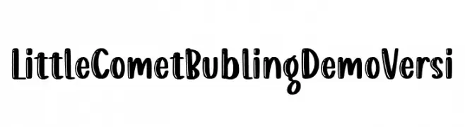
A playful, handwritten font with a bubbly and energetic style.
![Little Comet Bubling Demo Versi Frei Schriftart Herunterladen]() Herunterladen 236 Downloads@WebFont
Herunterladen 236 Downloads@WebFont -
![Klondike-Seven Frei Schriftart Herunterladen]() Herunterladen 236 Downloads@WebFont
Herunterladen 236 Downloads@WebFont -
( Noto is a trademark of Google Inc. Noto fonts are open source. All Noto fonts are published under the SIL Open Font License, Version 1.1 )
No valid font is displayed; only placeholder glyphs are shown.
![Noto Sans Tai Viet Frei Schriftart Herunterladen]() Herunterladen 236 Downloads@WebFont
Herunterladen 236 Downloads@WebFont -
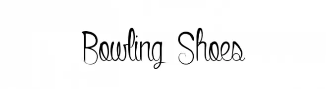
( Fonts by www.dcoxy.com )
A whimsical, artistic font with elongated, curvy strokes and elegant swirls.
![Bowling Shoes Frei Schriftart Herunterladen]() Herunterladen 236 Downloads@WebFont
Herunterladen 236 Downloads@WebFont -
( Fonts by yomeiko - Personal-use only. For commercial use please contact owner. )
A playful, hand-drawn font with rounded, smooth strokes and a whimsical style.
![Milky Regular Frei Schriftart Herunterladen]() Herunterladen 236 Downloads@WebFont
Herunterladen 236 Downloads@WebFont -
( JOEBOB graphics - Joe vanderHam - www.joebob.nl )
A bold, playful font with a three-dimensional shadow effect.
![Crialblack Frei Schriftart Herunterladen]() Herunterladen 236 Downloads@WebFont
Herunterladen 236 Downloads@WebFont -
( Fonts by AVType - Personal-use only. For commercial use please contact owner. )
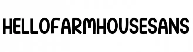
A playful, bold sans-serif font with a rustic charm and rounded, condensed characters.
![Hello Farmhouse Sans Frei Schriftart Herunterladen]() Herunterladen 236 Downloads@WebFont
Herunterladen 236 Downloads@WebFont -
![HostilShadow Frei Schriftart Herunterladen]() Herunterladen 236 Downloads@WebFont
Herunterladen 236 Downloads@WebFont -
( Fonts by Tokokoo Studio )
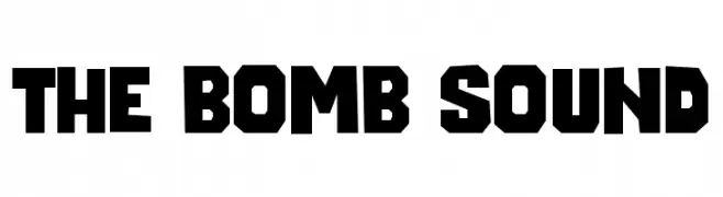
A bold, angular font with a modern, edgy style.
![The Bomb Sound Frei Schriftart Herunterladen]() Herunterladen 236 Downloads@WebFont
Herunterladen 236 Downloads@WebFont -
( Fonts by www.blambot.com )
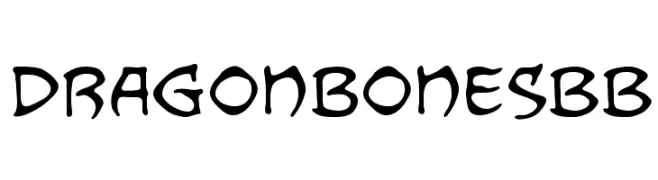
A bold, decorative font with a whimsical, hand-drawn style.
![DragonbonesBB Frei Schriftart Herunterladen]() Herunterladen 236 Downloads@WebFont
Herunterladen 236 Downloads@WebFont -
( Fonts by Daniel Zadorozny - www.iconian.com - Free for personal use )
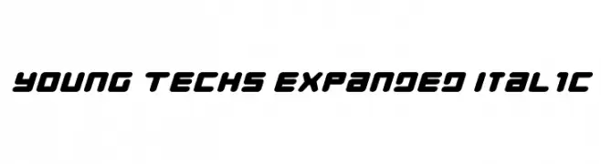
A bold, expanded italic font with a futuristic and tech-inspired style.
![Young Techs Expanded Italic Frei Schriftart Herunterladen]() Herunterladen 236 Downloads@WebFont
Herunterladen 236 Downloads@WebFont -
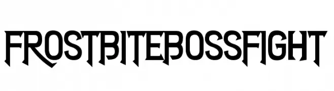
![Frostbite Boss Fight Frei Schriftart Herunterladen]() Herunterladen 236 Downloads@WebFont
Herunterladen 236 Downloads@WebFont -
( Fonts by Woodcutter )
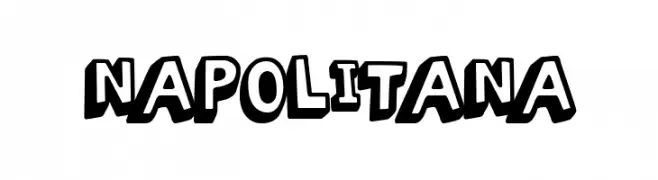
A bold, playful font with a cartoonish, hand-drawn style.
![Napolitana Frei Schriftart Herunterladen]() Herunterladen 236 Downloads@WebFont
Herunterladen 236 Downloads@WebFont -
( Fonts by fey design )
A bold, decorative font with modern and playful elements.
![HardStonesSansStrip Frei Schriftart Herunterladen]() Herunterladen 236 Downloads@WebFont
Herunterladen 236 Downloads@WebFont -
( Fonts by www.typodermicfonts.com - Ray Larabie )
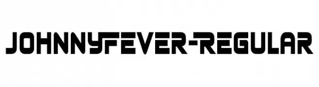
A bold, futuristic font with geometric and angular elements.
![JohnnyFever-Regular Frei Schriftart Herunterladen]() Herunterladen 236 Downloads@WebFont
Herunterladen 236 Downloads@WebFont -
( Fonts by www.aenigmafonts.com )
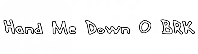
A playful, hand-drawn font with bold outlines and a whimsical style.
![Hand Me Down O BRK Frei Schriftart Herunterladen]() Herunterladen 236 Downloads@WebFont
Herunterladen 236 Downloads@WebFont -
( Fonts by Daniel Gauthier )
A bold, decorative font with intricate circular patterns.
![CaviarRancid Frei Schriftart Herunterladen]() Herunterladen 236 Downloads@WebFont
Herunterladen 236 Downloads@WebFont -
![Far Away, So Close Frei Schriftart Herunterladen]() Herunterladen 236 Downloads@WebFont
Herunterladen 236 Downloads@WebFont -
( Fonts by Nur Solikh )
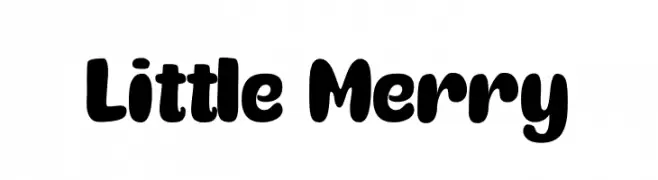
A playful, bold font with rounded, bubbly characters ideal for fun and informal designs.
![Little Merry Frei Schriftart Herunterladen]() Herunterladen 236 Downloads@WebFont
Herunterladen 236 Downloads@WebFont -
( Fonts by www.junkohanhero.com )
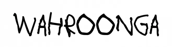
A playful, hand-drawn font with bold, irregular strokes.
![Wahroonga Frei Schriftart Herunterladen]() Herunterladen 236 Downloads@WebFont
Herunterladen 236 Downloads@WebFont -
( Fonts by www.kimberlygeswein.com - Kimberly Geswein )
A lively, handwritten font with a playful and informal style.
![KG Shark in the Water Frei Schriftart Herunterladen]() Herunterladen 236 Downloads@WebFont
Herunterladen 236 Downloads@WebFont -
( Fonts by Daniel Zadorozny - www.iconian.com - Free for personal use )
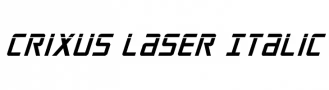
A bold, italic, and angular font with a futuristic and dynamic style.
![Crixus Laser Italic Frei Schriftart Herunterladen]() Herunterladen 236 Downloads@WebFont
Herunterladen 236 Downloads@WebFont -
( Fonts by Ihdytype - Personal-use only. For commercial use please contact owner. )
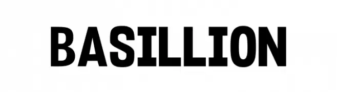
A bold, blocky font with strong, uniform characters.
![Basillion Frei Schriftart Herunterladen]() Herunterladen 236 Downloads@WebFont
Herunterladen 236 Downloads@WebFont -
( Fonts by Xerographer Fonts )
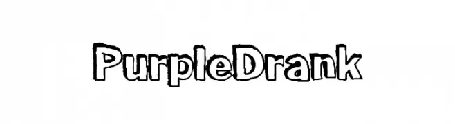
A bold, playful font with a hand-drawn, outlined style.
![PurpleDrank Frei Schriftart Herunterladen]() Herunterladen 236 Downloads@WebFont
Herunterladen 236 Downloads@WebFont -
( Fonts by David Espinosa - http://issuu.com/davidespinosa5/ )
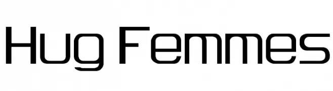
A modern, geometric font with a sleek and uniform design.
![Hug Femmes Frei Schriftart Herunterladen]() Herunterladen 236 Downloads@WebFont
Herunterladen 236 Downloads@WebFont -
( Fonts by Nirmala Creative )
A flowing, cursive script font with an elegant and sophisticated style.
![Keyna Frei Schriftart Herunterladen]() Herunterladen 236 Downloads@WebFont
Herunterladen 236 Downloads@WebFont -
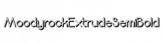
![Moodyrock Extrude SemiBold Frei Schriftart Herunterladen]() Herunterladen 236 Downloads@WebFont
Herunterladen 236 Downloads@WebFont -
( Fonts by Manfred Klein. Free for private and charity use. Free for commercial with donation to organizations )
A dynamic, calligraphic font with bold, angular strokes and artistic flair.
![KleinKallig Frei Schriftart Herunterladen]() Herunterladen 236 Downloads@WebFont
Herunterladen 236 Downloads@WebFont -
( Fonts by Shara Weber )
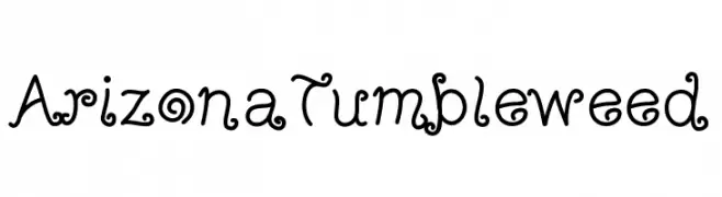
A whimsical, curly decorative font with a vintage flair.
![ArizonaTumbleweed Frei Schriftart Herunterladen]() Herunterladen 236 Downloads@WebFont
Herunterladen 236 Downloads@WebFont -
( Fonts by www.freakyfonts.de )
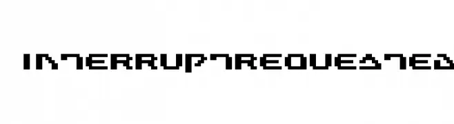
A bold, pixelated font with a retro digital aesthetic.
![InterruptRequested Frei Schriftart Herunterladen]() Herunterladen 236 Downloads@WebFont
Herunterladen 236 Downloads@WebFont -
( Fonts by www.asleycruz.com - Asley Cruz - Personal-use only. For commercial use please contact owner. )
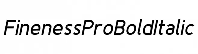
A sleek, bold, and italicized modern font with smooth strokes and dynamic slant.
![Fineness Pro Bold Italic Frei Schriftart Herunterladen]() Herunterladen 236 Downloads@WebFont
Herunterladen 236 Downloads@WebFont -
( Fonts by Danilo Miguel )
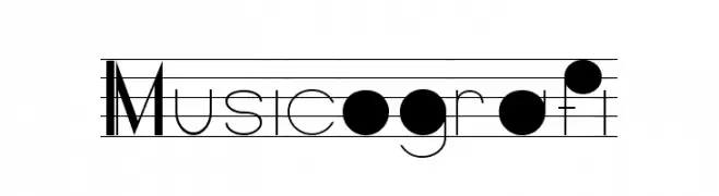
A music-themed decorative font with elements of musical notation.
![Musicografi Frei Schriftart Herunterladen]() Herunterladen 236 Downloads@WebFont
Herunterladen 236 Downloads@WebFont -
( Fonts by Ibram Syah - Personal-use only. For commercial use please contact owner. )
A bold, geometric font with a condensed and modern style.
![Bumpers Regular Frei Schriftart Herunterladen]() Herunterladen 236 Downloads@WebFont
Herunterladen 236 Downloads@WebFont -
( TheLouster115 )
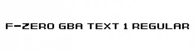
A pixelated, retro-style font with a blocky, digital appearance.
![F-Zero GBA Text 1 Regular Frei Schriftart Herunterladen]() Herunterladen 236 Downloads@WebFont
Herunterladen 236 Downloads@WebFont


Welche Schriften sind gerade am populärsten?
Poppins, Roboto, Montserrat, Open Sans und Lato sind wegen ihrer klaren Formen und breiten Einsetzbarkeit sehr gefragt – von Markenauftritt über Landingpages bis hin zu Postern.
Welche Fonts eignen sich für Logos?
Geometrische Sans‑Serifs (z. B. Poppins, Familien im Gotham‑Stil) sind ein häufiger Griff für sauberes, skalierbares Branding. Für eine persönlichere Note bleiben Scripts und Handschrift‑Stile beliebt. Kombinieren Sie einen prägnanten Headline‑Font mit einer neutralen Brotschrift für Wiedererkennung und Harmonie.
Wie oft wird die Top‑Liste aktualisiert?
Regelmäßig – basierend auf realen Downloads und Interaktionen. Schauen Sie öfter vorbei, um aufstrebende Favoriten früh zu entdecken.
💡 Tipp: Seite bookmarken – Trends wechseln schnell, und heutige Top‑Schriften inspirieren morgen vielleicht das Rebranding.