Willkommen bei den Top‑Schriften – hier treffen Beliebtheit und Qualität aufeinander. Das sind die in diesem Jahr am häufigsten heruntergeladenen und genutzten Fonts. Wenn Sie sichere Optionen für Logo, Web oder Social suchen, starten Sie hier.
Jeder Top‑Font überzeugt durch Balance, Lesbarkeit und Vielseitigkeit. Sie finden moderne Sans‑Serifs, elegante Scripts, Vintage‑Serifs und minimalistische Displays.
-
 Herunterladen 224 Downloads@WebFont
 -
( Fonts by www.TomzWeb.com - Thomas E. Harvey - NOT free - Commercial use requires license )
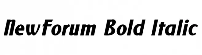
A bold, italicized font with strong, dynamic strokes and a modern appearance.
![NewForum Bold Italic Frei Schriftart Herunterladen]() Herunterladen 224 Downloads@WebFont
Herunterladen 224 Downloads@WebFont -
( Fonts by Daniel Zadorozny - www.iconian.com - Free for personal use )
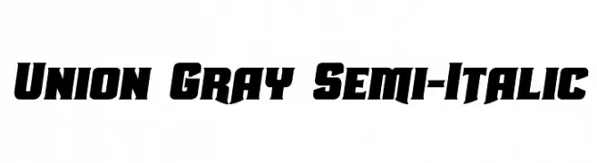
A bold, semi-italic font with angular, dynamic characters.
![Union Gray Semi-Italic Frei Schriftart Herunterladen]() Herunterladen 224 Downloads@WebFont
Herunterladen 224 Downloads@WebFont -
![Rena Version2000 Frei Schriftart Herunterladen]() Herunterladen 224 Downloads@WebFont
Herunterladen 224 Downloads@WebFont -
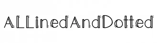
![ALLinedAndDotted Frei Schriftart Herunterladen]() Herunterladen 224 Downloads@WebFont
Herunterladen 224 Downloads@WebFont -
( Fonts by a Neale Davidson - www.pixelsagas.com. Personal-use only. For commercial use please contact owner. )
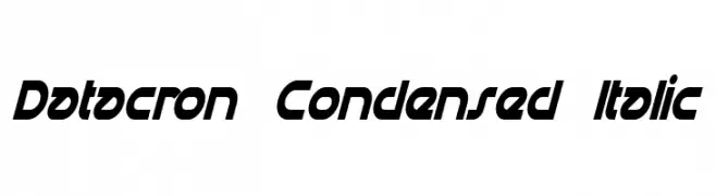
A bold, condensed, and italic font with a futuristic and dynamic design.
![Datacron Condensed Italic Frei Schriftart Herunterladen]() Herunterladen 224 Downloads@WebFont
Herunterladen 224 Downloads@WebFont -
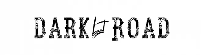
![Dark Road Frei Schriftart Herunterladen]() Herunterladen 224 Downloads@WebFont
Herunterladen 224 Downloads@WebFont -
( Fonts by Letterayu )
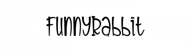
A playful and whimsical font with curvy, energetic characters.
![Funny Rabbit Frei Schriftart Herunterladen]() Herunterladen 224 Downloads@WebFont
Herunterladen 224 Downloads@WebFont -
( Fonts by www.studiotypo.com - Personal-use only. For commercial use please contact owner. )
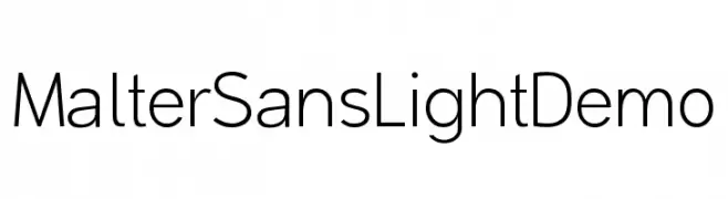
A modern, light sans-serif font with excellent readability and clean lines.
![Malter Sans Light Demo Frei Schriftart Herunterladen]() Herunterladen 224 Downloads@WebFont
Herunterladen 224 Downloads@WebFont -
( 100% Free - oohlalaartsy.blogspot.com )
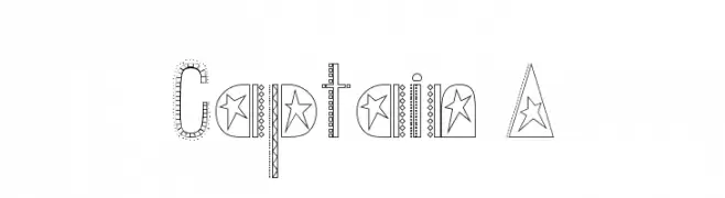
A decorative font with star motifs and dotted patterns, offering a playful and whimsical style.
![Captain A Frei Schriftart Herunterladen]() Herunterladen 224 Downloads@WebFont
Herunterladen 224 Downloads@WebFont -
( Fonts by Holydie Studio )
A playful, bold font with a whimsical, cartoonish style and rounded edges.
![Cattyla Frei Schriftart Herunterladen]() Herunterladen 224 Downloads@WebFont
Herunterladen 224 Downloads@WebFont -
( Fonts by www.studiotypo.com - Personal-use only. For commercial use please contact owner. )
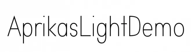
A clean, modern sans-serif font with a light weight and uniform appearance.
![Aprikas Light Demo Frei Schriftart Herunterladen]() Herunterladen 224 Downloads@WebFont
Herunterladen 224 Downloads@WebFont -
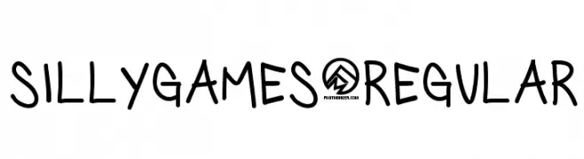
![SillyGames-Regular Frei Schriftart Herunterladen]() Herunterladen 224 Downloads@WebFont
Herunterladen 224 Downloads@WebFont -
( Fonts by Andrew McCluskey - nalgames.com )
A bold, geometric font with sharp angles and a futuristic style.
![Particulator Regular Frei Schriftart Herunterladen]() Herunterladen 224 Downloads@WebFont
Herunterladen 224 Downloads@WebFont -
( Fonts by Andi Moz )
A playful and artistic script font with a handwritten style.
![Night Market Frei Schriftart Herunterladen]() Herunterladen 224 Downloads@WebFont
Herunterladen 224 Downloads@WebFont -
( Fonts by Fontfabric - Svetoslav Simov - Personal-use only. For commercial use please contact owner. )
A bold, modern font with strong geometric shapes and consistent stroke widths.
![Mont Blanc-Trial Black Frei Schriftart Herunterladen]() Herunterladen 224 Downloads@WebFont
Herunterladen 224 Downloads@WebFont -
![Third World Buzz Frei Schriftart Herunterladen]() Herunterladen 224 Downloads@WebFont
Herunterladen 224 Downloads@WebFont -
![Distro II Bats Frei Schriftart Herunterladen]() Herunterladen 224 Downloads@WebFont
Herunterladen 224 Downloads@WebFont -
( Fonts by Apostrophic Lab )
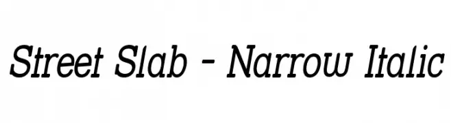
A narrow, italic slab serif font with a dynamic and structured style.
![Street Slab - Narrow Italic Frei Schriftart Herunterladen]() Herunterladen 224 Downloads@WebFont
Herunterladen 224 Downloads@WebFont -
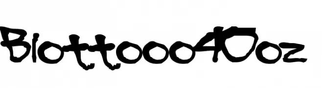
![Blottooo40oz Frei Schriftart Herunterladen]() Herunterladen 224 Downloads@WebFont
Herunterladen 224 Downloads@WebFont -
( Fonts by Mike Hind - Stick Fonts )
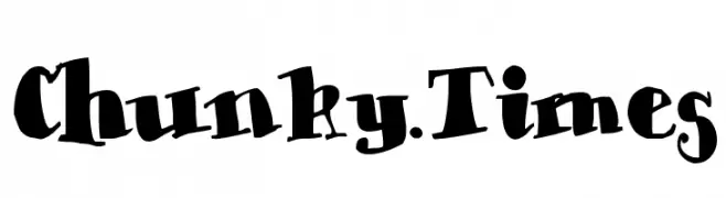
A bold, playful font with chunky, whimsical characters and a dynamic style.
![Chunky-Times Frei Schriftart Herunterladen]() Herunterladen 224 Downloads@WebFont
Herunterladen 224 Downloads@WebFont -
( Chequered Ink - chequered.ink/ )
A bold, angular font with a geometric and modern style.
![Squirk Frei Schriftart Herunterladen]() Herunterladen 224 Downloads@WebFont
Herunterladen 224 Downloads@WebFont -
( Fonts by Nick's Fonts )
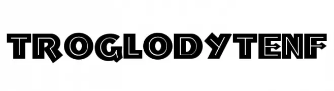
A bold, geometric font with a modern, edgy style and high contrast.
![TroglodyteNF Frei Schriftart Herunterladen]() Herunterladen 224 Downloads@WebFont
Herunterladen 224 Downloads@WebFont -
( www.southype.com )
Outlined floral dingbat font with diverse flower shapes.
![Flowers St Frei Schriftart Herunterladen]() Herunterladen 224 Downloads@WebFont
Herunterladen 224 Downloads@WebFont -
![Carr Dingbats 1 Frei Schriftart Herunterladen]() Herunterladen 224 Downloads@WebFont
Herunterladen 224 Downloads@WebFont -
( Fonts by allsuperfont.com - Personal-use only. For commercial use please contact owner. )
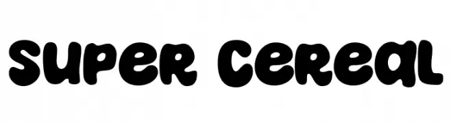
A bold, playful font with rounded, bubbly characters.
![Super Cereal Frei Schriftart Herunterladen]() Herunterladen 224 Downloads@WebFont
Herunterladen 224 Downloads@WebFont -
( Fonts by Graham Meade - GemFonts )
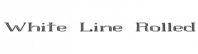
A modern, outline-style font with a futuristic and technical look.
![White Line Rolled Frei Schriftart Herunterladen]() Herunterladen 224 Downloads@WebFont
Herunterladen 224 Downloads@WebFont -
![Irnafont_8 Frei Schriftart Herunterladen]() Herunterladen 224 Downloads@WebFont
Herunterladen 224 Downloads@WebFont -
( Fonts by ingoFonts. http://www.ingofonts.de )
A bold, pixelated font with a retro digital aesthetic.
![DePixel-Boldreduced Frei Schriftart Herunterladen]() Herunterladen 224 Downloads@WebFont
Herunterladen 224 Downloads@WebFont -
![Irnafont_1 Frei Schriftart Herunterladen]() Herunterladen 224 Downloads@WebFont
Herunterladen 224 Downloads@WebFont -
( illustrateddaydreams.tumblr.com/ )
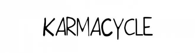
A playful, handwritten font with a casual and friendly style.
![KarmaCycle Frei Schriftart Herunterladen]() Herunterladen 224 Downloads@WebFont
Herunterladen 224 Downloads@WebFont -
( Fonts by Michal Kokerski )
A bold, artistic serif font with a vintage, hand-crafted appearance.
![Kalapitka Regular Frei Schriftart Herunterladen]() Herunterladen 224 Downloads@WebFont
Herunterladen 224 Downloads@WebFont -
( Fonts by Alif Ryan Zulfikar )
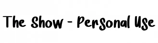
A bold, playful handwritten font with thick strokes and rounded edges.
![The Show - Personal Use Frei Schriftart Herunterladen]() Herunterladen 224 Downloads@WebFont
Herunterladen 224 Downloads@WebFont -
( Free for a personal use. For a commercial use please visit www.kevinandamanda.com )
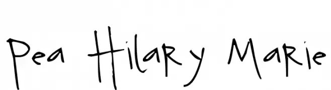
A playful, hand-drawn font with a whimsical and casual style.
![Pea Hilary Marie Frei Schriftart Herunterladen]() Herunterladen 224 Downloads@WebFont
Herunterladen 224 Downloads@WebFont -
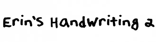
( Fonts by Erin Loper )
A bold, playful handwritten font with thick, consistent strokes and a casual vibe.
![Erin's Handwriting 2 Frei Schriftart Herunterladen]() Herunterladen 224 Downloads@WebFont
Herunterladen 224 Downloads@WebFont


Welche Schriften sind gerade am populärsten?
Poppins, Roboto, Montserrat, Open Sans und Lato sind wegen ihrer klaren Formen und breiten Einsetzbarkeit sehr gefragt – von Markenauftritt über Landingpages bis hin zu Postern.
Welche Fonts eignen sich für Logos?
Geometrische Sans‑Serifs (z. B. Poppins, Familien im Gotham‑Stil) sind ein häufiger Griff für sauberes, skalierbares Branding. Für eine persönlichere Note bleiben Scripts und Handschrift‑Stile beliebt. Kombinieren Sie einen prägnanten Headline‑Font mit einer neutralen Brotschrift für Wiedererkennung und Harmonie.
Wie oft wird die Top‑Liste aktualisiert?
Regelmäßig – basierend auf realen Downloads und Interaktionen. Schauen Sie öfter vorbei, um aufstrebende Favoriten früh zu entdecken.
💡 Tipp: Seite bookmarken – Trends wechseln schnell, und heutige Top‑Schriften inspirieren morgen vielleicht das Rebranding.