Willkommen bei den Top‑Schriften – hier treffen Beliebtheit und Qualität aufeinander. Das sind die in diesem Jahr am häufigsten heruntergeladenen und genutzten Fonts. Wenn Sie sichere Optionen für Logo, Web oder Social suchen, starten Sie hier.
Jeder Top‑Font überzeugt durch Balance, Lesbarkeit und Vielseitigkeit. Sie finden moderne Sans‑Serifs, elegante Scripts, Vintage‑Serifs und minimalistische Displays.
-
 Herunterladen 235 Downloads@WebFont
 -
( Fonts by Style-7 - www.styleseven.com - Personal-use only. For commercial use please contact owner. )
A bold, stencil-style font with a military and industrial feel.
![Military Font 7 Frei Schriftart Herunterladen]() Herunterladen 235 Downloads@WebFont
Herunterladen 235 Downloads@WebFont -
( Måns Grebäck - www.mansgreback.com )
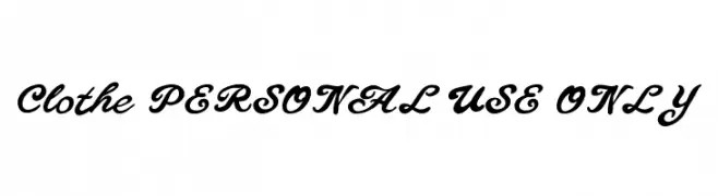
A flowing, cursive font with elegant, sweeping strokes and a handwritten appearance.
![Clothe PERSONAL USE ONLY Frei Schriftart Herunterladen]() Herunterladen 235 Downloads@WebFont
Herunterladen 235 Downloads@WebFont -
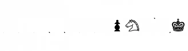
![Chess-Condal Frei Schriftart Herunterladen]() Herunterladen 235 Downloads@WebFont
Herunterladen 235 Downloads@WebFont -
![SchneidlerInitialen Frei Schriftart Herunterladen]() Herunterladen 235 Downloads@WebFont
Herunterladen 235 Downloads@WebFont -
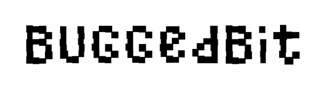
![BuggedBit Frei Schriftart Herunterladen]() Herunterladen 235 Downloads@WebFont
Herunterladen 235 Downloads@WebFont -
Schriftart von fontsnthings. For commercial use please contact the owner.
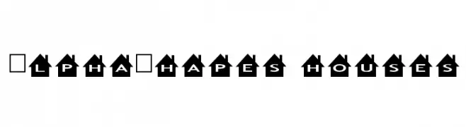
![AlphaShapes houses Frei Schriftart Herunterladen]() Herunterladen 235 Downloads@WebFont
Herunterladen 235 Downloads@WebFont -
( Fonts by Manuel Viergutz - Typo Graphic Design - www.typographicdesign.de )
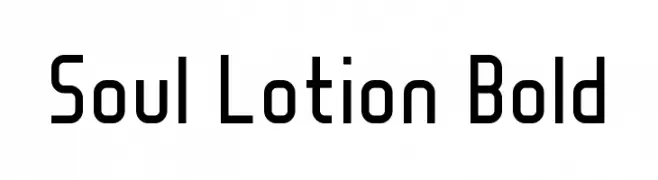
A bold, modern font with clean, geometric lines and a slightly condensed style.
![Soul Lotion Bold Frei Schriftart Herunterladen]() Herunterladen 235 Downloads@WebFont
Herunterladen 235 Downloads@WebFont -
( Free for Personal Use. To use commercially please visit the www.bvfonts.com )
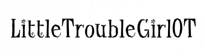
A quirky, hand-drawn font with playful, uneven strokes and exaggerated serifs.
![LittleTroubleGirlOT Frei Schriftart Herunterladen]() Herunterladen 235 Downloads@WebFont
Herunterladen 235 Downloads@WebFont -
![Loomis Sans Frei Schriftart Herunterladen]() Herunterladen 235 Downloads@WebFont
Herunterladen 235 Downloads@WebFont -
( Fonts by Alex Tomlinson - Skyhaven Fonts - shfonts.com )
A bold, retro font with a three-dimensional outline and vintage flair.
![Retro-Supermarket Frei Schriftart Herunterladen]() Herunterladen 235 Downloads@WebFont
Herunterladen 235 Downloads@WebFont -
( Fonts by Wojciech Kalinowski "wmk69" (wmk69@o2.pl) - Personal-use only. For commercial use please contact owner. )
A bold, italic sans-serif font with smooth, rounded edges and a modern look.
![Simply Sans Bold Italic Frei Schriftart Herunterladen]() Herunterladen 235 Downloads@WebFont
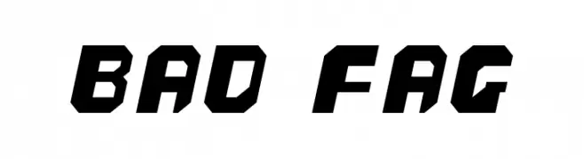
Herunterladen 235 Downloads@WebFont -
![bad fag Frei Schriftart Herunterladen]() Herunterladen 235 Downloads@WebFont
Herunterladen 235 Downloads@WebFont -
( Fonts by Jamie Place [FontBlast Design] - Personal-use only. For commercial use please contact owner. )
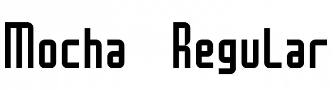
A bold, geometric font with a modern and cohesive design.
![Mocha Regular Frei Schriftart Herunterladen]() Herunterladen 235 Downloads@WebFont
Herunterladen 235 Downloads@WebFont -
( Fonts by Kat`s Fun Fonts - Personal-use only. For commercial use please contact owner. )
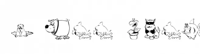
A whimsical decorative font with cartoon-style characters and animals.
![KR All Smiles Frei Schriftart Herunterladen]() Herunterladen 235 Downloads@WebFont
Herunterladen 235 Downloads@WebFont -
( Free for personal use - www.studiotypo.com )
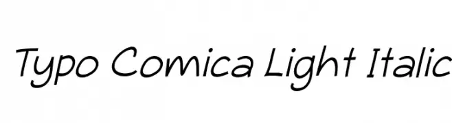
A playful, handwritten-style font with a light, italicized appearance.
![Typo Comica Light Italic Frei Schriftart Herunterladen]() Herunterladen 235 Downloads@WebFont
Herunterladen 235 Downloads@WebFont -
( Fonts by Letterena Studios )
Expressive modern handwritten script.
![Banetigra Frei Schriftart Herunterladen]() Herunterladen 235 Downloads@WebFont
Herunterladen 235 Downloads@WebFont -
( Fonts by www.lifewithouttaffy.com )
A bold, dynamic font with sharp, angular cuts and decorative flair.
![Vibrato Frei Schriftart Herunterladen]() Herunterladen 235 Downloads@WebFont
Herunterladen 235 Downloads@WebFont -
( Fonts by www.aenigmafonts.com )
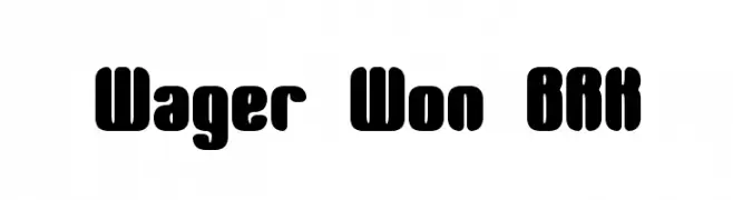
A bold, rounded font with playful, smooth curves and consistent stroke width.
![Wager Won BRK Frei Schriftart Herunterladen]() Herunterladen 235 Downloads@WebFont
Herunterladen 235 Downloads@WebFont -
![NEWBLACKDEMO Frei Schriftart Herunterladen]() Herunterladen 235 Downloads@WebFont
Herunterladen 235 Downloads@WebFont -
![Hesitant Frei Schriftart Herunterladen]() Herunterladen 235 Downloads@WebFont
Herunterladen 235 Downloads@WebFont -
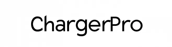
![Charger Pro Frei Schriftart Herunterladen]() Herunterladen 235 Downloads@WebFont
Herunterladen 235 Downloads@WebFont -
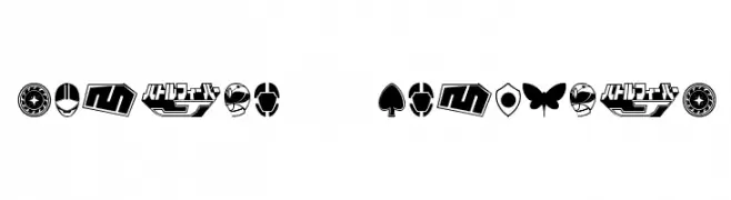
![Sentai 30 Dingbats Frei Schriftart Herunterladen]() Herunterladen 235 Downloads@WebFont
Herunterladen 235 Downloads@WebFont -
( dcoxy - Greg Medina - www.dcoxy.com/ )
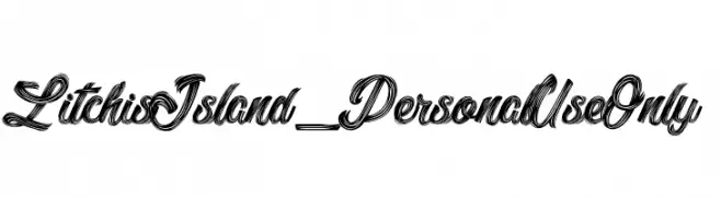
A bold, decorative script font with flowing, interconnected letters and intricate details.
![Litchis Island_PersonalUseOnly Frei Schriftart Herunterladen]() Herunterladen 235 Downloads@WebFont
Herunterladen 235 Downloads@WebFont -
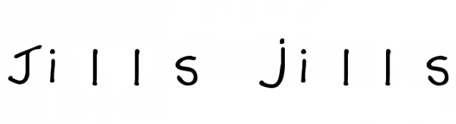
![Jills jills Frei Schriftart Herunterladen]() Herunterladen 235 Downloads@WebFont
Herunterladen 235 Downloads@WebFont -
![Leck Frei Schriftart Herunterladen]() Herunterladen 235 Downloads@WebFont
Herunterladen 235 Downloads@WebFont -
( Fonts by Graphix Line Studio - Personal-use only. For commercial use please contact owner. )
A playful, casual handwritten font with smooth strokes and a friendly aesthetic.
![Friendship Frei Schriftart Herunterladen]() Herunterladen 235 Downloads@WebFont
Herunterladen 235 Downloads@WebFont -
![Kantonswappen CHFL Frei Schriftart Herunterladen]() Herunterladen 235 Downloads@WebFont
Herunterladen 235 Downloads@WebFont -
![CreeNormal Frei Schriftart Herunterladen]() Herunterladen 235 Downloads@WebFont
Herunterladen 235 Downloads@WebFont -
![Clunky Frei Schriftart Herunterladen]() Herunterladen 235 Downloads@WebFont
Herunterladen 235 Downloads@WebFont -
( Fonts by Kurnia Setyadi )
A playful, hand-drawn font with bold, rounded characters and a whimsical style.
![Alien Learns To Write Frei Schriftart Herunterladen]() Herunterladen 235 Downloads@WebFont
Herunterladen 235 Downloads@WebFont -
( Free for personal use - www.qkila.com/ )
An elegant and whimsical script font with flowing, interconnected letterforms.
![Queen of today Frei Schriftart Herunterladen]() Herunterladen 235 Downloads@WebFont
Herunterladen 235 Downloads@WebFont -
( Fonts by Iordanis Passas - Personal-use only. For commercial use please contact owner. )
A bold, distressed font with a vintage, rugged appearance.
![Polis Frei Schriftart Herunterladen]() Herunterladen 235 Downloads@WebFont
Herunterladen 235 Downloads@WebFont -
( Free for a personal use. For a commercial use please visit www.kevinandamanda.com )
A playful, handwritten font with bold, irregular strokes.
![Pea Lyndal Frei Schriftart Herunterladen]() Herunterladen 235 Downloads@WebFont
Herunterladen 235 Downloads@WebFont -
( Iconian Fonts - Daniel Zadorozny - www.iconian.com )
A bold, italicized font with a modern and dynamic style.
![Jeebra Super-Italic Frei Schriftart Herunterladen]() Herunterladen 235 Downloads@WebFont
Herunterladen 235 Downloads@WebFont


Welche Schriften sind gerade am populärsten?
Poppins, Roboto, Montserrat, Open Sans und Lato sind wegen ihrer klaren Formen und breiten Einsetzbarkeit sehr gefragt – von Markenauftritt über Landingpages bis hin zu Postern.
Welche Fonts eignen sich für Logos?
Geometrische Sans‑Serifs (z. B. Poppins, Familien im Gotham‑Stil) sind ein häufiger Griff für sauberes, skalierbares Branding. Für eine persönlichere Note bleiben Scripts und Handschrift‑Stile beliebt. Kombinieren Sie einen prägnanten Headline‑Font mit einer neutralen Brotschrift für Wiedererkennung und Harmonie.
Wie oft wird die Top‑Liste aktualisiert?
Regelmäßig – basierend auf realen Downloads und Interaktionen. Schauen Sie öfter vorbei, um aufstrebende Favoriten früh zu entdecken.
💡 Tipp: Seite bookmarken – Trends wechseln schnell, und heutige Top‑Schriften inspirieren morgen vielleicht das Rebranding.