Willkommen bei den Top‑Schriften – hier treffen Beliebtheit und Qualität aufeinander. Das sind die in diesem Jahr am häufigsten heruntergeladenen und genutzten Fonts. Wenn Sie sichere Optionen für Logo, Web oder Social suchen, starten Sie hier.
Jeder Top‑Font überzeugt durch Balance, Lesbarkeit und Vielseitigkeit. Sie finden moderne Sans‑Serifs, elegante Scripts, Vintage‑Serifs und minimalistische Displays.
-
 Herunterladen 235 Downloads@WebFont
 -
( HypeForType.com - Alex Haigh - www.hypefortype.com )
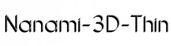
A sleek, modern 3D font with clean lines and a dynamic, futuristic appearance.
![Nanami-3D-Thin Frei Schriftart Herunterladen]() Herunterladen 235 Downloads@WebFont
Herunterladen 235 Downloads@WebFont -
( Fonts by Brother Grounds Studio )
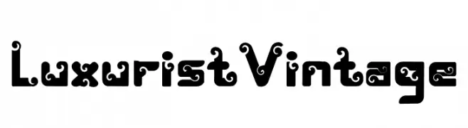
A bold, decorative font with vintage-inspired swirls and curls.
![Luxurist Vintage Frei Schriftart Herunterladen]() Herunterladen 235 Downloads@WebFont
Herunterladen 235 Downloads@WebFont -
( Fonts by Daniel Zadorozny - www.iconian.com - Free for personal use )
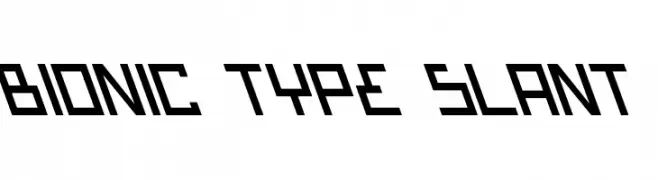
A bold, slanted, and futuristic font with angular, geometric shapes.
![Bionic Type Slant Frei Schriftart Herunterladen]() Herunterladen 235 Downloads
Herunterladen 235 Downloads -
( 100% Free - oohlalaartsy.blogspot.com )
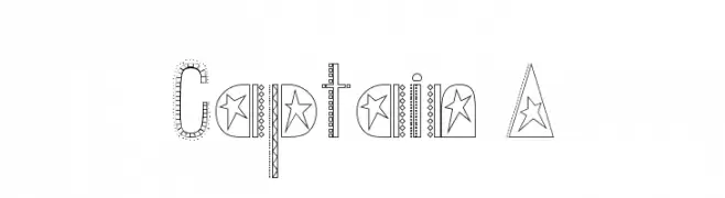
A decorative font with star motifs and dotted patterns, offering a playful and whimsical style.
![Captain A Frei Schriftart Herunterladen]() Herunterladen 235 Downloads@WebFont
Herunterladen 235 Downloads@WebFont -
( Fonts by Dave Ellis )
A playful, bold typeface with rounded, consistent strokes.
![Sile Frei Schriftart Herunterladen]() Herunterladen 235 Downloads@WebFont
Herunterladen 235 Downloads@WebFont -
![Negatori Frei Schriftart Herunterladen]() Herunterladen 235 Downloads@WebFont
Herunterladen 235 Downloads@WebFont -
![BlottoooLightBeer Frei Schriftart Herunterladen]() Herunterladen 235 Downloads@WebFont
Herunterladen 235 Downloads@WebFont -
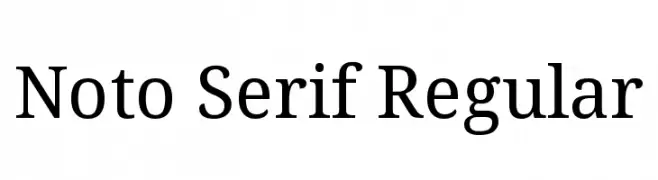
( Noto is a trademark of Google Inc. Noto fonts are open source. All Noto fonts are published under the SIL Open Font License, Version 1.1 )
A classic serif font with medium contrast and elegant serifs.
![Noto Serif Regular Frei Schriftart Herunterladen]() Herunterladen 235 Downloads@WebFont
Herunterladen 235 Downloads@WebFont -
![SCI FI BOX Frei Schriftart Herunterladen]() Herunterladen 235 Downloads@WebFont
Herunterladen 235 Downloads@WebFont -
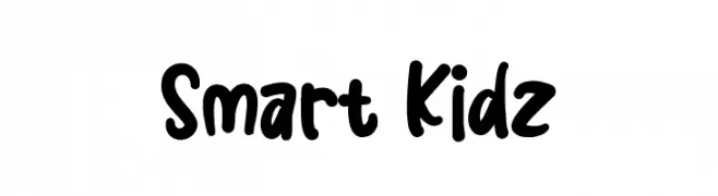
( Fonts by GoldenGraph Design )
A playful, bold, and hand-drawn font with rounded characters.
![Smart Kidz Frei Schriftart Herunterladen]() Herunterladen 235 Downloads@WebFont
Herunterladen 235 Downloads@WebFont -
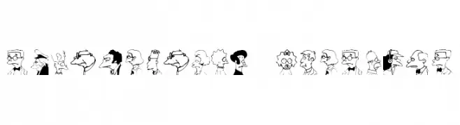
( Fonts by Paul Reid - tracertong.co.uk )
Cartoonish, hand-drawn display font with character portraits as glyphs.
![Springfield MugShots Frei Schriftart Herunterladen]() Herunterladen 235 Downloads
Herunterladen 235 Downloads -
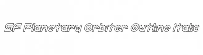
( Fonts by ShyFonts )
A futuristic, geometric outline font with italicized characters.
![SF Planetary Orbiter Outline Italic Frei Schriftart Herunterladen]() Herunterladen 235 Downloads@WebFont
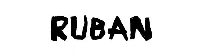
Herunterladen 235 Downloads@WebFont -
![Ruban Frei Schriftart Herunterladen]() Herunterladen 235 Downloads@WebFont
Herunterladen 235 Downloads@WebFont -
![messsyyy;] Frei Schriftart Herunterladen]() Herunterladen 235 Downloads@WebFont
Herunterladen 235 Downloads@WebFont -
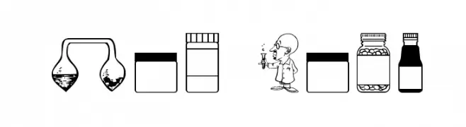
( Fonts by Apostrophic Lab )
A laboratory-themed dingbat font with science icons and cartoon scientists.
![Lab Bats Frei Schriftart Herunterladen]() Herunterladen 235 Downloads@WebFont
Herunterladen 235 Downloads@WebFont -
( Fonts by Allouse Studio )
A playful, casual handwritten font with rounded edges and a friendly appearance.
![Talklessy Frei Schriftart Herunterladen]() Herunterladen 235 Downloads@WebFont
Herunterladen 235 Downloads@WebFont -
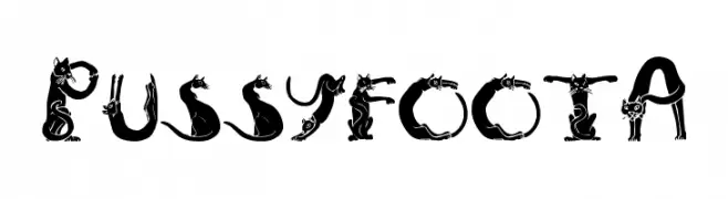
( Fonts by Greg Smith )
A whimsical font with letters formed by cat silhouettes, offering a playful and decorative style.
![PussyfootA Frei Schriftart Herunterladen]() Herunterladen 235 Downloads@WebFont
Herunterladen 235 Downloads@WebFont -
( Fonts by Mans Greback - Personal-use only. For commercial use please contact owner. )
A bold, modern sans-serif font with clean lines and strong presence.
![Famiar PERSONAL USE ONLY SemiBold Frei Schriftart Herunterladen]() Herunterladen 235 Downloads@WebFont
Herunterladen 235 Downloads@WebFont -
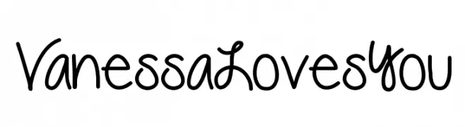
( Fonts by Vanessa Bays - bythebutterfly.com )
A playful, handwritten font with smooth, rounded edges and a casual style.
![VanessaLovesYou Frei Schriftart Herunterladen]() Herunterladen 235 Downloads@WebFont
Herunterladen 235 Downloads@WebFont -
( Fonts by Fenny Wiryani - Personal-use only. For commercial use please contact owner. )
A playful, rounded font with smooth curves and a friendly style.
![Really Petshop Frei Schriftart Herunterladen]() Herunterladen 235 Downloads@WebFont
Herunterladen 235 Downloads@WebFont -
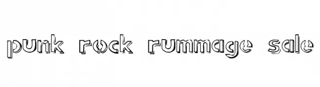
( Fonts by Pennyzine - www.thedevilinjasonramirez.com - Free for personal use )
A bold, edgy font with a punk rock aesthetic and shadowed outline.
![punk rock rummage sale Frei Schriftart Herunterladen]() Herunterladen 235 Downloads@WebFont
Herunterladen 235 Downloads@WebFont -
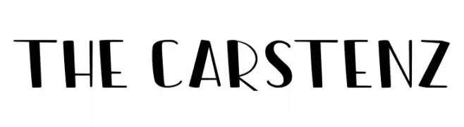
( Fonts by Syafiiirman Studio )
A playful, modern font with geometric and hand-drawn elements.
![The Carstenz Frei Schriftart Herunterladen]() Herunterladen 235 Downloads@WebFont
Herunterladen 235 Downloads@WebFont -
( Fonts by David Rakowski )
A bold, decorative font with a three-dimensional, shadowed effect.
![Tejaratchi Th Bold Frei Schriftart Herunterladen]() Herunterladen 235 Downloads@WebFont
Herunterladen 235 Downloads@WebFont -
( Fonts by Perspectype Studio )
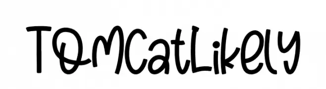
A playful, bold handwritten font with rounded, whimsical letterforms.
![Tomcat Likely Frei Schriftart Herunterladen]() Herunterladen 235 Downloads@WebFont
Herunterladen 235 Downloads@WebFont -
( Fonts by Manfred Klein. Free for private and charity use. Free for commercial with donation to organizations )
Sketch-style font featuring ballet dancer illustrations as characters.
![BalletSketches Frei Schriftart Herunterladen]() Herunterladen 235 Downloads@WebFont
Herunterladen 235 Downloads@WebFont -
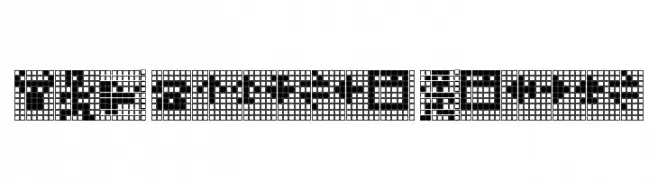
![TPF Display Symbol Frei Schriftart Herunterladen]() Herunterladen 235 Downloads@WebFont
Herunterladen 235 Downloads@WebFont -
![Alertse Frei Schriftart Herunterladen]() Herunterladen 235 Downloads@WebFont
Herunterladen 235 Downloads@WebFont -
( Fonts by Setype )
A playful, bold handwritten font with rounded edges and a casual style.
![samble Frei Schriftart Herunterladen]() Herunterladen 235 Downloads@WebFont
Herunterladen 235 Downloads@WebFont -
( Fonts by pOPdOG fONTS - Dimitris Kolyris - popdog_fonts.tripod.com Sponsoren Schriftart )
A bold, playful font with a hand-drawn, whimsical style.
![Victor Vector Frei Schriftart Herunterladen]() Herunterladen 235 Downloads
Herunterladen 235 Downloads -
( Fonts by ingoFonts. http://www.ingofonts.de )
A bold, pixelated font with a retro digital aesthetic.
![DePixel-Boldreduced Frei Schriftart Herunterladen]() Herunterladen 235 Downloads@WebFont
Herunterladen 235 Downloads@WebFont -
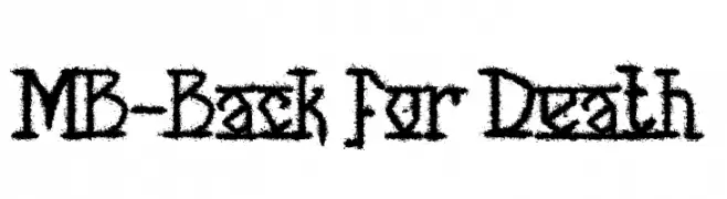
![MB-Back for Death Frei Schriftart Herunterladen]() Herunterladen 235 Downloads@WebFont
Herunterladen 235 Downloads@WebFont -
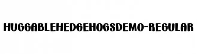
( Fonts by Brittney Murphy Design )
A playful, bold font with rounded characters and a whimsical charm.
![HuggableHedgehogsDemo-Regular Frei Schriftart Herunterladen]() Herunterladen 235 Downloads@WebFont
Herunterladen 235 Downloads@WebFont -
( Fonts by Lennart Koopman )
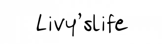
A playful, casual handwritten font with smooth, flowing lines and varying stroke widths.
![Livy'slife Frei Schriftart Herunterladen]() Herunterladen 235 Downloads@WebFont
Herunterladen 235 Downloads@WebFont -
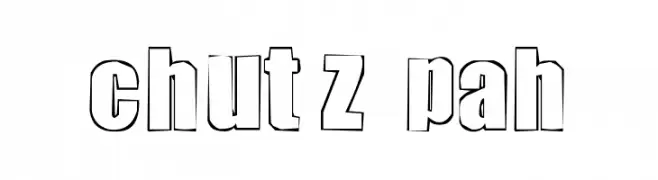
![chutzpah Frei Schriftart Herunterladen]() Herunterladen 235 Downloads@WebFont
Herunterladen 235 Downloads@WebFont


![messsyyy;] Frei Schriftart Herunterladen](https://d144mzi0q5mijx.cloudfront.net/img/M/E/messsyyy.webp)


Welche Schriften sind gerade am populärsten?
Poppins, Roboto, Montserrat, Open Sans und Lato sind wegen ihrer klaren Formen und breiten Einsetzbarkeit sehr gefragt – von Markenauftritt über Landingpages bis hin zu Postern.
Welche Fonts eignen sich für Logos?
Geometrische Sans‑Serifs (z. B. Poppins, Familien im Gotham‑Stil) sind ein häufiger Griff für sauberes, skalierbares Branding. Für eine persönlichere Note bleiben Scripts und Handschrift‑Stile beliebt. Kombinieren Sie einen prägnanten Headline‑Font mit einer neutralen Brotschrift für Wiedererkennung und Harmonie.
Wie oft wird die Top‑Liste aktualisiert?
Regelmäßig – basierend auf realen Downloads und Interaktionen. Schauen Sie öfter vorbei, um aufstrebende Favoriten früh zu entdecken.
💡 Tipp: Seite bookmarken – Trends wechseln schnell, und heutige Top‑Schriften inspirieren morgen vielleicht das Rebranding.