Willkommen bei den Top‑Schriften – hier treffen Beliebtheit und Qualität aufeinander. Das sind die in diesem Jahr am häufigsten heruntergeladenen und genutzten Fonts. Wenn Sie sichere Optionen für Logo, Web oder Social suchen, starten Sie hier.
Jeder Top‑Font überzeugt durch Balance, Lesbarkeit und Vielseitigkeit. Sie finden moderne Sans‑Serifs, elegante Scripts, Vintage‑Serifs und minimalistische Displays.
-
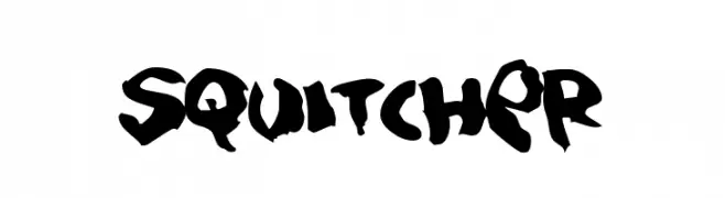
( Fonts by Jacob Fisher - www.pizzadude.dk )
A bold, hand-drawn font with a graffiti-like, artistic style.
 Herunterladen 233 Downloads@WebFont
 -
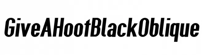
( Fonts by CannotIntoSpaceFonts - KineticPlasma Fonts - Personal-use only. For commercial use please contact owner. )
Bold, oblique font with a dynamic and modern style.
![Give A Hoot Black Oblique Frei Schriftart Herunterladen]() Herunterladen 233 Downloads@WebFont
Herunterladen 233 Downloads@WebFont -
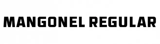
( Fonts by Vladimir Nikolic - www.creativefabrica.com/designer/vladimirnikolic/ - Personal-use only. For commercial use please contact owner. )
A bold, geometric font with a modern and impactful design.
![Mangonel Regular Frei Schriftart Herunterladen]() Herunterladen 233 Downloads@WebFont
Herunterladen 233 Downloads@WebFont -
![SamtolKalmi Frei Schriftart Herunterladen]() Herunterladen 233 Downloads@WebFont
Herunterladen 233 Downloads@WebFont -
( Fonts by a Galdino Otten - galdinootten.com . Personal-use only. For commercial use please contact owner. )
A bold, graffiti-inspired font with a three-dimensional, street art style.
![Street 2 Art Frei Schriftart Herunterladen]() Herunterladen 233 Downloads@WebFont
Herunterladen 233 Downloads@WebFont -
( Fonts by Greg Fleming )
A bold, geometric font with clean lines and a modern aesthetic.
![RailwayAlternate Frei Schriftart Herunterladen]() Herunterladen 233 Downloads@WebFont
Herunterladen 233 Downloads@WebFont -
( Fonts by Jacob Fisher - www.pizzadude.dk )
A modern, geometric sans-serif font with clean lines and balanced proportions.
![Kookaburra Frei Schriftart Herunterladen]() Herunterladen 233 Downloads@WebFont
Herunterladen 233 Downloads@WebFont -
( Fonts by a Neale Davidson - www.pixelsagas.com. Personal-use only. For commercial use please contact owner. )
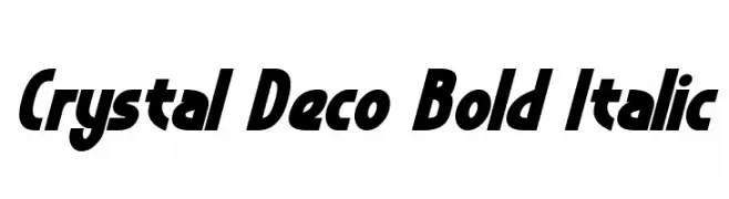
A bold, italicized font with geometric angles and a modern, dynamic style.
![Crystal Deco Bold Italic Frei Schriftart Herunterladen]() Herunterladen 233 Downloads@WebFont
Herunterladen 233 Downloads@WebFont -
( Fonts by typeformerstudio.com - Personal-use only. For commercial use please contact owner. )
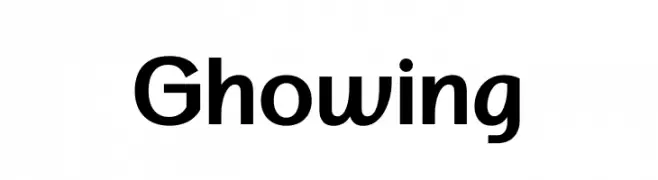
A modern sans-serif font with clean lines and balanced structure.
![Ghowing Frei Schriftart Herunterladen]() Herunterladen 233 Downloads@WebFont
Herunterladen 233 Downloads@WebFont -
( Fonts by Emma Kumer )
A whimsical, playful handwritten font with thin, tall letters.
![Kaleidescope Frei Schriftart Herunterladen]() Herunterladen 232 Downloads@WebFont
Herunterladen 232 Downloads@WebFont -
( Fonts by Daniel Zadorozny - www.iconian.com )
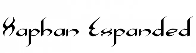
A bold, gothic-inspired font with sharp, angular lines and medieval flourishes.
![Xaphan Expanded Frei Schriftart Herunterladen]() Herunterladen 232 Downloads@WebFont
Herunterladen 232 Downloads@WebFont -
( Haris Prawoto - graphicriver.net/user/selawe/portfolio )
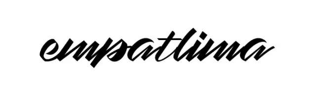
A dynamic, flowing script font with elegant, interconnected letters.
![empatlima Frei Schriftart Herunterladen]() Herunterladen 232 Downloads@WebFont
Herunterladen 232 Downloads@WebFont -
( Fonts by Aaron Amar - Personal-use only. For commercial use please contact owner. )
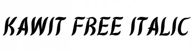
A dynamic, flowing script font with elegant, cursive letterforms and a consistent italic slant.
![Kawit Free Italic Frei Schriftart Herunterladen]() Herunterladen 232 Downloads@WebFont
Herunterladen 232 Downloads@WebFont -
( Fonts by Daniel Zadorozny - www.iconian.com - Free for personal use )
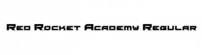
A bold, futuristic font with geometric outlines and sharp edges.
![Red Rocket Academy Regular Frei Schriftart Herunterladen]() Herunterladen 232 Downloads@WebFont
Herunterladen 232 Downloads@WebFont -
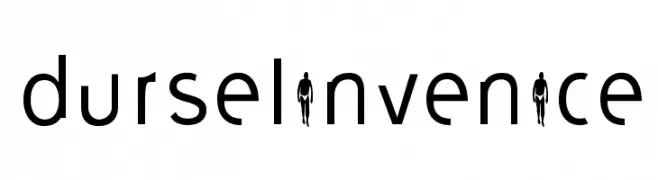
Schriftart von nicolasmartin. For commercial use please contact the owner.
![durselinvenice Frei Schriftart Herunterladen]() Herunterladen 232 Downloads@WebFont
Herunterladen 232 Downloads@WebFont -
( Fonts by Bud White. Personal-use only. For commercial use please contact owner. )
A modern, elongated font with narrow, geometric characters and minimal contrast.
![Kinkinch Regular Frei Schriftart Herunterladen]() Herunterladen 232 Downloads@WebFont
Herunterladen 232 Downloads@WebFont -
( Fonts by New Typography - Vernon Adams. Personal-use only. For commercial use please contact owner. )
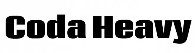
A bold, modern font with thick, uniform strokes and high readability.
![Coda Heavy Frei Schriftart Herunterladen]() Herunterladen 232 Downloads@WebFont
Herunterladen 232 Downloads@WebFont -
( Fonts by Ibnu Nur Rahman )
A bold, handwritten-style font with fluid, interconnected strokes.
![Dimetone Frei Schriftart Herunterladen]() Herunterladen 232 Downloads@WebFont
Herunterladen 232 Downloads@WebFont -
( Fonts by David Rakowski )
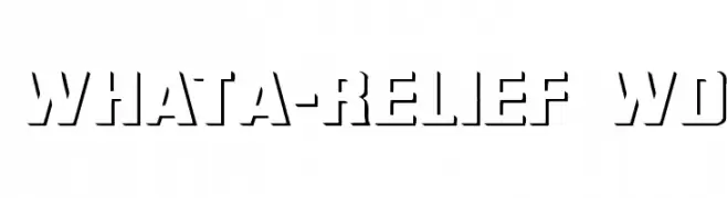
Bold, stencil-like font with sharp, angular edges and a modern industrial feel.
![WhatA-Relief Wd Frei Schriftart Herunterladen]() Herunterladen 232 Downloads@WebFont
Herunterladen 232 Downloads@WebFont -
( Fonts by MuraKnockout Media + Design - muraknockout.com. Personal-use only. For commercial use please contact owner. )
A modern, geometric font with thin, uniform strokes and a minimalist design.
![Espacio Frei Schriftart Herunterladen]() Herunterladen 232 Downloads@WebFont
Herunterladen 232 Downloads@WebFont -
( Fonts by Typegoals Labs )
A bold, playful font with rounded, hand-drawn characters.
![Los felis Frei Schriftart Herunterladen]() Herunterladen 232 Downloads@WebFont
Herunterladen 232 Downloads@WebFont -
![Toon-Time Narrow Frei Schriftart Herunterladen]() Herunterladen 232 Downloads@WebFont
Herunterladen 232 Downloads@WebFont -
( Fonts by Zetafonts - Personal-use only. For commercial use please contact owner. )
A bold, high-contrast serif font with a modern and elegant style.
![Calvino Grande Trial Extrabold Frei Schriftart Herunterladen]() Herunterladen 232 Downloads@WebFont
Herunterladen 232 Downloads@WebFont -
( Demo - https://www.facebook.com/pages/Typesgal/263689187041814 )
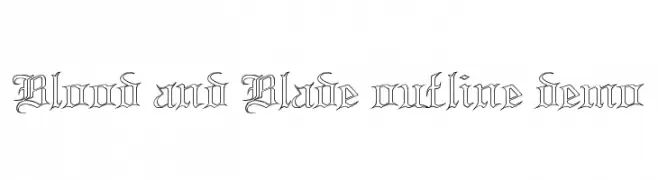
A gothic, medieval-style font with sharp, angular lines and ornate detailing.
![Blood and Blade outline demo Frei Schriftart Herunterladen]() Herunterladen 232 Downloads@WebFont
Herunterladen 232 Downloads@WebFont -
( Fonts by Daniel Zadorozny - www.iconian.com )
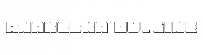
A bold, geometric outline font with a modern, angular design.
![Anakefka Outline Frei Schriftart Herunterladen]() Herunterladen 232 Downloads@WebFont
Herunterladen 232 Downloads@WebFont -
( Fonts by Captain Jack Harkness )
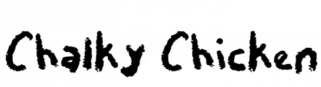
A playful, chalk-like font with a hand-drawn, textured appearance.
![Chalky Chicken Frei Schriftart Herunterladen]() Herunterladen 232 Downloads@WebFont
Herunterladen 232 Downloads@WebFont -
![ROUGHAGE Frei Schriftart Herunterladen]() Herunterladen 232 Downloads@WebFont
Herunterladen 232 Downloads@WebFont -
( Fargun Studio - Fajar Gunawan - creativemarket.com/FargunStudio )
A playful, casual handwritten font with flowing, slightly irregular letterforms.
![Black Hawk Frei Schriftart Herunterladen]() Herunterladen 232 Downloads@WebFont
Herunterladen 232 Downloads@WebFont -
( Fonts by Forberas Club )
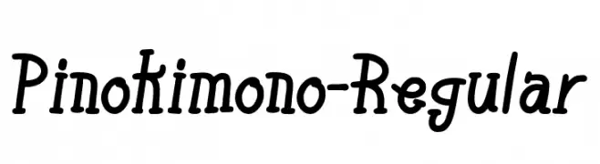
A playful, handwritten-style font with consistent stroke width and dynamic character design.
![Pinokimono-Regular Frei Schriftart Herunterladen]() Herunterladen 232 Downloads@WebFont
Herunterladen 232 Downloads@WebFont -
( Fonts by fsuarez913 )
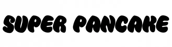
A playful, bold font with rounded, bubbly characters perfect for fun and whimsical designs.
![Super Pancake Frei Schriftart Herunterladen]() Herunterladen 232 Downloads@WebFont
Herunterladen 232 Downloads@WebFont -
( www.tattoowoo.com )
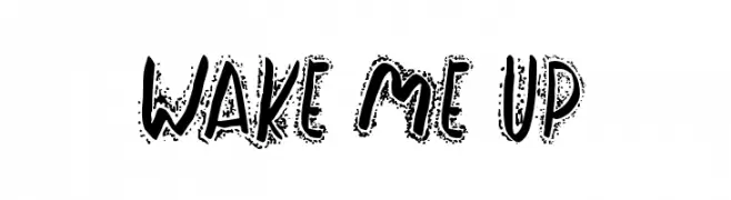
A bold, hand-drawn font with a graffiti-like texture and playful style.
![Wake Me Up Frei Schriftart Herunterladen]() Herunterladen 232 Downloads@WebFont
Herunterladen 232 Downloads@WebFont -
( www.behance.net/SebastianMejiaQ )
A modern, geometric font with intricate line and dot details.
![Inspira Frei Schriftart Herunterladen]() Herunterladen 232 Downloads@WebFont
Herunterladen 232 Downloads@WebFont -
( Fonts by Manfred Klein. Free for private and charity use. Free for commercial with donation to organizations )
Cartoonish, character-based font with grandparent and child illustrations.
![GrandParents Frei Schriftart Herunterladen]() Herunterladen 232 Downloads@WebFont
Herunterladen 232 Downloads@WebFont -
( Fonts by Nuno Dias - Personal-use only. For commercial use please contact owner. )
A bold, geometric font with sharp angles and a futuristic style.
![Origram Frei Schriftart Herunterladen]() Herunterladen 232 Downloads@WebFont
Herunterladen 232 Downloads@WebFont -
( Fonts by Michela Ferretti )
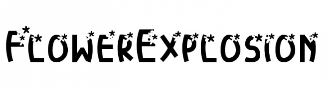
A playful, decorative font with floral accents on bold, rounded characters.
![FlowerExplosion Frei Schriftart Herunterladen]() Herunterladen 232 Downloads@WebFont
Herunterladen 232 Downloads@WebFont


Welche Schriften sind gerade am populärsten?
Poppins, Roboto, Montserrat, Open Sans und Lato sind wegen ihrer klaren Formen und breiten Einsetzbarkeit sehr gefragt – von Markenauftritt über Landingpages bis hin zu Postern.
Welche Fonts eignen sich für Logos?
Geometrische Sans‑Serifs (z. B. Poppins, Familien im Gotham‑Stil) sind ein häufiger Griff für sauberes, skalierbares Branding. Für eine persönlichere Note bleiben Scripts und Handschrift‑Stile beliebt. Kombinieren Sie einen prägnanten Headline‑Font mit einer neutralen Brotschrift für Wiedererkennung und Harmonie.
Wie oft wird die Top‑Liste aktualisiert?
Regelmäßig – basierend auf realen Downloads und Interaktionen. Schauen Sie öfter vorbei, um aufstrebende Favoriten früh zu entdecken.
💡 Tipp: Seite bookmarken – Trends wechseln schnell, und heutige Top‑Schriften inspirieren morgen vielleicht das Rebranding.