Willkommen bei den Top‑Schriften – hier treffen Beliebtheit und Qualität aufeinander. Das sind die in diesem Jahr am häufigsten heruntergeladenen und genutzten Fonts. Wenn Sie sichere Optionen für Logo, Web oder Social suchen, starten Sie hier.
Jeder Top‑Font überzeugt durch Balance, Lesbarkeit und Vielseitigkeit. Sie finden moderne Sans‑Serifs, elegante Scripts, Vintage‑Serifs und minimalistische Displays.
-
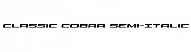
( Iconian Fonts - Daniel Zadorozny - www.iconian.com )
A sleek, semi-italic font with a modern and dynamic style.
 Herunterladen 231 Downloads@WebFont
 -
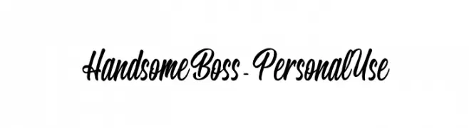
( Fonts by Good Java Studio - www.creativefabrica.com/designer/goodjavastudio/ref/236564 - Personal-use only. For commercial use please contact owner. )
A lively and expressive handwritten font with fluid, dynamic strokes.
![Gloryouss Frei Schriftart Herunterladen]() Herunterladen 231 Downloads@WebFont
Herunterladen 231 Downloads@WebFont -
![DU30 Frei Schriftart Herunterladen]() Herunterladen 231 Downloads@WebFont
Herunterladen 231 Downloads@WebFont -
![Handsome Boss - Personal Use Frei Schriftart Herunterladen]() Herunterladen 231 Downloads@WebFont
Herunterladen 231 Downloads@WebFont -
( Fonts by Daniel Zadorozny - www.iconian.com )
A bold, decorative font with a vintage flair and outlined characters.
![Xiphos College Frei Schriftart Herunterladen]() Herunterladen 231 Downloads@WebFont
Herunterladen 231 Downloads@WebFont -
( Fonts by Jeri Ingalls - littlehouse.homestead.com )
The image contains decorative kaleidoscope patterns, not a font.
![JI Kaleidoscope Bats 3 Frei Schriftart Herunterladen]() Herunterladen 231 Downloads@WebFont
Herunterladen 231 Downloads@WebFont -
![auto mobile Frei Schriftart Herunterladen]() Herunterladen 231 Downloads@WebFont
Herunterladen 231 Downloads@WebFont -
![JamminBaby Frei Schriftart Herunterladen]() Herunterladen 231 Downloads@WebFont
Herunterladen 231 Downloads@WebFont -
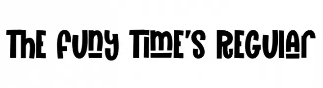
( Fonts by Gilar Studio )
A playful, bold font with rounded, quirky characters.
![The Funy Time's Regular Frei Schriftart Herunterladen]() Herunterladen 231 Downloads@WebFont
Herunterladen 231 Downloads@WebFont -
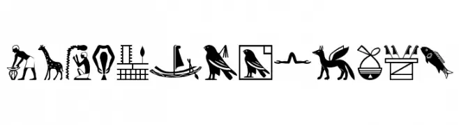
( Fonts by Manfred Klein. Free for private and charity use. Free for commercial with donation to organizations )
Decorative pictogram font inspired by Egyptian hieroglyphs.
![EgyptChildren Frei Schriftart Herunterladen]() Herunterladen 231 Downloads@WebFont
Herunterladen 231 Downloads@WebFont -
( Fonts by Galdino Otten - galdinootten.com )
A whimsical, hand-drawn font with thin, elongated letterforms.
![Just Skinny Frei Schriftart Herunterladen]() Herunterladen 231 Downloads@WebFont
Herunterladen 231 Downloads@WebFont -
( Fonts by www.freakyfonts.de )
A dynamic pictogram font featuring stick figures in motion, ideal for creative and thematic designs.
![DanceFloor eXit Frei Schriftart Herunterladen]() Herunterladen 231 Downloads
Herunterladen 231 Downloads -
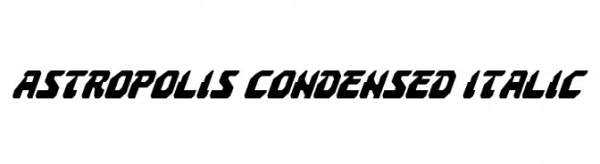
( Fonts by Daniel Zadorozny - www.iconian.com - Free for personal use )
A bold, condensed italic font with a futuristic and dynamic style.
![Astropolis Condensed Italic Frei Schriftart Herunterladen]() Herunterladen 231 Downloads@WebFont
Herunterladen 231 Downloads@WebFont -
Schriftart von glyphstyle. For commercial use please contact the owner.
( NOTE: This demo font is for PERSONAL USE ONLY! But any donation are very appreciated. Paypal account for donation : https://www.paypal.me/dimasardhi full version: https://www.glyphstyle.net/cronicle/ contact us at styleglyph@gmail.com And follow my in )
A modern, sleek font with clean lines and professional appeal.
![Cronicle Demo Frei Schriftart Herunterladen]() Herunterladen 231 Downloads@WebFont
Herunterladen 231 Downloads@WebFont -
![Sunspots Frei Schriftart Herunterladen]() Herunterladen 231 Downloads@WebFont
Herunterladen 231 Downloads@WebFont -
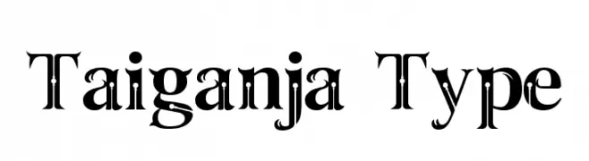
( Fonts by Hardi Nugraha Tunggele )
A bold, decorative font with high contrast and intricate detailing.
![Taiganja Type Frei Schriftart Herunterladen]() Herunterladen 231 Downloads@WebFont
Herunterladen 231 Downloads@WebFont -
( Fonts by Zetafonts - Personal-use only. For commercial use please contact owner. )
A bold, heavy italic font with a modern and dynamic style.
![CocoSharp Trial Heavy Italic Frei Schriftart Herunterladen]() Herunterladen 231 Downloads@WebFont
Herunterladen 231 Downloads@WebFont -
( Fonts by Mirco Zett )
A bold, edgy font with a hand-drawn, graffiti-like style.
![UncutMadnessDemoversion Frei Schriftart Herunterladen]() Herunterladen 231 Downloads@WebFont
Herunterladen 231 Downloads@WebFont -
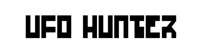
( Fonts by Daniel Zadorozny - www.iconian.com - Free for personal use )
A bold, geometric font with a futuristic, digital aesthetic.
![UFO Hunter Frei Schriftart Herunterladen]() Herunterladen 231 Downloads@WebFont
Herunterladen 231 Downloads@WebFont -
( Fonts by Kong Font - fontkong.com - Personal-use only. For commercial use please contact owner. )
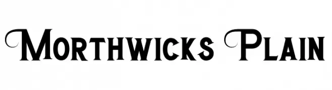
A bold, decorative font with elegant curves and artistic flair.
![Morthwicks Plain Frei Schriftart Herunterladen]() Herunterladen 231 Downloads@WebFont
Herunterladen 231 Downloads@WebFont -
( Fonts by MaknaStudio - www.maknastudio.com - Personal-use only. For commercial use please contact owner. )
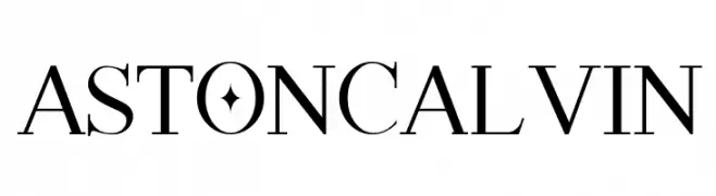
Elegant serif font with high contrast and decorative elements.
![ASTON CALVIN Frei Schriftart Herunterladen]() Herunterladen 231 Downloads@WebFont
Herunterladen 231 Downloads@WebFont -
( Fonts by Jonathan S. Harris - www.tattoowoo.com. Personal-use only. For commercial use please contact owner. )
A bold, expressive brush script font with dynamic strokes and a textured appearance.
![Yeti Fety Frei Schriftart Herunterladen]() Herunterladen 231 Downloads@WebFont
Herunterladen 231 Downloads@WebFont -
( Fonts by Maelle.K - Thomas Boucherie )
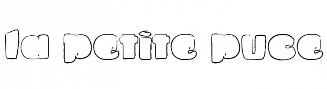
A playful, rounded font with bold strokes and whimsical, cartoon-like characters.
![La petite puce Frei Schriftart Herunterladen]() Herunterladen 231 Downloads@WebFont
Herunterladen 231 Downloads@WebFont -
( Fonts by ToniStudio - Fatoni Nurman - Personal-use only. For commercial use please contact owner. )
A bold, high-contrast serif font with a classic yet modern appeal.
![Mofista Frei Schriftart Herunterladen]() Herunterladen 231 Downloads@WebFont
Herunterladen 231 Downloads@WebFont -
![Howlin' Mad Punch Frei Schriftart Herunterladen]() Herunterladen 231 Downloads@WebFont
Herunterladen 231 Downloads@WebFont -
( Fonts by Vladimir Nikolic - https://www.creativefabrica.com/product/educated-deers/ref/144265/ - Personal-use only. For commercial use please contact owner. )
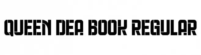
A bold, geometric font with strong, angular lines and a modern aesthetic.
![Queen Dea Book Regular Frei Schriftart Herunterladen]() Herunterladen 231 Downloads@WebFont
Herunterladen 231 Downloads@WebFont -
( Fonts by Green Adventure Studio - Ardi Parwito - Personal-use only. For commercial use please contact owner. )
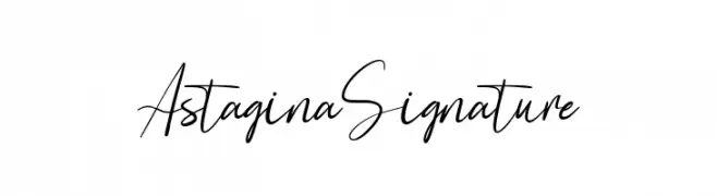
A fluid, cursive font with an elegant and sophisticated style.
![Astagina Signature Frei Schriftart Herunterladen]() Herunterladen 231 Downloads@WebFont
Herunterladen 231 Downloads@WebFont -
( Sein_sk8 - Juan Rubio - www.behance.net/sein )
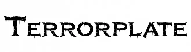
A bold, thorn-like font with sharp, jagged edges, perfect for horror themes.
![Terrorplate Frei Schriftart Herunterladen]() Herunterladen 231 Downloads@WebFont
Herunterladen 231 Downloads@WebFont -
![D'ni Script Linguistic Mapping Frei Schriftart Herunterladen]() Herunterladen 231 Downloads@WebFont
Herunterladen 231 Downloads@WebFont -
![Canne Frei Schriftart Herunterladen]() Herunterladen 231 Downloads@WebFont
Herunterladen 231 Downloads@WebFont -
( Fonts by Vladimir Nikolic )
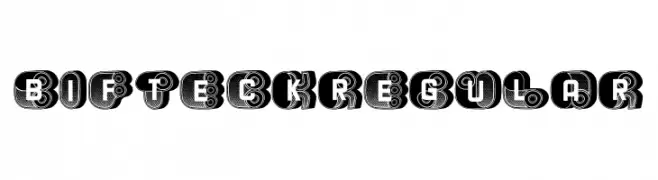
A bold, decorative typeface with intricate patterns and a playful, artistic style.
![Bifteck Regular Frei Schriftart Herunterladen]() Herunterladen 231 Downloads@WebFont
Herunterladen 231 Downloads@WebFont -
Schriftart von Qbotype. For commercial use please contact the owner.
( Fonts by www.phuxerdesigns.com.ar - Non-commercial use of any typeface free version, only buying the full version )
A futuristic, geometric font with a neon-inspired, outlined design.
![Spac3 neon Frei Schriftart Herunterladen]() Herunterladen 231 Downloads@WebFont
Herunterladen 231 Downloads@WebFont -
( Fonts by Steve Cloutier - www.cloutierfontes.ca )
A bold, vintage serif font with dramatic strokes and sharp serifs.
![NapoleonDemo Regular Frei Schriftart Herunterladen]() Herunterladen 231 Downloads@WebFont
Herunterladen 231 Downloads@WebFont -
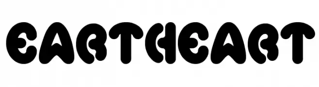
![eartheart Frei Schriftart Herunterladen]() Herunterladen 231 Downloads@WebFont
Herunterladen 231 Downloads@WebFont -
( Fonts by www.twopeasinabucket.com )
A playful, block-style font with characters enclosed in squares, ideal for fun and informal projects.
![2Peas Blocks - Soccer Frei Schriftart Herunterladen]() Herunterladen 231 Downloads@WebFont
Herunterladen 231 Downloads@WebFont


Welche Schriften sind gerade am populärsten?
Poppins, Roboto, Montserrat, Open Sans und Lato sind wegen ihrer klaren Formen und breiten Einsetzbarkeit sehr gefragt – von Markenauftritt über Landingpages bis hin zu Postern.
Welche Fonts eignen sich für Logos?
Geometrische Sans‑Serifs (z. B. Poppins, Familien im Gotham‑Stil) sind ein häufiger Griff für sauberes, skalierbares Branding. Für eine persönlichere Note bleiben Scripts und Handschrift‑Stile beliebt. Kombinieren Sie einen prägnanten Headline‑Font mit einer neutralen Brotschrift für Wiedererkennung und Harmonie.
Wie oft wird die Top‑Liste aktualisiert?
Regelmäßig – basierend auf realen Downloads und Interaktionen. Schauen Sie öfter vorbei, um aufstrebende Favoriten früh zu entdecken.
💡 Tipp: Seite bookmarken – Trends wechseln schnell, und heutige Top‑Schriften inspirieren morgen vielleicht das Rebranding.