Willkommen bei den Top‑Schriften – hier treffen Beliebtheit und Qualität aufeinander. Das sind die in diesem Jahr am häufigsten heruntergeladenen und genutzten Fonts. Wenn Sie sichere Optionen für Logo, Web oder Social suchen, starten Sie hier.
Jeder Top‑Font überzeugt durch Balance, Lesbarkeit und Vielseitigkeit. Sie finden moderne Sans‑Serifs, elegante Scripts, Vintage‑Serifs und minimalistische Displays.
-
( Fonts by Apostrophic Lab )
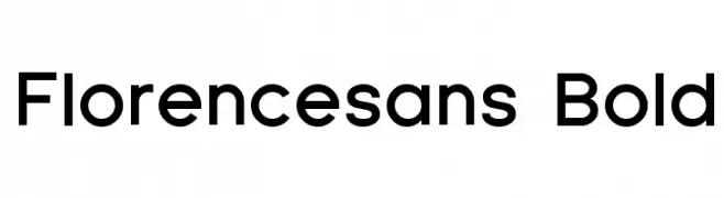
A bold, modern sans-serif font with clean lines and uniform strokes.
 Herunterladen 3233 Downloads@WebFont
 -
![Cute Stitch Frei Schriftart Herunterladen]() Herunterladen 3232 Downloads@WebFont
Herunterladen 3232 Downloads@WebFont -
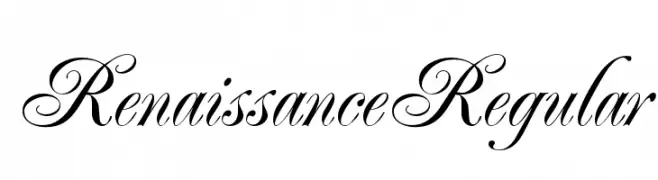
![RenaissanceRegular Frei Schriftart Herunterladen]() Herunterladen 3231 Downloads@WebFont
Herunterladen 3231 Downloads@WebFont -
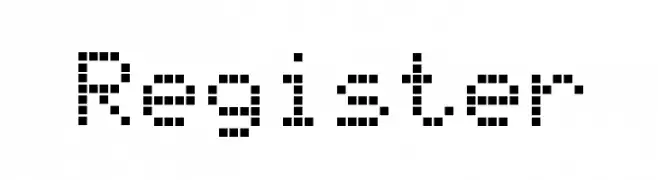
![Register Frei Schriftart Herunterladen]() Herunterladen 3231 Downloads@WebFont
Herunterladen 3231 Downloads@WebFont -
( Fonts by Youssef Habchi )
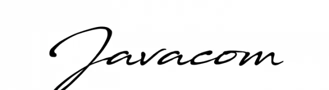
A fluid, cursive script font with a natural handwritten style.
![Javacom Frei Schriftart Herunterladen]() Herunterladen 3230 Downloads@WebFont
Herunterladen 3230 Downloads@WebFont -
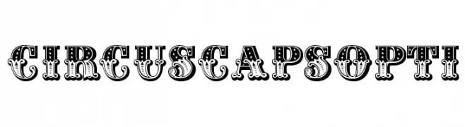
( Fonts by Castcraft Software - opti.netii.net - check the website before use )
A bold, decorative font with intricate patterns, ideal for vintage-themed designs.
![CIRcusCapsOpti Frei Schriftart Herunterladen]() Herunterladen 3230 Downloads@WebFont
Herunterladen 3230 Downloads@WebFont -
( Fonts by Manfred Klein - manfred-klein.ina-mar.com )
A modern, minimalist font with clean lines and consistent stroke width.
![PetitaLight Frei Schriftart Herunterladen]() Herunterladen 3230 Downloads@WebFont
Herunterladen 3230 Downloads@WebFont -
![arachnid Frei Schriftart Herunterladen]() Herunterladen 3229 Downloads@WebFont
Herunterladen 3229 Downloads@WebFont -
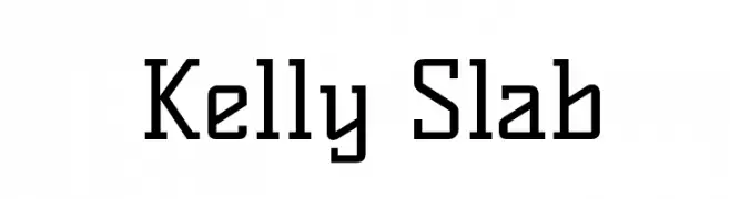
( Copyright (c) 2011, Denis Masharov
A modern slab serif font with strong lines and prominent serifs.
![Kelly Slab Frei Schriftart Herunterladen]() Herunterladen 3228 Downloads@WebFont
Herunterladen 3228 Downloads@WebFont -
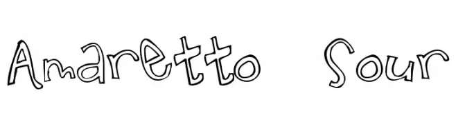
( Fonts by Matthew Austin Petty - www.disturbed.com )
A playful, hand-drawn font with whimsical and irregular characters.
![Amaretto Sour Frei Schriftart Herunterladen]() Herunterladen 3228 Downloads@WebFont
Herunterladen 3228 Downloads@WebFont -
![Drakon Frei Schriftart Herunterladen]() Herunterladen 3228 Downloads@WebFont
Herunterladen 3228 Downloads@WebFont -
( Roger White - web.archive.org/web/20120416090521/www.rogersfonts.org.uk/ )
A classic serif font with elegant, well-balanced strokes.
![Oxford Frei Schriftart Herunterladen]() Herunterladen 3227 Downloads@WebFont
Herunterladen 3227 Downloads@WebFont -
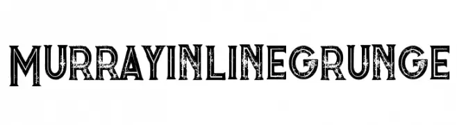
( Fonts by Peter Olexa )
A bold, distressed font with a grunge aesthetic and inline design.
![Murrayinlinegrunge Frei Schriftart Herunterladen]() Herunterladen 3227 Downloads@WebFont
Herunterladen 3227 Downloads@WebFont -
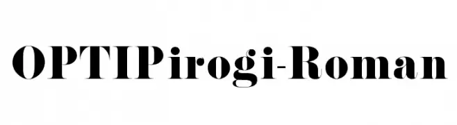
( Fonts by Castcraft Software - OPTI Fonts Archive - opti.netii.net - Personal-use only. For commercial use please contact owner. )
A bold, high-contrast serif font with a modern twist.
![OPTIPirogi-Roman Frei Schriftart Herunterladen]() Herunterladen 3227 Downloads@WebFont
Herunterladen 3227 Downloads@WebFont -
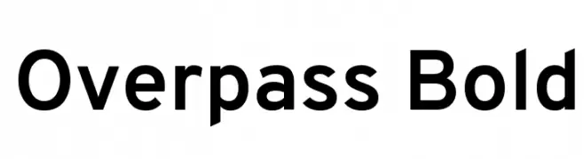
( Copyright (c) 2016 by Red Hat, Inc. All rights reserved. )
A bold, modern sans-serif font with excellent readability and uniform strokes.
![Overpass Bold Frei Schriftart Herunterladen]() Herunterladen 3227 Downloads@WebFont
Herunterladen 3227 Downloads@WebFont -
![UHoàiH 1.1 Frei Schriftart Herunterladen]() Herunterladen 3227 Downloads
Herunterladen 3227 Downloads -
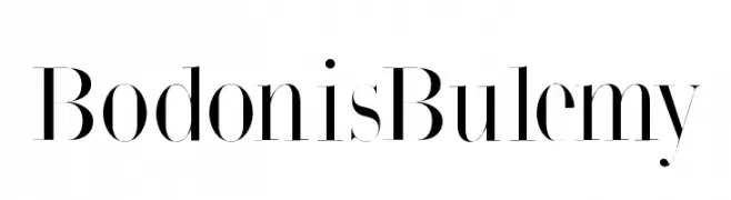
( Fonts by Manfred Klein. Free for private and charity use. Free for commercial with donation to organizations )
An elegant serif font with high contrast and sharp serifs.
![BodonisBulemy Frei Schriftart Herunterladen]() Herunterladen 3226 Downloads@WebFont
Herunterladen 3226 Downloads@WebFont -
( Fonts by www.26plus-zeichen.de )
A sleek, modern italic font with clean lines and a dynamic slant.
![Acid-Italic Frei Schriftart Herunterladen]() Herunterladen 3226 Downloads@WebFont
Herunterladen 3226 Downloads@WebFont -
( Fonts by www.exclamachine.com )
A bold, italicized blackletter-inspired font with sharp, angular lines.
![!The Black Bloc Bold Italic Frei Schriftart Herunterladen]() Herunterladen 3226 Downloads@WebFont
Herunterladen 3226 Downloads@WebFont -
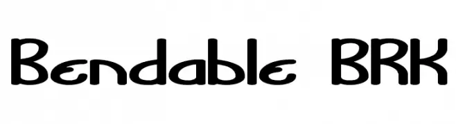
![Bendable BRK Frei Schriftart Herunterladen]() Herunterladen 3226 Downloads@WebFont
Herunterladen 3226 Downloads@WebFont -
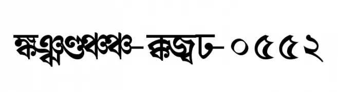
![Shree-Ban-0552 Frei Schriftart Herunterladen]() Herunterladen 3225 Downloads@WebFont
Herunterladen 3225 Downloads@WebFont -
![Tiny Pixy Frei Schriftart Herunterladen]() Herunterladen 3225 Downloads@WebFont
Herunterladen 3225 Downloads@WebFont -
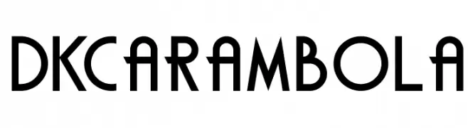
![DKCarambola Frei Schriftart Herunterladen]() Herunterladen 3224 Downloads@WebFont
Herunterladen 3224 Downloads@WebFont -
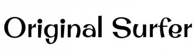
( Copyright (c) 2011 by Brian J. Bonislawsky DBA Astigmatic (AOETI) )
A playful and dynamic font with bold, curved letterforms.
![Original Surfer Frei Schriftart Herunterladen]() Herunterladen 3224 Downloads@WebFont
Herunterladen 3224 Downloads@WebFont -
( Fonts by Rick Mueller )
A bold, playful font with rounded, thick strokes and a whimsical style.
![Advert Regular Frei Schriftart Herunterladen]() Herunterladen 3224 Downloads@WebFont
Herunterladen 3224 Downloads@WebFont -
![Theano Old Style Regular Frei Schriftart Herunterladen]() Herunterladen 3224 Downloads@WebFont
Herunterladen 3224 Downloads@WebFont -
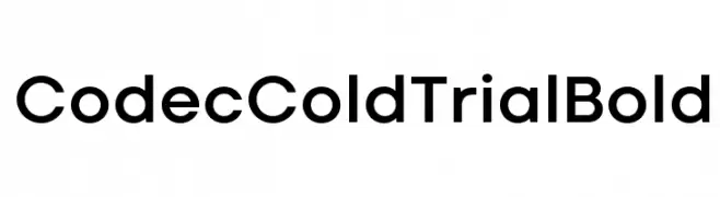
( Zetafonts - www.zetafonts.com )
A bold, modern sans-serif font with clean, geometric letterforms.
![Codec Cold Trial Bold Frei Schriftart Herunterladen]() Herunterladen 3223 Downloads@WebFont
Herunterladen 3223 Downloads@WebFont -
( Fonts by Daniel Zadorozny - www.iconian.com )
A modern, italicized font with expanded characters and medium contrast.
![Usuzi Expanded Italic Frei Schriftart Herunterladen]() Herunterladen 3223 Downloads@WebFont
Herunterladen 3223 Downloads@WebFont -
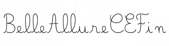
( JBFoundry - Jean Boyault - jean.boyault.pagesperso-orange.fr/ )
A delicate and elegant script font with flowing, graceful strokes.
![Belle Allure CE Fin Frei Schriftart Herunterladen]() Herunterladen 3221 Downloads@WebFont
Herunterladen 3221 Downloads@WebFont -
( Copyright (c) 2015 Dan Reynolds. )
A bold serif font with strong, authoritative strokes and classic appeal.
![Martel Heavy Frei Schriftart Herunterladen]() Herunterladen 3221 Downloads@WebFont
Herunterladen 3221 Downloads@WebFont -
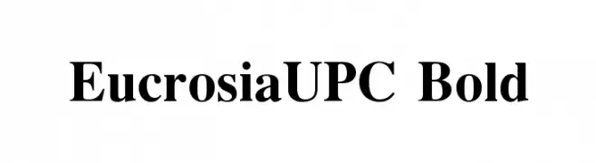
![EucrosiaUPC Bold Frei Schriftart Herunterladen]() Herunterladen 3221 Downloads@WebFont
Herunterladen 3221 Downloads@WebFont -
![Serenity Frei Schriftart Herunterladen]() Herunterladen 3221 Downloads@WebFont
Herunterladen 3221 Downloads@WebFont -
( Google Web Fonts )
A bold, italic serif font with a classic yet modern appeal.
![Droid Serif Bold Italic Frei Schriftart Herunterladen]() Herunterladen 3221 Downloads@WebFont
Herunterladen 3221 Downloads@WebFont -
( Fonts by Maelle.K - Thomas Boucherie )
An elegant script font with intricate swashes and flowing lines.
![DragonisComing Frei Schriftart Herunterladen]() Herunterladen 3220 Downloads@WebFont
Herunterladen 3220 Downloads@WebFont -
![Trek TNG Credits Frei Schriftart Herunterladen]() Herunterladen 3220 Downloads@WebFont
Herunterladen 3220 Downloads@WebFont


Welche Schriften sind gerade am populärsten?
Poppins, Roboto, Montserrat, Open Sans und Lato sind wegen ihrer klaren Formen und breiten Einsetzbarkeit sehr gefragt – von Markenauftritt über Landingpages bis hin zu Postern.
Welche Fonts eignen sich für Logos?
Geometrische Sans‑Serifs (z. B. Poppins, Familien im Gotham‑Stil) sind ein häufiger Griff für sauberes, skalierbares Branding. Für eine persönlichere Note bleiben Scripts und Handschrift‑Stile beliebt. Kombinieren Sie einen prägnanten Headline‑Font mit einer neutralen Brotschrift für Wiedererkennung und Harmonie.
Wie oft wird die Top‑Liste aktualisiert?
Regelmäßig – basierend auf realen Downloads und Interaktionen. Schauen Sie öfter vorbei, um aufstrebende Favoriten früh zu entdecken.
💡 Tipp: Seite bookmarken – Trends wechseln schnell, und heutige Top‑Schriften inspirieren morgen vielleicht das Rebranding.