Willkommen bei den Top‑Schriften – hier treffen Beliebtheit und Qualität aufeinander. Das sind die in diesem Jahr am häufigsten heruntergeladenen und genutzten Fonts. Wenn Sie sichere Optionen für Logo, Web oder Social suchen, starten Sie hier.
Jeder Top‑Font überzeugt durch Balance, Lesbarkeit und Vielseitigkeit. Sie finden moderne Sans‑Serifs, elegante Scripts, Vintage‑Serifs und minimalistische Displays.
-
( Fonts by junkohanhero )
A bold, distressed font with a grunge, industrial style.
 Herunterladen 230 Downloads@WebFont
 -
( Fonts by Modestype Studio )
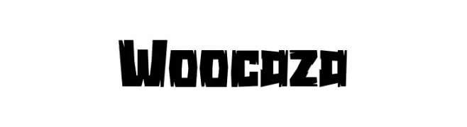
A bold, angular font with a distressed and dynamic style.
![Woocaza Frei Schriftart Herunterladen]() Herunterladen 230 Downloads@WebFont
Herunterladen 230 Downloads@WebFont -
( Magang Letterhend - www.letterhend.com )
A smooth, flowing script font with a natural handwriting style.
![Nagoya Frei Schriftart Herunterladen]() Herunterladen 230 Downloads@WebFont
Herunterladen 230 Downloads@WebFont -
( Fonts by exe.vis.ne.jp )
A tall, narrow, hand-drawn font with thin, elongated strokes.
![BeltaLight Frei Schriftart Herunterladen]() Herunterladen 230 Downloads@WebFont
Herunterladen 230 Downloads@WebFont -
( Fonts by NDISCOVER )
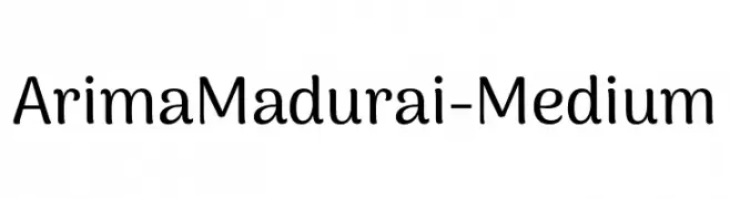
A modern, rounded font with a clean and approachable style.
![ArimaMadurai-Medium Frei Schriftart Herunterladen]() Herunterladen 230 Downloads@WebFont
Herunterladen 230 Downloads@WebFont -
( Fonts by Kitaleigh Boutique )
A playful, hand-drawn font with tall, narrow characters and a whimsical style.
![KLFrances Frei Schriftart Herunterladen]() Herunterladen 230 Downloads@WebFont
Herunterladen 230 Downloads@WebFont -
( Fonts by Jayde Garrow - Personal-use only. For commercial use please contact owner. )
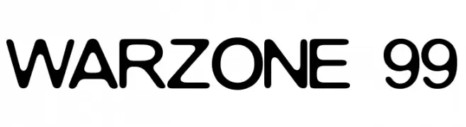
A bold, rounded font with smooth curves and uniform strokes.
![WARZONE 99 Frei Schriftart Herunterladen]() Herunterladen 230 Downloads@WebFont
Herunterladen 230 Downloads@WebFont -
( Fonts by Almarkhatype - Abdul Malik Wisnu - Personal-use only. For commercial use please contact owner. )
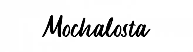
A dynamic and expressive handwritten font with fluid strokes and a natural flow.
![Mochalosta Frei Schriftart Herunterladen]() Herunterladen 230 Downloads@WebFont
Herunterladen 230 Downloads@WebFont -
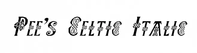
( Fonts by Graham Meade - GemFonts )
A decorative Celtic-inspired italic font with intricate knot patterns.
![Pee's Celtic Italic Frei Schriftart Herunterladen]() Herunterladen 230 Downloads@WebFont
Herunterladen 230 Downloads@WebFont -
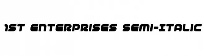
( Fonts by Iconian Fonts )
A bold, rounded, semi-italic font with a modern and dynamic style.
![1st Enterprises Semi-Italic Frei Schriftart Herunterladen]() Herunterladen 230 Downloads@WebFont
Herunterladen 230 Downloads@WebFont -
( Fonts by Scratchones )
Playful handwritten font with rounded edges.
![Winter Vacation Frei Schriftart Herunterladen]() Herunterladen 230 Downloads@WebFont
Herunterladen 230 Downloads@WebFont -
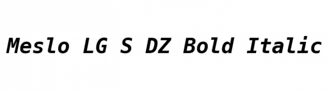
( Fonts by Andre Berg. Personal-use only. For commercial use please contact owner. )
A bold, italic, monospaced font with a modern and clean design.
![Meslo LG S DZ Bold Italic Frei Schriftart Herunterladen]() Herunterladen 230 Downloads@WebFont
Herunterladen 230 Downloads@WebFont -
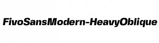
( Fonts by Alex Slobzheninov - Personal-use only. For commercial use please contact owner. )
A bold, oblique sans-serif font with a modern and dynamic style.
![FivoSansModern-HeavyOblique Frei Schriftart Herunterladen]() Herunterladen 230 Downloads@WebFont
Herunterladen 230 Downloads@WebFont -
( Java Pep )
A flowing, elegant cursive font with interconnected characters and moderate stroke contrast.
![Land Of Laugh Frei Schriftart Herunterladen]() Herunterladen 230 Downloads@WebFont
Herunterladen 230 Downloads@WebFont -
( Fonts by Mr Fisk - Mike Larsson - fontorama.net )
A bold, dripping font perfect for horror-themed designs.
![Bodybag Frei Schriftart Herunterladen]() Herunterladen 230 Downloads@WebFont
Herunterladen 230 Downloads@WebFont -
![GE Zoom Frei Schriftart Herunterladen]() Herunterladen 230 Downloads@WebFont
Herunterladen 230 Downloads@WebFont -
( www.luk.net.br/ )
A bold, geometric font with a modern, industrial style.
![UntitledRegular Frei Schriftart Herunterladen]() Herunterladen 230 Downloads@WebFont
Herunterladen 230 Downloads@WebFont -
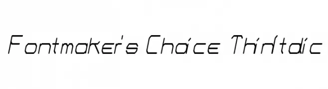
( Fonts by Dieter Schumacher )
A thin, italicized font with a modern, geometric style.
![Fontmaker's Choice ThinItalic Frei Schriftart Herunterladen]() Herunterladen 230 Downloads@WebFont
Herunterladen 230 Downloads@WebFont -
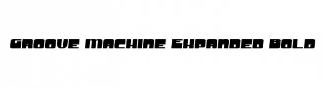
![Groove Machine Expanded Bold Frei Schriftart Herunterladen]() Herunterladen 230 Downloads@WebFont
Herunterladen 230 Downloads@WebFont -
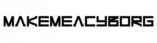
![Make Me A Cyborg Frei Schriftart Herunterladen]() Herunterladen 230 Downloads@WebFont
Herunterladen 230 Downloads@WebFont -
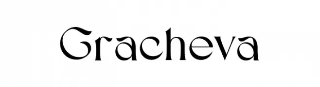
( Fonts by Aluyeah Studio - Personal-use only. For commercial use please contact owner. )
A modern serif font with elegant, elongated letterforms and subtle serifs.
![Gracheva Frei Schriftart Herunterladen]() Herunterladen 230 Downloads@WebFont
Herunterladen 230 Downloads@WebFont -
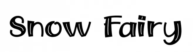
( Fonts by Khurasan )
A playful, hand-drawn font with bold strokes and a whimsical style.
![Snow Fairy Frei Schriftart Herunterladen]() Herunterladen 230 Downloads@WebFont
Herunterladen 230 Downloads@WebFont -
( Fonts by Zetafonts - Personal-use only. For commercial use please contact owner. )
A bold, heavy font with tall, narrow letterforms and high contrast strokes.
![Heading Now Trial 08 Heavy Frei Schriftart Herunterladen]() Herunterladen 230 Downloads@WebFont
Herunterladen 230 Downloads@WebFont -
( Haksen Letters - Sarwo Edhi Prayitno )
A flowing, cursive font with elegant loops and swashes, perfect for creative projects.
![Muttung Frei Schriftart Herunterladen]() Herunterladen 230 Downloads@WebFont
Herunterladen 230 Downloads@WebFont -
( Font by Jonathan Harris - www.tattoowoo.com )
A collection of intricate and decorative abstract alien symbols.
![Abstract Alien Symbols Frei Schriftart Herunterladen]() Herunterladen 230 Downloads@WebFont
Herunterladen 230 Downloads@WebFont -
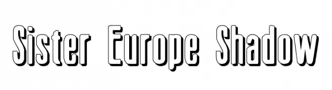
( Fonts by Daniel Zadorozny - www.iconian.com )
A bold, shadowed font with a three-dimensional effect.
![Sister Europe Shadow Frei Schriftart Herunterladen]() Herunterladen 230 Downloads@WebFont
Herunterladen 230 Downloads@WebFont -
( THESE ARE SHAREWARE FONTS ! NOT FREEWARE ! PLEASE VISIT www.fuelfonts.com )
A bold, geometric font with a modern, tech-inspired design.
![Armorica Frei Schriftart Herunterladen]() Herunterladen 230 Downloads@WebFont
Herunterladen 230 Downloads@WebFont -
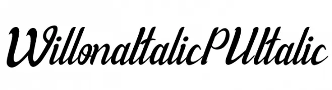
( Haksen Letters - Sarwo Edhi Prayitno )
A dynamic and elegant script font with a modern, italic style.
![Willona Italic - PU Italic Frei Schriftart Herunterladen]() Herunterladen 230 Downloads@WebFont
Herunterladen 230 Downloads@WebFont -
( Fonts by Jadatype )
A playful, bold font with a unique shadow effect and cartoon-like style.
![Geno Gone Frei Schriftart Herunterladen]() Herunterladen 230 Downloads@WebFont
Herunterladen 230 Downloads@WebFont -
( Copyright (c) 2013 by Sovichet Tep with Reserved Font Name "Kantumruy". )
A bold, modern sans-serif font with clean lines and excellent readability.
![Kantumruy Bold Frei Schriftart Herunterladen]() Herunterladen 230 Downloads@WebFont
Herunterladen 230 Downloads@WebFont -
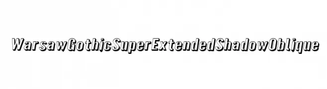
( Fonts by CannotIntoSpaceFonts - KineticPlasma Fonts - Personal-use only. For commercial use please contact owner. )
A bold, shadowed, and oblique font with a dynamic and three-dimensional look.
![Warsaw Gothic SuperExtended Shadow Oblique Frei Schriftart Herunterladen]() Herunterladen 230 Downloads@WebFont
Herunterladen 230 Downloads@WebFont -
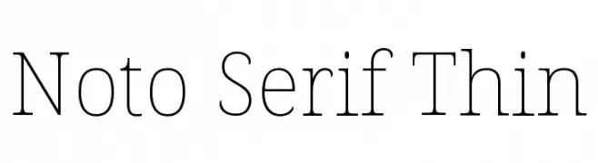
( Noto is a trademark of Google Inc. Noto fonts are open source. All Noto fonts are published under the SIL Open Font License, Version 1.1 )
A refined serif typeface with thin, elegant strokes and a modern aesthetic.
![Noto Serif Thin Frei Schriftart Herunterladen]() Herunterladen 230 Downloads@WebFont
Herunterladen 230 Downloads@WebFont -
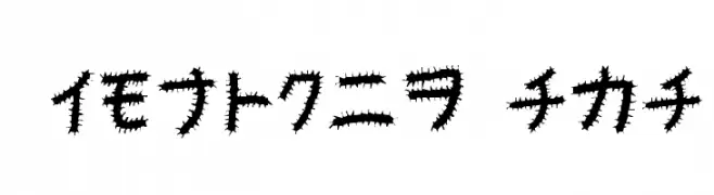
![Kemushi_Kata Frei Schriftart Herunterladen]() Herunterladen 230 Downloads@WebFont
Herunterladen 230 Downloads@WebFont -
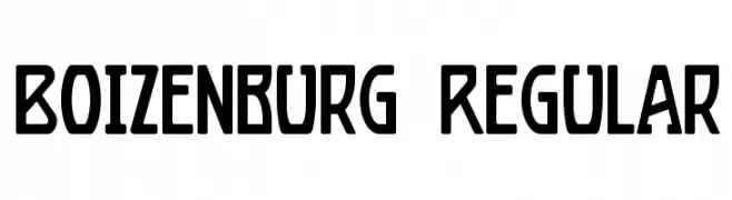
( Fonts by Mario Arturo - marioarturo.com. Personal-use only. For commercial use please contact owner. Contact the owner for a donation. )
A bold, geometric font with a modern and distinctive style.
![Boizenburg Regular Frei Schriftart Herunterladen]() Herunterladen 230 Downloads@WebFont
Herunterladen 230 Downloads@WebFont -
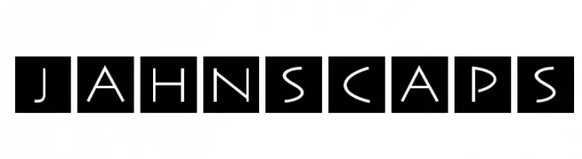
( Fonts by Manfred Klein. Free for private and charity use. Free for commercial with donation to organizations )
A geometric, modern font with characters enclosed in squares.
![JahnsCaps Frei Schriftart Herunterladen]() Herunterladen 230 Downloads@WebFont
Herunterladen 230 Downloads@WebFont


Welche Schriften sind gerade am populärsten?
Poppins, Roboto, Montserrat, Open Sans und Lato sind wegen ihrer klaren Formen und breiten Einsetzbarkeit sehr gefragt – von Markenauftritt über Landingpages bis hin zu Postern.
Welche Fonts eignen sich für Logos?
Geometrische Sans‑Serifs (z. B. Poppins, Familien im Gotham‑Stil) sind ein häufiger Griff für sauberes, skalierbares Branding. Für eine persönlichere Note bleiben Scripts und Handschrift‑Stile beliebt. Kombinieren Sie einen prägnanten Headline‑Font mit einer neutralen Brotschrift für Wiedererkennung und Harmonie.
Wie oft wird die Top‑Liste aktualisiert?
Regelmäßig – basierend auf realen Downloads und Interaktionen. Schauen Sie öfter vorbei, um aufstrebende Favoriten früh zu entdecken.
💡 Tipp: Seite bookmarken – Trends wechseln schnell, und heutige Top‑Schriften inspirieren morgen vielleicht das Rebranding.