Willkommen bei den Top‑Schriften – hier treffen Beliebtheit und Qualität aufeinander. Das sind die in diesem Jahr am häufigsten heruntergeladenen und genutzten Fonts. Wenn Sie sichere Optionen für Logo, Web oder Social suchen, starten Sie hier.
Jeder Top‑Font überzeugt durch Balance, Lesbarkeit und Vielseitigkeit. Sie finden moderne Sans‑Serifs, elegante Scripts, Vintage‑Serifs und minimalistische Displays.
-
 Herunterladen 230 Downloads@WebFont
 -
( Fonts by www.aenigmafonts.com )
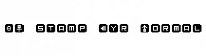
A bold, playful font with exaggerated, cartoonish strokes.
![Exaggerate [BRK] Frei Schriftart Herunterladen]() Herunterladen 230 Downloads@WebFont
Herunterladen 230 Downloads@WebFont -
( Copyright 2011 The Montserrat Project Authors (https://github.com/JulietaUla/Montserrat) )
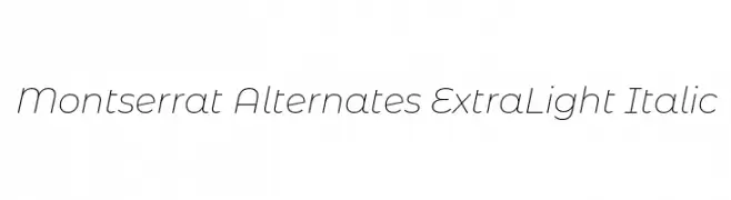
A sleek, modern, extra light italic font with elegant curves and a fluid style.
![Montserrat Alternates ExtraLight Italic Frei Schriftart Herunterladen]() Herunterladen 230 Downloads@WebFont
Herunterladen 230 Downloads@WebFont -
( Fonts by Tshepo Mosoeu - https://www.behance.net/thecyantist Personal-use only. For commercial use please contact owner. )
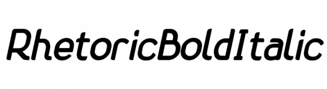
A bold, italicized font with a modern and dynamic style.
![Rhetoric Bold Italic Frei Schriftart Herunterladen]() Herunterladen 230 Downloads@WebFont
Herunterladen 230 Downloads@WebFont -
( Fonts by www.typodermicfonts.com - Ray Larabie )
A bold, vintage-style font with thick, irregular strokes and a handcrafted look.
![AirmoleAntique-Regular Frei Schriftart Herunterladen]() Herunterladen 230 Downloads@WebFont
Herunterladen 230 Downloads@WebFont -
( Fonts by Hanken Design Co. )
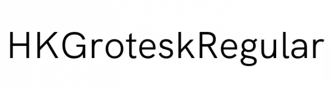
A modern, geometric sans-serif font with clean lines and balanced proportions.
![HK Grotesk Regular Frei Schriftart Herunterladen]() Herunterladen 230 Downloads@WebFont
Herunterladen 230 Downloads@WebFont -
( Fonts by Letterhend Studio - Hendry Juanda - Personal-use only. For commercial use please contact owner. )
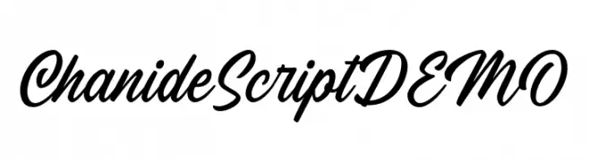
A flowing, elegant script font with a handwritten style.
![ChanideScriptDEMO Frei Schriftart Herunterladen]() Herunterladen 230 Downloads@WebFont
Herunterladen 230 Downloads@WebFont -
( Copyright 2012 The Encode Project Authors (impallari@gmail.com), with Reserved Font Name "Encode Sansâ€. )
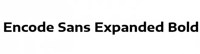
A bold, expanded sans-serif font with a modern and clean design.
![Encode Sans Expanded Bold Frei Schriftart Herunterladen]() Herunterladen 230 Downloads@WebFont
Herunterladen 230 Downloads@WebFont -
( Typhoon Type - Suthi Srisopha - www.typhoontype.net )
A cursive, handwritten font with elegant, flowing strokes.
![Plastic Beauty Light Frei Schriftart Herunterladen]() Herunterladen 230 Downloads@WebFont
Herunterladen 230 Downloads@WebFont -
![Korinthus Frei Schriftart Herunterladen]() Herunterladen 230 Downloads@WebFont
Herunterladen 230 Downloads@WebFont -
( Fonts by Wino S Kadir - weknow - www.revolge.com/shop/weknow/ - Personal-use only. For commercial use please contact owner. )
A modern, hexagon-patterned font with a bold and futuristic style.
![HEXAGONAL Frei Schriftart Herunterladen]() Herunterladen 229 Downloads@WebFont
Herunterladen 229 Downloads@WebFont -
![VTCSuperMarketSaleDisplayWired Frei Schriftart Herunterladen]() Herunterladen 229 Downloads@WebFont
Herunterladen 229 Downloads@WebFont -
( Fonts by Manfred Klein. Free for private and charity use. Free for commercial with donation to organizations )
An ornate and decorative font with intricate, vintage-style embellishments.
![KaiserRotbartTwoCaps Frei Schriftart Herunterladen]() Herunterladen 229 Downloads@WebFont
Herunterladen 229 Downloads@WebFont -
( Fonts by ShyFonts )
A playful and bold font with exaggerated curves and a whimsical style.
![SF Ferretopia Frei Schriftart Herunterladen]() Herunterladen 229 Downloads@WebFont
Herunterladen 229 Downloads@WebFont -
![IntellectaHeraldics Frei Schriftart Herunterladen]() Herunterladen 229 Downloads@WebFont
Herunterladen 229 Downloads@WebFont -
( Fonts by Mr Letters - https://www.creativefabrica.com/designer/mrletters/ - Personal-use only. For commercial use please contact owner. )
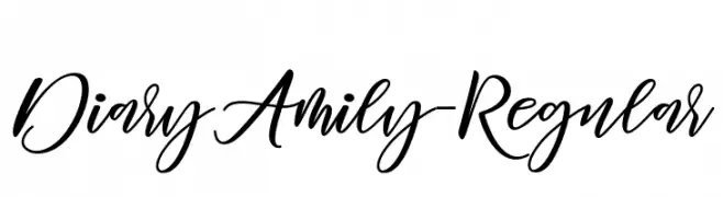
A charming and elegant script font with fluid, graceful strokes.
![DiaryAmily-Regular Frei Schriftart Herunterladen]() Herunterladen 229 Downloads@WebFont
Herunterladen 229 Downloads@WebFont -
( Fonts by dalerms - Daler Mukhiddinov - Personal-use only. For commercial use please contact owner. )
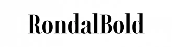
A bold, high-contrast serif font with elegant and modern characteristics.
![Rondal Bold Frei Schriftart Herunterladen]() Herunterladen 229 Downloads@WebFont
Herunterladen 229 Downloads@WebFont -
![Weigl Frei Schriftart Herunterladen]() Herunterladen 229 Downloads@WebFont
Herunterladen 229 Downloads@WebFont -
( Fonts by Prof. Markus Schröppel )
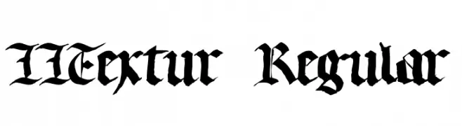
A bold blackletter font with intricate Gothic detailing.
![LLTextur Regular Frei Schriftart Herunterladen]() Herunterladen 229 Downloads@WebFont
Herunterladen 229 Downloads@WebFont -
![Finnish Lines Regular Frei Schriftart Herunterladen]() Herunterladen 229 Downloads@WebFont
Herunterladen 229 Downloads@WebFont -
( Fonts by Daniel Zadorozny - www.iconian.com - Free for personal use )
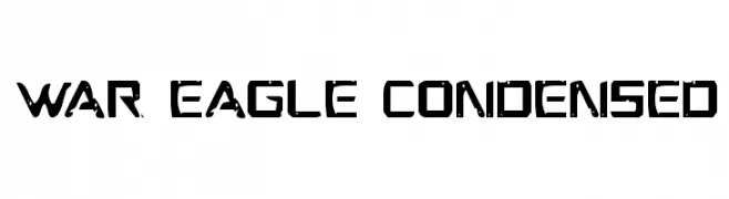
A bold, condensed font with a modern, industrial look and unique cut-out details.
![War Eagle Condensed Frei Schriftart Herunterladen]() Herunterladen 229 Downloads@WebFont
Herunterladen 229 Downloads@WebFont -
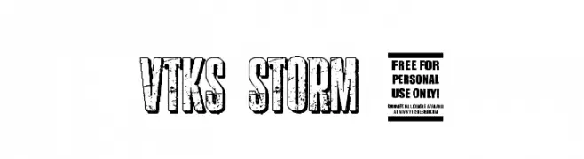
( Fonts by Douglas Vitkauskas - www.vtksdesign.com. Personal-use only. For commercial use please contact owner. )
A bold, distressed font with a rugged, textured appearance.
![vtks storm 2 Frei Schriftart Herunterladen]() Herunterladen 229 Downloads@WebFont
Herunterladen 229 Downloads@WebFont -
![Tall_N_Skinny Frei Schriftart Herunterladen]() Herunterladen 229 Downloads@WebFont
Herunterladen 229 Downloads@WebFont -
Schriftart von jamieprestons. For commercial use please contact the owner.
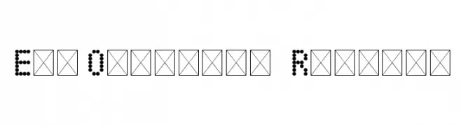
( eduowl.pro - https://eduowl.pro/ - free font )
A modern dot matrix font with a digital, technological aesthetic.
![EduOwl-font Regular Frei Schriftart Herunterladen]() Herunterladen 229 Downloads@WebFont
Herunterladen 229 Downloads@WebFont -
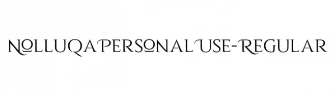
( Fonts by Vacatype Co. - Vacatype - Personal-use only. For commercial use please contact owner. )
An elegant serif font with flowing strokes and artistic flair.
![NolluqaPersonalUse-Regular Frei Schriftart Herunterladen]() Herunterladen 229 Downloads@WebFont
Herunterladen 229 Downloads@WebFont -
![Space Cruiser Gradient Frei Schriftart Herunterladen]() Herunterladen 229 Downloads@WebFont
Herunterladen 229 Downloads@WebFont -
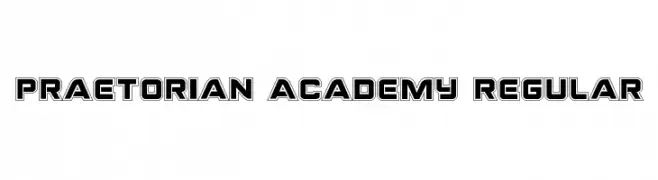
( Fonts by Daniel Zadorozny - www.iconian.com )
A bold, geometric font with outlined characters and a modern, authoritative style.
![Praetorian Academy Regular Frei Schriftart Herunterladen]() Herunterladen 229 Downloads@WebFont
Herunterladen 229 Downloads@WebFont -
( Fonts by www.junkohanhero.com )
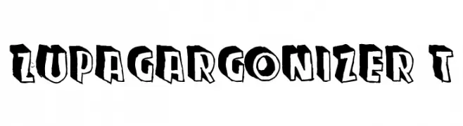
A bold, playful font with a three-dimensional shadow effect.
![Zupagargonizer T Frei Schriftart Herunterladen]() Herunterladen 229 Downloads@WebFont
Herunterladen 229 Downloads@WebFont -
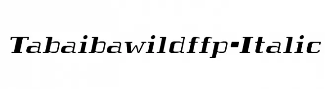
Schriftart von defharo. For commercial use please contact the owner.
![Tabaibawildffp-Italic Frei Schriftart Herunterladen]() Herunterladen 229 Downloads@WebFont
Herunterladen 229 Downloads@WebFont -
( Fonts by Daniel Zadorozny - www.iconian.com - Free for personal use )
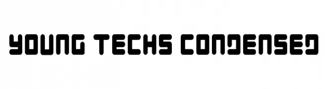
A bold, futuristic font with rounded edges and a condensed, tech-inspired design.
![Young Techs Condensed Frei Schriftart Herunterladen]() Herunterladen 229 Downloads@WebFont
Herunterladen 229 Downloads@WebFont -
( Fonts by MJType )
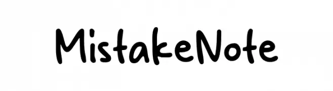
Casual handwritten font with rounded, playful strokes.
![Mistake Note Frei Schriftart Herunterladen]() Herunterladen 229 Downloads@WebFont
Herunterladen 229 Downloads@WebFont -
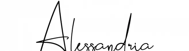
![Alessandria Frei Schriftart Herunterladen]() Herunterladen 229 Downloads@WebFont
Herunterladen 229 Downloads@WebFont -
( Fonts by Paul Lloyd )
An ornate, decorative font with intricate floral embellishments.
![Grimeswade Frei Schriftart Herunterladen]() Herunterladen 229 Downloads@WebFont
Herunterladen 229 Downloads@WebFont -
( Fonts by Daniel Zadorozny - www.iconian.com - Free for personal use )
A playful, bold font with a unique shadow effect for a three-dimensional look.
![First Order Shadow Frei Schriftart Herunterladen]() Herunterladen 229 Downloads@WebFont
Herunterladen 229 Downloads@WebFont -
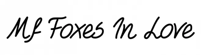
( Misti's Fonts - mistifonts.com/ )
A playful, handwritten script font with connected letters and a casual feel.
![Mf Foxes In Love Frei Schriftart Herunterladen]() Herunterladen 229 Downloads@WebFont
Herunterladen 229 Downloads@WebFont
![Exaggerate [BRK] Frei Schriftart Herunterladen](https://d144mzi0q5mijx.cloudfront.net/img/E/X/Exaggerate-BRK.webp)


Welche Schriften sind gerade am populärsten?
Poppins, Roboto, Montserrat, Open Sans und Lato sind wegen ihrer klaren Formen und breiten Einsetzbarkeit sehr gefragt – von Markenauftritt über Landingpages bis hin zu Postern.
Welche Fonts eignen sich für Logos?
Geometrische Sans‑Serifs (z. B. Poppins, Familien im Gotham‑Stil) sind ein häufiger Griff für sauberes, skalierbares Branding. Für eine persönlichere Note bleiben Scripts und Handschrift‑Stile beliebt. Kombinieren Sie einen prägnanten Headline‑Font mit einer neutralen Brotschrift für Wiedererkennung und Harmonie.
Wie oft wird die Top‑Liste aktualisiert?
Regelmäßig – basierend auf realen Downloads und Interaktionen. Schauen Sie öfter vorbei, um aufstrebende Favoriten früh zu entdecken.
💡 Tipp: Seite bookmarken – Trends wechseln schnell, und heutige Top‑Schriften inspirieren morgen vielleicht das Rebranding.