Willkommen bei den Top‑Schriften – hier treffen Beliebtheit und Qualität aufeinander. Das sind die in diesem Jahr am häufigsten heruntergeladenen und genutzten Fonts. Wenn Sie sichere Optionen für Logo, Web oder Social suchen, starten Sie hier.
Jeder Top‑Font überzeugt durch Balance, Lesbarkeit und Vielseitigkeit. Sie finden moderne Sans‑Serifs, elegante Scripts, Vintage‑Serifs und minimalistische Displays.
-
( Dirtyline Studio - Hendra Maulia - creativemarket.com/h_m )
A sophisticated script font with elegant, flowing cursive strokes.
 Herunterladen 227 Downloads@WebFont
 -
![Martians spacewarped my dad Frei Schriftart Herunterladen]() Herunterladen 227 Downloads@WebFont
Herunterladen 227 Downloads@WebFont -
( Free - https://www.behance.net/string4 )
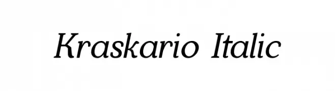
An elegant italic font with smooth curves and moderate contrast.
![Kraskario Italic Frei Schriftart Herunterladen]() Herunterladen 227 Downloads@WebFont
Herunterladen 227 Downloads@WebFont -
( Måns Grebäck - www.mansgreback.com )
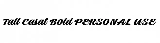
A bold, dynamic script font with connected letters and high contrast.
![Tall Casat Bold PERSONAL USE Frei Schriftart Herunterladen]() Herunterladen 227 Downloads@WebFont
Herunterladen 227 Downloads@WebFont -
( Fonts by MJType )
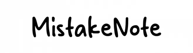
Casual handwritten font with rounded, playful strokes.
![Mistake Note Frei Schriftart Herunterladen]() Herunterladen 227 Downloads@WebFont
Herunterladen 227 Downloads@WebFont -
( Fonts by www.dcoxy.com )
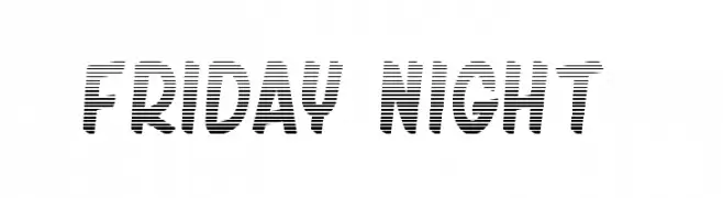
A bold, decorative font with a unique horizontal striped pattern.
![friday night 2 Frei Schriftart Herunterladen]() Herunterladen 227 Downloads@WebFont
Herunterladen 227 Downloads@WebFont -
( Misti's Fonts - mistifonts.com/ )
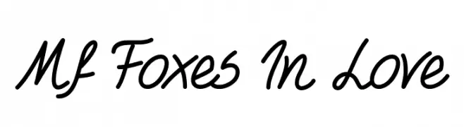
A playful, handwritten script font with connected letters and a casual feel.
![Mf Foxes In Love Frei Schriftart Herunterladen]() Herunterladen 227 Downloads@WebFont
Herunterladen 227 Downloads@WebFont -
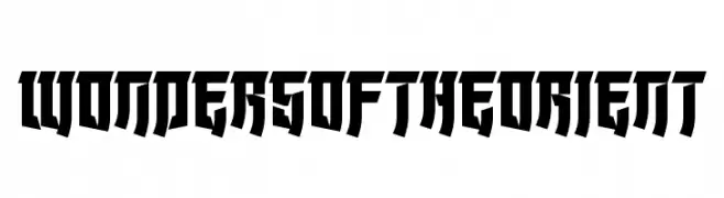
![Wonders of the Orient Frei Schriftart Herunterladen]() Herunterladen 227 Downloads@WebFont
Herunterladen 227 Downloads@WebFont -
( Fonts by LyonsType - Daniel Lyons - Personal-use only. For commercial use please contact owner. )
A clean, modern sans-serif font with balanced proportions and excellent readability.
![LT Internet Frei Schriftart Herunterladen]() Herunterladen 227 Downloads@WebFont
Herunterladen 227 Downloads@WebFont -
( Fonts by Iconian Fonts )
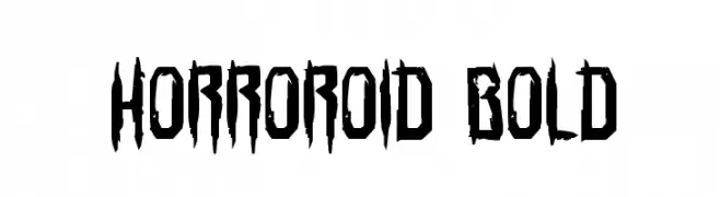
A bold, jagged font with a horror-inspired aesthetic.
![Horroroid Bold Frei Schriftart Herunterladen]() Herunterladen 227 Downloads@WebFont
Herunterladen 227 Downloads@WebFont -
( Fonts by Alit Design )
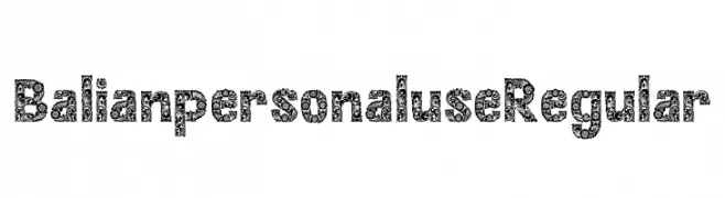
An ornate, decorative font with intricate floral patterns on each character.
![Balian personal use Regular Frei Schriftart Herunterladen]() Herunterladen 227 Downloads@WebFont
Herunterladen 227 Downloads@WebFont -
( Fonts by Style-7 - www.styleseven.com - Personal-use only. For commercial use please contact owner. )
A pixelated, retro-style font with a blocky, geometric appearance.
![Cyrillic Pixel-7 Frei Schriftart Herunterladen]() Herunterladen 227 Downloads@WebFont
Herunterladen 227 Downloads@WebFont -
![Roadtest Regular Frei Schriftart Herunterladen]() Herunterladen 227 Downloads@WebFont
Herunterladen 227 Downloads@WebFont -
( Fonts by www.selawetype.com - Personal-use only. FOR DONATION https://www.paypal.me/selawe . For commercial use please contact owner. )
A bold, angular font with a geometric and industrial style.
![GREENLAND Frei Schriftart Herunterladen]() Herunterladen 227 Downloads@WebFont
Herunterladen 227 Downloads@WebFont -
( Fonts by Nick Curtis - www.nicksfonts.com )
A bold, geometric display font with intricate patterns and angular shapes.
![FullTiltBoogie Frei Schriftart Herunterladen]() Herunterladen 227 Downloads@WebFont
Herunterladen 227 Downloads@WebFont -
( Fonts by Daniel Zadorozny - www.iconian.com - Free for personal use )
A bold, geometric font with a futuristic and condensed design.
![Terra Firma Condensed Frei Schriftart Herunterladen]() Herunterladen 227 Downloads@WebFont
Herunterladen 227 Downloads@WebFont -
( Fonts by Paul Lloyd )
An elegant script font with ornate, flowing letterforms and intricate flourishes.
![Wrenn Initials Frei Schriftart Herunterladen]() Herunterladen 227 Downloads@WebFont
Herunterladen 227 Downloads@WebFont -
( Tension Type - Michael Tension - www.TensionType.com )
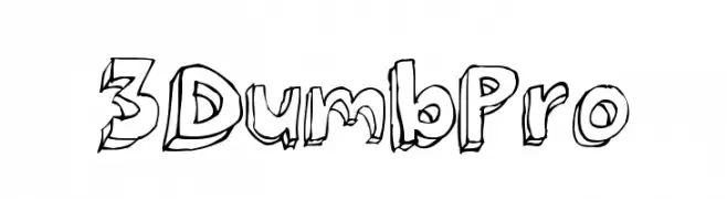
A playful, bold 3D font with a hand-drawn, cartoon-like style.
![3Dumb Pro Frei Schriftart Herunterladen]() Herunterladen 227 Downloads@WebFont
Herunterladen 227 Downloads@WebFont -
( Fonts by Khrys Bosland )
A playful, handwritten font with rounded edges and an informal style.
![KBQuipster Frei Schriftart Herunterladen]() Herunterladen 227 Downloads@WebFont
Herunterladen 227 Downloads@WebFont -
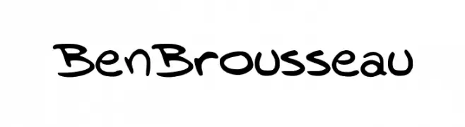
( Fonts by Ben Brousseau )
A playful, handwritten-style font with bold, rounded strokes.
![BenBrousseau Frei Schriftart Herunterladen]() Herunterladen 227 Downloads@WebFont
Herunterladen 227 Downloads@WebFont -
![Dastafarin-Regular Frei Schriftart Herunterladen]() Herunterladen 227 Downloads@WebFont
Herunterladen 227 Downloads@WebFont -
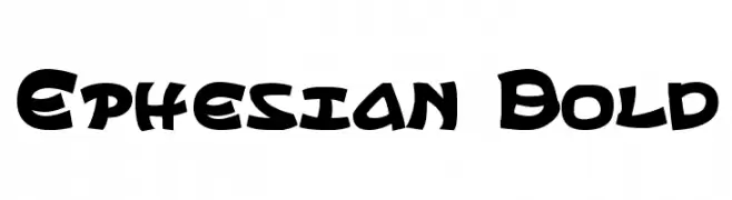
( Fonts by Daniel Zadorozny - www.iconian.com - Free for personal use )
A bold, playful font with a dynamic, graffiti-inspired style.
![Ephesian Bold Frei Schriftart Herunterladen]() Herunterladen 227 Downloads@WebFont
Herunterladen 227 Downloads@WebFont -
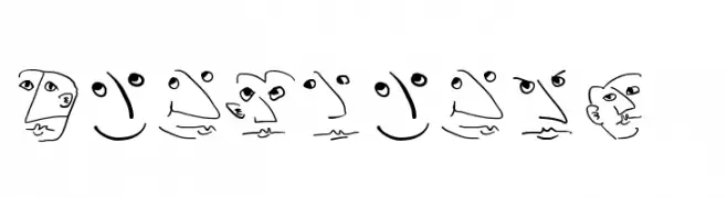
( Fonts by Manfred Klein. Free for private and charity use. Free for commercial with donation to organizations )
A whimsical font with characters designed as abstract faces.
![Wacofaces04 Frei Schriftart Herunterladen]() Herunterladen 227 Downloads@WebFont
Herunterladen 227 Downloads@WebFont -
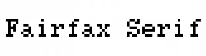
( Fonts by Kreative Korporation - www.kreativekorp.com )
A pixelated, monospaced font with a retro digital aesthetic.
![Fairfax Serif Frei Schriftart Herunterladen]() Herunterladen 227 Downloads@WebFont
Herunterladen 227 Downloads@WebFont -
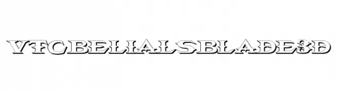
![VTCBelialsBlade3d Frei Schriftart Herunterladen]() Herunterladen 227 Downloads@WebFont
Herunterladen 227 Downloads@WebFont -
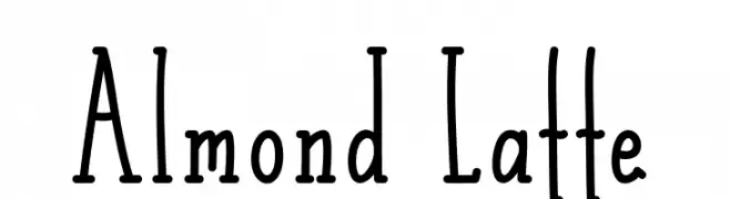
( Fonts by Alde Saputro - aldedesign - https://www.creativefabrica.com/product/the-crafty-holiday-font-bundle/ref/125925/ - Personal-use only. For commercial use please contact owner. )
A playful, hand-drawn font with tall, narrow characters and a whimsical style.
![Almond Latte Frei Schriftart Herunterladen]() Herunterladen 227 Downloads@WebFont
Herunterladen 227 Downloads@WebFont -
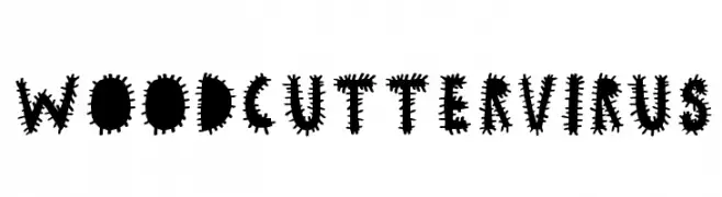
( www.woodcutter.es )
A bold, spiky font with a chaotic, virus-like design.
![woodcutter VIRUS Frei Schriftart Herunterladen]() Herunterladen 227 Downloads@WebFont
Herunterladen 227 Downloads@WebFont -
( Fonts by www.stimuleyefonts.com )
A casual, handwritten-style font with a warm and personal touch.
![Mumsies Frei Schriftart Herunterladen]() Herunterladen 227 Downloads@WebFont
Herunterladen 227 Downloads@WebFont -
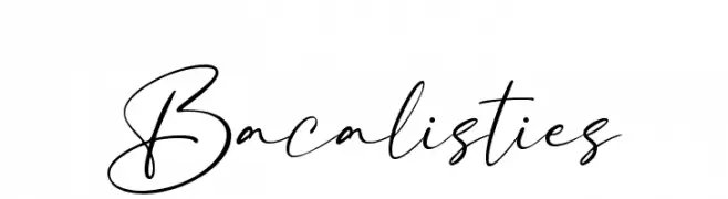
( Fonts by Abas Creative - Farhan Ramadhika - Personal-use only. For commercial use please contact owner. )
A flowing, cursive script font with elegant, interconnected letters.
![Bacalisties Frei Schriftart Herunterladen]() Herunterladen 227 Downloads@WebFont
Herunterladen 227 Downloads@WebFont -
![Nestor Condensed Frei Schriftart Herunterladen]() Herunterladen 227 Downloads
Herunterladen 227 Downloads -
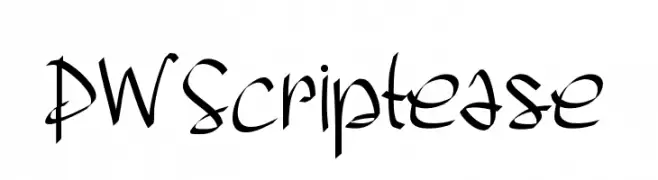
( Fonts by Peax Webdesign - www.peax-webdesign.com. Personal-use only. For commercial use please contact owner. )
A dynamic, cursive font with bold, expressive strokes and a lively, artistic flair.
![PWScriptease Frei Schriftart Herunterladen]() Herunterladen 227 Downloads@WebFont
Herunterladen 227 Downloads@WebFont -
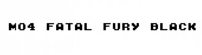
( Fonts by Miffies - mfs.jp.org - Personal-use only. For commercial use please contact owner. )
A bold, pixelated font with a retro video game style.
![M04_FATAL FURY BLACK Frei Schriftart Herunterladen]() Herunterladen 227 Downloads@WebFont
Herunterladen 227 Downloads@WebFont -
( Fonts by Dieter Steffmann )
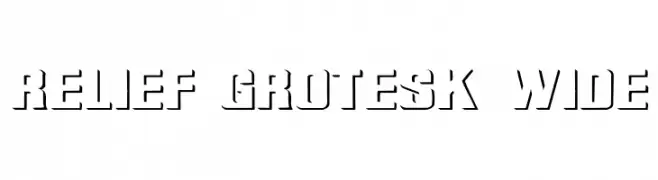
A bold, wide stencil-style font with a modern, industrial look.
![Relief Grotesk Wide Frei Schriftart Herunterladen]() Herunterladen 227 Downloads@WebFont
Herunterladen 227 Downloads@WebFont -
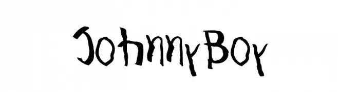
![JohnnyBoy Frei Schriftart Herunterladen]() Herunterladen 227 Downloads@WebFont
Herunterladen 227 Downloads@WebFont -
( Noto is a trademark of Google Inc. Noto fonts are open source. All Noto fonts are published under the SIL Open Font License, Version 1.1 )
A bold serif font with a classic and authoritative style.
![Noto Serif Telugu Bold Frei Schriftart Herunterladen]() Herunterladen 227 Downloads@WebFont
Herunterladen 227 Downloads@WebFont


Welche Schriften sind gerade am populärsten?
Poppins, Roboto, Montserrat, Open Sans und Lato sind wegen ihrer klaren Formen und breiten Einsetzbarkeit sehr gefragt – von Markenauftritt über Landingpages bis hin zu Postern.
Welche Fonts eignen sich für Logos?
Geometrische Sans‑Serifs (z. B. Poppins, Familien im Gotham‑Stil) sind ein häufiger Griff für sauberes, skalierbares Branding. Für eine persönlichere Note bleiben Scripts und Handschrift‑Stile beliebt. Kombinieren Sie einen prägnanten Headline‑Font mit einer neutralen Brotschrift für Wiedererkennung und Harmonie.
Wie oft wird die Top‑Liste aktualisiert?
Regelmäßig – basierend auf realen Downloads und Interaktionen. Schauen Sie öfter vorbei, um aufstrebende Favoriten früh zu entdecken.
💡 Tipp: Seite bookmarken – Trends wechseln schnell, und heutige Top‑Schriften inspirieren morgen vielleicht das Rebranding.