Willkommen bei den Top‑Schriften – hier treffen Beliebtheit und Qualität aufeinander. Das sind die in diesem Jahr am häufigsten heruntergeladenen und genutzten Fonts. Wenn Sie sichere Optionen für Logo, Web oder Social suchen, starten Sie hier.
Jeder Top‑Font überzeugt durch Balance, Lesbarkeit und Vielseitigkeit. Sie finden moderne Sans‑Serifs, elegante Scripts, Vintage‑Serifs und minimalistische Displays.
-
 Herunterladen 229 Downloads@WebFont
 -
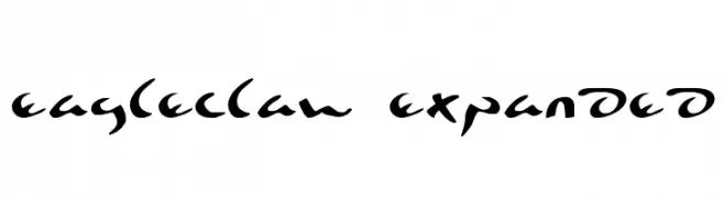
( Fonts by Daniel Zadorozny - www.iconian.com )
A bold, dynamic script font with sharp, angular strokes and a sense of movement.
![Eagleclaw Expanded Frei Schriftart Herunterladen]() Herunterladen 229 Downloads@WebFont
Herunterladen 229 Downloads@WebFont -
( Fonts by www.typodermicfonts.com - Ray Larabie )
A bold, italicized font with a modern and dynamic style.
![Vibrocentric-BoldItalic Frei Schriftart Herunterladen]() Herunterladen 229 Downloads@WebFont
Herunterladen 229 Downloads@WebFont -
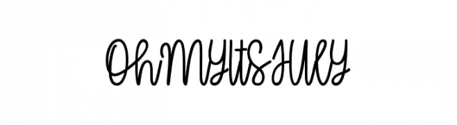
( Fonts by Misti's Fonts )
A playful, handwritten cursive font with fluid, interconnected strokes.
![OhMyItsJuly Frei Schriftart Herunterladen]() Herunterladen 229 Downloads@WebFont
Herunterladen 229 Downloads@WebFont -
( گالری فانت فارسی پژوهش آريانا - only compatible with Farsi and Arabic )
A bold, geometric font with a modern and professional look.
![Zibaa Frei Schriftart Herunterladen]() Herunterladen 229 Downloads@WebFont
Herunterladen 229 Downloads@WebFont -
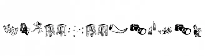
( Fonts by Galdino Otten - Personal-use only. For commercial use please contact owner. )
A pictogram font with folk-inspired, hand-drawn illustrations.
![Cordel de Mangai Frei Schriftart Herunterladen]() Herunterladen 229 Downloads@WebFont
Herunterladen 229 Downloads@WebFont -
( Fonts by CannotIntoSpaceFonts - KineticPlasma Fonts - Personal-use only. For commercial use please contact owner. )
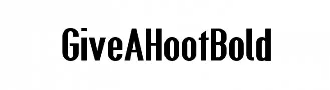
A bold, condensed font with high contrast and tight spacing, perfect for impactful designs.
![Give A Hoot Bold Frei Schriftart Herunterladen]() Herunterladen 229 Downloads@WebFont
Herunterladen 229 Downloads@WebFont -
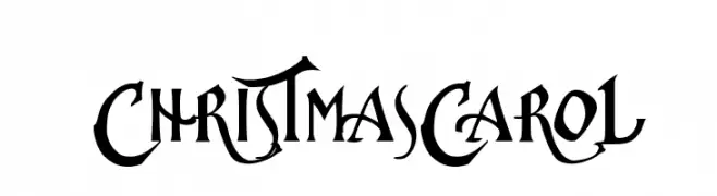
![ChristmasCarol Frei Schriftart Herunterladen]() Herunterladen 229 Downloads@WebFont
Herunterladen 229 Downloads@WebFont -
( Fonts by Jacob Fisher - www.pizzadude.dk )
A bold, hand-drawn font with a playful and dynamic style.
![Hold your breath Frei Schriftart Herunterladen]() Herunterladen 229 Downloads@WebFont
Herunterladen 229 Downloads@WebFont -
( Fonts by Manfred Klein. Free for private and charity use. Free for commercial with donation to organizations )
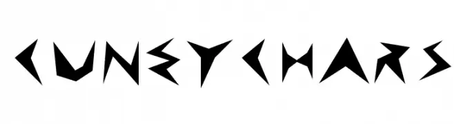
A bold, angular font with sharp, jagged edges and a geometric style.
![CuneyChars Frei Schriftart Herunterladen]() Herunterladen 229 Downloads@WebFont
Herunterladen 229 Downloads@WebFont -
![just a kid Frei Schriftart Herunterladen]() Herunterladen 229 Downloads@WebFont
Herunterladen 229 Downloads@WebFont -
( Fonts by Daniel Zadorozny - www.iconian.com )
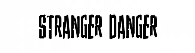
A bold, angular font with a vintage horror aesthetic.
![Stranger Danger Frei Schriftart Herunterladen]() Herunterladen 229 Downloads@WebFont
Herunterladen 229 Downloads@WebFont -
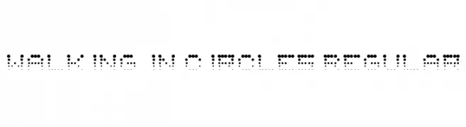
![Walking in Circles Regular Frei Schriftart Herunterladen]() Herunterladen 229 Downloads@WebFont
Herunterladen 229 Downloads@WebFont -
( Fonts by Wahyu Eka Prasetya - wepfont.com - Personal-use only. For commercial use please contact owner. )
A bold, rounded font with a friendly and modern appearance.
![Anti Corona Frei Schriftart Herunterladen]() Herunterladen 229 Downloads@WebFont
Herunterladen 229 Downloads@WebFont -
( Vladimir Nikolic - www.coroflot.com/vladimirnikolic )
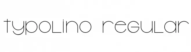
A sleek, modern font with thin, geometric lines and a minimalist style.
![Typolino Regular Frei Schriftart Herunterladen]() Herunterladen 229 Downloads@WebFont
Herunterladen 229 Downloads@WebFont -
( Fonts by Daniel Zadorozny - www.iconian.com )
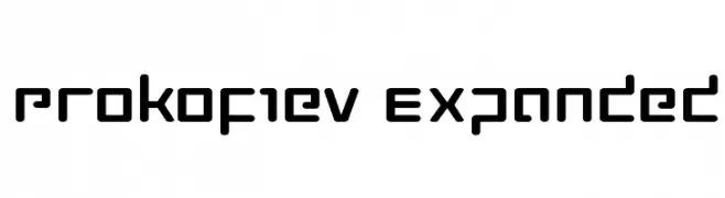
A modern, geometric font with bold, rounded rectangular characters and consistent stroke width.
![Prokofiev Expanded Frei Schriftart Herunterladen]() Herunterladen 229 Downloads@WebFont
Herunterladen 229 Downloads@WebFont -
( Fonts by www.foamtrain.com )
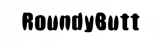
A playful, bold font with rounded, bulbous characters and a whimsical style.
![RoundyButt Frei Schriftart Herunterladen]() Herunterladen 229 Downloads@WebFont
Herunterladen 229 Downloads@WebFont -
( Edgard Rupel )
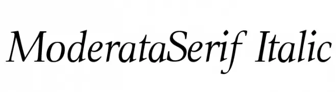
An elegant serif font with a classic italic style and refined serifs.
![ModerataSerif Italic Frei Schriftart Herunterladen]() Herunterladen 229 Downloads@WebFont
Herunterladen 229 Downloads@WebFont -
( Fonts by Daniel Zadorozny - www.iconian.com )
A sleek, italicized, extra-condensed font with a modern and streamlined appearance.
![Antietam Extra-Condensed Italic Frei Schriftart Herunterladen]() Herunterladen 229 Downloads@WebFont
Herunterladen 229 Downloads@WebFont -
( Noto is a trademark of Google Inc. Noto fonts are open source. All Noto fonts are published under the SIL Open Font License, Version 1.1 )
A bold, modern sans-serif font ideal for clear digital displays.
![Noto Sans Oriya UI Bold Frei Schriftart Herunterladen]() Herunterladen 229 Downloads@WebFont
Herunterladen 229 Downloads@WebFont -
( Fonts by Maelle.K - Thomas Boucherie )
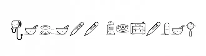
A playful decorative font with kawaii-style medical illustrations.
![Kawaii Medical Frei Schriftart Herunterladen]() Herunterladen 229 Downloads@WebFont
Herunterladen 229 Downloads@WebFont -
( Fonts by www.studiotypo.com - Personal-use only. For commercial use please contact owner. )
A modern, bold, rounded font with clean lines and balanced spacing.
![Typo Angular Rounded Demo Bold Frei Schriftart Herunterladen]() Herunterladen 229 Downloads@WebFont
Herunterladen 229 Downloads@WebFont -
( Fonts by Neoqueto - Personal-use only. For commercial use please contact owner. )
A bold, angular font with a futuristic, geometric design.
![SynthekKana LDR Frei Schriftart Herunterladen]() Herunterladen 229 Downloads@WebFont
Herunterladen 229 Downloads@WebFont -
( Fonts by www.dcoxy.com )
A playful, bold font with rounded edges and a modern, casual style.
![Big Bang Comix Frei Schriftart Herunterladen]() Herunterladen 229 Downloads@WebFont
Herunterladen 229 Downloads@WebFont -
![Auttentic Frei Schriftart Herunterladen]() Herunterladen 229 Downloads@WebFont
Herunterladen 229 Downloads@WebFont -
Schriftart von tomtor. For commercial use please contact the owner.
![TonleSab Medium Frei Schriftart Herunterladen]() Herunterladen 229 Downloads@WebFont
Herunterladen 229 Downloads@WebFont -
![Korinthus Frei Schriftart Herunterladen]() Herunterladen 229 Downloads@WebFont
Herunterladen 229 Downloads@WebFont -
( Fonts by Southype )
A bold, playful font with a two-tone color scheme and retro digital display style.
![DoUbLe CoLoR St Frei Schriftart Herunterladen]() Herunterladen 228 Downloads@WebFont
Herunterladen 228 Downloads@WebFont -
( Fonts by Uddi Uddi )
A playful, hand-drawn font with irregular, whimsical letterforms.
![Fusty-Luggs Frei Schriftart Herunterladen]() Herunterladen 228 Downloads@WebFont
Herunterladen 228 Downloads@WebFont -
( Fonts by www.houseoflime.com )
Ornamental dingbat set with varied decorative motifs.
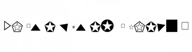
![DesignerDing Frei Schriftart Herunterladen]() Herunterladen 228 Downloads@WebFont
Herunterladen 228 Downloads@WebFont -
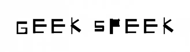
![Geek Speek Frei Schriftart Herunterladen]() Herunterladen 228 Downloads@WebFont
Herunterladen 228 Downloads@WebFont -
![KensingtonDingbats Regular Frei Schriftart Herunterladen]() Herunterladen 228 Downloads@WebFont
Herunterladen 228 Downloads@WebFont -
( Fonts by Hendrick Rolandez - www.moinzek.com - Personal-use only. For commercial use please contact owner. )
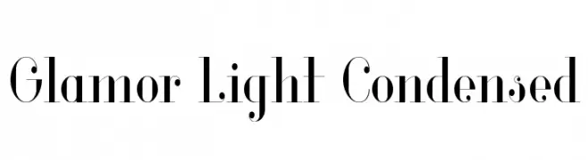
A sophisticated, high-contrast serif font with a condensed and elegant design.
![Glamor Light Condensed Frei Schriftart Herunterladen]() Herunterladen 228 Downloads@WebFont
Herunterladen 228 Downloads@WebFont -
( Fonts by Vladimir Nikolic )
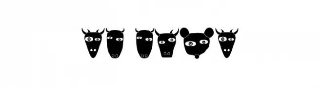
A playful decorative font featuring unique animal face illustrations for each character.
![Nature Regular Frei Schriftart Herunterladen]() Herunterladen 228 Downloads@WebFont
Herunterladen 228 Downloads@WebFont -
( Fonts by Mr Letters - https://www.creativefabrica.com/designer/mrletters/ - Personal-use only. For commercial use please contact owner. )
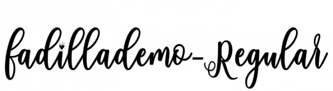
A whimsical and elegant script font with decorative swirls.
![fadillademo-Regular Frei Schriftart Herunterladen]() Herunterladen 228 Downloads@WebFont
Herunterladen 228 Downloads@WebFont


Welche Schriften sind gerade am populärsten?
Poppins, Roboto, Montserrat, Open Sans und Lato sind wegen ihrer klaren Formen und breiten Einsetzbarkeit sehr gefragt – von Markenauftritt über Landingpages bis hin zu Postern.
Welche Fonts eignen sich für Logos?
Geometrische Sans‑Serifs (z. B. Poppins, Familien im Gotham‑Stil) sind ein häufiger Griff für sauberes, skalierbares Branding. Für eine persönlichere Note bleiben Scripts und Handschrift‑Stile beliebt. Kombinieren Sie einen prägnanten Headline‑Font mit einer neutralen Brotschrift für Wiedererkennung und Harmonie.
Wie oft wird die Top‑Liste aktualisiert?
Regelmäßig – basierend auf realen Downloads und Interaktionen. Schauen Sie öfter vorbei, um aufstrebende Favoriten früh zu entdecken.
💡 Tipp: Seite bookmarken – Trends wechseln schnell, und heutige Top‑Schriften inspirieren morgen vielleicht das Rebranding.