Willkommen bei den Top‑Schriften – hier treffen Beliebtheit und Qualität aufeinander. Das sind die in diesem Jahr am häufigsten heruntergeladenen und genutzten Fonts. Wenn Sie sichere Optionen für Logo, Web oder Social suchen, starten Sie hier.
Jeder Top‑Font überzeugt durch Balance, Lesbarkeit und Vielseitigkeit. Sie finden moderne Sans‑Serifs, elegante Scripts, Vintage‑Serifs und minimalistische Displays.
-
( Vladimir Fedotov )
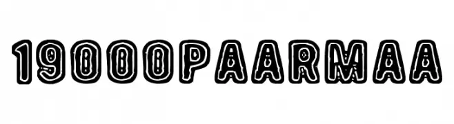
A tall, angular font with a futuristic and geometric style.
 Herunterladen 226 Downloads@WebFont
 -
![19 000 paarmaa Frei Schriftart Herunterladen]() Herunterladen 226 Downloads@WebFont
Herunterladen 226 Downloads@WebFont -
( Free for personal use )
A playful, hand-drawn font with tall, narrow letters and a whimsical style.
![CMonkeeBold Frei Schriftart Herunterladen]() Herunterladen 226 Downloads@WebFont
Herunterladen 226 Downloads@WebFont -
( Fonts by Ikiiko Type )
Elegant handwritten script font.
![Athens ikiiko.com Frei Schriftart Herunterladen]() Herunterladen 226 Downloads@WebFont
Herunterladen 226 Downloads@WebFont -
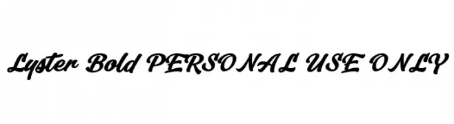
( Fonts by Mans Greback - Personal-use only. For commercial use please contact owner. )
A bold, flowing script font with interconnected characters and elegant curves.
![Lyster Bold PERSONAL USE ONLY Frei Schriftart Herunterladen]() Herunterladen 226 Downloads@WebFont
Herunterladen 226 Downloads@WebFont -
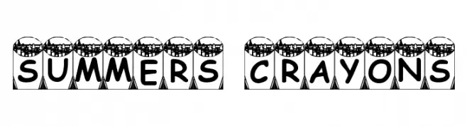
![Summers Crayons Frei Schriftart Herunterladen]() Herunterladen 226 Downloads@WebFont
Herunterladen 226 Downloads@WebFont -
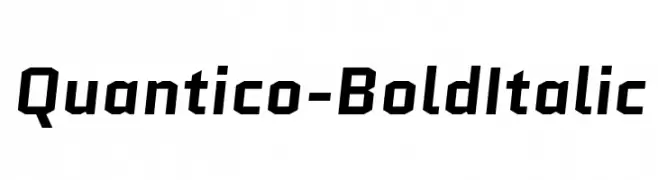
( Fonts by MADType )
A bold, italicized font with a modern, geometric style.
![Quantico-BoldItalic Frei Schriftart Herunterladen]() Herunterladen 226 Downloads@WebFont
Herunterladen 226 Downloads@WebFont -
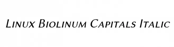
( Linux Libertine - www.linuxlibertine.org )
An elegant italic font with smooth, flowing lines and a modern aesthetic.
![Linux Biolinum Capitals Italic Frei Schriftart Herunterladen]() Herunterladen 226 Downloads@WebFont
Herunterladen 226 Downloads@WebFont -
( Tannon Behunin )
A futuristic, geometric font with sharp angles and clean lines.
![SprawlRegular Frei Schriftart Herunterladen]() Herunterladen 226 Downloads@WebFont
Herunterladen 226 Downloads@WebFont -
( Fonts by Chaka Rastar )
A playful, casual handwritten font with rounded, slightly irregular letterforms.
![welcome me Frei Schriftart Herunterladen]() Herunterladen 226 Downloads@WebFont
Herunterladen 226 Downloads@WebFont -
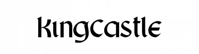
( Fonts by Typefactoryco )
A medieval-inspired font with bold, angular lines and intricate curves.
![KingCastle Frei Schriftart Herunterladen]() Herunterladen 226 Downloads@WebFont
Herunterladen 226 Downloads@WebFont -
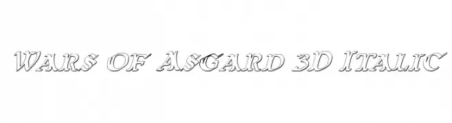
( Fonts by Daniel Zadorozny - www.iconian.com )
A bold, 3D italic serif font with dynamic, angular serifs and a shadow effect.
![Wars of Asgard 3D Italic Frei Schriftart Herunterladen]() Herunterladen 226 Downloads@WebFont
Herunterladen 226 Downloads@WebFont -
![American Kestrel Italic Frei Schriftart Herunterladen]() Herunterladen 226 Downloads@WebFont
Herunterladen 226 Downloads@WebFont -
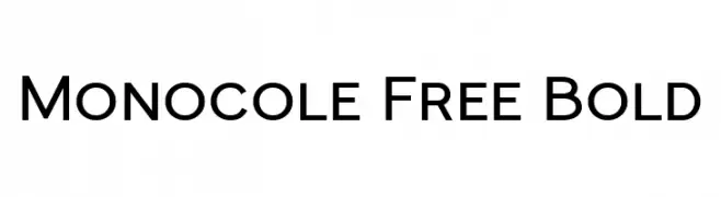
( Fonts by Craft Supply Co - Personal-use only. For commercial use please contact owner. )
A bold, modern sans-serif font with clean lines and excellent legibility.
![Monocole Free Bold Frei Schriftart Herunterladen]() Herunterladen 226 Downloads@WebFont
Herunterladen 226 Downloads@WebFont -
![AFV2 Frei Schriftart Herunterladen]() Herunterladen 226 Downloads@WebFont
Herunterladen 226 Downloads@WebFont -
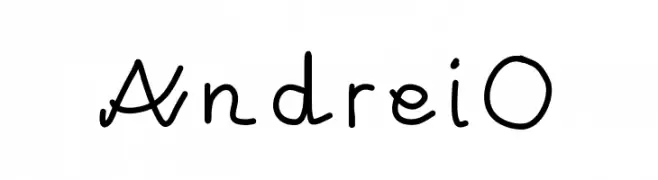
Schriftart von kreativ. For commercial use please contact the owner.
![AndreiO Frei Schriftart Herunterladen]() Herunterladen 226 Downloads@WebFont
Herunterladen 226 Downloads@WebFont -
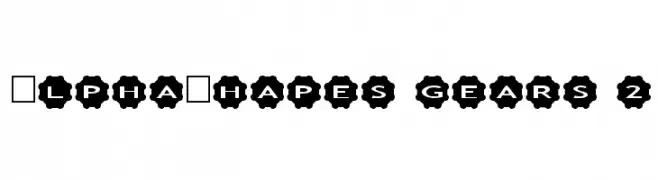
Schriftart von fontsnthings. For commercial use please contact the owner.
![AlphaShapes gears 2 Frei Schriftart Herunterladen]() Herunterladen 226 Downloads@WebFont
Herunterladen 226 Downloads@WebFont -
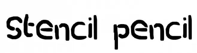
![stencil pencil Frei Schriftart Herunterladen]() Herunterladen 226 Downloads@WebFont
Herunterladen 226 Downloads@WebFont -
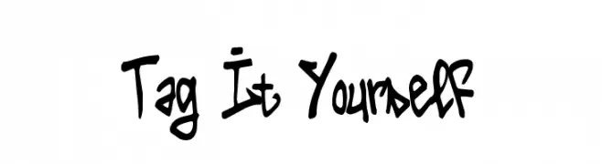
![Tag It Yourself Frei Schriftart Herunterladen]() Herunterladen 226 Downloads@WebFont
Herunterladen 226 Downloads@WebFont -
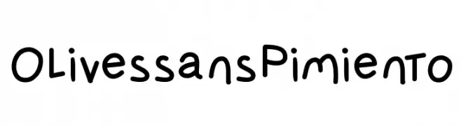
( Fonts by Shara Weber )
A playful, rounded font with a hand-drawn, whimsical style.
![OlivessansPimiento Frei Schriftart Herunterladen]() Herunterladen 226 Downloads@WebFont
Herunterladen 226 Downloads@WebFont -
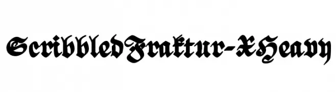
( Fonts by Manfred Klein. Free for private and charity use. Free for commercial with donation to organizations )
A bold, intricate blackletter style with dramatic, ornate characters.
![ScribbledFraktur-XHeavy Frei Schriftart Herunterladen]() Herunterladen 226 Downloads@WebFont
Herunterladen 226 Downloads@WebFont -
( Fonts by Vunira Design - Personal-use only. For commercial use please contact owner. )
A lively and dynamic script font with fluid strokes and a playful character.
![Scott Pilgrim Frei Schriftart Herunterladen]() Herunterladen 226 Downloads@WebFont
Herunterladen 226 Downloads@WebFont -
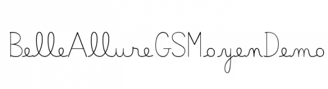
( Fonts by JBFoundry )
A thin, elegant font with a mix of modern and handwritten styles.
![Belle Allure GS Moyen Demo Frei Schriftart Herunterladen]() Herunterladen 226 Downloads@WebFont
Herunterladen 226 Downloads@WebFont -
( Fonts by Vladimir Nikolic - www.creativefabrica.com/designer/vladimirnikolic/ - Personal-use only. For commercial use please contact owner. )
A bold, three-dimensional font with a dotted texture and angular design.
![Strike Regular Frei Schriftart Herunterladen]() Herunterladen 226 Downloads@WebFont
Herunterladen 226 Downloads@WebFont -
( Fonts by Kurdz - vividbluezz.weebly.com )
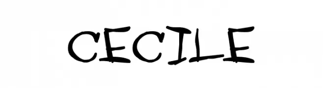
A playful, casual handwritten font with irregular strokes and a spontaneous feel.
![CECILE Frei Schriftart Herunterladen]() Herunterladen 226 Downloads@WebFont
Herunterladen 226 Downloads@WebFont -
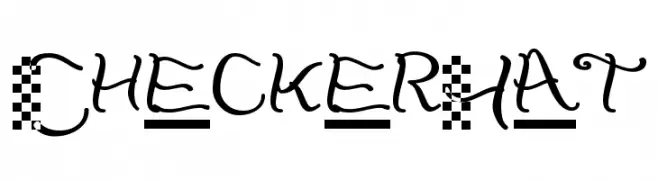
( Fonts by Glyphobet Font Foundry - Matt Chisholm - http://glyphobet.net/typography/ )
A playful and artistic font with checkerboard patterns and whimsical strokes.
![CheckerHat Frei Schriftart Herunterladen]() Herunterladen 226 Downloads@WebFont
Herunterladen 226 Downloads@WebFont -
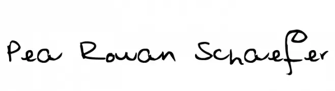
( Free for a personal use. For a commercial use please visit www.kevinandamanda.com )
A playful, handwritten font with dynamic strokes and whimsical loops.
![Pea Rowan Schaefer Frei Schriftart Herunterladen]() Herunterladen 226 Downloads@WebFont
Herunterladen 226 Downloads@WebFont -
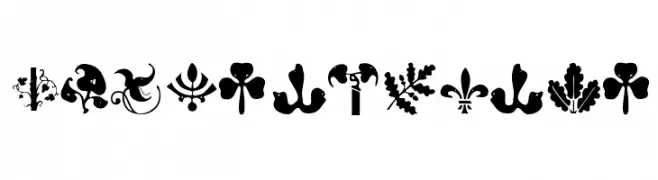
( Fonts by Manfred Klein. Free for private and charity use. Free for commercial with donation to organizations )
Ornate dingbat font with plant and bird motifs.
![BirdsNPlants Frei Schriftart Herunterladen]() Herunterladen 226 Downloads@WebFont
Herunterladen 226 Downloads@WebFont -
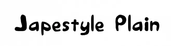
![Japestyle Plain Frei Schriftart Herunterladen]() Herunterladen 226 Downloads@WebFont
Herunterladen 226 Downloads@WebFont -
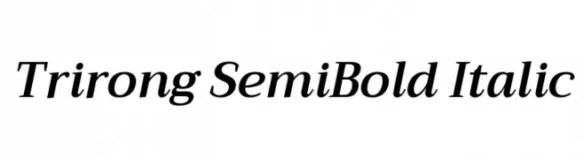
( Copyright (c) 2015, Cadson Demak (info@cadsondemak.com) )
A semi-bold, italic serif font with a classic and elegant style.
![Trirong SemiBold Italic Frei Schriftart Herunterladen]() Herunterladen 226 Downloads@WebFont
Herunterladen 226 Downloads@WebFont -
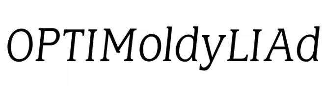
( Fonts by Castcraft Software - opti.netii.net - check the website before use )
A classic serif font with elegant curves and moderate contrast, perfect for sophisticated designs.
![OPTIMoldyLIAd Frei Schriftart Herunterladen]() Herunterladen 226 Downloads@WebFont
Herunterladen 226 Downloads@WebFont -
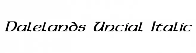
( Fonts by a Neale Davidson - www.pixelsagas.com. Personal-use only. For commercial use please contact owner. )
An italic font with a medieval, angular serif style and fluid strokes.
![Dalelands Uncial Italic Frei Schriftart Herunterladen]() Herunterladen 226 Downloads@WebFont
Herunterladen 226 Downloads@WebFont -
![stefanieFont Frei Schriftart Herunterladen]() Herunterladen 226 Downloads@WebFont
Herunterladen 226 Downloads@WebFont -
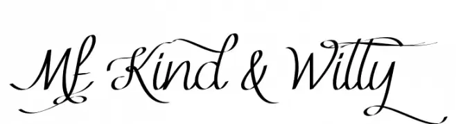
![Mf Kind & Witty Frei Schriftart Herunterladen]() Herunterladen 226 Downloads@WebFont
Herunterladen 226 Downloads@WebFont -
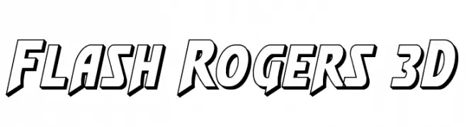
( Iconian Fonts - Daniel Zadorozny - www.iconian.com )
A bold, 3D font with a dynamic, comic book style.
![Flash Rogers 3D Frei Schriftart Herunterladen]() Herunterladen 226 Downloads@WebFont
Herunterladen 226 Downloads@WebFont


Welche Schriften sind gerade am populärsten?
Poppins, Roboto, Montserrat, Open Sans und Lato sind wegen ihrer klaren Formen und breiten Einsetzbarkeit sehr gefragt – von Markenauftritt über Landingpages bis hin zu Postern.
Welche Fonts eignen sich für Logos?
Geometrische Sans‑Serifs (z. B. Poppins, Familien im Gotham‑Stil) sind ein häufiger Griff für sauberes, skalierbares Branding. Für eine persönlichere Note bleiben Scripts und Handschrift‑Stile beliebt. Kombinieren Sie einen prägnanten Headline‑Font mit einer neutralen Brotschrift für Wiedererkennung und Harmonie.
Wie oft wird die Top‑Liste aktualisiert?
Regelmäßig – basierend auf realen Downloads und Interaktionen. Schauen Sie öfter vorbei, um aufstrebende Favoriten früh zu entdecken.
💡 Tipp: Seite bookmarken – Trends wechseln schnell, und heutige Top‑Schriften inspirieren morgen vielleicht das Rebranding.