Willkommen bei den Top‑Schriften – hier treffen Beliebtheit und Qualität aufeinander. Das sind die in diesem Jahr am häufigsten heruntergeladenen und genutzten Fonts. Wenn Sie sichere Optionen für Logo, Web oder Social suchen, starten Sie hier.
Jeder Top‑Font überzeugt durch Balance, Lesbarkeit und Vielseitigkeit. Sie finden moderne Sans‑Serifs, elegante Scripts, Vintage‑Serifs und minimalistische Displays.
-
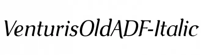
( Fonts by Arkandis Digital Foundry )
An elegant, italicized font with smooth curves and a classic style.
 Herunterladen 225 Downloads@WebFont
 -
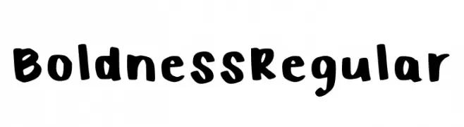
( Fonts by Kelsi Sockwell - Personal-use only. For commercial use please contact owner. )
A bold, playful handwritten font with thick strokes and a casual style.
![Boldness Regular Frei Schriftart Herunterladen]() Herunterladen 225 Downloads@WebFont
Herunterladen 225 Downloads@WebFont -
![Hussar3D Two Frei Schriftart Herunterladen]() Herunterladen 225 Downloads@WebFont
Herunterladen 225 Downloads@WebFont -
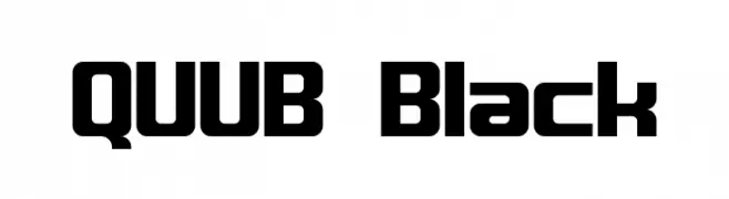
( Fonts by Abhishek Junghare - Personal-use only. For commercial use please contact owner. )
A bold, geometric font with rounded edges and a modern style.
![QUUB Black Frei Schriftart Herunterladen]() Herunterladen 225 Downloads@WebFont
Herunterladen 225 Downloads@WebFont -
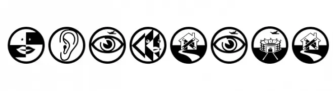
( Fonts by Manfred Klein. Free for private and charity use. Free for commercial with donation to organizations )
Bold, circular pictogram icon set with high contrast.
![NonSense Frei Schriftart Herunterladen]() Herunterladen 225 Downloads@WebFont
Herunterladen 225 Downloads@WebFont -
![American Kestrel Italic Frei Schriftart Herunterladen]() Herunterladen 225 Downloads@WebFont
Herunterladen 225 Downloads@WebFont -
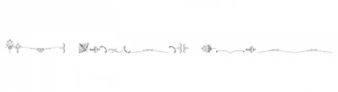
( Free for personal use - new.myfonts.com/foundry/Intellecta_Design/?refby=paulow )
Ornamental and flourish-based decorative glyph set.
![Soft Ornaments Three Frei Schriftart Herunterladen]() Herunterladen 225 Downloads@WebFont
Herunterladen 225 Downloads@WebFont -
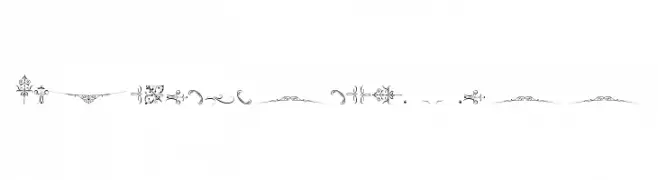
( Free for personal use - new.myfonts.com/foundry/Intellecta_Design/?refby=paulow )
Intricate ornamental designs with swirling and floral motifs for decorative use.
![SoftOrnamentsThree Frei Schriftart Herunterladen]() Herunterladen 225 Downloads@WebFont
Herunterladen 225 Downloads@WebFont -
( Fonts by Kong Font - https://fontkong.com/ - Personal-use only. For commercial use please contact owner. )
A dynamic, cursive italic font with fluid strokes and elegant style.
![Amongh Sein Italic Frei Schriftart Herunterladen]() Herunterladen 225 Downloads@WebFont
Herunterladen 225 Downloads@WebFont -
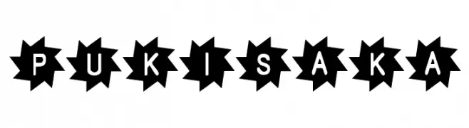
![Pukisaka Frei Schriftart Herunterladen]() Herunterladen 225 Downloads@WebFont
Herunterladen 225 Downloads@WebFont -
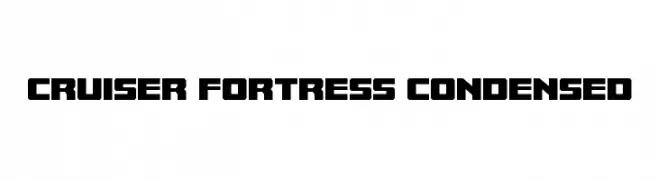
( Fonts by Iconian Fonts )
A bold, geometric font with a modern, industrial style.
![Cruiser Fortress Condensed Frei Schriftart Herunterladen]() Herunterladen 225 Downloads@WebFont
Herunterladen 225 Downloads@WebFont -
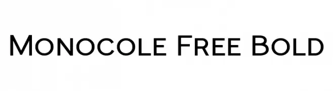
( Fonts by Craft Supply Co - Personal-use only. For commercial use please contact owner. )
A bold, modern sans-serif font with clean lines and excellent legibility.
![Monocole Free Bold Frei Schriftart Herunterladen]() Herunterladen 225 Downloads@WebFont
Herunterladen 225 Downloads@WebFont -
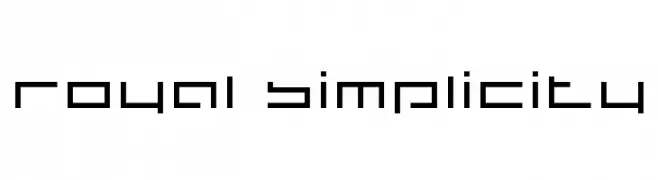
![royal simplicity Frei Schriftart Herunterladen]() Herunterladen 225 Downloads@WebFont
Herunterladen 225 Downloads@WebFont -
![AFV2 Frei Schriftart Herunterladen]() Herunterladen 225 Downloads@WebFont
Herunterladen 225 Downloads@WebFont -
![Circus train Frei Schriftart Herunterladen]() Herunterladen 225 Downloads@WebFont
Herunterladen 225 Downloads@WebFont -
![Script Soft Frei Schriftart Herunterladen]() Herunterladen 225 Downloads@WebFont
Herunterladen 225 Downloads@WebFont -
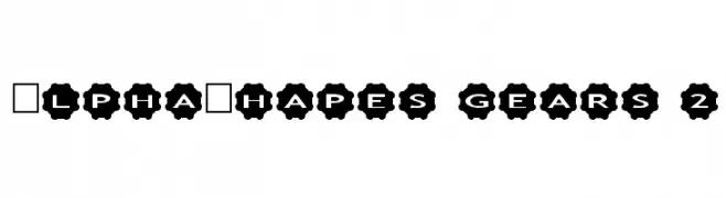
Schriftart von fontsnthings. For commercial use please contact the owner.
![AlphaShapes gears 2 Frei Schriftart Herunterladen]() Herunterladen 225 Downloads@WebFont
Herunterladen 225 Downloads@WebFont -
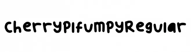
( Fonts by kimwinnie )
A playful, bold typeface with rounded, bubbly characters and a hand-drawn feel.
![Cherryplfumpy Regular Frei Schriftart Herunterladen]() Herunterladen 225 Downloads@WebFont
Herunterladen 225 Downloads@WebFont -
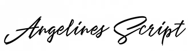
( Cotbada Studio - Isfani - creativemarket.com/Cotbada_studio )
A flowing, cursive script with elegant, connected letters.
![AngelinesScript Frei Schriftart Herunterladen]() Herunterladen 225 Downloads@WebFont
Herunterladen 225 Downloads@WebFont -
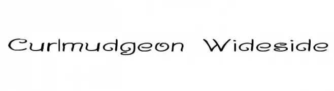
( Fonts by Graham Meade - GemFonts )
A playful and whimsical font with curly, flowing letterforms.
![Curlmudgeon Wideside Frei Schriftart Herunterladen]() Herunterladen 225 Downloads@WebFont
Herunterladen 225 Downloads@WebFont -
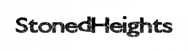
( Fonts by a Max Infeld - XEROGRAPHER FONTS - xerographer.blogspot.com . Personal-use only. For commercial use please contact owner. )
A bold, textured font with a cracked stone appearance.
![StonedHeights Frei Schriftart Herunterladen]() Herunterladen 225 Downloads@WebFont
Herunterladen 225 Downloads@WebFont -
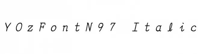
![YOzFontN97 Italic Frei Schriftart Herunterladen]() Herunterladen 225 Downloads@WebFont
Herunterladen 225 Downloads@WebFont -
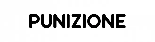
( Fonts by Akhmad Reza Fauzi )
A bold, rounded font with a modern and friendly appearance.
![Punizione Frei Schriftart Herunterladen]() Herunterladen 225 Downloads@WebFont
Herunterladen 225 Downloads@WebFont -
![Off Normal Frei Schriftart Herunterladen]() Herunterladen 225 Downloads@WebFont
Herunterladen 225 Downloads@WebFont -
( Fonts by Manfred Klein - manfred-klein.ina-mar.com )
An ornate, medieval-inspired font with decorative curves and elegant serifs.
![LightUnciale Frei Schriftart Herunterladen]() Herunterladen 225 Downloads@WebFont
Herunterladen 225 Downloads@WebFont -
( Fonts by or from www.graffitifonts.net )
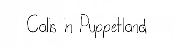
A playful, hand-drawn font with irregular, whimsical characters.
![Calis in Puppetland Frei Schriftart Herunterladen]() Herunterladen 225 Downloads@WebFont
Herunterladen 225 Downloads@WebFont -
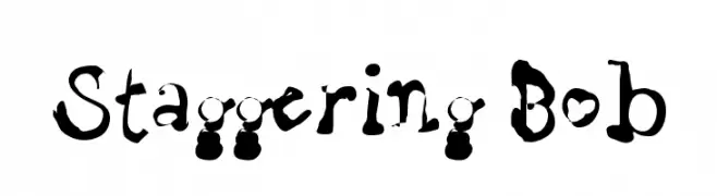
( Fonts by Uddi Uddi )
A playful, hand-drawn font with irregular strokes and a whimsical appearance.
![Staggering Bob Frei Schriftart Herunterladen]() Herunterladen 225 Downloads@WebFont
Herunterladen 225 Downloads@WebFont -
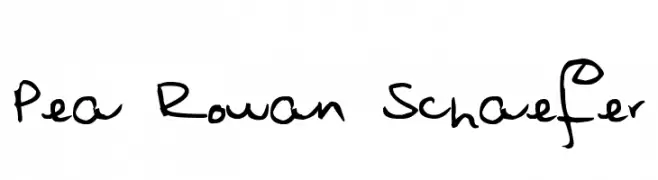
( Free for a personal use. For a commercial use please visit www.kevinandamanda.com )
A playful, handwritten font with dynamic strokes and whimsical loops.
![Pea Rowan Schaefer Frei Schriftart Herunterladen]() Herunterladen 225 Downloads@WebFont
Herunterladen 225 Downloads@WebFont -
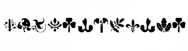
( Fonts by Manfred Klein. Free for private and charity use. Free for commercial with donation to organizations )
Ornate dingbat font with plant and bird motifs.
![BirdsNPlants Frei Schriftart Herunterladen]() Herunterladen 225 Downloads@WebFont
Herunterladen 225 Downloads@WebFont -
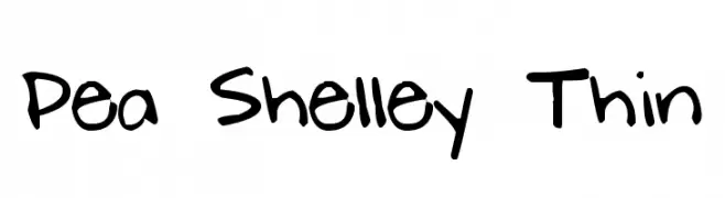
( Free for a personal use. For a commercial use please visit www.kevinandamanda.com )
A playful, casual handwritten font with a lively and informal style.
![Pea Shelley Thin Frei Schriftart Herunterladen]() Herunterladen 225 Downloads@WebFont
Herunterladen 225 Downloads@WebFont -
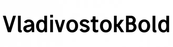
( Fonts by Michael Sharanda )
A bold, modern sans-serif font with excellent readability.
![Vladivostok Bold Frei Schriftart Herunterladen]() Herunterladen 225 Downloads@WebFont
Herunterladen 225 Downloads@WebFont -
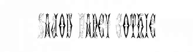
( Fonts by Toto )
An ornate and decorative Gothic-style font with intricate detailing.
![Sajou Fancy Gothic Frei Schriftart Herunterladen]() Herunterladen 225 Downloads@WebFont
Herunterladen 225 Downloads@WebFont -
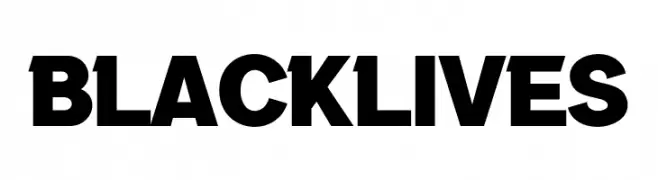
( Fonts by wep - Wahyu Eka Prasetya - Personal-use only. For commercial use please contact owner. )
A bold, sans-serif typeface with a strong, impactful presence.
![Black Lives Frei Schriftart Herunterladen]() Herunterladen 225 Downloads@WebFont
Herunterladen 225 Downloads@WebFont -
( Fonts by Dave Kellam - Brian Stuparyk - www.eightface.com )
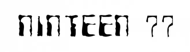
A bold, distressed font with an irregular, grunge aesthetic.
![Ninteen 77 Frei Schriftart Herunterladen]() Herunterladen 225 Downloads@WebFont
Herunterladen 225 Downloads@WebFont -
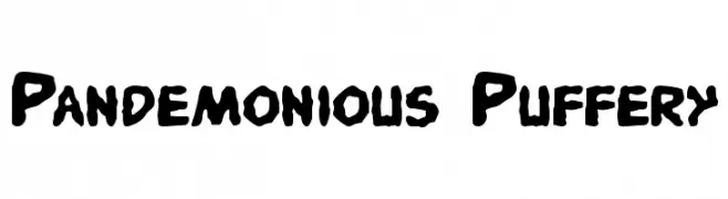
![Pandemonious Puffery Frei Schriftart Herunterladen]() Herunterladen 225 Downloads@WebFont
Herunterladen 225 Downloads@WebFont


Welche Schriften sind gerade am populärsten?
Poppins, Roboto, Montserrat, Open Sans und Lato sind wegen ihrer klaren Formen und breiten Einsetzbarkeit sehr gefragt – von Markenauftritt über Landingpages bis hin zu Postern.
Welche Fonts eignen sich für Logos?
Geometrische Sans‑Serifs (z. B. Poppins, Familien im Gotham‑Stil) sind ein häufiger Griff für sauberes, skalierbares Branding. Für eine persönlichere Note bleiben Scripts und Handschrift‑Stile beliebt. Kombinieren Sie einen prägnanten Headline‑Font mit einer neutralen Brotschrift für Wiedererkennung und Harmonie.
Wie oft wird die Top‑Liste aktualisiert?
Regelmäßig – basierend auf realen Downloads und Interaktionen. Schauen Sie öfter vorbei, um aufstrebende Favoriten früh zu entdecken.
💡 Tipp: Seite bookmarken – Trends wechseln schnell, und heutige Top‑Schriften inspirieren morgen vielleicht das Rebranding.