Willkommen bei den Top‑Schriften – hier treffen Beliebtheit und Qualität aufeinander. Das sind die in diesem Jahr am häufigsten heruntergeladenen und genutzten Fonts. Wenn Sie sichere Optionen für Logo, Web oder Social suchen, starten Sie hier.
Jeder Top‑Font überzeugt durch Balance, Lesbarkeit und Vielseitigkeit. Sie finden moderne Sans‑Serifs, elegante Scripts, Vintage‑Serifs und minimalistische Displays.
-
 Herunterladen 226 Downloads@WebFont
 -
( Fonts by Kat`s Fun Fonts - Personal-use only. For commercial use please contact owner. )
A decorative font with fishing-themed illustrations for each character.
![KR A Fishing We Go Frei Schriftart Herunterladen]() Herunterladen 226 Downloads@WebFont
Herunterladen 226 Downloads@WebFont -
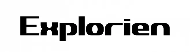
![Explorien Frei Schriftart Herunterladen]() Herunterladen 226 Downloads@WebFont
Herunterladen 226 Downloads@WebFont -
( Fonts by Daniel Zadorozny - www.iconian.com - Free for personal use )
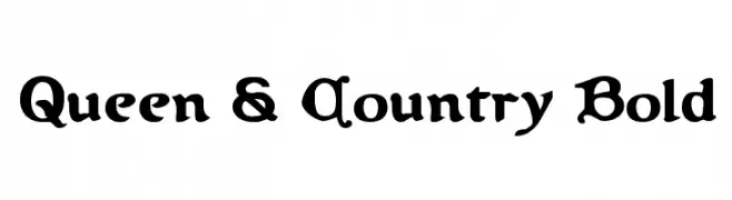
A bold, decorative font with a medieval-inspired design and intricate curves.
![Queen & Country Bold Frei Schriftart Herunterladen]() Herunterladen 226 Downloads@WebFont
Herunterladen 226 Downloads@WebFont -
![Funny Letters Frei Schriftart Herunterladen]() Herunterladen 226 Downloads@WebFont
Herunterladen 226 Downloads@WebFont -
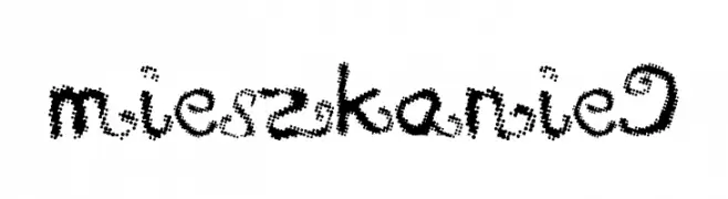
![mieszkanie9 Frei Schriftart Herunterladen]() Herunterladen 226 Downloads@WebFont
Herunterladen 226 Downloads@WebFont -
![Rekles Frei Schriftart Herunterladen]() Herunterladen 226 Downloads@WebFont
Herunterladen 226 Downloads@WebFont -
( DJB Fonts - Darcy Baldwin - darcybaldwin.com )
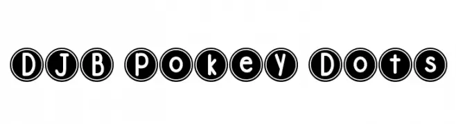
A playful, circular-bordered font with bold, rounded characters.
![DJB Pokey Dots Frei Schriftart Herunterladen]() Herunterladen 226 Downloads@WebFont
Herunterladen 226 Downloads@WebFont -
( Fonts by Jacob Fisher - www.pizzadude.dk )
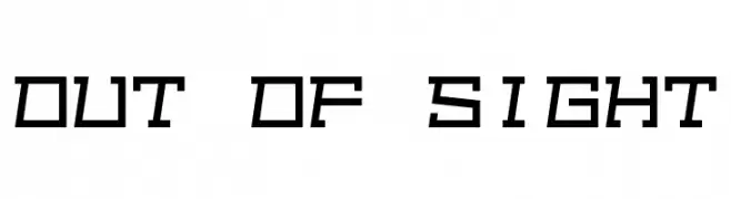
A bold, angular font with a futuristic, mechanical design.
![Out of sight Frei Schriftart Herunterladen]() Herunterladen 226 Downloads@WebFont
Herunterladen 226 Downloads@WebFont -
( Fonts by The Fly )
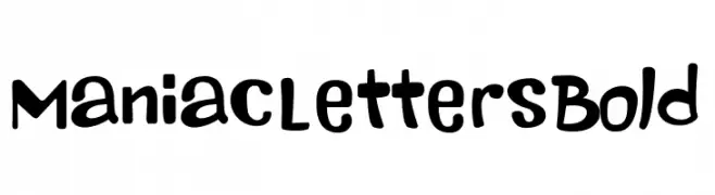
A playful, bold, and hand-drawn font with a whimsical and energetic style.
![Maniac Letters Bold Frei Schriftart Herunterladen]() Herunterladen 226 Downloads@WebFont
Herunterladen 226 Downloads@WebFont -
![YBMangoFruitCocktail Frei Schriftart Herunterladen]() Herunterladen 226 Downloads@WebFont
Herunterladen 226 Downloads@WebFont -
( Fonts by Andrew McCluskey - nalgames.com )
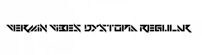
A futuristic, angular font with a bold, geometric design.
![Vermin Vibes Dystopia Regular Frei Schriftart Herunterladen]() Herunterladen 226 Downloads@WebFont
Herunterladen 226 Downloads@WebFont -
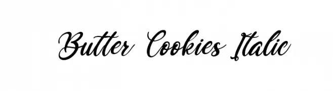
( Fonts by Kong Font - https://fontkong.com/ - Personal-use only. For commercial use please contact owner. )
An elegant, flowing script font with an italic slant and interconnected characters.
![Butter Cookies Italic Frei Schriftart Herunterladen]() Herunterladen 226 Downloads@WebFont
Herunterladen 226 Downloads@WebFont -
![Thoughts!]() Herunterladen 226 Downloads@WebFont
Herunterladen 226 Downloads@WebFont -
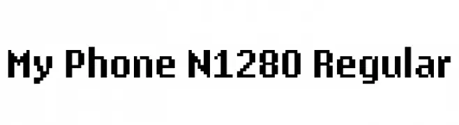
( Satria Muchlis - www.facebook.com/triaChlis )
A pixelated, retro-style font with a digital, blocky appearance.
![My Phone N1280 Regular Frei Schriftart Herunterladen]() Herunterladen 226 Downloads@WebFont
Herunterladen 226 Downloads@WebFont -
![Bravery Frei Schriftart Herunterladen]() Herunterladen 226 Downloads@WebFont
Herunterladen 226 Downloads@WebFont -
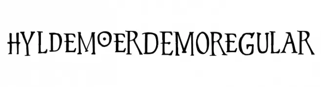
![Hyldemoer DEMO Regular Frei Schriftart Herunterladen]() Herunterladen 226 Downloads@WebFont
Herunterladen 226 Downloads@WebFont -
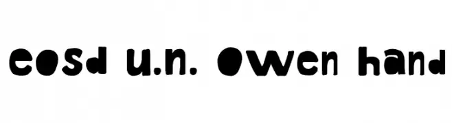
![EoSD U.N. Owen Hand Frei Schriftart Herunterladen]() Herunterladen 226 Downloads@WebFont
Herunterladen 226 Downloads@WebFont -
( mx-logo.com )
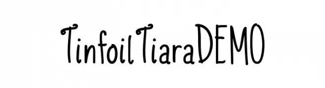
A playful, hand-drawn font with tall, narrow letters and a whimsical style.
![TinfoilTiaraDEMO Frei Schriftart Herunterladen]() Herunterladen 226 Downloads@WebFont
Herunterladen 226 Downloads@WebFont -
( Fonts by Chris EF )
A playful, casual handwritten font with flowing, organic strokes.
![CEF Frei Schriftart Herunterladen]() Herunterladen 226 Downloads@WebFont
Herunterladen 226 Downloads@WebFont -
( Fonts by www.kimberlygeswein.com - Kimberly Geswein )
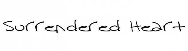
A casual, handwritten font with a playful and informal style.
![Surrendered Heart Frei Schriftart Herunterladen]() Herunterladen 226 Downloads@WebFont
Herunterladen 226 Downloads@WebFont -
( Fonts by www.glukfonts.pl - Personal-use only. For commercial use please contact owner. )
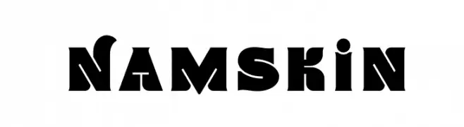
A bold, geometric font with strong, industrial characteristics.
![Namskin Frei Schriftart Herunterladen]() Herunterladen 226 Downloads@WebFont
Herunterladen 226 Downloads@WebFont -
( Fonts by David Kerkhoff - www.hanodedphotography.com )
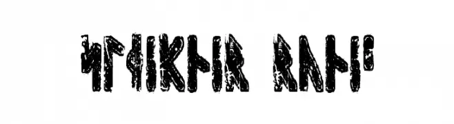
A bold, textured runic font with a rugged, ancient appearance.
![Sleipnir Runic Frei Schriftart Herunterladen]() Herunterladen 226 Downloads@WebFont
Herunterladen 226 Downloads@WebFont -
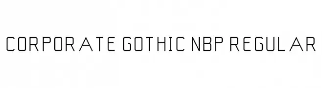
![Corporate Gothic NBP Regular Frei Schriftart Herunterladen]() Herunterladen 226 Downloads@WebFont
Herunterladen 226 Downloads@WebFont -
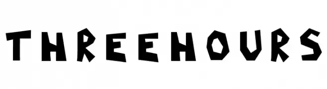
![ThreeHours Frei Schriftart Herunterladen]() Herunterladen 226 Downloads@WebFont
Herunterladen 226 Downloads@WebFont -
( Fonts by Daniel Zadorozny - www.iconian.com - Free for personal use )
A bold, calligraphic font with dynamic, fluid strokes and sharp angles.
![Bushido Leftalic Frei Schriftart Herunterladen]() Herunterladen 226 Downloads@WebFont
Herunterladen 226 Downloads@WebFont -
( Fonts by Woodcutter - woodcutter Manero - Personal-use only. For commercial use please contact owner. )
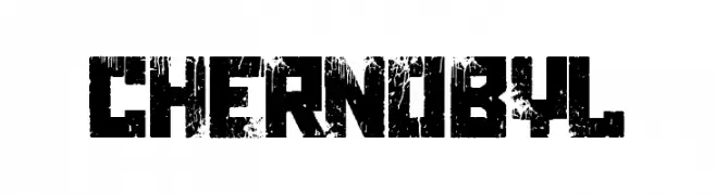
A distressed, grungy font with a bold, eroded appearance.
![Chernobyl Frei Schriftart Herunterladen]() Herunterladen 226 Downloads@WebFont
Herunterladen 226 Downloads@WebFont -
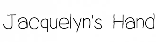
![Jacquelyn's Hand Frei Schriftart Herunterladen]() Herunterladen 226 Downloads@WebFont
Herunterladen 226 Downloads@WebFont -
( Fonts by Fargun Studio - Fajar Gunawan - Personal-use only. For commercial use please contact owner. )
A bold, flowing script font with elegant curves and connected strokes.
![Historia Script DEMO Frei Schriftart Herunterladen]() Herunterladen 226 Downloads@WebFont
Herunterladen 226 Downloads@WebFont -
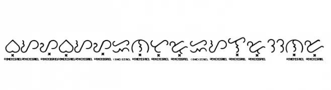
![Baybayin Trial Round Frei Schriftart Herunterladen]() Herunterladen 226 Downloads@WebFont
Herunterladen 226 Downloads@WebFont -
![cheek2cheek [faded!] by shk.dezign Frei Schriftart Herunterladen]() Herunterladen 226 Downloads
Herunterladen 226 Downloads -
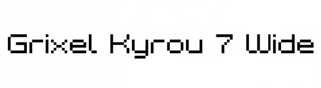
![Grixel Kyrou 7 Wide Frei Schriftart Herunterladen]() Herunterladen 226 Downloads@WebFont
Herunterladen 226 Downloads@WebFont -
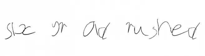
![Six yr old rushed Frei Schriftart Herunterladen]() Herunterladen 226 Downloads@WebFont
Herunterladen 226 Downloads@WebFont -
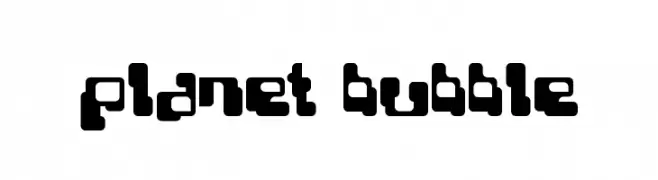
( Fonts by www.planet.dk )
A bold, playful font with rounded, bubble-like characters.
![Planet Bubble Frei Schriftart Herunterladen]() Herunterladen 226 Downloads@WebFont
Herunterladen 226 Downloads@WebFont -
Schriftart von kshtrgyn. For commercial use please contact the owner.
( sanskrit logograms )
A bold, geometric font with a monospaced, logogram-inspired design.
![Sanskrit Logograms Regular Frei Schriftart Herunterladen]() Herunterladen 226 Downloads@WebFont
Herunterladen 226 Downloads@WebFont


![cheek2cheek [faded!] by shk.dezign Frei Schriftart Herunterladen](https://d144mzi0q5mijx.cloudfront.net/img/C/H/cheek2cheek-faded-by-shkdezign.webp)

Welche Schriften sind gerade am populärsten?
Poppins, Roboto, Montserrat, Open Sans und Lato sind wegen ihrer klaren Formen und breiten Einsetzbarkeit sehr gefragt – von Markenauftritt über Landingpages bis hin zu Postern.
Welche Fonts eignen sich für Logos?
Geometrische Sans‑Serifs (z. B. Poppins, Familien im Gotham‑Stil) sind ein häufiger Griff für sauberes, skalierbares Branding. Für eine persönlichere Note bleiben Scripts und Handschrift‑Stile beliebt. Kombinieren Sie einen prägnanten Headline‑Font mit einer neutralen Brotschrift für Wiedererkennung und Harmonie.
Wie oft wird die Top‑Liste aktualisiert?
Regelmäßig – basierend auf realen Downloads und Interaktionen. Schauen Sie öfter vorbei, um aufstrebende Favoriten früh zu entdecken.
💡 Tipp: Seite bookmarken – Trends wechseln schnell, und heutige Top‑Schriften inspirieren morgen vielleicht das Rebranding.