Willkommen bei den Top‑Schriften – hier treffen Beliebtheit und Qualität aufeinander. Das sind die in diesem Jahr am häufigsten heruntergeladenen und genutzten Fonts. Wenn Sie sichere Optionen für Logo, Web oder Social suchen, starten Sie hier.
Jeder Top‑Font überzeugt durch Balance, Lesbarkeit und Vielseitigkeit. Sie finden moderne Sans‑Serifs, elegante Scripts, Vintage‑Serifs und minimalistische Displays.
-
( Fonts by Manfred Klein. Free for private and charity use. Free for commercial with donation to organizations )
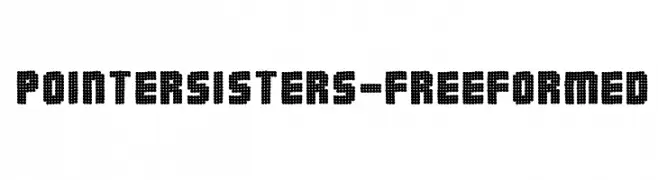
A bold, dotted font with a playful and decorative style.
 Herunterladen 213 Downloads@WebFont
 -
( Please check the owner website: http://www.billie.grosse.is-a-geek.com )
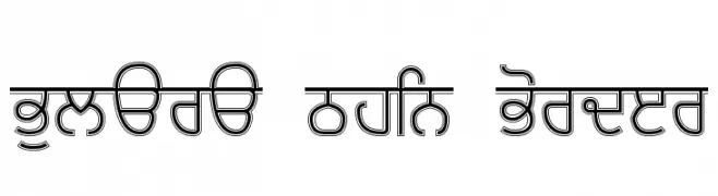
A decorative font with thin borders and geometric structure, offering a modern yet classic style.
![Bulara Thin Border Frei Schriftart Herunterladen]() Herunterladen 213 Downloads@WebFont
Herunterladen 213 Downloads@WebFont -
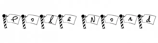
![Pole Nord Frei Schriftart Herunterladen]() Herunterladen 213 Downloads@WebFont
Herunterladen 213 Downloads@WebFont -
( Fonts by Nick Curtis - www.nicksfonts.com )
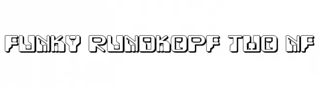
A bold, geometric font with a playful, modern aesthetic and three-dimensional effect.
![Funky Rundkopf Two NF Frei Schriftart Herunterladen]() Herunterladen 213 Downloads@WebFont
Herunterladen 213 Downloads@WebFont -
( Fonts by Graham Meade - GemFonts )
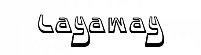
A bold, three-dimensional font with angular, geometric shapes and strong contrast.
![Layaway Frei Schriftart Herunterladen]() Herunterladen 213 Downloads@WebFont
Herunterladen 213 Downloads@WebFont -
![Ice Sans Italic Frei Schriftart Herunterladen]() Herunterladen 213 Downloads@WebFont
Herunterladen 213 Downloads@WebFont -
( Free - comeunbound.tumblr.com/ )
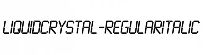
A digital, segmented font with an italic slant, reminiscent of LCD displays.
![LiquidCrystal-RegularItalic Frei Schriftart Herunterladen]() Herunterladen 213 Downloads@WebFont
Herunterladen 213 Downloads@WebFont -
( Fonts by www.foamtrain.com )
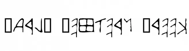
A font inspired by early Western Greek scripts with an ancient, hand-drawn aesthetic.
![Early Western Greek Frei Schriftart Herunterladen]() Herunterladen 213 Downloads@WebFont
Herunterladen 213 Downloads@WebFont -
( Fonts by Daniel Zadorozny - www.iconian.com )
A futuristic, bold italic font with angular lines and a sci-fi aesthetic.
![4114 Blaster Super-Italic Frei Schriftart Herunterladen]() Herunterladen 213 Downloads@WebFont
Herunterladen 213 Downloads@WebFont -
( Fonts by Wahyu Studio - Wahyu Setiyawan - Personal-use only. For commercial use please contact owner. )
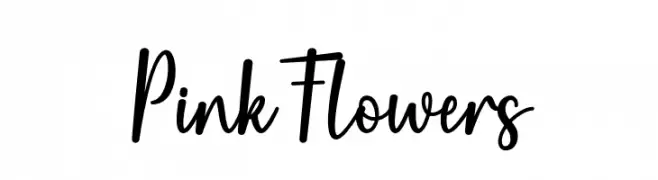
A playful, modern script font with a handwritten feel.
![Pink Flowers Frei Schriftart Herunterladen]() Herunterladen 213 Downloads@WebFont
Herunterladen 213 Downloads@WebFont -
( Fonts by Wahyu Eka Prasetya - wepfont.com - Personal-use only. For commercial use please contact owner. )
A bold, rounded font with a friendly and modern appearance.
![Anti Corona Frei Schriftart Herunterladen]() Herunterladen 213 Downloads@WebFont
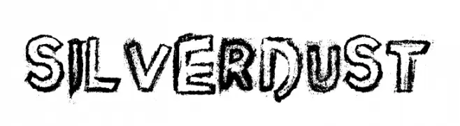
Herunterladen 213 Downloads@WebFont -
![Silver Dust Frei Schriftart Herunterladen]() Herunterladen 213 Downloads@WebFont
Herunterladen 213 Downloads@WebFont -
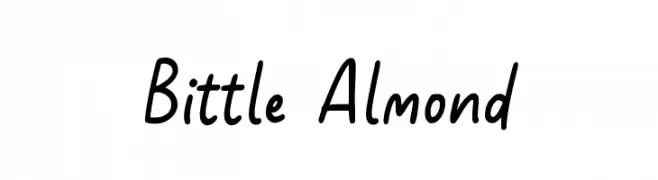
( Fonts by Allouse Studio - Personal-use only. For commercial use please contact owner. )
A playful, casual handwritten font with smooth curves and consistent strokes.
![Bittle Almond Frei Schriftart Herunterladen]() Herunterladen 213 Downloads@WebFont
Herunterladen 213 Downloads@WebFont -
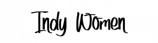
( Typhoon Type - Suthi Srisopha - www.typhoontype.net )
A dynamic, expressive handwritten font with fluid strokes and a playful aesthetic.
![Indy Women Frei Schriftart Herunterladen]() Herunterladen 213 Downloads@WebFont
Herunterladen 213 Downloads@WebFont -
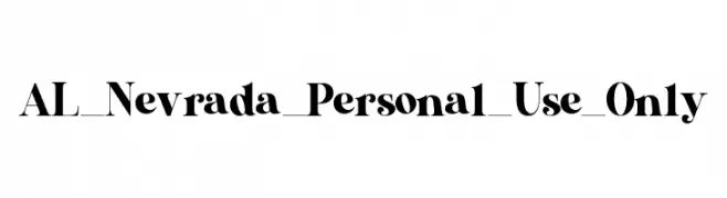
( Fonts by Aluyeah Studio - Personal-use only. For commercial use please contact owner. )
A bold, high-contrast serif font with a vintage yet modern style.
![AL_Nevrada_Personal_Use_Only Frei Schriftart Herunterladen]() Herunterladen 213 Downloads@WebFont
Herunterladen 213 Downloads@WebFont -
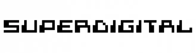
( Font by Sven Stuber - www.superlooper.de )
A bold, pixelated typeface with a retro digital aesthetic.
![superdigital Frei Schriftart Herunterladen]() Herunterladen 213 Downloads@WebFont
Herunterladen 213 Downloads@WebFont -
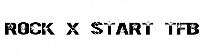
( truefonts.blogspot.com )
A bold, decorative font with star motifs integrated into each character.
![Rock X Start tfb Frei Schriftart Herunterladen]() Herunterladen 213 Downloads@WebFont
Herunterladen 213 Downloads@WebFont -
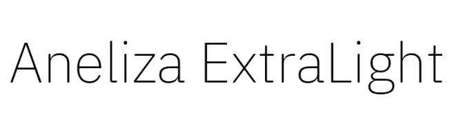
( Fonts by Mike Abbink, Paul van der Laan, Pieter van Rosmalen - Personal-use only. For commercial use please contact owner. )
A clean, minimalist extra-light font with consistent stroke width and modern appeal.
![Aneliza ExtraLight Frei Schriftart Herunterladen]() Herunterladen 213 Downloads@WebFont
Herunterladen 213 Downloads@WebFont -
( Fonts by Ahmad Syarif Afandi - https://delapan.studio - Personal-use only. For commercial use please contact owner. )
A graceful and elegant script font with flowing, cursive letterforms.
![SherlettaRegular Frei Schriftart Herunterladen]() Herunterladen 213 Downloads@WebFont
Herunterladen 213 Downloads@WebFont -
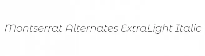
( Copyright 2011 The Montserrat Project Authors (https://github.com/JulietaUla/Montserrat) )
A sleek, modern, extra light italic font with elegant curves and a fluid style.
![Montserrat Alternates ExtraLight Italic Frei Schriftart Herunterladen]() Herunterladen 213 Downloads@WebFont
Herunterladen 213 Downloads@WebFont -
( Fonts by PampaType - Personal-use only. For commercial use please contact owner. )
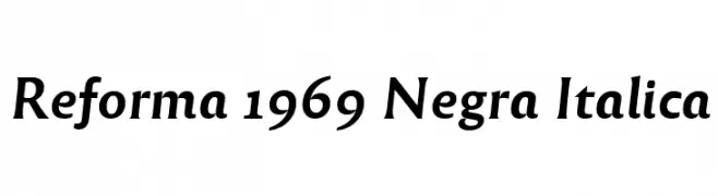
A bold, italic serif font with high contrast and dynamic style.
![Reforma 1969 Negra Italica Frei Schriftart Herunterladen]() Herunterladen 213 Downloads@WebFont
Herunterladen 213 Downloads@WebFont -
( Font by Eric Wirjanata. All of my font are donation based. You can support by buying something from here. http://society6.com/EricWirjanata )
A playful, pixelated font with characters enclosed in square boxes, ideal for digital-themed projects.
![kick ass bob Frei Schriftart Herunterladen]() Herunterladen 213 Downloads@WebFont
Herunterladen 213 Downloads@WebFont -
( Fonts by Creatype Studio )
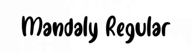
A playful, bold handwritten font with rounded edges and a friendly vibe.
![Mandaly Regular Frei Schriftart Herunterladen]() Herunterladen 213 Downloads@WebFont
Herunterladen 213 Downloads@WebFont -
( Fonts by New Typography - Vernon Adams. Personal-use only. For commercial use please contact owner. )
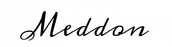
An elegant, cursive font with flowing, interconnected characters.
![Meddon Frei Schriftart Herunterladen]() Herunterladen 213 Downloads@WebFont
Herunterladen 213 Downloads@WebFont -
( Parker Creative - Alan Parker - fontbundles.net/parker-creative )
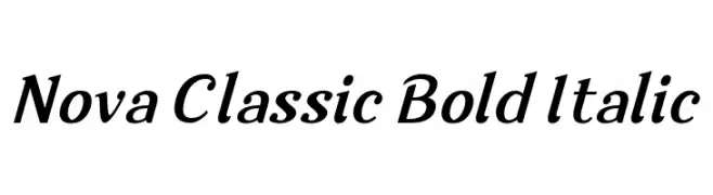
A bold, italic serif font with a classic and elegant style.
![Nova Classic Bold Italic Frei Schriftart Herunterladen]() Herunterladen 213 Downloads@WebFont
Herunterladen 213 Downloads@WebFont -
( Fonts by Wahyu Eka Prasetya - wepfont.com - Personal-use only. For commercial use please contact owner. )
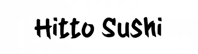
A bold, hand-drawn font with a playful and dynamic style.
![Hitto Sushi Frei Schriftart Herunterladen]() Herunterladen 213 Downloads@WebFont
Herunterladen 213 Downloads@WebFont -
( Fonts by Kayla Divis )
A bold, playful font with rounded, hand-drawn characters.
![Kayla1 Frei Schriftart Herunterladen]() Herunterladen 213 Downloads@WebFont
Herunterladen 213 Downloads@WebFont -
( Fonts by Andrew McCluskey - nalgames.com. Personal-use only. For commercial use please contact owner. )
A bold, geometric font with a modern and impactful design.
![Radaro Frei Schriftart Herunterladen]() Herunterladen 213 Downloads@WebFont
Herunterladen 213 Downloads@WebFont -
( Fonts by a Neale Davidson - www.pixelsagas.com. Personal-use only. For commercial use please contact owner. )
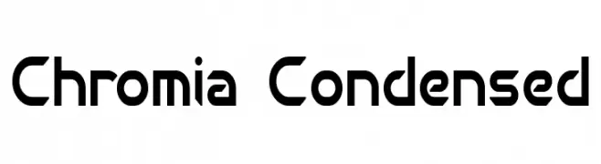
A modern, geometric font with a condensed and angular design.
![Chromia Condensed Frei Schriftart Herunterladen]() Herunterladen 213 Downloads@WebFont
Herunterladen 213 Downloads@WebFont -
( Fonts by www.chequered.ink - Chequered Ink - Personal-use only. For commercial use please contact owner. )
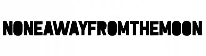
A bold, geometric font with high contrast and strong visual impact.
![None Away from the Moon Frei Schriftart Herunterladen]() Herunterladen 212 Downloads@WebFont
Herunterladen 212 Downloads@WebFont -
( Fonts by ShyFonts )
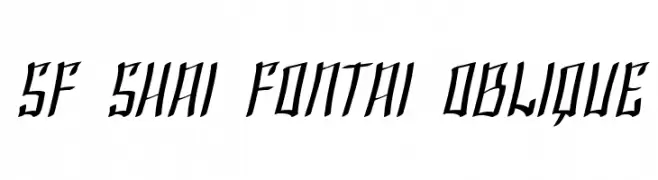
A dynamic, angular font with sharp, slanted strokes and a modern feel.
![SF Shai Fontai Oblique Frei Schriftart Herunterladen]() Herunterladen 212 Downloads@WebFont
Herunterladen 212 Downloads@WebFont -
( Fonts by www.houseoflime.com )
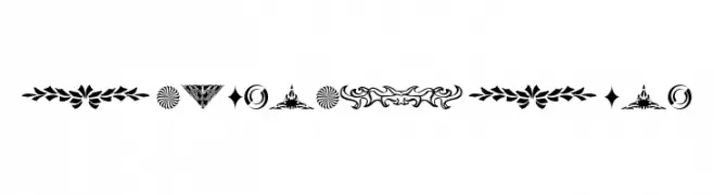
Ornamental dingbat set with varied decorative motifs.
![DesignerDing Frei Schriftart Herunterladen]() Herunterladen 212 Downloads@WebFont
Herunterladen 212 Downloads@WebFont -
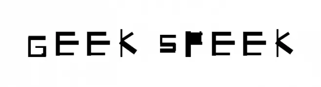
![Geek Speek Frei Schriftart Herunterladen]() Herunterladen 212 Downloads@WebFont
Herunterladen 212 Downloads@WebFont -
( Fonts by Des Gomez )
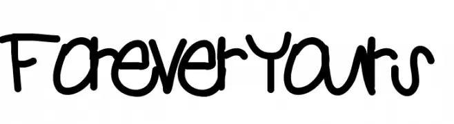
A playful, handwritten font with bold, rounded characters and whimsical special symbols.
![ForeverYours Frei Schriftart Herunterladen]() Herunterladen 212 Downloads@WebFont
Herunterladen 212 Downloads@WebFont -
( Tama Putra - be.net/tmptr )
A bold, geometric font with a modern and edgy style.
![Clobot Personal Use Regular Frei Schriftart Herunterladen]() Herunterladen 212 Downloads@WebFont
Herunterladen 212 Downloads@WebFont


Welche Schriften sind gerade am populärsten?
Poppins, Roboto, Montserrat, Open Sans und Lato sind wegen ihrer klaren Formen und breiten Einsetzbarkeit sehr gefragt – von Markenauftritt über Landingpages bis hin zu Postern.
Welche Fonts eignen sich für Logos?
Geometrische Sans‑Serifs (z. B. Poppins, Familien im Gotham‑Stil) sind ein häufiger Griff für sauberes, skalierbares Branding. Für eine persönlichere Note bleiben Scripts und Handschrift‑Stile beliebt. Kombinieren Sie einen prägnanten Headline‑Font mit einer neutralen Brotschrift für Wiedererkennung und Harmonie.
Wie oft wird die Top‑Liste aktualisiert?
Regelmäßig – basierend auf realen Downloads und Interaktionen. Schauen Sie öfter vorbei, um aufstrebende Favoriten früh zu entdecken.
💡 Tipp: Seite bookmarken – Trends wechseln schnell, und heutige Top‑Schriften inspirieren morgen vielleicht das Rebranding.