Willkommen bei den Top‑Schriften – hier treffen Beliebtheit und Qualität aufeinander. Das sind die in diesem Jahr am häufigsten heruntergeladenen und genutzten Fonts. Wenn Sie sichere Optionen für Logo, Web oder Social suchen, starten Sie hier.
Jeder Top‑Font überzeugt durch Balance, Lesbarkeit und Vielseitigkeit. Sie finden moderne Sans‑Serifs, elegante Scripts, Vintage‑Serifs und minimalistische Displays.
-
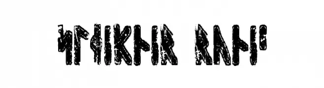
( Fonts by David Kerkhoff - www.hanodedphotography.com )
A bold, textured runic font with a rugged, ancient appearance.
 Herunterladen 222 Downloads@WebFont
 -
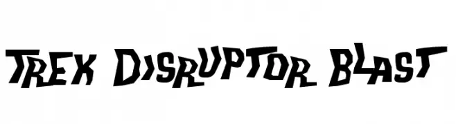
( Fonts by Steve Ferrera )
A bold, angular font with a futuristic and dynamic style.
![Trek Disruptor Blast Frei Schriftart Herunterladen]() Herunterladen 222 Downloads@WebFont
Herunterladen 222 Downloads@WebFont -
![Corporate Gothic NBP Regular Frei Schriftart Herunterladen]() Herunterladen 222 Downloads@WebFont
Herunterladen 222 Downloads@WebFont -
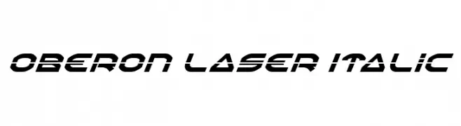
( Fonts by Daniel Zadorozny - www.iconian.com )
A futuristic, italicized font with bold, angular lines and geometric style.
![Oberon Laser Italic Frei Schriftart Herunterladen]() Herunterladen 222 Downloads@WebFont
Herunterladen 222 Downloads@WebFont -
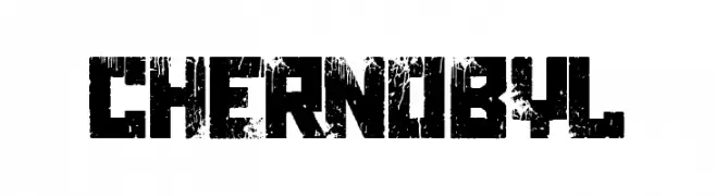
( Fonts by Woodcutter - woodcutter Manero - Personal-use only. For commercial use please contact owner. )
A distressed, grungy font with a bold, eroded appearance.
![Chernobyl Frei Schriftart Herunterladen]() Herunterladen 222 Downloads@WebFont
Herunterladen 222 Downloads@WebFont -
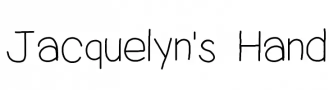
![Jacquelyn's Hand Frei Schriftart Herunterladen]() Herunterladen 222 Downloads@WebFont
Herunterladen 222 Downloads@WebFont -
![Delancy Frei Schriftart Herunterladen]() Herunterladen 222 Downloads@WebFont
Herunterladen 222 Downloads@WebFont -
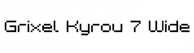
![Grixel Kyrou 7 Wide Frei Schriftart Herunterladen]() Herunterladen 222 Downloads@WebFont
Herunterladen 222 Downloads@WebFont -
![JD Din Frei Schriftart Herunterladen]() Herunterladen 222 Downloads@WebFont
Herunterladen 222 Downloads@WebFont -
![Progoty Cactus Frei Schriftart Herunterladen]() Herunterladen 222 Downloads@WebFont
Herunterladen 222 Downloads@WebFont -
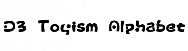
( Fonts by www.DigitalDreamDesign.net )
A playful, bold font with rounded, dynamic letterforms.
![D3 Toyism Alphabet Frei Schriftart Herunterladen]() Herunterladen 222 Downloads@WebFont
Herunterladen 222 Downloads@WebFont -
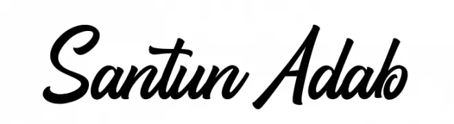
( Fonts by Thirtypath - Personal-use only. For commercial use please contact owner. )
A bold, flowing script font with interconnected characters and dynamic style.
![Santun Adab Frei Schriftart Herunterladen]() Herunterladen 222 Downloads@WebFont
Herunterladen 222 Downloads@WebFont -
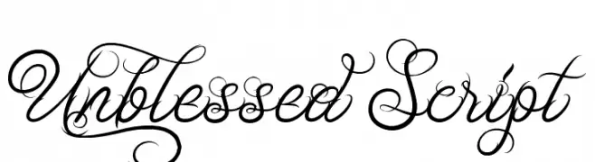
![Unblessed Script Frei Schriftart Herunterladen]() Herunterladen 222 Downloads@WebFont
Herunterladen 222 Downloads@WebFont -
( Fonts by Misti's Fonts )
A playful, handwritten font with smooth, flowing curves and consistent stroke width.
![Oh My It's July Frei Schriftart Herunterladen]() Herunterladen 222 Downloads@WebFont
Herunterladen 222 Downloads@WebFont -
( Fonts by Graphix Line Studio )
A lively, flowing script font with smooth, cursive strokes.
![Marisha Frei Schriftart Herunterladen]() Herunterladen 222 Downloads@WebFont
Herunterladen 222 Downloads@WebFont -
Schriftart von jlog3000. For commercial use please contact the owner.
( Fonts by John Ocasio. Free for personal use only )
A bold, italic slab serif font with angular edges and a modern, dynamic style.
![J-LOG Rebellion Slab Serif Normal Italic Frei Schriftart Herunterladen]() Herunterladen 222 Downloads@WebFont
Herunterladen 222 Downloads@WebFont -
![ORU Frei Schriftart Herunterladen]() Herunterladen 222 Downloads@WebFont
Herunterladen 222 Downloads@WebFont -
![Ice Sans Italic Frei Schriftart Herunterladen]() Herunterladen 222 Downloads@WebFont
Herunterladen 222 Downloads@WebFont -
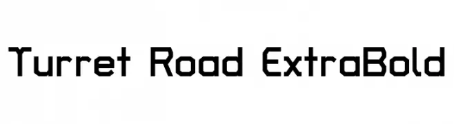
( Copyright 2018 The Turret Road Project Authors (https://github.com/noponies/turret-road) )
A bold, geometric font with a modern, industrial style.
![Turret Road ExtraBold Frei Schriftart Herunterladen]() Herunterladen 222 Downloads@WebFont
Herunterladen 222 Downloads@WebFont -
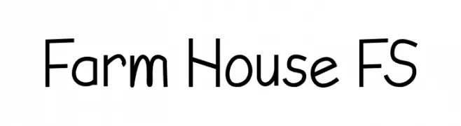
( Fonts by Farz Studio - Lian Felani - Personal-use only. For commercial use please contact owner. )
A playful, handwritten-style font with a casual and friendly appearance.
![Farm House FS Frei Schriftart Herunterladen]() Herunterladen 222 Downloads@WebFont
Herunterladen 222 Downloads@WebFont -
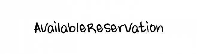
( Fonts by Xerographer Fonts )
A playful, handwritten font with bold, rounded letters and a casual, friendly style.
![AvailableReservation Frei Schriftart Herunterladen]() Herunterladen 222 Downloads@WebFont
Herunterladen 222 Downloads@WebFont -
( Fonts by Roland Huse - rolandhuse.com )
A whimsical, flowing handwritten font with elegant, elongated letterforms.
![Sunny Winter Frei Schriftart Herunterladen]() Herunterladen 222 Downloads@WebFont
Herunterladen 222 Downloads@WebFont -
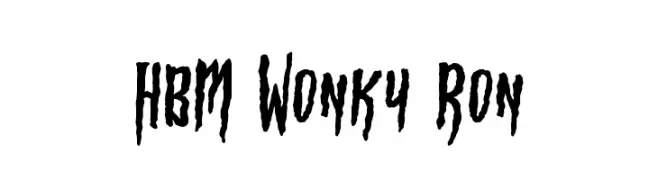
( Fonts by Here Be Monsters )
A quirky, hand-drawn font with irregular, jagged strokes.
![HBM Wonky Ron Frei Schriftart Herunterladen]() Herunterladen 222 Downloads@WebFont
Herunterladen 222 Downloads@WebFont -
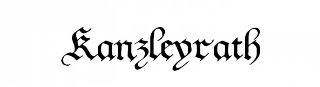
( Fonts by www.peter-wiegel.de. Personal-use only. For commercial use please contact owner. )
A Gothic-style font with ornate, angular strokes and medieval flair.
![Kanzleyrath Frei Schriftart Herunterladen]() Herunterladen 222 Downloads@WebFont
Herunterladen 222 Downloads@WebFont -
![Sweeet! Frei Schriftart Herunterladen]() Herunterladen 222 Downloads@WebFont
Herunterladen 222 Downloads@WebFont -
( Fonts by dcoxy )
A bold, dynamic script font with a brush-like, artistic style.
![Gatalike_Personal Use Frei Schriftart Herunterladen]() Herunterladen 222 Downloads@WebFont
Herunterladen 222 Downloads@WebFont -
( Fonts by HeartEmotes )
A playful, rounded font with a bold, friendly appearance.
![Heart Emotes Regular Frei Schriftart Herunterladen]() Herunterladen 222 Downloads@WebFont
Herunterladen 222 Downloads@WebFont -
![BRANDEEZFONTV2 Frei Schriftart Herunterladen]() Herunterladen 222 Downloads@WebFont
Herunterladen 222 Downloads@WebFont -
( JBFoundry - Jean Boyault - jean.boyault.pagesperso-orange.fr/ )
A hand-drawn, sketch-like font with a unique, artistic flair.
![CentaureaDemo Frei Schriftart Herunterladen]() Herunterladen 222 Downloads@WebFont
Herunterladen 222 Downloads@WebFont -
![Zeta Grey Frei Schriftart Herunterladen]() Herunterladen 222 Downloads@WebFont
Herunterladen 222 Downloads@WebFont -
( Fonts by dartcanada.tripod.com - Darren Rigby )
A bold and impactful font with strong, well-defined characters.
![Water Street Detour Regular Frei Schriftart Herunterladen]() Herunterladen 222 Downloads@WebFont
Herunterladen 222 Downloads@WebFont -
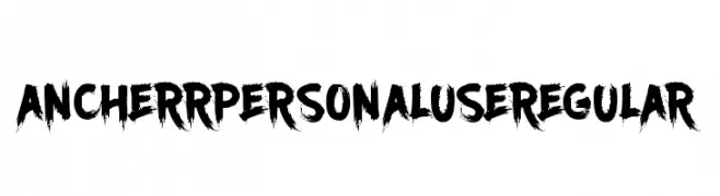
( Tama Putra - be.net/tmptr )
A bold, brush-style font with a textured, artistic appearance.
![Ancherr Personal Use Regular Frei Schriftart Herunterladen]() Herunterladen 222 Downloads@WebFont
Herunterladen 222 Downloads@WebFont -
( Fonts by PampaType - Personal-use only. For commercial use please contact owner. )
A bold, italic serif font with high contrast and dynamic style.
![Reforma 1969 Negra Italica Frei Schriftart Herunterladen]() Herunterladen 222 Downloads@WebFont
Herunterladen 222 Downloads@WebFont -
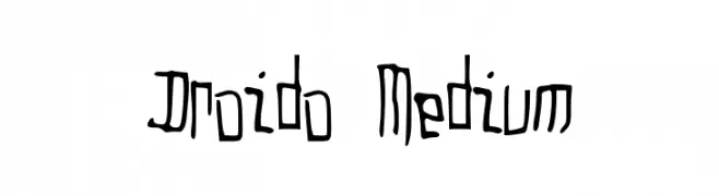
( winty5.wix.com/noahtheawesome )
A whimsical, hand-drawn font with playful, irregular strokes.
![Droido Medium Frei Schriftart Herunterladen]() Herunterladen 222 Downloads@WebFont
Herunterladen 222 Downloads@WebFont -
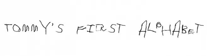
( Fonts by Divide By Zero! - fonts.tom7.com )
A playful, childlike handwritten font with irregular strokes.
![Tommy's First Alphabet Frei Schriftart Herunterladen]() Herunterladen 222 Downloads@WebFont
Herunterladen 222 Downloads@WebFont


Welche Schriften sind gerade am populärsten?
Poppins, Roboto, Montserrat, Open Sans und Lato sind wegen ihrer klaren Formen und breiten Einsetzbarkeit sehr gefragt – von Markenauftritt über Landingpages bis hin zu Postern.
Welche Fonts eignen sich für Logos?
Geometrische Sans‑Serifs (z. B. Poppins, Familien im Gotham‑Stil) sind ein häufiger Griff für sauberes, skalierbares Branding. Für eine persönlichere Note bleiben Scripts und Handschrift‑Stile beliebt. Kombinieren Sie einen prägnanten Headline‑Font mit einer neutralen Brotschrift für Wiedererkennung und Harmonie.
Wie oft wird die Top‑Liste aktualisiert?
Regelmäßig – basierend auf realen Downloads und Interaktionen. Schauen Sie öfter vorbei, um aufstrebende Favoriten früh zu entdecken.
💡 Tipp: Seite bookmarken – Trends wechseln schnell, und heutige Top‑Schriften inspirieren morgen vielleicht das Rebranding.