Willkommen bei den Top‑Schriften – hier treffen Beliebtheit und Qualität aufeinander. Das sind die in diesem Jahr am häufigsten heruntergeladenen und genutzten Fonts. Wenn Sie sichere Optionen für Logo, Web oder Social suchen, starten Sie hier.
Jeder Top‑Font überzeugt durch Balance, Lesbarkeit und Vielseitigkeit. Sie finden moderne Sans‑Serifs, elegante Scripts, Vintage‑Serifs und minimalistische Displays.
-
( Fonts by Astigmatic One Eye Typographic Institute - Brian J. Bonislawsky - astigmatic.com )
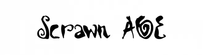
A playful, hand-drawn font with quirky, artistic flourishes.
 Herunterladen 225 Downloads@WebFont
 -
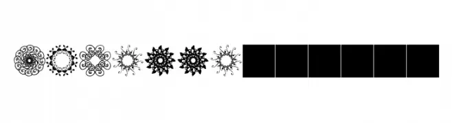
![rosette110621 Frei Schriftart Herunterladen]() Herunterladen 225 Downloads@WebFont
Herunterladen 225 Downloads@WebFont -
( Copyright 2019 The Gelasio Project Authors (https://github.com/sorkintype/Gelasio) )
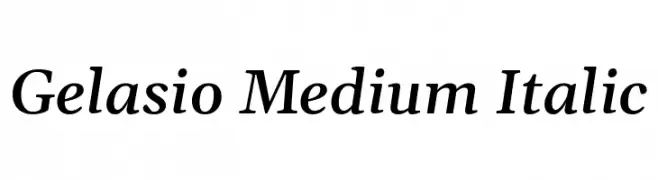
Elegant serif font with medium weight and italic style.
![Gelasio Medium Italic Frei Schriftart Herunterladen]() Herunterladen 225 Downloads@WebFont
Herunterladen 225 Downloads@WebFont -
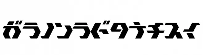
![TokyoSquare Frei Schriftart Herunterladen]() Herunterladen 225 Downloads@WebFont
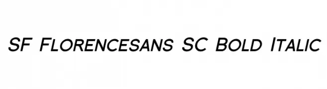
Herunterladen 225 Downloads@WebFont -
![SF Florencesans SC Bold Italic Frei Schriftart Herunterladen]() Herunterladen 225 Downloads@WebFont
Herunterladen 225 Downloads@WebFont -
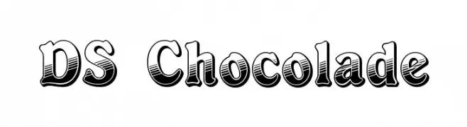
( Fonts by Typographer Mediengestaltung - Personal-use only. For commercial use please contact owner. )
A bold, decorative font with a playful, three-dimensional style.
![DS Chocolade Frei Schriftart Herunterladen]() Herunterladen 225 Downloads@WebFont
Herunterladen 225 Downloads@WebFont -
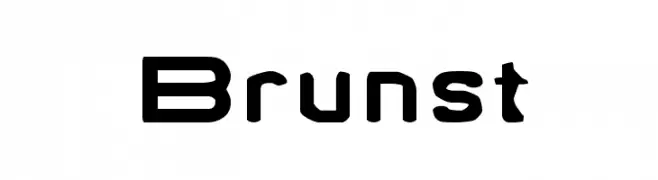
( Fonts by TarmSaft Font Factory - http://www.aska.nu/tarmsaft/ )
A bold, geometric font with a modern and futuristic style.
![Brunst Frei Schriftart Herunterladen]() Herunterladen 225 Downloads@WebFont
Herunterladen 225 Downloads@WebFont -
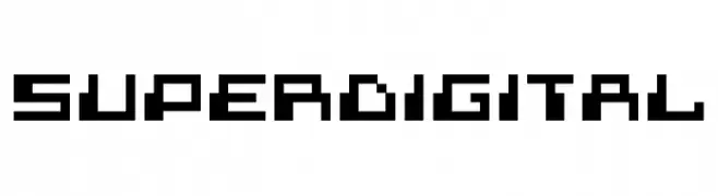
( Font by Sven Stuber - www.superlooper.de )
A bold, pixelated typeface with a retro digital aesthetic.
![superdigital Frei Schriftart Herunterladen]() Herunterladen 225 Downloads@WebFont
Herunterladen 225 Downloads@WebFont -
( Fonts by Galia Atri - Personal-use only. For commercial use please contact owner. )
A decorative font with elegant swirls and flourishes, perfect for artistic projects.
![Tlakah Frei Schriftart Herunterladen]() Herunterladen 225 Downloads@WebFont
Herunterladen 225 Downloads@WebFont -
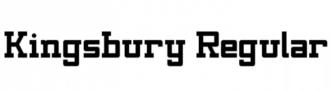
( Fonts by Geronimo Fonts - Personal-use only. For commercial use please contact owner. )
A bold, structured font with geometric shapes and slab serif elements, offering a vintage yet modern appeal.
![Kingsbury Regular Frei Schriftart Herunterladen]() Herunterladen 225 Downloads@WebFont
Herunterladen 225 Downloads@WebFont -
( Fonts by Klaus Johansen - www.listemageren.dK )
A playful, domino-themed font with italicized, outlined characters.
![Domino flad kursiv omrids Frei Schriftart Herunterladen]() Herunterladen 225 Downloads@WebFont
Herunterladen 225 Downloads@WebFont -
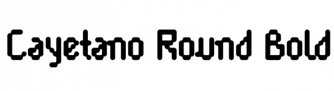
( Fonts by Apostrophic Lab )
A bold, rounded font with a playful and modern style.
![Cayetano Round Bold Frei Schriftart Herunterladen]() Herunterladen 225 Downloads@WebFont
Herunterladen 225 Downloads@WebFont -
( Fonts by Typhoon Type - Suthi Srisopha - www.typhoontype.net - Personal-use only. For commercial use please contact owner. )
A dynamic script font with elegant, calligraphic strokes and intricate flourishes.
![Ole Blizzard - Personal Use Frei Schriftart Herunterladen]() Herunterladen 225 Downloads@WebFont
Herunterladen 225 Downloads@WebFont -
![Bamum Symbols 1 Frei Schriftart Herunterladen]() Herunterladen 225 Downloads@WebFont
Herunterladen 225 Downloads@WebFont -
( Riskiansyah Ilyas )
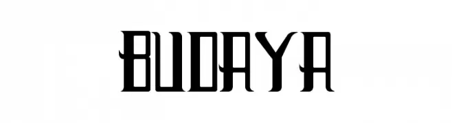
A bold, modern font with Gothic influences and high contrast strokes.
![Budaya Frei Schriftart Herunterladen]() Herunterladen 225 Downloads@WebFont
Herunterladen 225 Downloads@WebFont -
( Fonts by arukidz.fl )
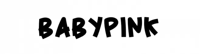
A playful, bold font with rounded, slightly irregular letters.
![BabyPink Frei Schriftart Herunterladen]() Herunterladen 225 Downloads@WebFont
Herunterladen 225 Downloads@WebFont -
( winty5.wix.com/noahtheawesome )
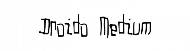
A whimsical, hand-drawn font with playful, irregular strokes.
![Droido Medium Frei Schriftart Herunterladen]() Herunterladen 225 Downloads@WebFont
Herunterladen 225 Downloads@WebFont -
( Fonts by Fajar Abdul Fattah - https://fontbundles.net/sibelumpagi-studio - Personal-use only. For commercial use please contact owner. )
An elegant, flowing script font with high contrast and graceful, elongated letterforms.
![Alliando Frei Schriftart Herunterladen]() Herunterladen 225 Downloads@WebFont
Herunterladen 225 Downloads@WebFont -
( Fonts by www.legacyofdefeat.com )
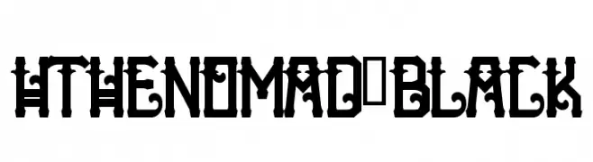
A bold, decorative font with gothic influences and intricate details.
![HTheNomad-Black Frei Schriftart Herunterladen]() Herunterladen 225 Downloads@WebFont
Herunterladen 225 Downloads@WebFont -
( Fonts by Steve Cloutier - www.cloutierfontes.ca )
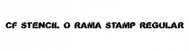
A bold, distressed stencil font with a vintage, industrial feel.
![CF Stencil O Rama Stamp Regular Frei Schriftart Herunterladen]() Herunterladen 225 Downloads@WebFont
Herunterladen 225 Downloads@WebFont -
( Fonts by Daniel Zadorozny - www.iconian.com )
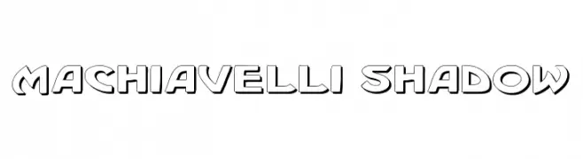
A bold, shadowed font with a three-dimensional effect, ideal for decorative use.
![Machiavelli Shadow Frei Schriftart Herunterladen]() Herunterladen 224 Downloads@WebFont
Herunterladen 224 Downloads@WebFont -
( Copyright (c) 2011, Carolina Trebol
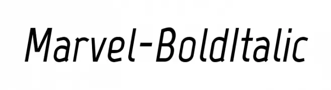
A modern, bold italic font with medium contrast and slightly condensed characters.
![Marvel-BoldItalic Frei Schriftart Herunterladen]() Herunterladen 224 Downloads@WebFont
Herunterladen 224 Downloads@WebFont -
( Fonts by Peax Webdesign - www.peax-webdesign.com. Personal-use only. For commercial use please contact owner. )
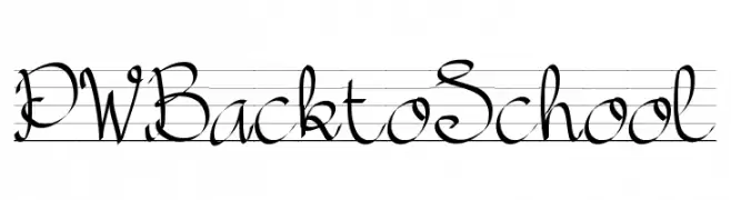
A playful, cursive script font with smooth, connected letters and elegant loops.
![PWBacktoSchool Frei Schriftart Herunterladen]() Herunterladen 224 Downloads@WebFont
Herunterladen 224 Downloads@WebFont -
![Return of Ganon Regular Frei Schriftart Herunterladen]() Herunterladen 224 Downloads@WebFont
Herunterladen 224 Downloads@WebFont -
( Fonts by Daegeseage Daisy. Personal-use only. For commercial use please contact owner. )
A playful handwritten font with irregular strokes and a whimsical appearance.
![menlotus Frei Schriftart Herunterladen]() Herunterladen 224 Downloads@WebFont
Herunterladen 224 Downloads@WebFont -
( Bartosz Wesolek - creativemarket.com/bart_wesolek )
A bold, geometric font with a condensed and modern style.
![Theobald_Clean Frei Schriftart Herunterladen]() Herunterladen 224 Downloads@WebFont
Herunterladen 224 Downloads@WebFont -
( Fonts by www.peter-wiegel.de. Personal-use only. For commercial use please contact owner. )
A bold, playful script font with rounded edges and a whimsical style.
![GraphicCAT Frei Schriftart Herunterladen]() Herunterladen 224 Downloads@WebFont
Herunterladen 224 Downloads@WebFont -
( Fonts by ShyFonts )
A bold, geometric outline font with a modern, architectural style.
![SF Archery Black SC Outline Frei Schriftart Herunterladen]() Herunterladen 224 Downloads@WebFont
Herunterladen 224 Downloads@WebFont -
( Fonts by KÄrlis KalviÅ¡kis . For commercial use please contact owner. )
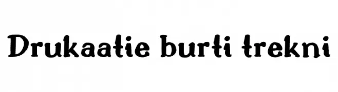
A bold, playful font with a hand-drawn, artistic style.
![Drukaatie burti trekni Frei Schriftart Herunterladen]() Herunterladen 224 Downloads@WebFont
Herunterladen 224 Downloads@WebFont -
( Fonts by Daniel Zadorozny - www.iconian.com - Free for personal use )
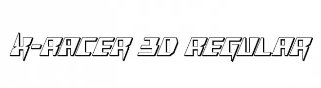
A bold, angular font with a futuristic, three-dimensional appearance.
![X-Racer 3D Regular Frei Schriftart Herunterladen]() Herunterladen 224 Downloads@WebFont
Herunterladen 224 Downloads@WebFont -
( Sifat Ahmed )
A playful, hand-drawn font with smooth curves and an organic feel.
![Nillima Frei Schriftart Herunterladen]() Herunterladen 224 Downloads@WebFont
Herunterladen 224 Downloads@WebFont -
( Free for a personal use. For a commercial use please visit www.kevinandamanda.com )
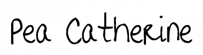
A playful, handwritten font with a casual and informal style.
![Pea Catherine Frei Schriftart Herunterladen]() Herunterladen 224 Downloads@WebFont
Herunterladen 224 Downloads@WebFont -
![SirucaPictograms Frei Schriftart Herunterladen]() Herunterladen 224 Downloads@WebFont
Herunterladen 224 Downloads@WebFont -
( Fonts by nomlimofont - Personal-use only. For commercial use please contact owner. )
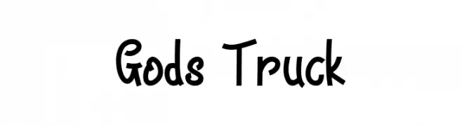
A bold, playful handwritten font with a dynamic and energetic style.
![Gods Truck Frei Schriftart Herunterladen]() Herunterladen 224 Downloads@WebFont
Herunterladen 224 Downloads@WebFont -
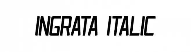
![Ingrata Italic Frei Schriftart Herunterladen]() Herunterladen 224 Downloads@WebFont
Herunterladen 224 Downloads@WebFont


Welche Schriften sind gerade am populärsten?
Poppins, Roboto, Montserrat, Open Sans und Lato sind wegen ihrer klaren Formen und breiten Einsetzbarkeit sehr gefragt – von Markenauftritt über Landingpages bis hin zu Postern.
Welche Fonts eignen sich für Logos?
Geometrische Sans‑Serifs (z. B. Poppins, Familien im Gotham‑Stil) sind ein häufiger Griff für sauberes, skalierbares Branding. Für eine persönlichere Note bleiben Scripts und Handschrift‑Stile beliebt. Kombinieren Sie einen prägnanten Headline‑Font mit einer neutralen Brotschrift für Wiedererkennung und Harmonie.
Wie oft wird die Top‑Liste aktualisiert?
Regelmäßig – basierend auf realen Downloads und Interaktionen. Schauen Sie öfter vorbei, um aufstrebende Favoriten früh zu entdecken.
💡 Tipp: Seite bookmarken – Trends wechseln schnell, und heutige Top‑Schriften inspirieren morgen vielleicht das Rebranding.