Willkommen bei den Top‑Schriften – hier treffen Beliebtheit und Qualität aufeinander. Das sind die in diesem Jahr am häufigsten heruntergeladenen und genutzten Fonts. Wenn Sie sichere Optionen für Logo, Web oder Social suchen, starten Sie hier.
Jeder Top‑Font überzeugt durch Balance, Lesbarkeit und Vielseitigkeit. Sie finden moderne Sans‑Serifs, elegante Scripts, Vintage‑Serifs und minimalistische Displays.
-
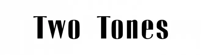
( Fonts by Emeralda Noor Achni Halilintar - emeraldanoorachni.tk )
A bold, two-tone font with striking contrast and modern elegance.
 Herunterladen 1040 Downloads@WebFont
 -
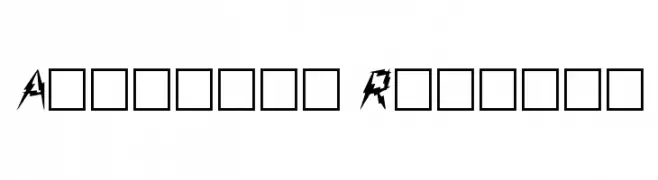
( Fonts by Rick Mueller )
A bold, retro font with playful curves and a 1960s vibe.
![Sixties Frei Schriftart Herunterladen]() Herunterladen 1040 Downloads@WebFont
Herunterladen 1040 Downloads@WebFont -
![Julius Frei Schriftart Herunterladen]() Herunterladen 1040 Downloads@WebFont
Herunterladen 1040 Downloads@WebFont -
( Fonts by David Rakowski )
A bold, jagged font with sharp, dynamic angles and an energetic appearance.
![Aarcover Regular Frei Schriftart Herunterladen]() Herunterladen 1040 Downloads@WebFont
Herunterladen 1040 Downloads@WebFont -
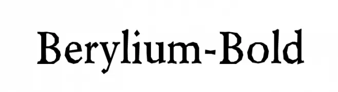
( Fonts by www.typodermicfonts.com - Ray Larabie )
A bold serif font with high contrast and angular serifs, offering a classic yet impactful style.
![Berylium-Bold Frei Schriftart Herunterladen]() Herunterladen 1040 Downloads@WebFont
Herunterladen 1040 Downloads@WebFont -
-
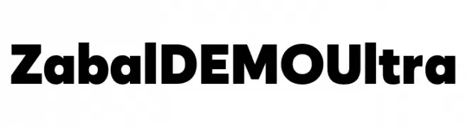
( Fonts by Font People - Personal-use only. For commercial use please contact owner. )
A bold, ultra-heavy geometric sans-serif font with a modern and assertive style.
![Zabal DEMO Ultra Frei Schriftart Herunterladen]() Herunterladen 1039 Downloads@WebFont
Herunterladen 1039 Downloads@WebFont -
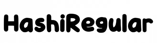
( Fonts by Jipartsy Jips )
A playful, rounded font with bold, thick strokes and smooth curves.
![Hashi Regular Frei Schriftart Herunterladen]() Herunterladen 1039 Downloads@WebFont
Herunterladen 1039 Downloads@WebFont -
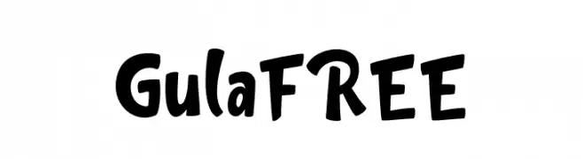
( Fonts by InspiraType )
A playful, bold, and hand-drawn font with a whimsical and energetic style.
![GulaFREE Frei Schriftart Herunterladen]() Herunterladen 1039 Downloads@WebFont
Herunterladen 1039 Downloads@WebFont -
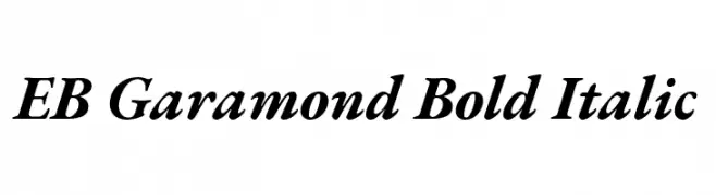
( Copyright 2017 The EB Garamond Project Authors (https://github.com/octaviopardo/EBGaramond12) )
A bold, italic serif font with a classic and elegant style.
![EB Garamond Bold Italic Frei Schriftart Herunterladen]() Herunterladen 1039 Downloads@WebFont
Herunterladen 1039 Downloads@WebFont -
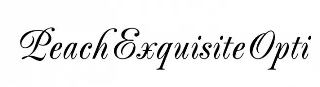
( Fonts by Castcraft Software - OPTI Fonts Archive - opti.netii.net - Personal-use only. For commercial use please contact owner. )
An elegant cursive font with flowing lines and high contrast.
![PeachExquisiteOpti Frei Schriftart Herunterladen]() Herunterladen 1039 Downloads@WebFont
Herunterladen 1039 Downloads@WebFont


Welche Schriften sind gerade am populärsten?
Poppins, Roboto, Montserrat, Open Sans und Lato sind wegen ihrer klaren Formen und breiten Einsetzbarkeit sehr gefragt – von Markenauftritt über Landingpages bis hin zu Postern.
Welche Fonts eignen sich für Logos?
Geometrische Sans‑Serifs (z. B. Poppins, Familien im Gotham‑Stil) sind ein häufiger Griff für sauberes, skalierbares Branding. Für eine persönlichere Note bleiben Scripts und Handschrift‑Stile beliebt. Kombinieren Sie einen prägnanten Headline‑Font mit einer neutralen Brotschrift für Wiedererkennung und Harmonie.
Wie oft wird die Top‑Liste aktualisiert?
Regelmäßig – basierend auf realen Downloads und Interaktionen. Schauen Sie öfter vorbei, um aufstrebende Favoriten früh zu entdecken.
💡 Tipp: Seite bookmarken – Trends wechseln schnell, und heutige Top‑Schriften inspirieren morgen vielleicht das Rebranding.