Willkommen bei den Top‑Schriften – hier treffen Beliebtheit und Qualität aufeinander. Das sind die in diesem Jahr am häufigsten heruntergeladenen und genutzten Fonts. Wenn Sie sichere Optionen für Logo, Web oder Social suchen, starten Sie hier.
Jeder Top‑Font überzeugt durch Balance, Lesbarkeit und Vielseitigkeit. Sie finden moderne Sans‑Serifs, elegante Scripts, Vintage‑Serifs und minimalistische Displays.
-
 Herunterladen 1036 Downloads@WebFont
 -
![King Richard Frei Schriftart Herunterladen]() Herunterladen 1036 Downloads@WebFont
Herunterladen 1036 Downloads@WebFont -
( Fonts by www.fontalicious.com )
A bold, playful handwritten font with smooth, rounded characters.
![Juice Frei Schriftart Herunterladen]() Herunterladen 1036 Downloads@WebFont
Herunterladen 1036 Downloads@WebFont -
( Fonts by Michel Martinsson - lunchtype.com - Personal-use only. For commercial use please contact owner. )
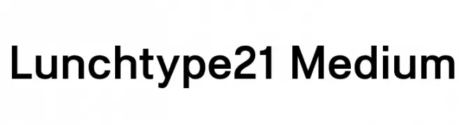
A modern, medium-weight sans-serif font with clean lines and balanced proportions.
![Lunchtype21 Medium Frei Schriftart Herunterladen]() Herunterladen 1035 Downloads@WebFont
Herunterladen 1035 Downloads@WebFont -
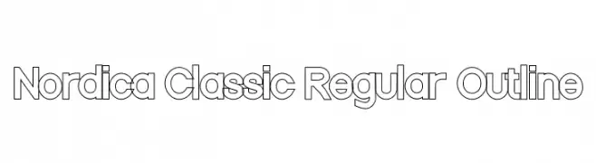
![Nordica Classic Regular Outline Frei Schriftart Herunterladen]() Herunterladen 1035 Downloads@WebFont
Herunterladen 1035 Downloads@WebFont -
-
( Fonts by Geronimo Fonts - Personal-use only. For commercial use please contact owner. )
A playful, handwritten font with a casual and dynamic style.
![Cheddar Frei Schriftart Herunterladen]() Herunterladen 1035 Downloads@WebFont
Herunterladen 1035 Downloads@WebFont -
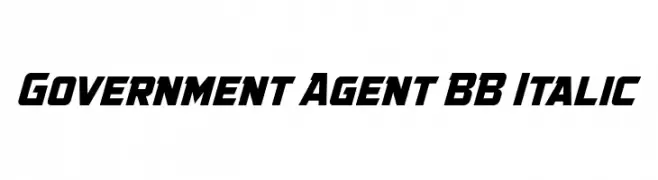
( Fonts by www.blambot.com )
A bold, italicized font with a dynamic, angled design and high contrast.
![Government Agent BB Italic Frei Schriftart Herunterladen]() Herunterladen 1035 Downloads@WebFont
Herunterladen 1035 Downloads@WebFont -
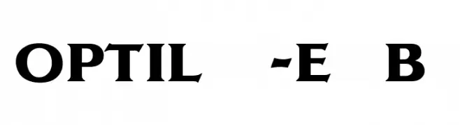
( Fonts by Castcraft Software - opti.netii.net - check the website before use )
A bold, serif font with strong strokes and sharp serifs, perfect for impactful designs.
![OPTILagoon-ExtraBold Frei Schriftart Herunterladen]() Herunterladen 1035 Downloads@WebFont
Herunterladen 1035 Downloads@WebFont -
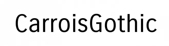
( Copyright (c) 2011 by Ralph du Carrois, with Reserved Font Name 'Carrois' )
A modern, geometric sans-serif font with uniform strokes and high legibility.
![CarroisGothic Frei Schriftart Herunterladen]() Herunterladen 1035 Downloads@WebFont
Herunterladen 1035 Downloads@WebFont -
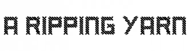
( Fonts by Mike Wolf )
A bold, textured font with a woven pattern, ideal for dynamic and modern designs.
![a ripping yarn Frei Schriftart Herunterladen]() Herunterladen 1035 Downloads@WebFont
Herunterladen 1035 Downloads@WebFont


Welche Schriften sind gerade am populärsten?
Poppins, Roboto, Montserrat, Open Sans und Lato sind wegen ihrer klaren Formen und breiten Einsetzbarkeit sehr gefragt – von Markenauftritt über Landingpages bis hin zu Postern.
Welche Fonts eignen sich für Logos?
Geometrische Sans‑Serifs (z. B. Poppins, Familien im Gotham‑Stil) sind ein häufiger Griff für sauberes, skalierbares Branding. Für eine persönlichere Note bleiben Scripts und Handschrift‑Stile beliebt. Kombinieren Sie einen prägnanten Headline‑Font mit einer neutralen Brotschrift für Wiedererkennung und Harmonie.
Wie oft wird die Top‑Liste aktualisiert?
Regelmäßig – basierend auf realen Downloads und Interaktionen. Schauen Sie öfter vorbei, um aufstrebende Favoriten früh zu entdecken.
💡 Tipp: Seite bookmarken – Trends wechseln schnell, und heutige Top‑Schriften inspirieren morgen vielleicht das Rebranding.