Willkommen bei den Top‑Schriften – hier treffen Beliebtheit und Qualität aufeinander. Das sind die in diesem Jahr am häufigsten heruntergeladenen und genutzten Fonts. Wenn Sie sichere Optionen für Logo, Web oder Social suchen, starten Sie hier.
Jeder Top‑Font überzeugt durch Balance, Lesbarkeit und Vielseitigkeit. Sie finden moderne Sans‑Serifs, elegante Scripts, Vintage‑Serifs und minimalistische Displays.
-
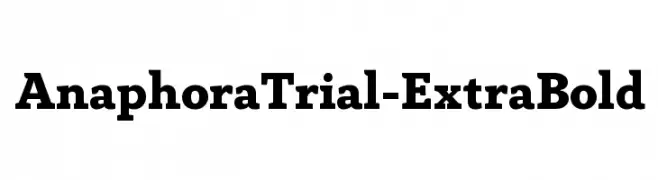
( Zetafonts - www.zetafonts.com )
A bold and robust font with strong, thick strokes for a confident and authoritative look.
 Herunterladen 1026 Downloads@WebFont
 -
Schriftart von muralman. For commercial use please contact the owner.
![Ampad Solid Regular Frei Schriftart Herunterladen]() Herunterladen 1026 Downloads@WebFont
Herunterladen 1026 Downloads@WebFont -
![Sex & Candy Frei Schriftart Herunterladen]() Herunterladen 1026 Downloads@WebFont
Herunterladen 1026 Downloads@WebFont -
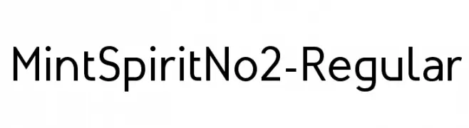
( Fonts by Arkandis Digital Foundry )
A modern, geometric sans-serif font with clean lines and excellent readability.
![MintSpiritNo2-Regular Frei Schriftart Herunterladen]() Herunterladen 1026 Downloads@WebFont
Herunterladen 1026 Downloads@WebFont -
![Tengwar Annatar Frei Schriftart Herunterladen]() Herunterladen 1026 Downloads@WebFont
Herunterladen 1026 Downloads@WebFont -
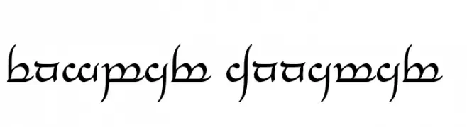
( Fonts by Christopher Hansen )
A bold, hand-drawn font with dynamic, irregular strokes for a rebellious look.
![Raiderz Frei Schriftart Herunterladen]() Herunterladen 1026 Downloads@WebFont
Herunterladen 1026 Downloads@WebFont -
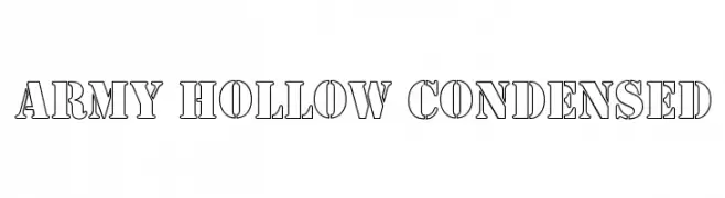
![Army Hollow Condensed Frei Schriftart Herunterladen]() Herunterladen 1026 Downloads
Herunterladen 1026 Downloads -
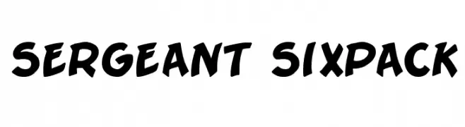
( Fonts by Nate Piekos - www.blambot.com )
A bold, playful font with thick, rounded strokes and a dynamic, hand-drawn style.
![Sergeant SixPack Frei Schriftart Herunterladen]() Herunterladen 1026 Downloads@WebFont
Herunterladen 1026 Downloads@WebFont -
( Fonts by Digi Temply - Personal-use only. For commercial use please contact owner. )
A classic serif font with high contrast and elegant serifs, perfect for sophisticated designs.
![Afterglow Regular Frei Schriftart Herunterladen]() Herunterladen 1025 Downloads@WebFont
Herunterladen 1025 Downloads@WebFont -
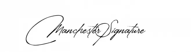
( Fonts by Yadhie Setiawan - typelinestudio.com - Personal-use only. For commercial use please contact owner. )
An elegant, cursive font with a signature-like flow.
![Manchester Signature Frei Schriftart Herunterladen]() Herunterladen 1025 Downloads@WebFont
Herunterladen 1025 Downloads@WebFont


Welche Schriften sind gerade am populärsten?
Poppins, Roboto, Montserrat, Open Sans und Lato sind wegen ihrer klaren Formen und breiten Einsetzbarkeit sehr gefragt – von Markenauftritt über Landingpages bis hin zu Postern.
Welche Fonts eignen sich für Logos?
Geometrische Sans‑Serifs (z. B. Poppins, Familien im Gotham‑Stil) sind ein häufiger Griff für sauberes, skalierbares Branding. Für eine persönlichere Note bleiben Scripts und Handschrift‑Stile beliebt. Kombinieren Sie einen prägnanten Headline‑Font mit einer neutralen Brotschrift für Wiedererkennung und Harmonie.
Wie oft wird die Top‑Liste aktualisiert?
Regelmäßig – basierend auf realen Downloads und Interaktionen. Schauen Sie öfter vorbei, um aufstrebende Favoriten früh zu entdecken.
💡 Tipp: Seite bookmarken – Trends wechseln schnell, und heutige Top‑Schriften inspirieren morgen vielleicht das Rebranding.