Willkommen bei den Top‑Schriften – hier treffen Beliebtheit und Qualität aufeinander. Das sind die in diesem Jahr am häufigsten heruntergeladenen und genutzten Fonts. Wenn Sie sichere Optionen für Logo, Web oder Social suchen, starten Sie hier.
Jeder Top‑Font überzeugt durch Balance, Lesbarkeit und Vielseitigkeit. Sie finden moderne Sans‑Serifs, elegante Scripts, Vintage‑Serifs und minimalistische Displays.
-
( Fonts by Dumadi Studios )
A bold, rounded font with a playful and energetic style.
 Herunterladen 1023 Downloads@WebFont
 -
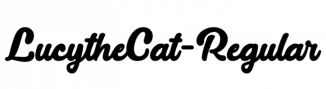
( Misti's Fonts - mistifonts.com/ )
A bold, cursive font with a playful and flowing script style.
![LucytheCat-Regular Frei Schriftart Herunterladen]() Herunterladen 1023 Downloads@WebFont
Herunterladen 1023 Downloads@WebFont -
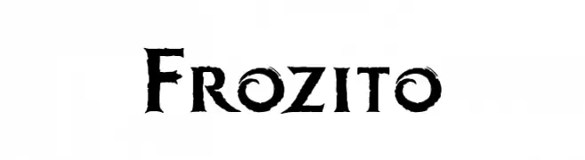
( JoannaVu - ioannaladopoulou.com )
A bold, gothic-style font with sharp edges and a distressed texture.
![Frozito Frei Schriftart Herunterladen]() Herunterladen 1023 Downloads@WebFont
Herunterladen 1023 Downloads@WebFont -
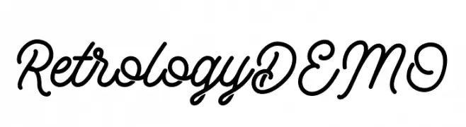
( Letterhend Studio - Hendry Juanda - creativemarket.com/letterhend )
A flowing, cursive font with elegant, connected characters.
![RetrologyDEMO Frei Schriftart Herunterladen]() Herunterladen 1023 Downloads@WebFont
Herunterladen 1023 Downloads@WebFont -
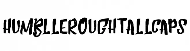
( Dirtyline Studio - Hendra Maulia - creativemarket.com/h_m )
A bold, hand-drawn font with a rough, textured appearance.
![HumblleRoughtAllCaps Frei Schriftart Herunterladen]() Herunterladen 1023 Downloads@WebFont
Herunterladen 1023 Downloads@WebFont -
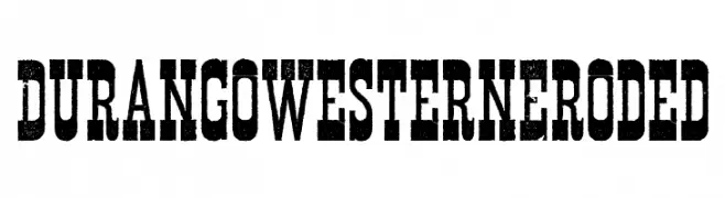
-
![Durango Western Eroded Frei Schriftart Herunterladen]() Herunterladen 1023 Downloads@WebFont
Herunterladen 1023 Downloads@WebFont -
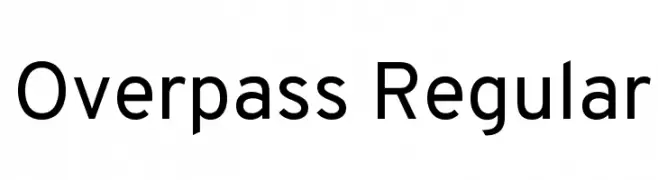
( Copyright (c) 2016 by Red Hat, Inc. All rights reserved. )
A modern, geometric sans-serif font with uniform stroke widths.
![Overpass Regular Frei Schriftart Herunterladen]() Herunterladen 1023 Downloads@WebFont
Herunterladen 1023 Downloads@WebFont -
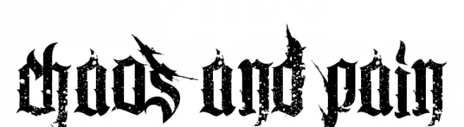
( Fonts by Chris Vile - fontmonger.com - Personal-use only. For commercial use please contact owner. )
A bold, distressed blackletter font with a gothic and textured style.
![Chaos and Pain Frei Schriftart Herunterladen]() Herunterladen 1023 Downloads@WebFont
Herunterladen 1023 Downloads@WebFont -
![Bonnie Frei Schriftart Herunterladen]() Herunterladen 1023 Downloads@WebFont
Herunterladen 1023 Downloads@WebFont -
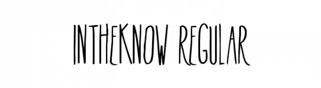
( Fonts by Alex Tomlinson - Skyhaven Fonts - shfonts.com )
A tall, narrow, and playful font with consistent stroke width.
![InTheKnow-Regular Frei Schriftart Herunterladen]() Herunterladen 1023 Downloads@WebFont
Herunterladen 1023 Downloads@WebFont

Welche Schriften sind gerade am populärsten?
Poppins, Roboto, Montserrat, Open Sans und Lato sind wegen ihrer klaren Formen und breiten Einsetzbarkeit sehr gefragt – von Markenauftritt über Landingpages bis hin zu Postern.
Welche Fonts eignen sich für Logos?
Geometrische Sans‑Serifs (z. B. Poppins, Familien im Gotham‑Stil) sind ein häufiger Griff für sauberes, skalierbares Branding. Für eine persönlichere Note bleiben Scripts und Handschrift‑Stile beliebt. Kombinieren Sie einen prägnanten Headline‑Font mit einer neutralen Brotschrift für Wiedererkennung und Harmonie.
Wie oft wird die Top‑Liste aktualisiert?
Regelmäßig – basierend auf realen Downloads und Interaktionen. Schauen Sie öfter vorbei, um aufstrebende Favoriten früh zu entdecken.
💡 Tipp: Seite bookmarken – Trends wechseln schnell, und heutige Top‑Schriften inspirieren morgen vielleicht das Rebranding.