Willkommen bei den Top‑Schriften – hier treffen Beliebtheit und Qualität aufeinander. Das sind die in diesem Jahr am häufigsten heruntergeladenen und genutzten Fonts. Wenn Sie sichere Optionen für Logo, Web oder Social suchen, starten Sie hier.
Jeder Top‑Font überzeugt durch Balance, Lesbarkeit und Vielseitigkeit. Sie finden moderne Sans‑Serifs, elegante Scripts, Vintage‑Serifs und minimalistische Displays.
-
Schriftart von spideraysfonts. For commercial use please contact the owner.
 Herunterladen 1011 Downloads@WebFont
 -
( Fonts by David Kerkhoff - www.hanodedphotography.com )
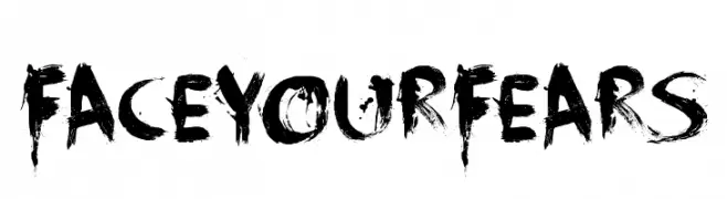
A bold, distressed font with a brush-like texture and chaotic aesthetic.
![FaceYourFears Frei Schriftart Herunterladen]() Herunterladen 1011 Downloads@WebFont
Herunterladen 1011 Downloads@WebFont -
( Free for a personal use. For a commercial use please visit www.kevinandamanda.com )
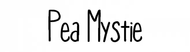
A playful, hand-drawn font with a whimsical and informal style.
![Pea Mystie Frei Schriftart Herunterladen]() Herunterladen 1011 Downloads@WebFont
Herunterladen 1011 Downloads@WebFont -
( K-Type Freebies (Free for Personal Use Only) FROM http://www.k-type.com )
A bold, artistic font with sharp, angular strokes and dynamic flair.
![Ming Frei Schriftart Herunterladen]() Herunterladen 1011 Downloads@WebFont
Herunterladen 1011 Downloads@WebFont -
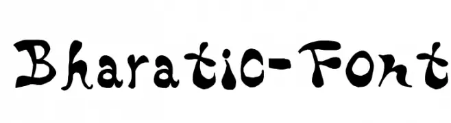
![Bharatic-Font Frei Schriftart Herunterladen]() Herunterladen 1011 Downloads@WebFont
Herunterladen 1011 Downloads@WebFont -
-
( Fonts by Apostrophic Lab )
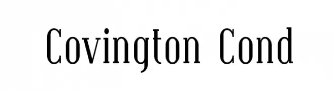
A classic serif font with a condensed style and medium contrast, ideal for elegant designs.
![Covington Cond Frei Schriftart Herunterladen]() Herunterladen 1011 Downloads@WebFont
Herunterladen 1011 Downloads@WebFont -
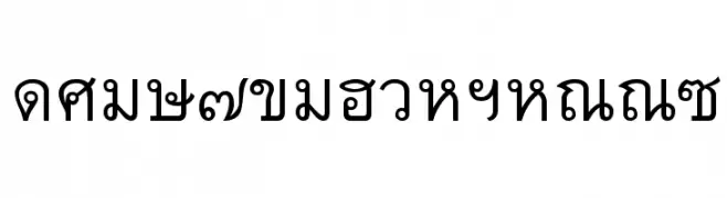
![Thai7BangkokSSK Frei Schriftart Herunterladen]() Herunterladen 1011 Downloads@WebFont
Herunterladen 1011 Downloads@WebFont -
![Savage Sausage Frei Schriftart Herunterladen]() Herunterladen 1011 Downloads@WebFont
Herunterladen 1011 Downloads@WebFont -
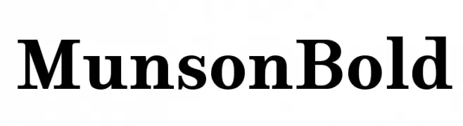
( PJM Homebrew Fonts - pauljmiller.wordpress.com/ )
A bold serif font with strong, classic lines and pronounced serifs.
![Munson Bold Frei Schriftart Herunterladen]() Herunterladen 1010 Downloads@WebFont
Herunterladen 1010 Downloads@WebFont -
( Fonts by prescottdesignshop.com - Personal-use only. For commercial use please contact owner. )
A modern, semi-bold font with clean lines and slight stroke contrast.
![PassionSansPDbi-SemiBoldSmallCaps Frei Schriftart Herunterladen]() Herunterladen 1010 Downloads@WebFont
Herunterladen 1010 Downloads@WebFont


Welche Schriften sind gerade am populärsten?
Poppins, Roboto, Montserrat, Open Sans und Lato sind wegen ihrer klaren Formen und breiten Einsetzbarkeit sehr gefragt – von Markenauftritt über Landingpages bis hin zu Postern.
Welche Fonts eignen sich für Logos?
Geometrische Sans‑Serifs (z. B. Poppins, Familien im Gotham‑Stil) sind ein häufiger Griff für sauberes, skalierbares Branding. Für eine persönlichere Note bleiben Scripts und Handschrift‑Stile beliebt. Kombinieren Sie einen prägnanten Headline‑Font mit einer neutralen Brotschrift für Wiedererkennung und Harmonie.
Wie oft wird die Top‑Liste aktualisiert?
Regelmäßig – basierend auf realen Downloads und Interaktionen. Schauen Sie öfter vorbei, um aufstrebende Favoriten früh zu entdecken.
💡 Tipp: Seite bookmarken – Trends wechseln schnell, und heutige Top‑Schriften inspirieren morgen vielleicht das Rebranding.