Willkommen bei den Top‑Schriften – hier treffen Beliebtheit und Qualität aufeinander. Das sind die in diesem Jahr am häufigsten heruntergeladenen und genutzten Fonts. Wenn Sie sichere Optionen für Logo, Web oder Social suchen, starten Sie hier.
Jeder Top‑Font überzeugt durch Balance, Lesbarkeit und Vielseitigkeit. Sie finden moderne Sans‑Serifs, elegante Scripts, Vintage‑Serifs und minimalistische Displays.
-
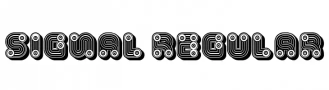
( Fonts by Vladimir Nikolic )
A bold, decorative font with intricate line work and circular patterns.
 Herunterladen 1006 Downloads@WebFont
 -
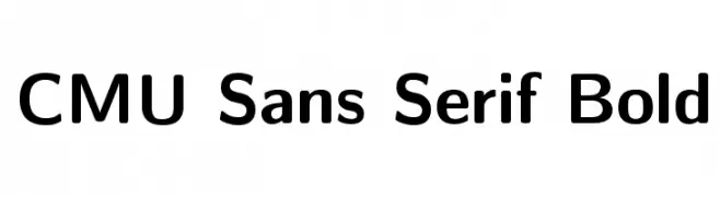
( Fonts by Donald E. Knuth - Personal-use only. For commercial use please contact owner. )
A bold, modern sans-serif typeface with clean lines and excellent legibility.
![CMU Sans Serif Bold Frei Schriftart Herunterladen]() Herunterladen 1006 Downloads@WebFont
Herunterladen 1006 Downloads@WebFont -
![BrickShapers Frei Schriftart Herunterladen]() Herunterladen 1006 Downloads@WebFont
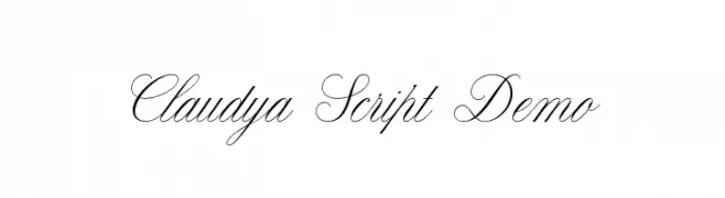
Herunterladen 1006 Downloads@WebFont -
![Claudya Script Demo Frei Schriftart Herunterladen]() Herunterladen 1006 Downloads@WebFont
Herunterladen 1006 Downloads@WebFont -
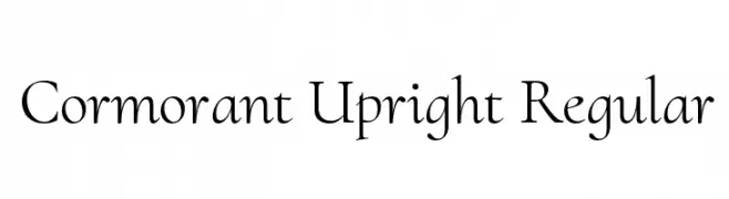
( Copyright (c) 2015, Christian Thalmann and the Cormorant Project Authors (github.com/CatharsisFonts/Cormorant) )
An elegant and sophisticated serif typeface with classic proportions.
![Cormorant Upright Regular Frei Schriftart Herunterladen]() Herunterladen 1006 Downloads@WebFont
Herunterladen 1006 Downloads@WebFont -
-
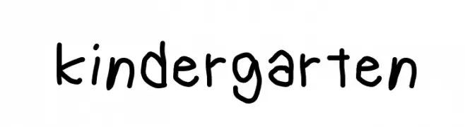
( Fonts by Geronimo Fonts - Personal-use only. For commercial use please contact owner. )
A playful, childlike font with rounded, irregular strokes.
![kindergarten Frei Schriftart Herunterladen]() Herunterladen 1006 Downloads@WebFont
Herunterladen 1006 Downloads@WebFont -
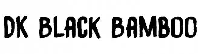
![DK Black Bamboo Frei Schriftart Herunterladen]() Herunterladen 1006 Downloads@WebFont
Herunterladen 1006 Downloads@WebFont -
( Fonts by www.blambot.com )
A bold, playful handwritten font with rounded strokes and a casual style.
![SmackAttackBB Frei Schriftart Herunterladen]() Herunterladen 1006 Downloads@WebFont
Herunterladen 1006 Downloads@WebFont -
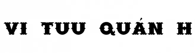
![VI Tuu Quán H Frei Schriftart Herunterladen]() Herunterladen 1006 Downloads
Herunterladen 1006 Downloads -
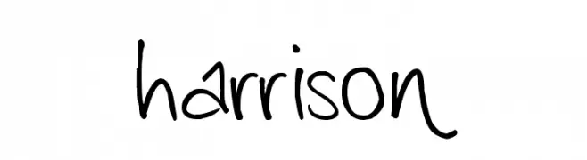
( Fonts by Andrew Harrison )
A lively and dynamic handwritten font with fluid strokes and playful tilt.
![harrison Frei Schriftart Herunterladen]() Herunterladen 1006 Downloads@WebFont
Herunterladen 1006 Downloads@WebFont


Welche Schriften sind gerade am populärsten?
Poppins, Roboto, Montserrat, Open Sans und Lato sind wegen ihrer klaren Formen und breiten Einsetzbarkeit sehr gefragt – von Markenauftritt über Landingpages bis hin zu Postern.
Welche Fonts eignen sich für Logos?
Geometrische Sans‑Serifs (z. B. Poppins, Familien im Gotham‑Stil) sind ein häufiger Griff für sauberes, skalierbares Branding. Für eine persönlichere Note bleiben Scripts und Handschrift‑Stile beliebt. Kombinieren Sie einen prägnanten Headline‑Font mit einer neutralen Brotschrift für Wiedererkennung und Harmonie.
Wie oft wird die Top‑Liste aktualisiert?
Regelmäßig – basierend auf realen Downloads und Interaktionen. Schauen Sie öfter vorbei, um aufstrebende Favoriten früh zu entdecken.
💡 Tipp: Seite bookmarken – Trends wechseln schnell, und heutige Top‑Schriften inspirieren morgen vielleicht das Rebranding.