Willkommen bei den Top‑Schriften – hier treffen Beliebtheit und Qualität aufeinander. Das sind die in diesem Jahr am häufigsten heruntergeladenen und genutzten Fonts. Wenn Sie sichere Optionen für Logo, Web oder Social suchen, starten Sie hier.
Jeder Top‑Font überzeugt durch Balance, Lesbarkeit und Vielseitigkeit. Sie finden moderne Sans‑Serifs, elegante Scripts, Vintage‑Serifs und minimalistische Displays.
-
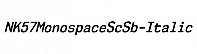
( Fonts by Typodermic Fonts )
A modern, monospaced italic font with a sleek and professional look.
 Herunterladen 209 Downloads@WebFont
 -
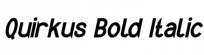
( Fonts by www.peter-wiegel.de. Personal-use only. For commercial use please contact owner. )
A bold, italicized font with a modern and energetic style.
![Quirkus Bold Italic Frei Schriftart Herunterladen]() Herunterladen 209 Downloads@WebFont
Herunterladen 209 Downloads@WebFont -
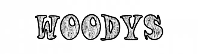
( Fonts by EvasUniqueFonts )
A playful, wood-textured decorative font with a handcrafted feel.
![Woodys Frei Schriftart Herunterladen]() Herunterladen 209 Downloads@WebFont
Herunterladen 209 Downloads@WebFont -
( Roch Art )
A playful and whimsical handwritten font with dynamic strokes.
![Berthy Frei Schriftart Herunterladen]() Herunterladen 209 Downloads@WebFont
Herunterladen 209 Downloads@WebFont -
( Fonts by Bumbayo Font Fabrik - bumbayo.blogspot.com )
A bold, Gothic-inspired font with ornate detailing and a dramatic flair.
![Grymmoire Frei Schriftart Herunterladen]() Herunterladen 209 Downloads@WebFont
Herunterladen 209 Downloads@WebFont -
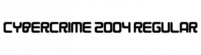
( Fonts by www.chequered.ink - Chequered Ink - Personal-use only. For commercial use please contact owner. )
A futuristic, geometric font with bold, rounded shapes and consistent stroke width.
![Cybercrime 2004 Regular Frei Schriftart Herunterladen]() Herunterladen 209 Downloads@WebFont
Herunterladen 209 Downloads@WebFont -
( Please visit www.fontsite.com before you use! )
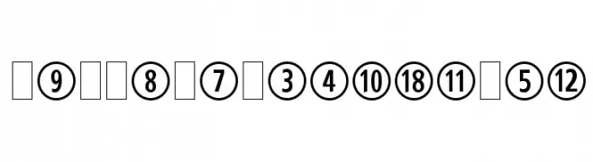
A bold numeral font enclosed in geometric shapes, offering a modern and decorative style.
![CombiNumeralsLtd Frei Schriftart Herunterladen]() Herunterladen 209 Downloads@WebFont
Herunterladen 209 Downloads@WebFont -
( Fonts by Wahyu Eka Prasetya - wepfont.com - Personal-use only. For commercial use please contact owner. )
A playful, hand-drawn font with bold, blob-like strokes.
![GATINK Frei Schriftart Herunterladen]() Herunterladen 209 Downloads@WebFont
Herunterladen 209 Downloads@WebFont -
( Fonts by www.paintblackeditions.org )
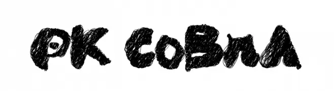
A bold, textured font with a hand-drawn, artistic style.
![PK CoBrA Frei Schriftart Herunterladen]() Herunterladen 209 Downloads@WebFont
Herunterladen 209 Downloads@WebFont -
( Fonts by Eknoji Studio )
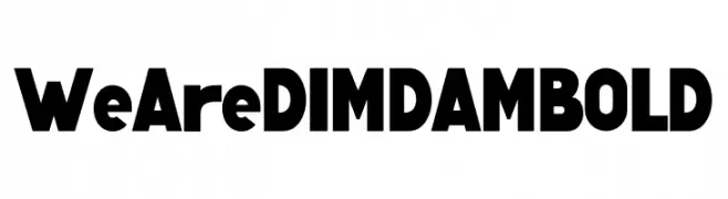
A bold, geometric sans-serif font with strong, uniform strokes.
![We Are DIMDAM BOLD Frei Schriftart Herunterladen]() Herunterladen 209 Downloads@WebFont
Herunterladen 209 Downloads@WebFont -
( Fonts by www.dcoxy.com )
A flowing, elegant cursive font with decorative flourishes.
![Lady Bohemia Frei Schriftart Herunterladen]() Herunterladen 209 Downloads@WebFont
Herunterladen 209 Downloads@WebFont -
( Fonts by Geronimo Fonts - Personal-use only. For commercial use please contact owner. )
A bold, geometric font with a modern, cinematic style.
![Cinematic Language Regular Frei Schriftart Herunterladen]() Herunterladen 209 Downloads@WebFont
Herunterladen 209 Downloads@WebFont -
( Fonts by Rantautype - Yudi Pratama Chandra - Personal-use only. For commercial use please contact owner. )
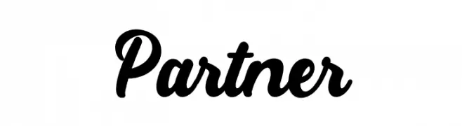
A bold, cursive font with elegant, flowing lines and a handwritten style.
![Partner Frei Schriftart Herunterladen]() Herunterladen 209 Downloads@WebFont
Herunterladen 209 Downloads@WebFont -
( Please check the owner website: http://www.billie.grosse.is-a-geek.com )
A bold, geometric font with a modern and striking design.
![Magaz Bold Frei Schriftart Herunterladen]() Herunterladen 209 Downloads@WebFont
Herunterladen 209 Downloads@WebFont -
( Fonts by Peter Wiegel - www.peter-wiegel.de - Personal-use only. For commercial use please contact owner. )
A classic monospaced font with a clean, structured design.
![Erica Type Regular Frei Schriftart Herunterladen]() Herunterladen 209 Downloads@WebFont
Herunterladen 209 Downloads@WebFont -
( Fonts by Daniel Zadorozny - www.iconian.com - Free for personal use )
A bold, italicized font with a futuristic and dynamic design.
![Quark Storm Academy Italic Frei Schriftart Herunterladen]() Herunterladen 209 Downloads@WebFont
Herunterladen 209 Downloads@WebFont -
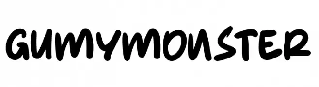
( Fonts by Kong Font )
A playful, bold handwritten font with rounded edges and a casual style.
![Gumy Monster Frei Schriftart Herunterladen]() Herunterladen 209 Downloads@WebFont
Herunterladen 209 Downloads@WebFont -
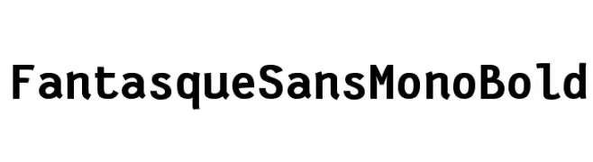
( Fonts by Jany Belluz - Personal-use only. For commercial use please contact owner. )
A bold, monospaced font with a playful and modern aesthetic.
![Fantasque Sans Mono Bold Frei Schriftart Herunterladen]() Herunterladen 209 Downloads@WebFont
Herunterladen 209 Downloads@WebFont -
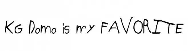
( Fonts by www.kimberlygeswein.com - Kimberly Geswein )
A playful, informal handwritten font with dynamic strokes and quirky character designs.
![KG Domo is my FAVORITE Frei Schriftart Herunterladen]() Herunterladen 209 Downloads@WebFont
Herunterladen 209 Downloads@WebFont -
( Fonts by Paul Lloyd )
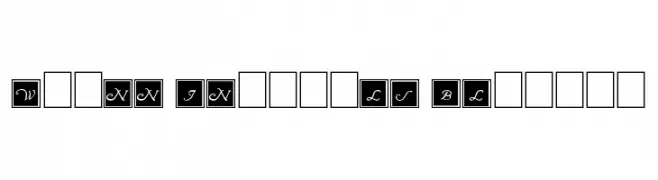
A decorative script font with uppercase letters in square blocks, offering a classic and elegant style.
![Wrenn Initials Blocked Frei Schriftart Herunterladen]() Herunterladen 209 Downloads@WebFont
Herunterladen 209 Downloads@WebFont -
( Fonts by wep - Wahyu Eka Prasetya - Personal-use only. For commercial use please contact owner. )
A bold, expressive handwritten font with dynamic strokes.
![Dimana Frei Schriftart Herunterladen]() Herunterladen 209 Downloads@WebFont
Herunterladen 209 Downloads@WebFont -
( Fonts by Luedecke Design Font Co. - ldfonts.weebly.com )
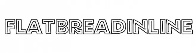
A bold, outlined font with a modern and playful aesthetic.
![FlatBreadInline Frei Schriftart Herunterladen]() Herunterladen 209 Downloads@WebFont
Herunterladen 209 Downloads@WebFont -
( Fonts by www.typodermicfonts.com - Ray Larabie )
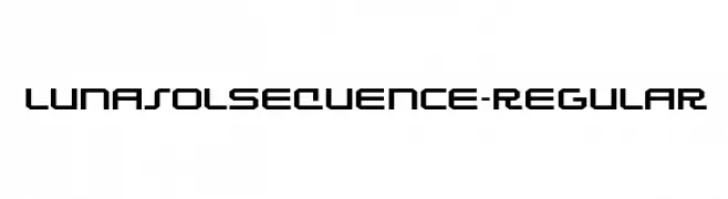
A futuristic, geometric font with bold, angular lines and a digital aesthetic.
![LunasolSequence-Regular Frei Schriftart Herunterladen]() Herunterladen 209 Downloads@WebFont
Herunterladen 209 Downloads@WebFont -
( Fonts by www.typodermicfonts.com - Ray Larabie )
A bold, geometric font with a futuristic and cohesive design.
![CharlesinCharge-Regular Frei Schriftart Herunterladen]() Herunterladen 209 Downloads@WebFont
Herunterladen 209 Downloads@WebFont -
( Fonts by Jecko Development - www.jeckodevelopment.com )
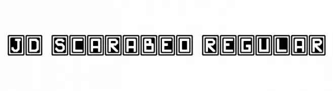
A bold, geometric font with characters enclosed in square borders, offering a modern and striking appearance.
![JD Scarabeo Regular Frei Schriftart Herunterladen]() Herunterladen 209 Downloads@WebFont
Herunterladen 209 Downloads@WebFont -
![Twister Fusion Frei Schriftart Herunterladen]() Herunterladen 209 Downloads@WebFont
Herunterladen 209 Downloads@WebFont -
![ManiacKt Frei Schriftart Herunterladen]() Herunterladen 209 Downloads@WebFont
Herunterladen 209 Downloads@WebFont -
![Shattered Pixels Frei Schriftart Herunterladen]() Herunterladen 209 Downloads@WebFont
Herunterladen 209 Downloads@WebFont -
![bubbly limit Frei Schriftart Herunterladen]() Herunterladen 209 Downloads@WebFont
Herunterladen 209 Downloads@WebFont -
Schriftart von NicholasJudy456. For commercial use please contact the owner.
( Here's More of the House Fonts )
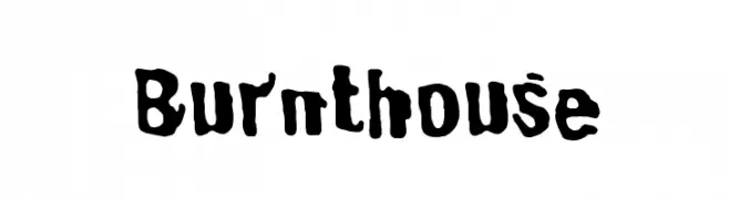
A bold, rugged, hand-drawn style with uneven edges.
![Burnthouse Frei Schriftart Herunterladen]() Herunterladen 209 Downloads@WebFont
Herunterladen 209 Downloads@WebFont -
Schriftart von danny91194. For commercial use please contact the owner.
( tricky )
Abstract, geometric design with bold lines and sharp angles.
![sabotage drawing Frei Schriftart Herunterladen]() Herunterladen 209 Downloads@WebFont
Herunterladen 209 Downloads@WebFont -
( Fonts by Fira Sans original fonts by bBox Type GmbH, Carrois Corporate GbR, & Edenspiekermann AG / Changes by Cristiano Sobral - Personal-use only. For commercial use please contact owner. )
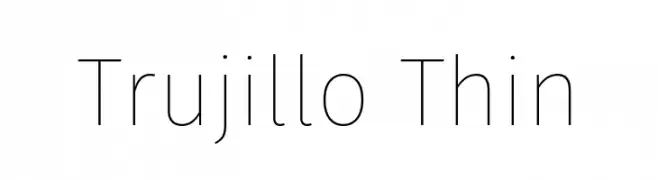
A sleek, modern font with thin, elegant strokes and a minimalistic design.
![Trujillo Thin Frei Schriftart Herunterladen]() Herunterladen 209 Downloads@WebFont
Herunterladen 209 Downloads@WebFont -
( Typodermic Fonts - Ray Larabie - www.typodermicfonts.com/ )
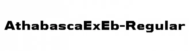
A bold, geometric font with a strong, modern presence.
![AthabascaExEb-Regular Frei Schriftart Herunterladen]() Herunterladen 209 Downloads@WebFont
Herunterladen 209 Downloads@WebFont -
![WarnSymbols4 Frei Schriftart Herunterladen]() Herunterladen 209 Downloads@WebFont
Herunterladen 209 Downloads@WebFont -
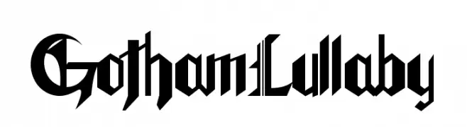
![GothamLullaby Frei Schriftart Herunterladen]() Herunterladen 209 Downloads@WebFont
Herunterladen 209 Downloads@WebFont


Welche Schriften sind gerade am populärsten?
Poppins, Roboto, Montserrat, Open Sans und Lato sind wegen ihrer klaren Formen und breiten Einsetzbarkeit sehr gefragt – von Markenauftritt über Landingpages bis hin zu Postern.
Welche Fonts eignen sich für Logos?
Geometrische Sans‑Serifs (z. B. Poppins, Familien im Gotham‑Stil) sind ein häufiger Griff für sauberes, skalierbares Branding. Für eine persönlichere Note bleiben Scripts und Handschrift‑Stile beliebt. Kombinieren Sie einen prägnanten Headline‑Font mit einer neutralen Brotschrift für Wiedererkennung und Harmonie.
Wie oft wird die Top‑Liste aktualisiert?
Regelmäßig – basierend auf realen Downloads und Interaktionen. Schauen Sie öfter vorbei, um aufstrebende Favoriten früh zu entdecken.
💡 Tipp: Seite bookmarken – Trends wechseln schnell, und heutige Top‑Schriften inspirieren morgen vielleicht das Rebranding.