Willkommen bei den Top‑Schriften – hier treffen Beliebtheit und Qualität aufeinander. Das sind die in diesem Jahr am häufigsten heruntergeladenen und genutzten Fonts. Wenn Sie sichere Optionen für Logo, Web oder Social suchen, starten Sie hier.
Jeder Top‑Font überzeugt durch Balance, Lesbarkeit und Vielseitigkeit. Sie finden moderne Sans‑Serifs, elegante Scripts, Vintage‑Serifs und minimalistische Displays.
-
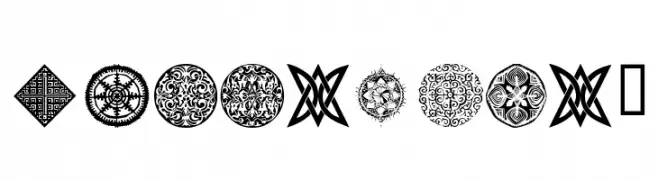
( Fonts by Manfred Klein. Free for private and charity use. Free for commercial with donation to organizations )
A decorative collection of symbols inspired by traditional African artifacts.
 Herunterladen 208 Downloads@WebFont
 -
( Fonts by www.woodcutter.es - woodcutter Manero - Personal-use only. For commercial use please contact owner. )
A diverse collection of decorative and expressive script fonts with unique flair.
![Words Frei Schriftart Herunterladen]() Herunterladen 208 Downloads@WebFont
Herunterladen 208 Downloads@WebFont -
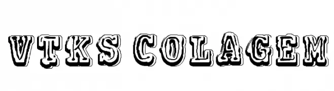
( Fonts by Douglas Vitkauskas - www.vtksdesign.com. Personal-use only. For commercial use please contact owner. )
A bold, decorative font with a vintage, three-dimensional style.
![VTKS COLAGEM Frei Schriftart Herunterladen]() Herunterladen 208 Downloads@WebFont
Herunterladen 208 Downloads@WebFont -
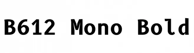
( Copyright 2012 The B612 Project Authors (https://github.com/polarsys/b612) )
A bold, monospaced font perfect for technical and coding applications.
![B612 Mono Bold Frei Schriftart Herunterladen]() Herunterladen 208 Downloads@WebFont
Herunterladen 208 Downloads@WebFont -
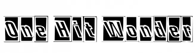
![One Hit Wonder Frei Schriftart Herunterladen]() Herunterladen 208 Downloads
Herunterladen 208 Downloads -
( Fonts by Alexa )
A bold, playful font with thick, rounded characters and a modern, decorative style.
![CHEESEBURGA Frei Schriftart Herunterladen]() Herunterladen 208 Downloads@WebFont
Herunterladen 208 Downloads@WebFont -
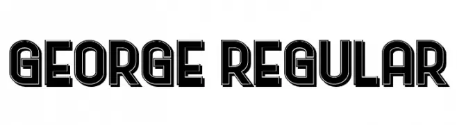
( Fonts by Vladimir Nikolic - www.creativefabrica.com/designer/vladimirnikolic/ - Personal-use only. For commercial use please contact owner. )
A bold, geometric font with outlined characters and a modern flair.
![George Regular Frei Schriftart Herunterladen]() Herunterladen 208 Downloads@WebFont
Herunterladen 208 Downloads@WebFont -
![Queen Xylophia Regular Frei Schriftart Herunterladen]() Herunterladen 208 Downloads@WebFont
Herunterladen 208 Downloads@WebFont -
( LJ Design Studios - www.ljdesignstudios.com )
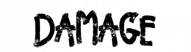
A distressed, grungy font with a bold, weathered appearance.
![Damage Frei Schriftart Herunterladen]() Herunterladen 208 Downloads@WebFont
Herunterladen 208 Downloads@WebFont -
( Fonts by Esa Nugroho )
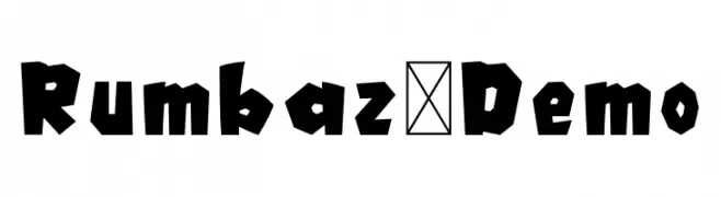
A bold, angular font with a geometric and playful design.
![Rumbaz-Demo Frei Schriftart Herunterladen]() Herunterladen 208 Downloads@WebFont
Herunterladen 208 Downloads@WebFont -
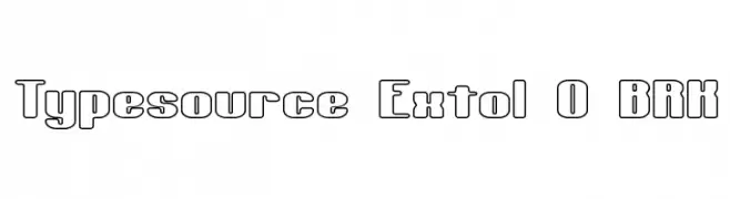
![Typesource Extol O BRK Frei Schriftart Herunterladen]() Herunterladen 208 Downloads@WebFont
Herunterladen 208 Downloads@WebFont -
( LJ Design Studios - www.ljdesignstudios.com )
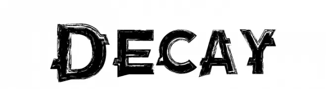
A bold, distressed font with a grunge, decayed appearance.
![Decay Frei Schriftart Herunterladen]() Herunterladen 208 Downloads@WebFont
Herunterladen 208 Downloads@WebFont -
( Fonts by junkohanhero - Personal-use only. For commercial use please contact owner. )
A bold, playful font with rounded edges and a modern, casual style.
![Behind the surprise Frei Schriftart Herunterladen]() Herunterladen 208 Downloads@WebFont
Herunterladen 208 Downloads@WebFont -
( Fonts by Zanatlija - Personal-use only. For commercial use please contact owner. )
A barcode-style font with vertical lines representing each character.
![Another barcode font Frei Schriftart Herunterladen]() Herunterladen 208 Downloads@WebFont
Herunterladen 208 Downloads@WebFont -
( Fonts by Chris Vile - fontmonger.com - Personal-use only. For commercial use please contact owner. )
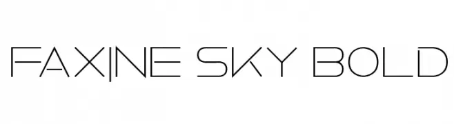
A sleek, modern font with geometric elements and a futuristic feel.
![Faxine Sky Bold Frei Schriftart Herunterladen]() Herunterladen 208 Downloads@WebFont
Herunterladen 208 Downloads@WebFont -
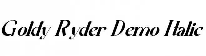
( Fonts by Edric Studio - Personal-use only. For commercial use please contact owner. )
An elegant italic font with high contrast and a modern, sophisticated style.
![Goldy Ryder Demo Italic Frei Schriftart Herunterladen]() Herunterladen 208 Downloads@WebFont
Herunterladen 208 Downloads@WebFont -
( Fonts by Arkandis Digital Foundry )
A classic serif font with a modern touch, featuring elegant and balanced proportions.
![MekanusADFStd-Regular Frei Schriftart Herunterladen]() Herunterladen 208 Downloads@WebFont
Herunterladen 208 Downloads@WebFont -
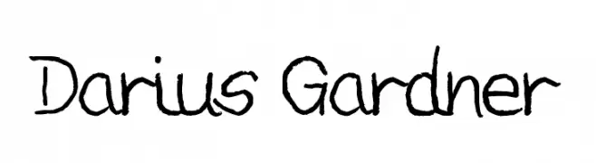
![Darius Gardner Frei Schriftart Herunterladen]() Herunterladen 208 Downloads@WebFont
Herunterladen 208 Downloads@WebFont -
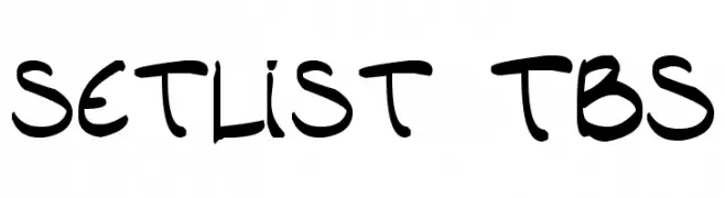
( Fonts by Press Gang Studios - Andeh Pinkard - www.pressgang-studios.com )
A bold, playful handwritten font with rounded, dynamic characters.
![setlist TBS Frei Schriftart Herunterladen]() Herunterladen 208 Downloads@WebFont
Herunterladen 208 Downloads@WebFont -
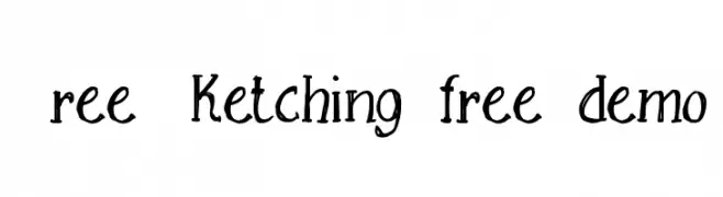
![Free Sketching_free-demo Frei Schriftart Herunterladen]() Herunterladen 208 Downloads@WebFont
Herunterladen 208 Downloads@WebFont -
( Fonts by Isa D'Aniello )
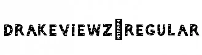
A bold, decorative font with unique embedded patterns in uppercase letters.
![DrakeViewz-Regular Frei Schriftart Herunterladen]() Herunterladen 208 Downloads@WebFont
Herunterladen 208 Downloads@WebFont -
( Fonts by Wino S Kadir - weknow - www.revolge.com/shop/weknow/ - Personal-use only. For commercial use please contact owner. )
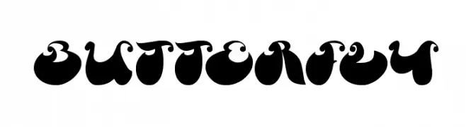
A bold, decorative font with playful, rounded characters resembling abstract shapes.
![Butterfly Frei Schriftart Herunterladen]() Herunterladen 208 Downloads@WebFont
Herunterladen 208 Downloads@WebFont -
( greenlaces.tumblr.com )
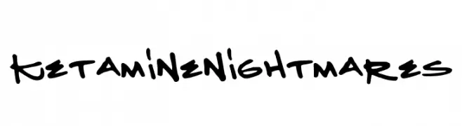
A bold, handwritten font with a playful and chaotic style.
![KetamineNightmares Frei Schriftart Herunterladen]() Herunterladen 208 Downloads@WebFont
Herunterladen 208 Downloads@WebFont -
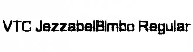
![VTC JezzabelBimbo Regular Frei Schriftart Herunterladen]() Herunterladen 208 Downloads@WebFont
Herunterladen 208 Downloads@WebFont -
( Fonts by Apostrophic Lab )
A modern, narrow, and geometric font with consistent stroke width.
![Erinal Narrow Frei Schriftart Herunterladen]() Herunterladen 208 Downloads@WebFont
Herunterladen 208 Downloads@WebFont -
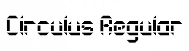
( Fonts by www.chequered.ink - Chequered Ink - Personal-use only. For commercial use please contact owner. )
A bold, geometric font with a futuristic and digital aesthetic.
![Circulus Regular Frei Schriftart Herunterladen]() Herunterladen 208 Downloads@WebFont
Herunterladen 208 Downloads@WebFont -
![wmdesigns2 Frei Schriftart Herunterladen]() Herunterladen 208 Downloads@WebFont
Herunterladen 208 Downloads@WebFont -
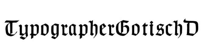
( Fonts by Dieter Steffmann )
A bold, traditional blackletter font with intricate, angular strokes.
![TypographerGotischD Frei Schriftart Herunterladen]() Herunterladen 208 Downloads@WebFont
Herunterladen 208 Downloads@WebFont -
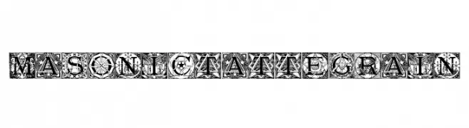
( Daxad - Adrien Daxhelet - www.daxhelet.eu/ )
An intricate, decorative font with Masonic-inspired designs and bold, artistic letters.
![Masonic Tattegrain Frei Schriftart Herunterladen]() Herunterladen 208 Downloads@WebFont
Herunterladen 208 Downloads@WebFont -
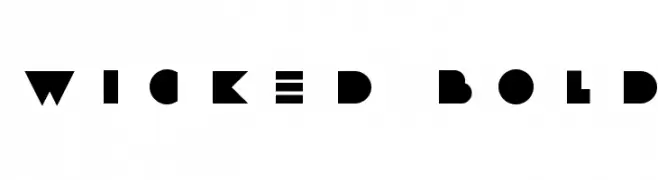
( Emile, Byeongsu Kim - panopt.net )
A bold, geometric font with a modern and edgy design.
![WICKED BOLD Frei Schriftart Herunterladen]() Herunterladen 208 Downloads@WebFont
Herunterladen 208 Downloads@WebFont -
![Gothic Pixel Regular Frei Schriftart Herunterladen]() Herunterladen 208 Downloads@WebFont
Herunterladen 208 Downloads@WebFont -
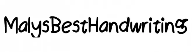
![Maly_s_Best_Handwriting Frei Schriftart Herunterladen]() Herunterladen 208 Downloads@WebFont
Herunterladen 208 Downloads@WebFont -
![zombie party Frei Schriftart Herunterladen]() Herunterladen 208 Downloads@WebFont
Herunterladen 208 Downloads@WebFont -
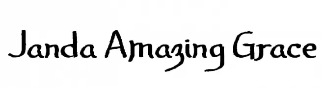
( Fonts by www.kimberlygeswein.com - Kimberly Geswein )
A playful, hand-drawn font with a whimsical and artistic style.
![Janda Amazing Grace Frei Schriftart Herunterladen]() Herunterladen 208 Downloads@WebFont
Herunterladen 208 Downloads@WebFont -
![carbonchaos fonts Frei Schriftart Herunterladen]() Herunterladen 208 Downloads@WebFont
Herunterladen 208 Downloads@WebFont


Welche Schriften sind gerade am populärsten?
Poppins, Roboto, Montserrat, Open Sans und Lato sind wegen ihrer klaren Formen und breiten Einsetzbarkeit sehr gefragt – von Markenauftritt über Landingpages bis hin zu Postern.
Welche Fonts eignen sich für Logos?
Geometrische Sans‑Serifs (z. B. Poppins, Familien im Gotham‑Stil) sind ein häufiger Griff für sauberes, skalierbares Branding. Für eine persönlichere Note bleiben Scripts und Handschrift‑Stile beliebt. Kombinieren Sie einen prägnanten Headline‑Font mit einer neutralen Brotschrift für Wiedererkennung und Harmonie.
Wie oft wird die Top‑Liste aktualisiert?
Regelmäßig – basierend auf realen Downloads und Interaktionen. Schauen Sie öfter vorbei, um aufstrebende Favoriten früh zu entdecken.
💡 Tipp: Seite bookmarken – Trends wechseln schnell, und heutige Top‑Schriften inspirieren morgen vielleicht das Rebranding.