Willkommen bei den Top‑Schriften – hier treffen Beliebtheit und Qualität aufeinander. Das sind die in diesem Jahr am häufigsten heruntergeladenen und genutzten Fonts. Wenn Sie sichere Optionen für Logo, Web oder Social suchen, starten Sie hier.
Jeder Top‑Font überzeugt durch Balance, Lesbarkeit und Vielseitigkeit. Sie finden moderne Sans‑Serifs, elegante Scripts, Vintage‑Serifs und minimalistische Displays.
-
( Marco Ballarè - www.marcoballare.com )
A bold, modern sans-serif font with geometric lines and consistent stroke width.
 Herunterladen 988 Downloads@WebFont
 -
( Fonts by Jovanny Lemonad - typetype.ru - Personal-use only. For commercial use please contact owner. )
A rugged, textured font with an inline style and vintage appeal.
![LumberjackInlineRough Frei Schriftart Herunterladen]() Herunterladen 988 Downloads@WebFont
Herunterladen 988 Downloads@WebFont -
( Fonts by Castcraft Software - OPTI Fonts Archive - opti.netii.net - Personal-use only. For commercial use please contact owner. )
A playful dotted font with a modern, decorative style.
![OPTIPinBall Frei Schriftart Herunterladen]() Herunterladen 988 Downloads@WebFont
Herunterladen 988 Downloads@WebFont -
![Glitch Frei Schriftart Herunterladen]() Herunterladen 988 Downloads@WebFont
Herunterladen 988 Downloads@WebFont -
( Fonts by www.aka-acid.com )
A bold, geometric font with a modern and futuristic style.
![Aka-AcidGR-Atomic Frei Schriftart Herunterladen]() Herunterladen 988 Downloads@WebFont
Herunterladen 988 Downloads@WebFont -
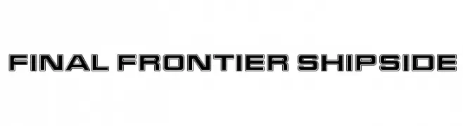
-
![Final Frontier Shipside Frei Schriftart Herunterladen]() Herunterladen 988 Downloads@WebFont
Herunterladen 988 Downloads@WebFont -
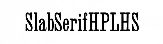
( Fonts by HPLHS Prop Fonts - Andrew H. Leman http://www.cthulhulives.org/toybox/propdocs/propfonts.html )
A bold slab serif font with strong, block-like serifs and a classic yet modern appeal.
![SlabSerifHPLHS Frei Schriftart Herunterladen]() Herunterladen 988 Downloads@WebFont
Herunterladen 988 Downloads@WebFont -
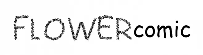
![FLOWERcomic Frei Schriftart Herunterladen]() Herunterladen 988 Downloads@WebFont
Herunterladen 988 Downloads@WebFont -
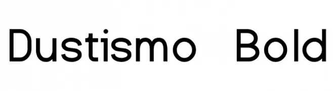
( Fonts by Dustin Norlander - www.cheapskatefonts.com )
A bold, modern sans-serif font with clean lines and balanced proportions.
![Dustismo Bold Frei Schriftart Herunterladen]() Herunterladen 988 Downloads@WebFont
Herunterladen 988 Downloads@WebFont -
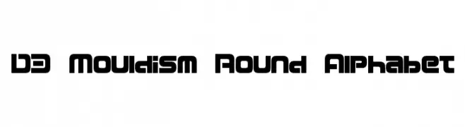
( Fonts by www.DigitalDreamDesign.net )
A bold, geometric font with rounded edges and a modern, futuristic style.
![D3 Mouldism Round Alphabet Frei Schriftart Herunterladen]() Herunterladen 988 Downloads@WebFont
Herunterladen 988 Downloads@WebFont

Welche Schriften sind gerade am populärsten?
Poppins, Roboto, Montserrat, Open Sans und Lato sind wegen ihrer klaren Formen und breiten Einsetzbarkeit sehr gefragt – von Markenauftritt über Landingpages bis hin zu Postern.
Welche Fonts eignen sich für Logos?
Geometrische Sans‑Serifs (z. B. Poppins, Familien im Gotham‑Stil) sind ein häufiger Griff für sauberes, skalierbares Branding. Für eine persönlichere Note bleiben Scripts und Handschrift‑Stile beliebt. Kombinieren Sie einen prägnanten Headline‑Font mit einer neutralen Brotschrift für Wiedererkennung und Harmonie.
Wie oft wird die Top‑Liste aktualisiert?
Regelmäßig – basierend auf realen Downloads und Interaktionen. Schauen Sie öfter vorbei, um aufstrebende Favoriten früh zu entdecken.
💡 Tipp: Seite bookmarken – Trends wechseln schnell, und heutige Top‑Schriften inspirieren morgen vielleicht das Rebranding.