Willkommen bei den Top‑Schriften – hier treffen Beliebtheit und Qualität aufeinander. Das sind die in diesem Jahr am häufigsten heruntergeladenen und genutzten Fonts. Wenn Sie sichere Optionen für Logo, Web oder Social suchen, starten Sie hier.
Jeder Top‑Font überzeugt durch Balance, Lesbarkeit und Vielseitigkeit. Sie finden moderne Sans‑Serifs, elegante Scripts, Vintage‑Serifs und minimalistische Displays.
-
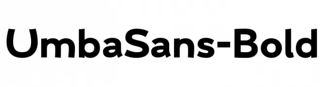
( Anita Jürgeleit - www.anitajuergeleit.de )
A bold, modern sans-serif font with clean, geometric lines.
 Herunterladen 963 Downloads@WebFont
 -
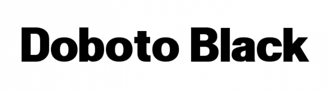
( Fonts by Dan P. Lyons - Personal-use only. For commercial use please contact owner. )
A bold, modern typeface with strong, consistent strokes and high readability.
![Doboto Black Frei Schriftart Herunterladen]() Herunterladen 963 Downloads@WebFont
Herunterladen 963 Downloads@WebFont -
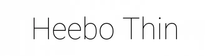
( Copyright 2014 The Heebo Project Authors. )
A modern, thin sans-serif font with a clean and minimalist design.
![Heebo Thin Frei Schriftart Herunterladen]() Herunterladen 963 Downloads@WebFont
Herunterladen 963 Downloads@WebFont -
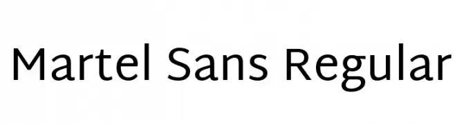
( Copyright (c) 2014 Dan Reynolds. )
A modern sans-serif font with clean lines and excellent readability.
![Martel Sans Regular Frei Schriftart Herunterladen]() Herunterladen 963 Downloads@WebFont
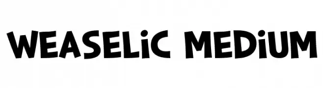
Herunterladen 963 Downloads@WebFont -
![Weaselic Medium Frei Schriftart Herunterladen]() Herunterladen 963 Downloads@WebFont
Herunterladen 963 Downloads@WebFont -
-
![NUN Frei Schriftart Herunterladen]() Herunterladen 963 Downloads@WebFont
Herunterladen 963 Downloads@WebFont -
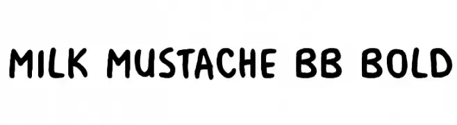
( Fonts by www.blambot.com )
A playful, bold handwritten font with rounded edges and a casual style.
![Milk Mustache BB Bold Frei Schriftart Herunterladen]() Herunterladen 963 Downloads@WebFont
Herunterladen 963 Downloads@WebFont -
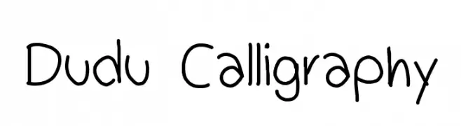
( adderou.cl )
A playful, casual handwritten font with smooth, rounded edges and irregular letterforms.
![Dudu Calligraphy Frei Schriftart Herunterladen]() Herunterladen 963 Downloads@WebFont
Herunterladen 963 Downloads@WebFont -
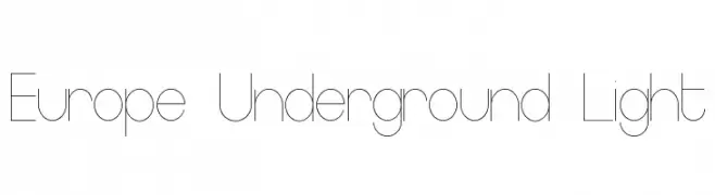
( Fonts by Mans Greback - www.mawns.com )
A sleek, modern font with thin lines and a minimalist design.
![Europe Underground Light Frei Schriftart Herunterladen]() Herunterladen 963 Downloads@WebFont
Herunterladen 963 Downloads@WebFont -
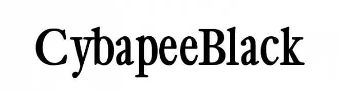
( Fonts by Manfred Klein. Free for private and charity use. Free for commercial with donation to organizations )
A bold serif font with high contrast, perfect for impactful headlines.
![CybapeeBlack Frei Schriftart Herunterladen]() Herunterladen 963 Downloads@WebFont
Herunterladen 963 Downloads@WebFont

Welche Schriften sind gerade am populärsten?
Poppins, Roboto, Montserrat, Open Sans und Lato sind wegen ihrer klaren Formen und breiten Einsetzbarkeit sehr gefragt – von Markenauftritt über Landingpages bis hin zu Postern.
Welche Fonts eignen sich für Logos?
Geometrische Sans‑Serifs (z. B. Poppins, Familien im Gotham‑Stil) sind ein häufiger Griff für sauberes, skalierbares Branding. Für eine persönlichere Note bleiben Scripts und Handschrift‑Stile beliebt. Kombinieren Sie einen prägnanten Headline‑Font mit einer neutralen Brotschrift für Wiedererkennung und Harmonie.
Wie oft wird die Top‑Liste aktualisiert?
Regelmäßig – basierend auf realen Downloads und Interaktionen. Schauen Sie öfter vorbei, um aufstrebende Favoriten früh zu entdecken.
💡 Tipp: Seite bookmarken – Trends wechseln schnell, und heutige Top‑Schriften inspirieren morgen vielleicht das Rebranding.