Willkommen bei den Top‑Schriften – hier treffen Beliebtheit und Qualität aufeinander. Das sind die in diesem Jahr am häufigsten heruntergeladenen und genutzten Fonts. Wenn Sie sichere Optionen für Logo, Web oder Social suchen, starten Sie hier.
Jeder Top‑Font überzeugt durch Balance, Lesbarkeit und Vielseitigkeit. Sie finden moderne Sans‑Serifs, elegante Scripts, Vintage‑Serifs und minimalistische Displays.
-
( Copyright (c) 2010, Igino Marini (mail@iginomarini.com) )
A classic, italicized font with elegant, flowing characters and historical charm.
 Herunterladen 2935 Downloads@WebFont
 -
![NotCourier-sans Frei Schriftart Herunterladen]() Herunterladen 2935 Downloads@WebFont
Herunterladen 2935 Downloads@WebFont -
( Fonts by Blue Vinyl - Jess Latham - www.bvfonts.com )
A bold, playful font with rounded, outlined characters and a cartoon-like style.
![Disko Frei Schriftart Herunterladen]() Herunterladen 2934 Downloads@WebFont
Herunterladen 2934 Downloads@WebFont -
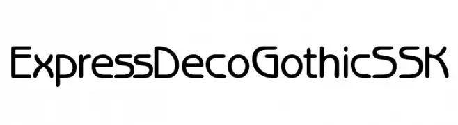
![ExpressDecoGothicSSK Frei Schriftart Herunterladen]() Herunterladen 2934 Downloads@WebFont
Herunterladen 2934 Downloads@WebFont -
( Fonts by Google - Personal-use only. For commercial use please contact owner. )
A bold, modern typeface with strong, uniform strokes and excellent readability.
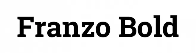
![Franzo Bold Frei Schriftart Herunterladen]() Herunterladen 2932 Downloads@WebFont
Herunterladen 2932 Downloads@WebFont -
![Weather Sunday - Personal Use Frei Schriftart Herunterladen]() Herunterladen 2931 Downloads@WebFont
Herunterladen 2931 Downloads@WebFont -
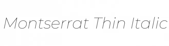
( Copyright 2011 The Montserrat Project Authors (https://github.com/JulietaUla/Montserrat) )
A sleek, modern, thin italic font with a minimalist design.
![Montserrat Thin Italic Frei Schriftart Herunterladen]() Herunterladen 2931 Downloads@WebFont
Herunterladen 2931 Downloads@WebFont -
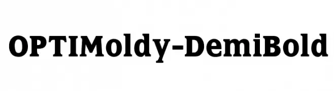
( Fonts by Castcraft Software - opti.netii.net - check the website before use )
A bold serif font with strong, thick strokes and a modern twist.
![OPTIMoldy-DemiBold Frei Schriftart Herunterladen]() Herunterladen 2930 Downloads@WebFont
Herunterladen 2930 Downloads@WebFont -
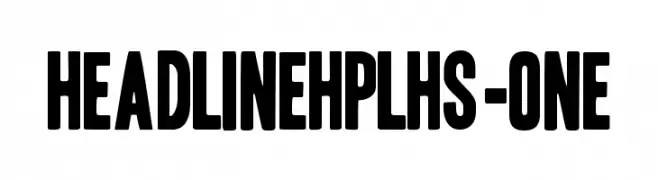
( Fonts by HPLHS Prop Fonts - Andrew H. Leman http://www.cthulhulives.org/toybox/propdocs/propfonts.html )
A bold, modern font with thick strokes and a strong presence.
![HeadlineHPLHS-One Frei Schriftart Herunterladen]() Herunterladen 2930 Downloads@WebFont
Herunterladen 2930 Downloads@WebFont -
( Fonts by Sungi Creative - Ivan Pranata - Personal-use only. For commercial use please contact owner. )
A playful, hand-drawn font with rounded, bold characters and a whimsical style.
![Chiffon Frei Schriftart Herunterladen]() Herunterladen 2929 Downloads@WebFont
Herunterladen 2929 Downloads@WebFont -
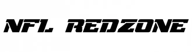
( Fonts by Jayde Garrow - GarrowGlitch - http://jaydegarrow.wix.com/jaydefonts. Personal-use only. For commercial use please contact owner. )
A bold, angular font with a dynamic, sporty aesthetic.
![NFL RedZone Frei Schriftart Herunterladen]() Herunterladen 2929 Downloads@WebFont
Herunterladen 2929 Downloads@WebFont -
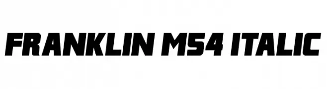
( Fonts by Mohammed Rahman )
A bold, italicized font with a dynamic and energetic style.
![Franklin M54 Italic Frei Schriftart Herunterladen]() Herunterladen 2929 Downloads@WebFont
Herunterladen 2929 Downloads@WebFont -
( Personal-use only. For commercial use please contact owner. )
A clean, modern sans-serif font with balanced spacing and consistent stroke width.
![Vazir FD Frei Schriftart Herunterladen]() Herunterladen 2928 Downloads@WebFont
Herunterladen 2928 Downloads@WebFont -
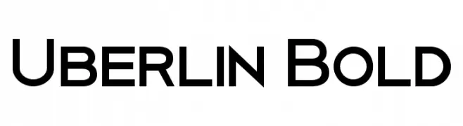
( Fonts by antoniorodriguesjr.com )
A bold, modern sans-serif font with clean lines and geometric shapes.
![Uberlin Bold Frei Schriftart Herunterladen]() Herunterladen 2928 Downloads@WebFont
Herunterladen 2928 Downloads@WebFont -
( Fonts by DesignByPlatform - Studio Aurora - https://creativemarket.com/studioaurora - Personal-use only. For commercial use please contact owner. )
A tall, narrow font with a modern, professional style, ideal for impactful headlines.
![Ranahan Frei Schriftart Herunterladen]() Herunterladen 2927 Downloads@WebFont
Herunterladen 2927 Downloads@WebFont -
![Typo Round Light Demo Frei Schriftart Herunterladen]() Herunterladen 2927 Downloads@WebFont
Herunterladen 2927 Downloads@WebFont -
( Fonts by www.creatingkeepsakes.com )
A playful, casual handwritten font with dynamic strokes and charming flourishes.
![CK Becky Frei Schriftart Herunterladen]() Herunterladen 2927 Downloads@WebFont
Herunterladen 2927 Downloads@WebFont -
( Fonts by Flanker - Personal-use only. For commercial use please contact owner. )
A bold, geometric sans-serif typeface with a modern and minimalistic design.
![Semplicita-Bold Frei Schriftart Herunterladen]() Herunterladen 2926 Downloads@WebFont
Herunterladen 2926 Downloads@WebFont -
![.VnAvantH Frei Schriftart Herunterladen]() Herunterladen 2926 Downloads
Herunterladen 2926 Downloads -
![Sepulcra Frei Schriftart Herunterladen]() Herunterladen 2926 Downloads@WebFont
Herunterladen 2926 Downloads@WebFont -
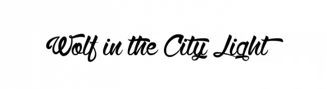
( Fonts by Maelle.K - Thomas Boucherie )
A dynamic and elegant script font with flowing curves and smooth connections.
![Wolf in the City Light Frei Schriftart Herunterladen]() Herunterladen 2925 Downloads@WebFont
Herunterladen 2925 Downloads@WebFont -
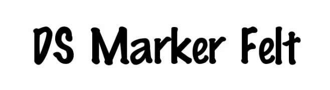
( Fonts by Typographer Mediengestaltung - Personal-use only. For commercial use please contact owner. )
A playful, hand-drawn style font with bold, rounded characters.
![DS Marker Felt Frei Schriftart Herunterladen]() Herunterladen 2924 Downloads@WebFont
Herunterladen 2924 Downloads@WebFont -
( Fonts by Typographer Mediengestaltung - Personal-use only. For commercial use please contact owner. )
A bold, contour-outlined font with a collegiate, varsity style.
![College TM Contour Frei Schriftart Herunterladen]() Herunterladen 2924 Downloads@WebFont
Herunterladen 2924 Downloads@WebFont -
![NHL Edge Minnesota Away Frei Schriftart Herunterladen]() Herunterladen 2924 Downloads@WebFont
Herunterladen 2924 Downloads@WebFont -
( Fonts by Diogene - Claude Pelletier )
A bold, geometric font with strong strokes and modern appeal.
![Bold Frei Schriftart Herunterladen]() Herunterladen 2924 Downloads@WebFont
Herunterladen 2924 Downloads@WebFont -
![CitrusFruits Frei Schriftart Herunterladen]() Herunterladen 2924 Downloads@WebFont
Herunterladen 2924 Downloads@WebFont -
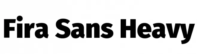
( Fonts by Mozilla Foundation - Personal-use only. For commercial use please contact owner. )
A bold, modern sans-serif font with a strong presence.
![Fira Sans Heavy Frei Schriftart Herunterladen]() Herunterladen 2923 Downloads@WebFont
Herunterladen 2923 Downloads@WebFont -
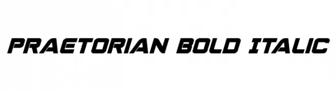
( Fonts by Daniel Zadorozny - www.iconian.com )
A bold, italicized font with a modern, dynamic style.
![Praetorian Bold Italic Frei Schriftart Herunterladen]() Herunterladen 2923 Downloads@WebFont
Herunterladen 2923 Downloads@WebFont -
![Distant Galaxy Symbols Frei Schriftart Herunterladen]() Herunterladen 2923 Downloads@WebFont
Herunterladen 2923 Downloads@WebFont -
![Banner Frei Schriftart Herunterladen]() Herunterladen 2922 Downloads@WebFont
Herunterladen 2922 Downloads@WebFont -
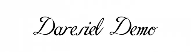
![Daresiel Demo Frei Schriftart Herunterladen]() Herunterladen 2922 Downloads@WebFont
Herunterladen 2922 Downloads@WebFont -
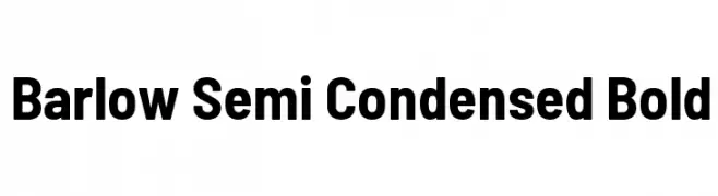
( Copyright 2017 The Barlow Project Authors (https://github.com/jpt/barlow) )
A bold, semi-condensed font with a modern and clean design.
![Barlow Semi Condensed Bold Frei Schriftart Herunterladen]() Herunterladen 2921 Downloads@WebFont
Herunterladen 2921 Downloads@WebFont -
![3ds-SemiBold Frei Schriftart Herunterladen]() Herunterladen 2921 Downloads@WebFont
Herunterladen 2921 Downloads@WebFont -
![PhuongThaoH 1.1 Frei Schriftart Herunterladen]() Herunterladen 2921 Downloads
Herunterladen 2921 Downloads -
( Fonts by a Neale Davidson - www.pixelsagas.com. Personal-use only. For commercial use please contact owner. )
A bold, geometric font with a futuristic and angular design.
![Jefferies Frei Schriftart Herunterladen]() Herunterladen 2920 Downloads@WebFont
Herunterladen 2920 Downloads@WebFont


Welche Schriften sind gerade am populärsten?
Poppins, Roboto, Montserrat, Open Sans und Lato sind wegen ihrer klaren Formen und breiten Einsetzbarkeit sehr gefragt – von Markenauftritt über Landingpages bis hin zu Postern.
Welche Fonts eignen sich für Logos?
Geometrische Sans‑Serifs (z. B. Poppins, Familien im Gotham‑Stil) sind ein häufiger Griff für sauberes, skalierbares Branding. Für eine persönlichere Note bleiben Scripts und Handschrift‑Stile beliebt. Kombinieren Sie einen prägnanten Headline‑Font mit einer neutralen Brotschrift für Wiedererkennung und Harmonie.
Wie oft wird die Top‑Liste aktualisiert?
Regelmäßig – basierend auf realen Downloads und Interaktionen. Schauen Sie öfter vorbei, um aufstrebende Favoriten früh zu entdecken.
💡 Tipp: Seite bookmarken – Trends wechseln schnell, und heutige Top‑Schriften inspirieren morgen vielleicht das Rebranding.