Willkommen bei den Top‑Schriften – hier treffen Beliebtheit und Qualität aufeinander. Das sind die in diesem Jahr am häufigsten heruntergeladenen und genutzten Fonts. Wenn Sie sichere Optionen für Logo, Web oder Social suchen, starten Sie hier.
Jeder Top‑Font überzeugt durch Balance, Lesbarkeit und Vielseitigkeit. Sie finden moderne Sans‑Serifs, elegante Scripts, Vintage‑Serifs und minimalistische Displays.
-
( Fonts by Khurasan )
A playful, bold handwritten font with rounded edges and a friendly appearance.
 Herunterladen 945 Downloads@WebFont
 -
( Fonts by Dalton Maag Ltd - Personal-use only. For commercial use please contact owner. )
A modern, light sans-serif font with clean lines and balanced spacing.
![Brisa Sans Light Frei Schriftart Herunterladen]() Herunterladen 945 Downloads@WebFont
Herunterladen 945 Downloads@WebFont -
![Gattely DEMO Frei Schriftart Herunterladen]() Herunterladen 945 Downloads@WebFont
Herunterladen 945 Downloads@WebFont -
![HaeartyScript Frei Schriftart Herunterladen]() Herunterladen 945 Downloads@WebFont
Herunterladen 945 Downloads@WebFont -
( GNU FreeFont - savannah.gnu.org/projects/freefont/ )
An elegant serif font with italic styling, perfect for classic and sophisticated designs.
![Free Serif Italic Frei Schriftart Herunterladen]() Herunterladen 945 Downloads@WebFont
Herunterladen 945 Downloads@WebFont -
-
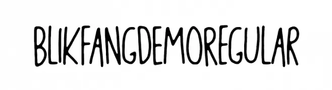
( bogstav - www.bogstav.com )
A playful, handwritten font with tall, narrow letters and smooth, rounded strokes.
![Blikfang DEMO Regular Frei Schriftart Herunterladen]() Herunterladen 945 Downloads@WebFont
Herunterladen 945 Downloads@WebFont -
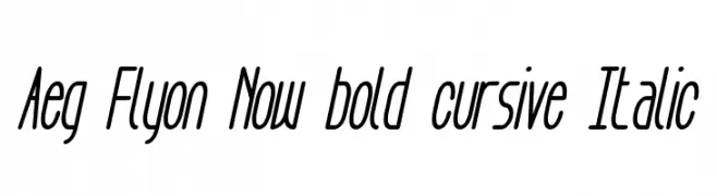
![Aeg Flyon Now bold cursive Italic Frei Schriftart Herunterladen]() Herunterladen 945 Downloads@WebFont
Herunterladen 945 Downloads@WebFont -
( Fonts by Misti's Fonts )
A playful, handwritten cursive font with a whimsical and friendly style.
![Mf I Love Glitter Frei Schriftart Herunterladen]() Herunterladen 945 Downloads@WebFont
Herunterladen 945 Downloads@WebFont -
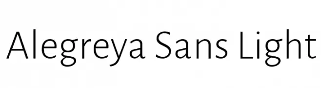
( Copyright 2013 The Alegreya Sans Project Authors (https://github.com/huertatipografica/Alegreya-Sans) )
A modern, light sans-serif font with low contrast and a clean, professional appearance.
![Alegreya Sans Light Frei Schriftart Herunterladen]() Herunterladen 945 Downloads@WebFont
Herunterladen 945 Downloads@WebFont -
![Timeline Regular Frei Schriftart Herunterladen]() Herunterladen 945 Downloads@WebFont
Herunterladen 945 Downloads@WebFont


Welche Schriften sind gerade am populärsten?
Poppins, Roboto, Montserrat, Open Sans und Lato sind wegen ihrer klaren Formen und breiten Einsetzbarkeit sehr gefragt – von Markenauftritt über Landingpages bis hin zu Postern.
Welche Fonts eignen sich für Logos?
Geometrische Sans‑Serifs (z. B. Poppins, Familien im Gotham‑Stil) sind ein häufiger Griff für sauberes, skalierbares Branding. Für eine persönlichere Note bleiben Scripts und Handschrift‑Stile beliebt. Kombinieren Sie einen prägnanten Headline‑Font mit einer neutralen Brotschrift für Wiedererkennung und Harmonie.
Wie oft wird die Top‑Liste aktualisiert?
Regelmäßig – basierend auf realen Downloads und Interaktionen. Schauen Sie öfter vorbei, um aufstrebende Favoriten früh zu entdecken.
💡 Tipp: Seite bookmarken – Trends wechseln schnell, und heutige Top‑Schriften inspirieren morgen vielleicht das Rebranding.