Willkommen bei den Top‑Schriften – hier treffen Beliebtheit und Qualität aufeinander. Das sind die in diesem Jahr am häufigsten heruntergeladenen und genutzten Fonts. Wenn Sie sichere Optionen für Logo, Web oder Social suchen, starten Sie hier.
Jeder Top‑Font überzeugt durch Balance, Lesbarkeit und Vielseitigkeit. Sie finden moderne Sans‑Serifs, elegante Scripts, Vintage‑Serifs und minimalistische Displays.
-
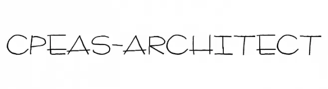
( Fonts by www.twopeasinabucket.com )
A hand-drawn, architectural sketch-style font with thin, irregular strokes.
 Herunterladen 916 Downloads@WebFont
 -
![funfont Frei Schriftart Herunterladen]() Herunterladen 916 Downloads@WebFont
Herunterladen 916 Downloads@WebFont -
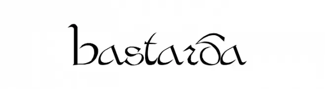
![Bastarda Frei Schriftart Herunterladen]() Herunterladen 916 Downloads@WebFont
Herunterladen 916 Downloads@WebFont -
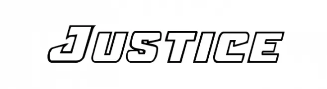
( Fonts by Daniel Zadorozny - www.iconian.com - Free for personal use )
A bold, geometric font with outlined characters and a modern, dynamic style.
![Justice Frei Schriftart Herunterladen]() Herunterladen 916 Downloads@WebFont
Herunterladen 916 Downloads@WebFont -
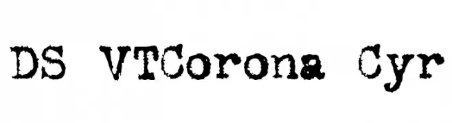
![DS VTCorona Cyr Frei Schriftart Herunterladen]() Herunterladen 916 Downloads@WebFont
Herunterladen 916 Downloads@WebFont -
-
( Fonts by Graphix Line Studio )
A playful, handwritten font with bold, rounded characters and a casual style.
![Farmer Kids Frei Schriftart Herunterladen]() Herunterladen 915 Downloads@WebFont
Herunterladen 915 Downloads@WebFont -
( Fonts by pprmint - Personal-use only. For commercial use please contact owner. )
A bold, modern sans-serif font with geometric precision and clarity.
![MintSans Bold Frei Schriftart Herunterladen]() Herunterladen 915 Downloads@WebFont
Herunterladen 915 Downloads@WebFont -
( Noto is a trademark of Google Inc. Noto fonts are open source. All Noto fonts are published under the SIL Open Font License, Version 1.1 )
A monospaced sans-serif font with uniform character width, ideal for coding and data alignment.
![Noto Sans Mono SemiBold Frei Schriftart Herunterladen]() Herunterladen 915 Downloads@WebFont
Herunterladen 915 Downloads@WebFont -
( Fonts by Cristiano Sobral - Personal-use only. For commercial use please contact owner. )
A modern, semi-bold sans-serif font with a clean and geometric design.
![Cheyenne Sans SemiBold Frei Schriftart Herunterladen]() Herunterladen 915 Downloads@WebFont
Herunterladen 915 Downloads@WebFont -
( Alexander Pravdin )
A bold, condensed font with strong, uniform strokes for impactful design.
![SONGERCondensed-Bold Frei Schriftart Herunterladen]() Herunterladen 915 Downloads@WebFont
Herunterladen 915 Downloads@WebFont


Welche Schriften sind gerade am populärsten?
Poppins, Roboto, Montserrat, Open Sans und Lato sind wegen ihrer klaren Formen und breiten Einsetzbarkeit sehr gefragt – von Markenauftritt über Landingpages bis hin zu Postern.
Welche Fonts eignen sich für Logos?
Geometrische Sans‑Serifs (z. B. Poppins, Familien im Gotham‑Stil) sind ein häufiger Griff für sauberes, skalierbares Branding. Für eine persönlichere Note bleiben Scripts und Handschrift‑Stile beliebt. Kombinieren Sie einen prägnanten Headline‑Font mit einer neutralen Brotschrift für Wiedererkennung und Harmonie.
Wie oft wird die Top‑Liste aktualisiert?
Regelmäßig – basierend auf realen Downloads und Interaktionen. Schauen Sie öfter vorbei, um aufstrebende Favoriten früh zu entdecken.
💡 Tipp: Seite bookmarken – Trends wechseln schnell, und heutige Top‑Schriften inspirieren morgen vielleicht das Rebranding.