Willkommen bei den Top‑Schriften – hier treffen Beliebtheit und Qualität aufeinander. Das sind die in diesem Jahr am häufigsten heruntergeladenen und genutzten Fonts. Wenn Sie sichere Optionen für Logo, Web oder Social suchen, starten Sie hier.
Jeder Top‑Font überzeugt durch Balance, Lesbarkeit und Vielseitigkeit. Sie finden moderne Sans‑Serifs, elegante Scripts, Vintage‑Serifs und minimalistische Displays.
-
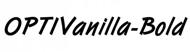
( Fonts by Castcraft Software - OPTI Fonts Archive - opti.netii.net - Personal-use only. For commercial use please contact owner. )
A bold, slanted font with sharp angles and dynamic energy.
 Herunterladen 905 Downloads@WebFont
 -
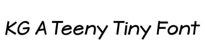
![KG A Teeny Tiny Font Frei Schriftart Herunterladen]() Herunterladen 905 Downloads@WebFont
Herunterladen 905 Downloads@WebFont -
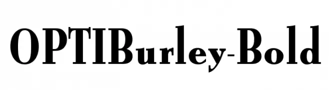
( Fonts by Castcraft Software - opti.netii.net - check the website before use )
A bold serif font with strong, angular serifs and a classic yet modern appearance.
![OPTIBurley-Bold Frei Schriftart Herunterladen]() Herunterladen 905 Downloads@WebFont
Herunterladen 905 Downloads@WebFont -
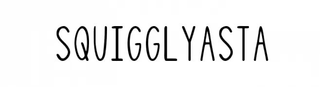
( Free for personal use - justlikethistrain.tumblr.com/ )
A playful, hand-drawn font with wavy lines and a casual style.
![SquigglyAsta Frei Schriftart Herunterladen]() Herunterladen 905 Downloads@WebFont
Herunterladen 905 Downloads@WebFont -
( Fonts by Luedecke Design Font Co. - ldfonts.weebly.com )
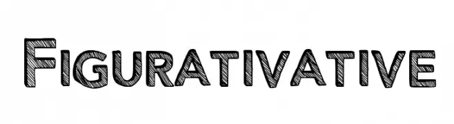
A bold, sketch-style font with textured, hand-drawn characters.
![Figurativative Frei Schriftart Herunterladen]() Herunterladen 905 Downloads@WebFont
Herunterladen 905 Downloads@WebFont -
-
( Fonts by David Kerkhoff - www.hanodedphotography.com )
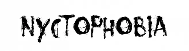
A bold, gritty font with splattered, distressed strokes and a chaotic artistic vibe.
![Nyctophobia Frei Schriftart Herunterladen]() Herunterladen 905 Downloads@WebFont
Herunterladen 905 Downloads@WebFont -
![PentaGram s Gothika Bold Frei Schriftart Herunterladen]() Herunterladen 905 Downloads@WebFont
Herunterladen 905 Downloads@WebFont -
( Fonts by www.someshinzz.com )
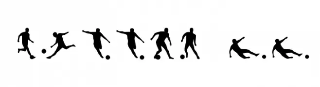
Silhouette dingbat font with soccer player and ball icons.
![Soccer II Frei Schriftart Herunterladen]() Herunterladen 905 Downloads@WebFont
Herunterladen 905 Downloads@WebFont -
( Fonts by www.blambot.com )
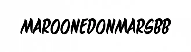
A bold, energetic script font with dynamic curves and a playful style.
![MaroonedOnMarsBB Frei Schriftart Herunterladen]() Herunterladen 905 Downloads@WebFont
Herunterladen 905 Downloads@WebFont -
![JJStencil Trial Version Frei Schriftart Herunterladen]() Herunterladen 905 Downloads@WebFont
Herunterladen 905 Downloads@WebFont

Welche Schriften sind gerade am populärsten?
Poppins, Roboto, Montserrat, Open Sans und Lato sind wegen ihrer klaren Formen und breiten Einsetzbarkeit sehr gefragt – von Markenauftritt über Landingpages bis hin zu Postern.
Welche Fonts eignen sich für Logos?
Geometrische Sans‑Serifs (z. B. Poppins, Familien im Gotham‑Stil) sind ein häufiger Griff für sauberes, skalierbares Branding. Für eine persönlichere Note bleiben Scripts und Handschrift‑Stile beliebt. Kombinieren Sie einen prägnanten Headline‑Font mit einer neutralen Brotschrift für Wiedererkennung und Harmonie.
Wie oft wird die Top‑Liste aktualisiert?
Regelmäßig – basierend auf realen Downloads und Interaktionen. Schauen Sie öfter vorbei, um aufstrebende Favoriten früh zu entdecken.
💡 Tipp: Seite bookmarken – Trends wechseln schnell, und heutige Top‑Schriften inspirieren morgen vielleicht das Rebranding.