Willkommen bei den Top‑Schriften – hier treffen Beliebtheit und Qualität aufeinander. Das sind die in diesem Jahr am häufigsten heruntergeladenen und genutzten Fonts. Wenn Sie sichere Optionen für Logo, Web oder Social suchen, starten Sie hier.
Jeder Top‑Font überzeugt durch Balance, Lesbarkeit und Vielseitigkeit. Sie finden moderne Sans‑Serifs, elegante Scripts, Vintage‑Serifs und minimalistische Displays.
-
( Fonts by CannotIntoSpaceFonts - KineticPlasma Fonts - Personal-use only. For commercial use please contact owner. )
A modern, narrow font with bold, clean lines and excellent readability.
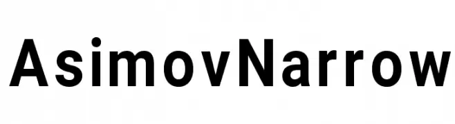 Herunterladen 2806 Downloads@WebFont
 -
![Acer Supplement Frei Schriftart Herunterladen]() Herunterladen 2806 Downloads@WebFont
Herunterladen 2806 Downloads@WebFont -
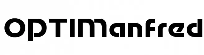
( Fonts by Castcraft Software - opti.netii.net - check the website before use )
A bold, geometric font with a futuristic and modern design.
![OPTIManfred Frei Schriftart Herunterladen]() Herunterladen 2806 Downloads@WebFont
Herunterladen 2806 Downloads@WebFont -
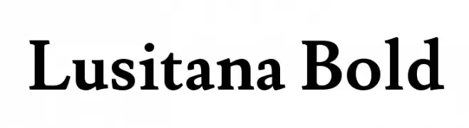
( Copyright (c) 2011 by Ana Paula Megda (www.anamegda.com|anapbm@gmail.com) )
A bold, classic serif font with strong, well-defined characters.
![Lusitana Bold Frei Schriftart Herunterladen]() Herunterladen 2806 Downloads@WebFont
Herunterladen 2806 Downloads@WebFont -
![Christmas Regular Frei Schriftart Herunterladen]() Herunterladen 2806 Downloads@WebFont
Herunterladen 2806 Downloads@WebFont -
( Fonts by Sompong Pradubboot - www.creativefabrica.com/designer/siinsticker/ - Personal-use only. For commercial use please contact owner. )
A bold, angular font with a dynamic and modern style.
![sdprostreet-Regular Frei Schriftart Herunterladen]() Herunterladen 2805 Downloads@WebFont
Herunterladen 2805 Downloads@WebFont -
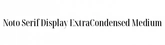
( Noto is a trademark of Google Inc. Noto fonts are open source. All Noto fonts are published under the SIL Open Font License, Version 1.1 )
A refined serif typeface with extra-condensed letterforms and high contrast strokes.
![Noto Serif Display ExtraCondensed Medium Frei Schriftart Herunterladen]() Herunterladen 2805 Downloads@WebFont
Herunterladen 2805 Downloads@WebFont -
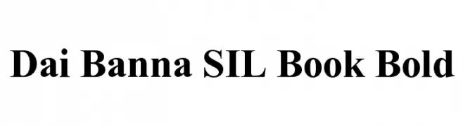
![Dai Banna SIL Book Bold Frei Schriftart Herunterladen]() Herunterladen 2805 Downloads@WebFont
Herunterladen 2805 Downloads@WebFont -
![Paddington Bold Frei Schriftart Herunterladen]() Herunterladen 2805 Downloads@WebFont
Herunterladen 2805 Downloads@WebFont -
( Copyright (c) 2012, Vicente Lamonaca (produccion.taller@gmail.com www.tipografia-montevideo.info www.tipotype.com) )
A modern, narrow sans-serif font with clean, uniform strokes.
![Economica-Regular Frei Schriftart Herunterladen]() Herunterladen 2804 Downloads@WebFont
Herunterladen 2804 Downloads@WebFont -
( Fonts by www.typodermicfonts.com - Ray Larabie )
A futuristic, italicized font with sharp angles and a sleek design.
![SofachromeRg-Italic Frei Schriftart Herunterladen]() Herunterladen 2804 Downloads@WebFont
Herunterladen 2804 Downloads@WebFont -
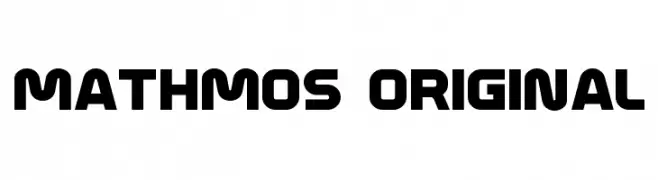
( Fonts by Levi Halmos )
A bold, modern font with geometric structure and rounded edges.
![Mathmos Original Frei Schriftart Herunterladen]() Herunterladen 2804 Downloads@WebFont
Herunterladen 2804 Downloads@WebFont -
( Fonts by Uddi Uddi )
A modern, elongated font with narrow characters and a sleek appearance.
![Andover Frei Schriftart Herunterladen]() Herunterladen 2804 Downloads@WebFont
Herunterladen 2804 Downloads@WebFont -
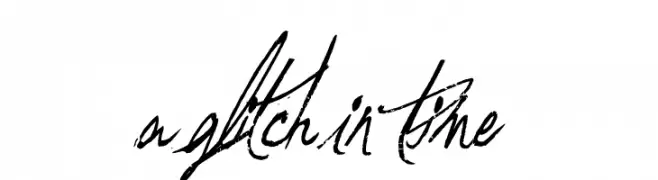
( Fonts by a Andrew Hart Dirt2.com - SickCapital. Personal-use only. For commercial use please contact owner. )
A chaotic, glitchy font with overlapping, distorted letterforms and a dynamic, scribbled style.
![A Glitch In Time Frei Schriftart Herunterladen]() Herunterladen 2803 Downloads@WebFont
Herunterladen 2803 Downloads@WebFont -
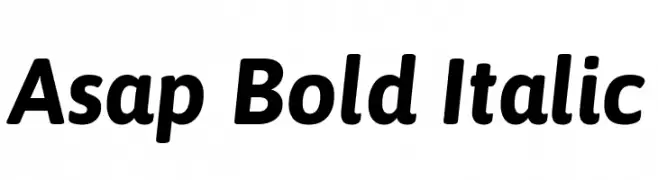
( Copyright 2016 The Asap Project Authors (omnibus.type@gmail.com) )
A bold, italicized font with a modern and dynamic style.
![Asap Bold Italic Frei Schriftart Herunterladen]() Herunterladen 2803 Downloads@WebFont
Herunterladen 2803 Downloads@WebFont -
![New Cicle Fina Frei Schriftart Herunterladen]() Herunterladen 2803 Downloads@WebFont
Herunterladen 2803 Downloads@WebFont -
( Fonts by Manfred Klein - manfred-klein.ina-mar.com )
An ornate, decorative font with intricate swirls and flourishes.
![Decadentia Frei Schriftart Herunterladen]() Herunterladen 2803 Downloads@WebFont
Herunterladen 2803 Downloads@WebFont -
![Bisque Frei Schriftart Herunterladen]() Herunterladen 2803 Downloads
Herunterladen 2803 Downloads -
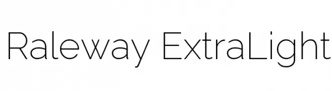
( Copyright (c) 2010, Matt McInerney (matt@pixelspread.com) )
A modern, minimalistic sans-serif typeface with clean lines and balanced proportions.
![Raleway ExtraLight Frei Schriftart Herunterladen]() Herunterladen 2802 Downloads@WebFont
Herunterladen 2802 Downloads@WebFont -
![VI Bach Mai Frei Schriftart Herunterladen]() Herunterladen 2802 Downloads@WebFont
Herunterladen 2802 Downloads@WebFont -
Schriftart von JuanCasco. For commercial use please contact the owner.
( Fonts by Juan Casco - www.juancasco.net )
A bold, Gothic-inspired stencil font with sharp, angular edges.
![Goth Stencil Frei Schriftart Herunterladen]() Herunterladen 2802 Downloads@WebFont
Herunterladen 2802 Downloads@WebFont -
![In A Flash Frei Schriftart Herunterladen]() Herunterladen 2802 Downloads@WebFont
Herunterladen 2802 Downloads@WebFont -
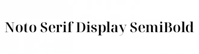
( Noto is a trademark of Google Inc. Noto fonts are open source. All Noto fonts are published under the SIL Open Font License, Version 1.1 )
A high-contrast serif font with elegant, bold strokes and refined details.
![Noto Serif Display SemiBold Frei Schriftart Herunterladen]() Herunterladen 2801 Downloads@WebFont
Herunterladen 2801 Downloads@WebFont -
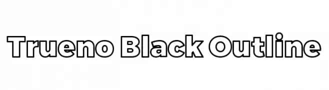
![Trueno Black Outline Frei Schriftart Herunterladen]() Herunterladen 2801 Downloads@WebFont
Herunterladen 2801 Downloads@WebFont -
( Fonts by www.vicfieger.com )
A bold, geometric font with a modern and dynamic style.
![Osaka-Sans Serif Frei Schriftart Herunterladen]() Herunterladen 2801 Downloads@WebFont
Herunterladen 2801 Downloads@WebFont -
![Hearts Frei Schriftart Herunterladen]() Herunterladen 2801 Downloads@WebFont
Herunterladen 2801 Downloads@WebFont -
( Fonts by Eric Grunin )
A modern serif font with sharp, angular serifs and dynamic stroke variations.
![Nadall Frei Schriftart Herunterladen]() Herunterladen 2801 Downloads@WebFont
Herunterladen 2801 Downloads@WebFont -
( Fonts by Burhan Afif - hanscostudio.com - Personal-use only. For commercial use please contact owner. )
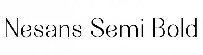
A modern, semi-bold sans-serif font with a clean and professional appearance.
![Nesans Semi Bold Frei Schriftart Herunterladen]() Herunterladen 2800 Downloads@WebFont
Herunterladen 2800 Downloads@WebFont -
( Fonts by Castcraft Software - opti.netii.net - check the website before use )
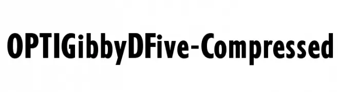
A bold, modern font with thick strokes and geometric shapes.
![OPTIGibbyDFive-Compressed Frei Schriftart Herunterladen]() Herunterladen 2800 Downloads@WebFont
Herunterladen 2800 Downloads@WebFont -
( Fonts by Castcraft Software - opti.netii.net - check the website before use )
A bold, high-contrast serif typeface with tall, narrow letters.
![OPTIAmvet Frei Schriftart Herunterladen]() Herunterladen 2799 Downloads@WebFont
Herunterladen 2799 Downloads@WebFont -
( Copyright (c) 2010, Google Corporation. )
A classic serif font with elegant lines and balanced proportions.
![Tinos Frei Schriftart Herunterladen]() Herunterladen 2799 Downloads@WebFont
Herunterladen 2799 Downloads@WebFont -
( Fonts by David Kerkhoff - www.hanodedphotography.com )
A bold, distressed font with a grunge texture and rugged appearance.
![Project X Frei Schriftart Herunterladen]() Herunterladen 2798 Downloads@WebFont
Herunterladen 2798 Downloads@WebFont -
![Justov Frei Schriftart Herunterladen]() Herunterladen 2798 Downloads
Herunterladen 2798 Downloads -
![Ogilvy Poster Frei Schriftart Herunterladen]() Herunterladen 2798 Downloads
Herunterladen 2798 Downloads -
( Fonts by Khurasan )
A bold, playful font with rounded edges and a chunky, whimsical style.
![Bhel Puri Frei Schriftart Herunterladen]() Herunterladen 2797 Downloads@WebFont
Herunterladen 2797 Downloads@WebFont


Welche Schriften sind gerade am populärsten?
Poppins, Roboto, Montserrat, Open Sans und Lato sind wegen ihrer klaren Formen und breiten Einsetzbarkeit sehr gefragt – von Markenauftritt über Landingpages bis hin zu Postern.
Welche Fonts eignen sich für Logos?
Geometrische Sans‑Serifs (z. B. Poppins, Familien im Gotham‑Stil) sind ein häufiger Griff für sauberes, skalierbares Branding. Für eine persönlichere Note bleiben Scripts und Handschrift‑Stile beliebt. Kombinieren Sie einen prägnanten Headline‑Font mit einer neutralen Brotschrift für Wiedererkennung und Harmonie.
Wie oft wird die Top‑Liste aktualisiert?
Regelmäßig – basierend auf realen Downloads und Interaktionen. Schauen Sie öfter vorbei, um aufstrebende Favoriten früh zu entdecken.
💡 Tipp: Seite bookmarken – Trends wechseln schnell, und heutige Top‑Schriften inspirieren morgen vielleicht das Rebranding.