Willkommen bei den Top‑Schriften – hier treffen Beliebtheit und Qualität aufeinander. Das sind die in diesem Jahr am häufigsten heruntergeladenen und genutzten Fonts. Wenn Sie sichere Optionen für Logo, Web oder Social suchen, starten Sie hier.
Jeder Top‑Font überzeugt durch Balance, Lesbarkeit und Vielseitigkeit. Sie finden moderne Sans‑Serifs, elegante Scripts, Vintage‑Serifs und minimalistische Displays.
-
 Herunterladen 895 Downloads@WebFont
 -
![Fool's Errand Frei Schriftart Herunterladen]() Herunterladen 895 Downloads@WebFont
Herunterladen 895 Downloads@WebFont -
![Stardate 81316 Frei Schriftart Herunterladen]() Herunterladen 895 Downloads@WebFont
Herunterladen 895 Downloads@WebFont -
( Fonts by Agathe M.Joyce - www.foundmyfont.com - Personal-use only. For commercial use please contact owner. )
An elegant script font with ornate loops and high contrast, ideal for formal uses.
![Mechanic of the Heart Frei Schriftart Herunterladen]() Herunterladen 895 Downloads@WebFont
Herunterladen 895 Downloads@WebFont -
![Kenney Future Narrow Regular Frei Schriftart Herunterladen]() Herunterladen 895 Downloads@WebFont
Herunterladen 895 Downloads@WebFont -
-
( Fonts by Daniel Zadorozny - www.iconian.com - Free for personal use )
A bold, geometric font with a futuristic and industrial design.
![MotorBlock Frei Schriftart Herunterladen]() Herunterladen 895 Downloads@WebFont
Herunterladen 895 Downloads@WebFont -
( Fonts by Castcraft Software - opti.netii.net - check the website before use )
A decorative blackletter font with intricate flourishes and a historical feel.
![LeonTextOpti-Solid Frei Schriftart Herunterladen]() Herunterladen 895 Downloads@WebFont
Herunterladen 895 Downloads@WebFont -
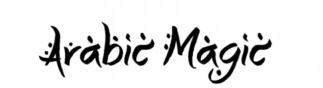
![Arabic Magic Frei Schriftart Herunterladen]() Herunterladen 895 Downloads@WebFont
Herunterladen 895 Downloads@WebFont -
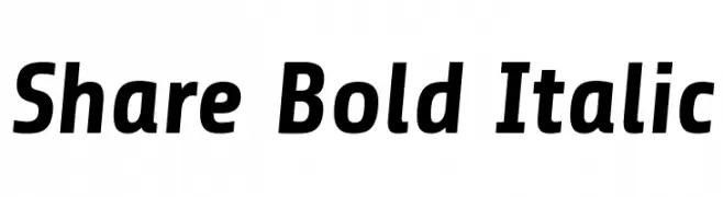
( Copyright (c) 2012, Carrois Type Design, Ralph du Carrois (post@carrois.com www.carrois.com), with Reserved Font Name 'Share' )
A bold, italicized font with strong strokes and a modern, dynamic style.
![Share Bold Italic Frei Schriftart Herunterladen]() Herunterladen 895 Downloads@WebFont
Herunterladen 895 Downloads@WebFont -
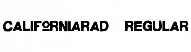
( Fonts by Alex Tomlinson - Skyhaven Fonts - shfonts.com )
A bold, hand-drawn font with a dynamic and artistic style.
![CaliforniaRad-Regular Frei Schriftart Herunterladen]() Herunterladen 895 Downloads@WebFont
Herunterladen 895 Downloads@WebFont


Welche Schriften sind gerade am populärsten?
Poppins, Roboto, Montserrat, Open Sans und Lato sind wegen ihrer klaren Formen und breiten Einsetzbarkeit sehr gefragt – von Markenauftritt über Landingpages bis hin zu Postern.
Welche Fonts eignen sich für Logos?
Geometrische Sans‑Serifs (z. B. Poppins, Familien im Gotham‑Stil) sind ein häufiger Griff für sauberes, skalierbares Branding. Für eine persönlichere Note bleiben Scripts und Handschrift‑Stile beliebt. Kombinieren Sie einen prägnanten Headline‑Font mit einer neutralen Brotschrift für Wiedererkennung und Harmonie.
Wie oft wird die Top‑Liste aktualisiert?
Regelmäßig – basierend auf realen Downloads und Interaktionen. Schauen Sie öfter vorbei, um aufstrebende Favoriten früh zu entdecken.
💡 Tipp: Seite bookmarken – Trends wechseln schnell, und heutige Top‑Schriften inspirieren morgen vielleicht das Rebranding.