Willkommen bei den Top‑Schriften – hier treffen Beliebtheit und Qualität aufeinander. Das sind die in diesem Jahr am häufigsten heruntergeladenen und genutzten Fonts. Wenn Sie sichere Optionen für Logo, Web oder Social suchen, starten Sie hier.
Jeder Top‑Font überzeugt durch Balance, Lesbarkeit und Vielseitigkeit. Sie finden moderne Sans‑Serifs, elegante Scripts, Vintage‑Serifs und minimalistische Displays.
-
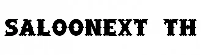
( Fonts by Jens R. Ziehn - www.filmhimmel.com )
A dramatic, angular font with a cursive-like, expressive style.
 Herunterladen 2782 Downloads@WebFont
 -
![SaloonExt Th Frei Schriftart Herunterladen]() Herunterladen 2782 Downloads@WebFont
Herunterladen 2782 Downloads@WebFont -
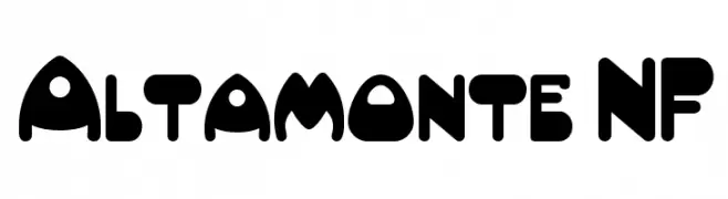
( Fonts by Nick Curtis - www.nicksfonts.com )
A bold, playful font with rounded, bulbous shapes and a whimsical design.
![Altamonte NF Frei Schriftart Herunterladen]() Herunterladen 2782 Downloads@WebFont
Herunterladen 2782 Downloads@WebFont -
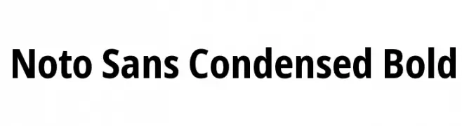
( Fonts by Google - Personal-use only. For commercial use please contact owner. )
A modern, bold, and condensed sans-serif typeface with excellent readability.
![Noto Sans Condensed Bold Frei Schriftart Herunterladen]() Herunterladen 2780 Downloads@WebFont
Herunterladen 2780 Downloads@WebFont -
![Scribble Frei Schriftart Herunterladen]() Herunterladen 2780 Downloads@WebFont
Herunterladen 2780 Downloads@WebFont -
![Kasskeo New Frei Schriftart Herunterladen]() Herunterladen 2780 Downloads@WebFont
Herunterladen 2780 Downloads@WebFont -
( Fonts by Castcraft Software - opti.netii.net - check the website before use )
A bold, clean font with strong lines and excellent legibility.
![OPTIFob-DemiBold Frei Schriftart Herunterladen]() Herunterladen 2779 Downloads@WebFont
Herunterladen 2779 Downloads@WebFont -
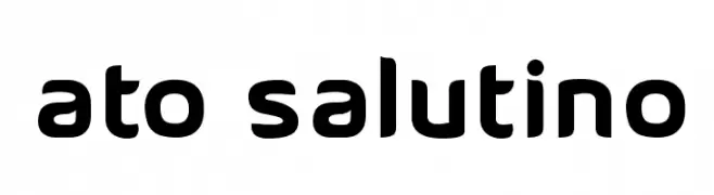
( Fonts by Alvaro Thomaz - alvarothomaz.com )
A bold, rounded font with smooth curves and a modern, friendly appearance.
![ATO Salutino Frei Schriftart Herunterladen]() Herunterladen 2779 Downloads@WebFont
Herunterladen 2779 Downloads@WebFont -
( Copyright (c) 2009, 2010, 2011 Daniel Johnson (
A bold serif font with strong, elegant strokes and pronounced serifs.
![Judson Bold Frei Schriftart Herunterladen]() Herunterladen 2779 Downloads@WebFont
Herunterladen 2779 Downloads@WebFont -
![Kirsty Frei Schriftart Herunterladen]() Herunterladen 2779 Downloads@WebFont
Herunterladen 2779 Downloads@WebFont -
Schriftart von SvNProd. For commercial use please contact the owner.
![Pat PaCool Frei Schriftart Herunterladen]() Herunterladen 2778 Downloads@WebFont
Herunterladen 2778 Downloads@WebFont -
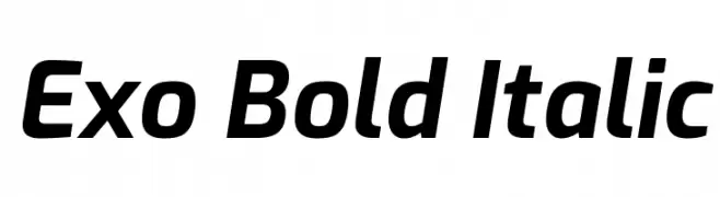
( Copyright 2017 The Exo Project Authors (https://github.com/NDISCOVER/Exo-1.0) )
A bold, italicized font with a modern and dynamic style.
![Exo Bold Italic Frei Schriftart Herunterladen]() Herunterladen 2778 Downloads@WebFont
Herunterladen 2778 Downloads@WebFont -
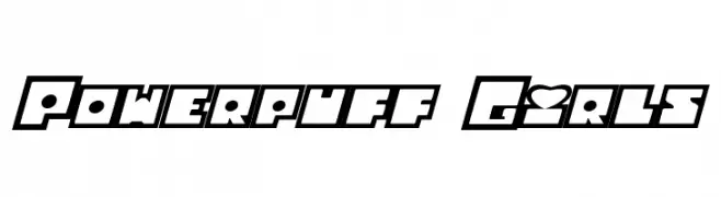
![Powerpuff Girls Frei Schriftart Herunterladen]() Herunterladen 2778 Downloads@WebFont
Herunterladen 2778 Downloads@WebFont -
( Fonts by www.blambot.com )
A bold, playful font with rounded edges and a dynamic slant.
![DigitalStrip.BB-Bold Frei Schriftart Herunterladen]() Herunterladen 2778 Downloads@WebFont
Herunterladen 2778 Downloads@WebFont -
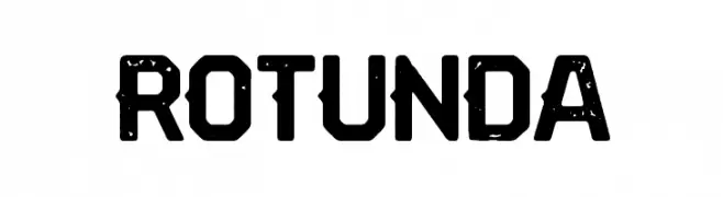
( Woodcutter - woodcutter Manero - www.woodcutter.es )
A bold, distressed font with a vintage, rugged appearance.
![Rotunda Frei Schriftart Herunterladen]() Herunterladen 2777 Downloads@WebFont
Herunterladen 2777 Downloads@WebFont -
![MOMO Frei Schriftart Herunterladen]() Herunterladen 2777 Downloads@WebFont
Herunterladen 2777 Downloads@WebFont -
![Stylo Bold Frei Schriftart Herunterladen]() Herunterladen 2777 Downloads@WebFont
Herunterladen 2777 Downloads@WebFont -
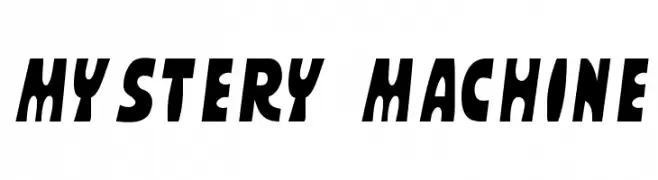
Schriftart von spideraysfonts. For commercial use please contact the owner.
![MYSTERY MACHINE Frei Schriftart Herunterladen]() Herunterladen 2776 Downloads@WebFont
Herunterladen 2776 Downloads@WebFont -
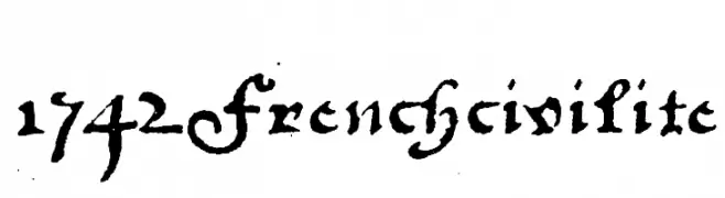
![1742Frenchcivilite Frei Schriftart Herunterladen]() Herunterladen 2776 Downloads@WebFont
Herunterladen 2776 Downloads@WebFont -
![VomZom Frei Schriftart Herunterladen]() Herunterladen 2776 Downloads@WebFont
Herunterladen 2776 Downloads@WebFont -
( Fonts by Daniel Zadorozny - www.iconian.com - Free for personal use )
A bold, futuristic font with geometric, angular characters.
![Battlefield Bold Frei Schriftart Herunterladen]() Herunterladen 2776 Downloads@WebFont
Herunterladen 2776 Downloads@WebFont -
( Fonts by Astigmatic )
A bold, playful font with rounded, cartoonish letterforms.
![Luckiest Guy Frei Schriftart Herunterladen]() Herunterladen 2775 Downloads@WebFont
Herunterladen 2775 Downloads@WebFont -
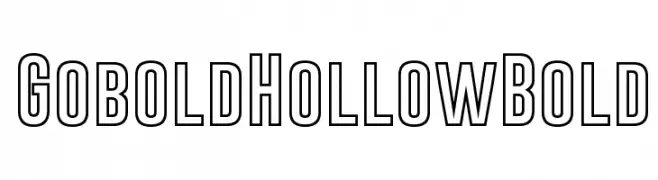
( Fonts by a Situjuh Nazara - c7n1.wordpress.com. Personal-use only. For commercial use please contact owner. )
A bold, hollow font with geometric lines and a modern, structured appearance.
![Gobold Hollow Bold Frei Schriftart Herunterladen]() Herunterladen 2774 Downloads@WebFont
Herunterladen 2774 Downloads@WebFont -
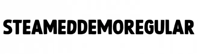
( Fonts by Hanoded )
A bold, playful font with thick, rounded characters and quirky symbols.
![Steamed DEMO Regular Frei Schriftart Herunterladen]() Herunterladen 2773 Downloads@WebFont
Herunterladen 2773 Downloads@WebFont -
( Fonts by www.houseoflime.com )
A bold, decorative font filled with intricate spider web patterns.
![Spiders Frei Schriftart Herunterladen]() Herunterladen 2772 Downloads@WebFont
Herunterladen 2772 Downloads@WebFont -
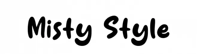
( Fonts by Syaf Rizal - Khurasan - Personal-use only. For commercial use please contact owner. )
A playful, bold font with rounded, bubbly characters and a hand-drawn feel.
![Misty Style Frei Schriftart Herunterladen]() Herunterladen 2771 Downloads@WebFont
Herunterladen 2771 Downloads@WebFont -
![RAI Denmark Neo Frei Schriftart Herunterladen]() Herunterladen 2771 Downloads@WebFont
Herunterladen 2771 Downloads@WebFont -
( Fonts by Paul Miller )
A smooth, flowing italic font with elegant curves and dynamic slant.
![Bainsley Italic Frei Schriftart Herunterladen]() Herunterladen 2770 Downloads@WebFont
Herunterladen 2770 Downloads@WebFont -
( Fonts by Castcraft Software - opti.netii.net - check the website before use )
A classic serif font with elegant strokes and balanced proportions.
![OPTIMichaelAngelo Frei Schriftart Herunterladen]() Herunterladen 2769 Downloads@WebFont
Herunterladen 2769 Downloads@WebFont -
( Copyright (c) 2011 by Anna GiedryÅ› (http://ancymonic.com) )
A clean, modern sans-serif font with a semi-bold weight and rounded edges.
![Signika SemiBold Frei Schriftart Herunterladen]() Herunterladen 2769 Downloads@WebFont
Herunterladen 2769 Downloads@WebFont -
( Fonts by Sinister Visions - Chad Savage - www.sinisterfonts.com )
A dramatic, jagged font with a hand-drawn, eerie appearance.
![Gypsy Curse Frei Schriftart Herunterladen]() Herunterladen 2769 Downloads@WebFont
Herunterladen 2769 Downloads@WebFont -
![University Ex Frei Schriftart Herunterladen]() Herunterladen 2769 Downloads@WebFont
Herunterladen 2769 Downloads@WebFont -
( Copyright (c) 2013, Natanael Gama (www.ndiscovered.com . info(at)ndiscovered.com), with Reserved Font Name 'Exo )
A modern, geometric sans-serif font with a clean and structured design.
![Exo 2 Semi Bold Frei Schriftart Herunterladen]() Herunterladen 2768 Downloads@WebFont
Herunterladen 2768 Downloads@WebFont -
![ArTarumianAnpuit Frei Schriftart Herunterladen]() Herunterladen 2768 Downloads@WebFont
Herunterladen 2768 Downloads@WebFont -
( Fonts by ShyFonts )
A futuristic, geometric font with bold, blocky letterforms and consistent stroke width.
![SF Automaton Frei Schriftart Herunterladen]() Herunterladen 2768 Downloads@WebFont
Herunterladen 2768 Downloads@WebFont


Welche Schriften sind gerade am populärsten?
Poppins, Roboto, Montserrat, Open Sans und Lato sind wegen ihrer klaren Formen und breiten Einsetzbarkeit sehr gefragt – von Markenauftritt über Landingpages bis hin zu Postern.
Welche Fonts eignen sich für Logos?
Geometrische Sans‑Serifs (z. B. Poppins, Familien im Gotham‑Stil) sind ein häufiger Griff für sauberes, skalierbares Branding. Für eine persönlichere Note bleiben Scripts und Handschrift‑Stile beliebt. Kombinieren Sie einen prägnanten Headline‑Font mit einer neutralen Brotschrift für Wiedererkennung und Harmonie.
Wie oft wird die Top‑Liste aktualisiert?
Regelmäßig – basierend auf realen Downloads und Interaktionen. Schauen Sie öfter vorbei, um aufstrebende Favoriten früh zu entdecken.
💡 Tipp: Seite bookmarken – Trends wechseln schnell, und heutige Top‑Schriften inspirieren morgen vielleicht das Rebranding.