Willkommen bei den Top‑Schriften – hier treffen Beliebtheit und Qualität aufeinander. Das sind die in diesem Jahr am häufigsten heruntergeladenen und genutzten Fonts. Wenn Sie sichere Optionen für Logo, Web oder Social suchen, starten Sie hier.
Jeder Top‑Font überzeugt durch Balance, Lesbarkeit und Vielseitigkeit. Sie finden moderne Sans‑Serifs, elegante Scripts, Vintage‑Serifs und minimalistische Displays.
-
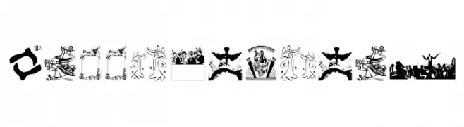
( Fonts by Manfred Klein. Free for private and charity use. Free for commercial with donation to organizations )
A whimsical and illustrative font with lively scenes replacing traditional letters.
 Herunterladen 887 Downloads@WebFont
 -
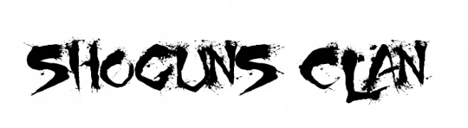
( Fonts by Christopher Hansen )
A bold, calligraphy-inspired font with sharp, angular strokes and ink splatter effects.
![Shoguns Clan Frei Schriftart Herunterladen]() Herunterladen 887 Downloads@WebFont
Herunterladen 887 Downloads@WebFont -
![SF Solar Sailer Extended Frei Schriftart Herunterladen]() Herunterladen 887 Downloads@WebFont
Herunterladen 887 Downloads@WebFont -
![Kubra_medium Frei Schriftart Herunterladen]() Herunterladen 887 Downloads@WebFont
Herunterladen 887 Downloads@WebFont -
( Fonts by Kong Font - https://fontkong.com/ - Personal-use only. For commercial use please contact owner. )
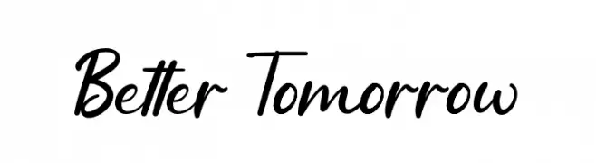
A lively, cursive script font with fluid connections and elegant curves.
![Better Tomorrow Frei Schriftart Herunterladen]() Herunterladen 886 Downloads@WebFont
Herunterladen 886 Downloads@WebFont -
-
( Zetafonts - www.zetafonts.com )
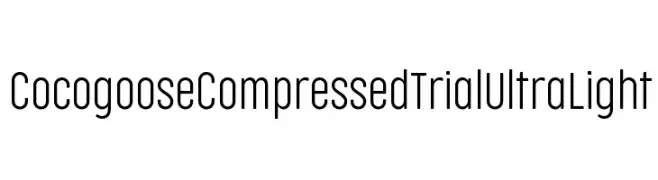
A modern, ultra-light, condensed font with a minimalist design.
![Cocogoose Compressed Trial UltraLight Frei Schriftart Herunterladen]() Herunterladen 886 Downloads@WebFont
Herunterladen 886 Downloads@WebFont -
( Thor Christopher Arisland - www.tcarisland.com )
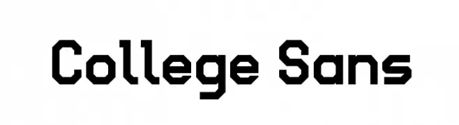
A bold, geometric font with a modern and industrial aesthetic.
![College Sans Frei Schriftart Herunterladen]() Herunterladen 886 Downloads@WebFont
Herunterladen 886 Downloads@WebFont -
( Chequered Ink - chequered.ink/ )
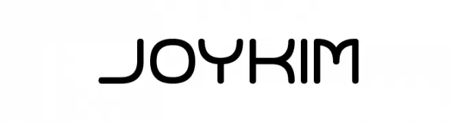
A modern, geometric font with rounded edges and a minimalist style.
![Joy Kim Frei Schriftart Herunterladen]() Herunterladen 886 Downloads@WebFont
Herunterladen 886 Downloads@WebFont -
( Copyright (c) 2013-2015 Post No Bills Project Authors (https://github.com/mooniak/post-no-bills-font). )
A modern, geometric stencil font with a semi-bold weight and industrial feel.
![Post No Bills Jaffna SemiBold Frei Schriftart Herunterladen]() Herunterladen 886 Downloads@WebFont
Herunterladen 886 Downloads@WebFont -
![Vacer Sans Personal Black Frei Schriftart Herunterladen]() Herunterladen 886 Downloads@WebFont
Herunterladen 886 Downloads@WebFont

Welche Schriften sind gerade am populärsten?
Poppins, Roboto, Montserrat, Open Sans und Lato sind wegen ihrer klaren Formen und breiten Einsetzbarkeit sehr gefragt – von Markenauftritt über Landingpages bis hin zu Postern.
Welche Fonts eignen sich für Logos?
Geometrische Sans‑Serifs (z. B. Poppins, Familien im Gotham‑Stil) sind ein häufiger Griff für sauberes, skalierbares Branding. Für eine persönlichere Note bleiben Scripts und Handschrift‑Stile beliebt. Kombinieren Sie einen prägnanten Headline‑Font mit einer neutralen Brotschrift für Wiedererkennung und Harmonie.
Wie oft wird die Top‑Liste aktualisiert?
Regelmäßig – basierend auf realen Downloads und Interaktionen. Schauen Sie öfter vorbei, um aufstrebende Favoriten früh zu entdecken.
💡 Tipp: Seite bookmarken – Trends wechseln schnell, und heutige Top‑Schriften inspirieren morgen vielleicht das Rebranding.