Willkommen bei den Top‑Schriften – hier treffen Beliebtheit und Qualität aufeinander. Das sind die in diesem Jahr am häufigsten heruntergeladenen und genutzten Fonts. Wenn Sie sichere Optionen für Logo, Web oder Social suchen, starten Sie hier.
Jeder Top‑Font überzeugt durch Balance, Lesbarkeit und Vielseitigkeit. Sie finden moderne Sans‑Serifs, elegante Scripts, Vintage‑Serifs und minimalistische Displays.
-
 Herunterladen 173 Downloads@WebFont
 -
( 538Fonts - storychoice.wix.com/homepage )
A playful, brush-stroke inspired font with a hand-drawn aesthetic.
![Oilpainter Frei Schriftart Herunterladen]() Herunterladen 173 Downloads@WebFont
Herunterladen 173 Downloads@WebFont -
( Fonts by Tokopress )
A bold, graffiti-inspired font with sharp angles and dynamic strokes.
![Madison Street Frei Schriftart Herunterladen]() Herunterladen 173 Downloads@WebFont
Herunterladen 173 Downloads@WebFont -
( Fonts by Aleksandar Stevanov )
A bold, handwritten font with a dynamic and energetic style.
![Kokan Frei Schriftart Herunterladen]() Herunterladen 173 Downloads@WebFont
Herunterladen 173 Downloads@WebFont -
![rt screenloft8 Frei Schriftart Herunterladen]() Herunterladen 173 Downloads@WebFont
Herunterladen 173 Downloads@WebFont -
( Fonts by Apostrophic Lab )
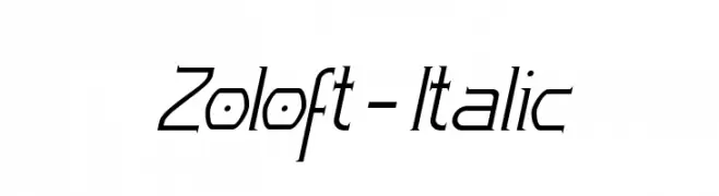
A sleek, modern italic font with geometric precision and clean lines.
![Zoloft-Italic Frei Schriftart Herunterladen]() Herunterladen 173 Downloads@WebFont
Herunterladen 173 Downloads@WebFont -
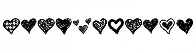
![Crazy Hearts Frei Schriftart Herunterladen]() Herunterladen 173 Downloads@WebFont
Herunterladen 173 Downloads@WebFont -
( Fonts by 38.lineart )
A playful, handwritten font with a casual and friendly style.
![Malique Frei Schriftart Herunterladen]() Herunterladen 173 Downloads@WebFont
Herunterladen 173 Downloads@WebFont -
( Fonts by DM Studio )
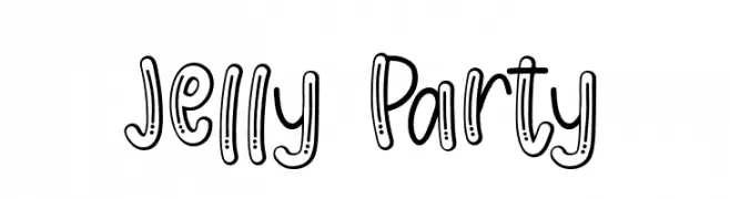
A playful, hand-drawn font with a bubbly, cartoonish style.
![Jelly Party Frei Schriftart Herunterladen]() Herunterladen 173 Downloads@WebFont
Herunterladen 173 Downloads@WebFont -
( Fonts by Wildan Type )
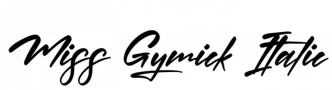
A bold, cursive script font with a dynamic, handwritten style.
![Miss Gymick Italic Frei Schriftart Herunterladen]() Herunterladen 173 Downloads@WebFont
Herunterladen 173 Downloads@WebFont -
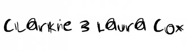
![Clarkie 3 Laura Cox Frei Schriftart Herunterladen]() Herunterladen 173 Downloads@WebFont
Herunterladen 173 Downloads@WebFont -
( Fonts by Pizzadude - Personal-use only. For commercial use please contact owner. )
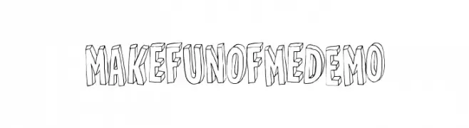
A playful, bold 3D font with a hand-drawn aesthetic.
![MakefunofmeDEMO Frei Schriftart Herunterladen]() Herunterladen 173 Downloads@WebFont
Herunterladen 173 Downloads@WebFont -
( Fonts by Daniel Zadorozny - www.iconian.com )
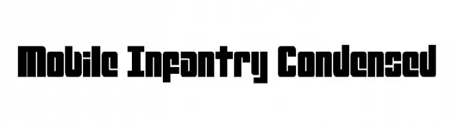
A bold, condensed font with a strong, geometric design.
![Mobile Infantry Condensed Frei Schriftart Herunterladen]() Herunterladen 173 Downloads@WebFont
Herunterladen 173 Downloads@WebFont -
( www.leodsen.com )
A bold, distressed font with an edgy, grunge-like style.
![CoolDay Frei Schriftart Herunterladen]() Herunterladen 173 Downloads@WebFont
Herunterladen 173 Downloads@WebFont -
( Fonts by CannotIntoSpaceFonts - KineticPlasma Fonts - Personal-use only. For commercial use please contact owner. )
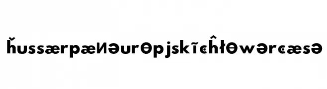
A bold, geometric sans-serif font with a modern and versatile design.
![Hussar Paneuropjskich Lowercase Frei Schriftart Herunterladen]() Herunterladen 173 Downloads@WebFont
Herunterladen 173 Downloads@WebFont -
( Fonts by Letterflow )
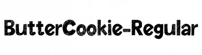
A bold, hand-drawn font with a textured, scribble-like pattern.
![ButterCookie-Regular Frei Schriftart Herunterladen]() Herunterladen 173 Downloads@WebFont
Herunterladen 173 Downloads@WebFont -
( Fonts by Breh Creative - Vavad Harahap - Personal-use only. For commercial use please contact owner. )
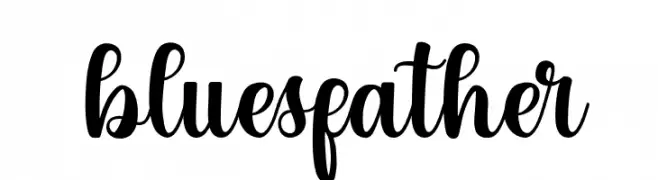
A bold, elegant script font with flowing, cursive letterforms.
![bluesfather Frei Schriftart Herunterladen]() Herunterladen 173 Downloads@WebFont
Herunterladen 173 Downloads@WebFont -
( Fonts by Staircase Studio )
Handwritten cursive script font.
![Kayliee Mightness Frei Schriftart Herunterladen]() Herunterladen 173 Downloads@WebFont
Herunterladen 173 Downloads@WebFont -
( Fonts by Maelle.K - Thomas Boucherie )
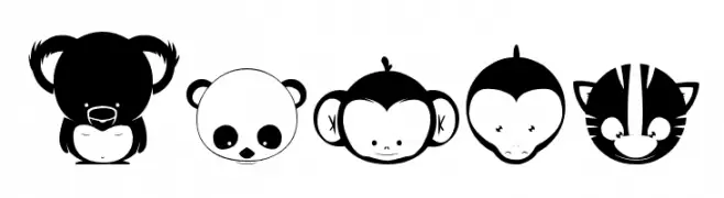
Cartoon animal dingbat font with bold, playful characters.
![Animox Frei Schriftart Herunterladen]() Herunterladen 173 Downloads@WebFont
Herunterladen 173 Downloads@WebFont -
( Motokiwo - Anton Cahyono - creativemarket.com/Motokiwo?u=Motokiwo )
A playful handwritten font with elongated, irregular letterforms and dynamic strokes.
![JamesBlack Frei Schriftart Herunterladen]() Herunterladen 173 Downloads@WebFont
Herunterladen 173 Downloads@WebFont -
( Fonts by Fenny Wiryani - Personal-use only. For commercial use please contact owner. )
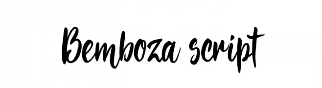
A bold, expressive brush script font with dynamic strokes and artistic flair.
![Bemboza script Frei Schriftart Herunterladen]() Herunterladen 173 Downloads@WebFont
Herunterladen 173 Downloads@WebFont -
( Fonts by Iconian Fonts )
A bold, italic font with thick outlines and a modern, dynamic style.
![USAngel Punch Italic Frei Schriftart Herunterladen]() Herunterladen 173 Downloads@WebFont
Herunterladen 173 Downloads@WebFont -
( Fonts by Douglas Vitkauskas - www.vtksdesign.com. Personal-use only. For commercial use please contact owner. )
A bold, distressed font with a textured, grunge style.
![vtks Control Frei Schriftart Herunterladen]() Herunterladen 173 Downloads@WebFont
Herunterladen 173 Downloads@WebFont -
( Fonts by Jen Jones )
A playful, handwritten font with rounded, informal letterforms.
![HelloHandMeDown Frei Schriftart Herunterladen]() Herunterladen 173 Downloads@WebFont
Herunterladen 173 Downloads@WebFont -
( Fonts by Inermedia Studio )
A playful and energetic script font with a handwritten feel.
![Brunch Frei Schriftart Herunterladen]() Herunterladen 173 Downloads@WebFont
Herunterladen 173 Downloads@WebFont -
( Fonts by Go Letter )
A playful, hand-drawn font with bold, exaggerated curves and loops.
![GROW UP Frei Schriftart Herunterladen]() Herunterladen 173 Downloads@WebFont
Herunterladen 173 Downloads@WebFont -
( Fonts by wepfont - Wahyu Eka Prasetya - Personal-use only. For commercial use please contact owner. )
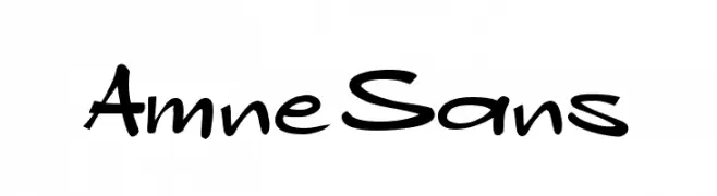
A playful, handwritten-style font with bold, flowing strokes.
![Amne Sans Frei Schriftart Herunterladen]() Herunterladen 173 Downloads@WebFont
Herunterladen 173 Downloads@WebFont -
( Fonts by Chris Vile - fontmonger.com - Personal-use only. For commercial use please contact owner. )
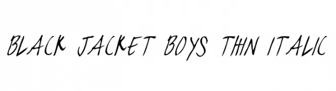
A thin, italicized handwritten font with dynamic and expressive strokes.
![black jacket boys Thin Italic Frei Schriftart Herunterladen]() Herunterladen 173 Downloads@WebFont
Herunterladen 173 Downloads@WebFont -
( Fonts by Xerographer Fonts )
A bold, high-contrast script font with a hand-drawn, dynamic style.
![Gaslighter Frei Schriftart Herunterladen]() Herunterladen 173 Downloads@WebFont
Herunterladen 173 Downloads@WebFont -
( Fonts by www.typodermicfonts.com - Ray Larabie )
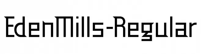
A geometric, modern font with clean lines and sharp angles.
![EdenMills-Regular Frei Schriftart Herunterladen]() Herunterladen 173 Downloads@WebFont
Herunterladen 173 Downloads@WebFont -
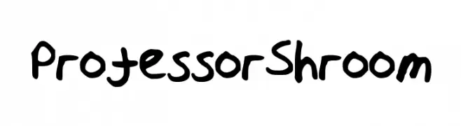
![ProfessorShroom Frei Schriftart Herunterladen]() Herunterladen 173 Downloads@WebFont
Herunterladen 173 Downloads@WebFont -
( Fonts by GlitzyGrapix - Lelanie - Personal-use only. For commercial use please contact owner. )
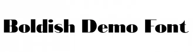
A bold, modern font with high contrast and unique stroke variations.
![Bold-ish Demo Font Frei Schriftart Herunterladen]() Herunterladen 173 Downloads@WebFont
Herunterladen 173 Downloads@WebFont -
( Fonts by The Branded Quotes )
A rough, sketchy handwritten font with tall, narrow characters and expressive strokes.
![Arkinthor Hands Frei Schriftart Herunterladen]() Herunterladen 173 Downloads@WebFont
Herunterladen 173 Downloads@WebFont -
( Fonts by Woodcutter )
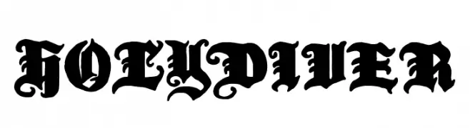
A bold, ornate blackletter font with intricate Gothic details.
![Holy Diver Frei Schriftart Herunterladen]() Herunterladen 173 Downloads@WebFont
Herunterladen 173 Downloads@WebFont -
( Fonts by Cooper Hewitt Smithsonian Design Museum )
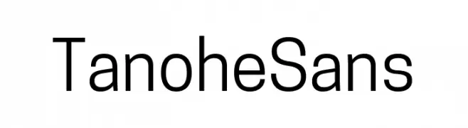
A clean, modern sans-serif font with consistent stroke width and excellent readability.
![Tanohe Sans Frei Schriftart Herunterladen]() Herunterladen 173 Downloads@WebFont
Herunterladen 173 Downloads@WebFont


Welche Schriften sind gerade am populärsten?
Poppins, Roboto, Montserrat, Open Sans und Lato sind wegen ihrer klaren Formen und breiten Einsetzbarkeit sehr gefragt – von Markenauftritt über Landingpages bis hin zu Postern.
Welche Fonts eignen sich für Logos?
Geometrische Sans‑Serifs (z. B. Poppins, Familien im Gotham‑Stil) sind ein häufiger Griff für sauberes, skalierbares Branding. Für eine persönlichere Note bleiben Scripts und Handschrift‑Stile beliebt. Kombinieren Sie einen prägnanten Headline‑Font mit einer neutralen Brotschrift für Wiedererkennung und Harmonie.
Wie oft wird die Top‑Liste aktualisiert?
Regelmäßig – basierend auf realen Downloads und Interaktionen. Schauen Sie öfter vorbei, um aufstrebende Favoriten früh zu entdecken.
💡 Tipp: Seite bookmarken – Trends wechseln schnell, und heutige Top‑Schriften inspirieren morgen vielleicht das Rebranding.