Willkommen bei den Top‑Schriften – hier treffen Beliebtheit und Qualität aufeinander. Das sind die in diesem Jahr am häufigsten heruntergeladenen und genutzten Fonts. Wenn Sie sichere Optionen für Logo, Web oder Social suchen, starten Sie hier.
Jeder Top‑Font überzeugt durch Balance, Lesbarkeit und Vielseitigkeit. Sie finden moderne Sans‑Serifs, elegante Scripts, Vintage‑Serifs und minimalistische Displays.
-
 Herunterladen 2679 Downloads@WebFont
 -
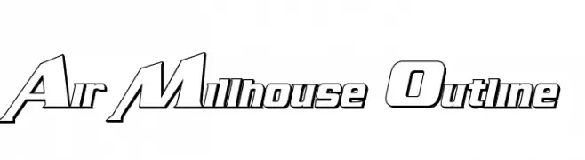
![Air Millhouse Outline Frei Schriftart Herunterladen]() Herunterladen 2679 Downloads@WebFont
Herunterladen 2679 Downloads@WebFont -
( Fonts by Sorkin Type Co - Personal-use only. For commercial use please contact owner. )
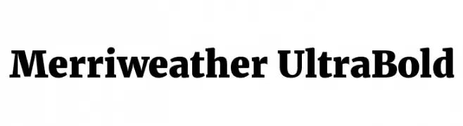
A bold serif font with strong, thick strokes and classic design elements.
![Merriweather UltraBold Frei Schriftart Herunterladen]() Herunterladen 2678 Downloads@WebFont
Herunterladen 2678 Downloads@WebFont -
![Kitten Fat Frei Schriftart Herunterladen]() Herunterladen 2678 Downloads@WebFont
Herunterladen 2678 Downloads@WebFont -
( Copyright (c) 2012, Carrois Type Design, Ralph du Carrois (post@carrois.com www.carrois.com), with Reserved Font Name 'Share' )
A bold, modern sans-serif font with strong, clean lines.
![Share Bold Frei Schriftart Herunterladen]() Herunterladen 2678 Downloads@WebFont
Herunterladen 2678 Downloads@WebFont -
( Fonts by Castcraft Software - opti.netii.net - check the website before use )
A decorative and vintage-style font with ornate details.
![OPTICampanile Frei Schriftart Herunterladen]() Herunterladen 2677 Downloads@WebFont
Herunterladen 2677 Downloads@WebFont -
![Bullpen Frei Schriftart Herunterladen]() Herunterladen 2677 Downloads@WebFont
Herunterladen 2677 Downloads@WebFont -
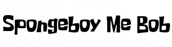
( Fonts by EyeOfTheLioness )
A playful, hand-drawn font with irregular, bold letterforms.
![Spongeboy Me Bob Frei Schriftart Herunterladen]() Herunterladen 2676 Downloads@WebFont
Herunterladen 2676 Downloads@WebFont -
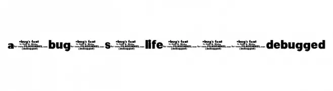
( Fonts by Jens R. Ziehn - www.filmhimmel.com )
A bold, modern font with thick, uniform strokes and high legibility.
![a-bug-s-life---debugged Frei Schriftart Herunterladen]() Herunterladen 2676 Downloads@WebFont
Herunterladen 2676 Downloads@WebFont -
( zuzulgo studio - creativemarket.com/zuzulgo )
A fluid, handwritten-style font with elegant curves and consistent strokes.
![Kinan Frei Schriftart Herunterladen]() Herunterladen 2674 Downloads@WebFont
Herunterladen 2674 Downloads@WebFont -
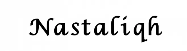
( گالری فانت فارسی پژوهش آريانا - only compatible with Farsi and Arabic )
A cursive, calligraphic font with elegant curves and a dynamic style.
![Nastaliqh Frei Schriftart Herunterladen]() Herunterladen 2674 Downloads@WebFont
Herunterladen 2674 Downloads@WebFont -
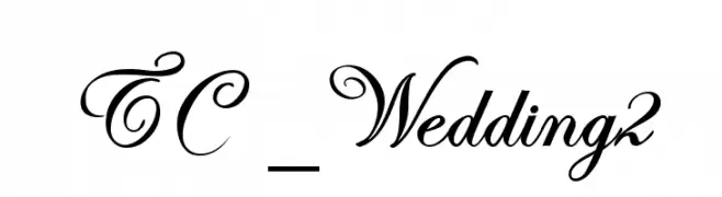
![TC _Wedding2 Frei Schriftart Herunterladen]() Herunterladen 2674 Downloads@WebFont
Herunterladen 2674 Downloads@WebFont -
![Juicy Hunt Frei Schriftart Herunterladen]() Herunterladen 2674 Downloads@WebFont
Herunterladen 2674 Downloads@WebFont -
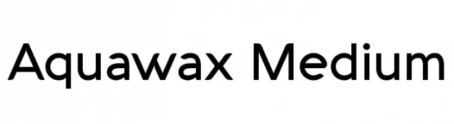
( Fonts by a kmzero font foundry - www.zetafonts.com. Personal-use only. For commercial use please contact owner. )
A modern sans-serif font with smooth curves and balanced proportions.
![Aquawax Medium Frei Schriftart Herunterladen]() Herunterladen 2672 Downloads@WebFont
Herunterladen 2672 Downloads@WebFont -
( Copyright (c) 2011 Angel Koziupa (sudtipos@sudtipos.com) )
A playful, bubbly font with rounded characters and a whimsical style.
![BubblegumSans-Regular Frei Schriftart Herunterladen]() Herunterladen 2672 Downloads@WebFont
Herunterladen 2672 Downloads@WebFont -
( Fonts by Castcraft Software - opti.netii.net - check the website before use )
A bold, classic serif font with strong, elegant strokes.
![OPTICaslonBold-Cond Frei Schriftart Herunterladen]() Herunterladen 2671 Downloads@WebFont
Herunterladen 2671 Downloads@WebFont -
( Fonts by Will Std )
A bold, dynamic font with playful angles and an energetic style.
![Chicken Dinner Demo Frei Schriftart Herunterladen]() Herunterladen 2670 Downloads@WebFont
Herunterladen 2670 Downloads@WebFont -
Schriftart von KiddieFonts. For commercial use please contact the owner.
![DANGERMOUSE Frei Schriftart Herunterladen]() Herunterladen 2670 Downloads@WebFont
Herunterladen 2670 Downloads@WebFont -
( Fonts by Dieter Steffmann )
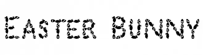
A whimsical, Easter-themed decorative font featuring eggs and bunnies.
![Easter Bunny Frei Schriftart Herunterladen]() Herunterladen 2670 Downloads@WebFont
Herunterladen 2670 Downloads@WebFont -
( Fonts by Paul Lloyd )
A bold blackletter font with shadow effects, offering a dramatic and ornate style.
![Dampfplatz Shadow Black Frei Schriftart Herunterladen]() Herunterladen 2670 Downloads@WebFont
Herunterladen 2670 Downloads@WebFont -
( Alexander Pravdin )
A bold, modern sans-serif font with semi-expanded, geometric letterforms.
![SONGERSemiExpanded-Bold Frei Schriftart Herunterladen]() Herunterladen 2668 Downloads@WebFont
Herunterladen 2668 Downloads@WebFont -
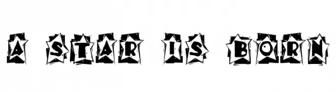
![A Star is Born Frei Schriftart Herunterladen]() Herunterladen 2668 Downloads@WebFont
Herunterladen 2668 Downloads@WebFont -
( Fonts by Utopia - www.daleharris.com )
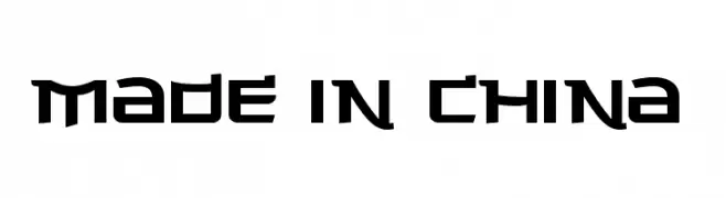
A bold, futuristic font with sharp, angular edges and a geometric structure.
![Made in China Frei Schriftart Herunterladen]() Herunterladen 2668 Downloads@WebFont
Herunterladen 2668 Downloads@WebFont -
( Fonts by Utopiafonts )
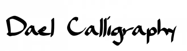
A dynamic calligraphic font with fluid, sweeping strokes and artistic flair.
![Dael Calligraphy Frei Schriftart Herunterladen]() Herunterladen 2668 Downloads@WebFont
Herunterladen 2668 Downloads@WebFont -
Schriftart von HammerBro101. For commercial use please contact the owner.
![Mario Kart Wii Placement Regular Frei Schriftart Herunterladen]() Herunterladen 2667 Downloads@WebFont
Herunterladen 2667 Downloads@WebFont -
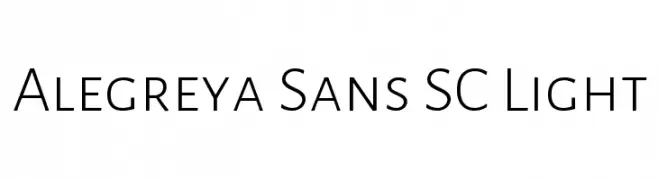
( Copyright 2013 The Alegreya Sans Project Authors (https://github.com/huertatipografica/Alegreya-Sans) )
A modern, light sans-serif font with a clean and professional look.
![Alegreya Sans SC Light Frei Schriftart Herunterladen]() Herunterladen 2667 Downloads@WebFont
Herunterladen 2667 Downloads@WebFont -
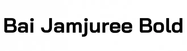
( Copyright 2018 Bai Jamjuree (https://github.com/cadsondemak/Bai-Jamjuree) )
A bold, modern sans-serif font with excellent readability and versatility.
![Bai Jamjuree Bold Frei Schriftart Herunterladen]() Herunterladen 2666 Downloads@WebFont
Herunterladen 2666 Downloads@WebFont -
![M+ 2p medium Frei Schriftart Herunterladen]() Herunterladen 2666 Downloads@WebFont
Herunterladen 2666 Downloads@WebFont -
![The Aeroplane Flies High Heavy Frei Schriftart Herunterladen]() Herunterladen 2666 Downloads@WebFont
Herunterladen 2666 Downloads@WebFont -
( Fonts by Castcraft Software - opti.netii.net - check the website before use )
A tall, narrow, and modern font with an elegant style.
![OPTIGalaxy Frei Schriftart Herunterladen]() Herunterladen 2665 Downloads@WebFont
Herunterladen 2665 Downloads@WebFont -
( گالری فانت فارسی پژوهش آريانا - only compatible with Farsi and Arabic )
A classic serif font with elegant strokes and refined details.
![Zarnegaar Frei Schriftart Herunterladen]() Herunterladen 2665 Downloads@WebFont
Herunterladen 2665 Downloads@WebFont -
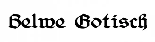
( Fonts by Dieter Steffmann )
A bold, gothic Blackletter font with intricate detailing and a medieval aesthetic.
![Belwe Gotisch Frei Schriftart Herunterladen]() Herunterladen 2665 Downloads@WebFont
Herunterladen 2665 Downloads@WebFont -
( Fonts by Daniel Heikkinen - Personal-use only. For commercial use please contact owner. )
A bold, geometric font with strong, blocky characters.
![nebraska Frei Schriftart Herunterladen]() Herunterladen 2664 Downloads@WebFont
Herunterladen 2664 Downloads@WebFont -
![Variane Script Frei Schriftart Herunterladen]() Herunterladen 2664 Downloads@WebFont
Herunterladen 2664 Downloads@WebFont -
![Typografix Frei Schriftart Herunterladen]() Herunterladen 2664 Downloads@WebFont
Herunterladen 2664 Downloads@WebFont


Welche Schriften sind gerade am populärsten?
Poppins, Roboto, Montserrat, Open Sans und Lato sind wegen ihrer klaren Formen und breiten Einsetzbarkeit sehr gefragt – von Markenauftritt über Landingpages bis hin zu Postern.
Welche Fonts eignen sich für Logos?
Geometrische Sans‑Serifs (z. B. Poppins, Familien im Gotham‑Stil) sind ein häufiger Griff für sauberes, skalierbares Branding. Für eine persönlichere Note bleiben Scripts und Handschrift‑Stile beliebt. Kombinieren Sie einen prägnanten Headline‑Font mit einer neutralen Brotschrift für Wiedererkennung und Harmonie.
Wie oft wird die Top‑Liste aktualisiert?
Regelmäßig – basierend auf realen Downloads und Interaktionen. Schauen Sie öfter vorbei, um aufstrebende Favoriten früh zu entdecken.
💡 Tipp: Seite bookmarken – Trends wechseln schnell, und heutige Top‑Schriften inspirieren morgen vielleicht das Rebranding.