Willkommen bei den Top‑Schriften – hier treffen Beliebtheit und Qualität aufeinander. Das sind die in diesem Jahr am häufigsten heruntergeladenen und genutzten Fonts. Wenn Sie sichere Optionen für Logo, Web oder Social suchen, starten Sie hier.
Jeder Top‑Font überzeugt durch Balance, Lesbarkeit und Vielseitigkeit. Sie finden moderne Sans‑Serifs, elegante Scripts, Vintage‑Serifs und minimalistische Displays.
-
 Herunterladen 2663 Downloads@WebFont
 -
![Priory Frei Schriftart Herunterladen]() Herunterladen 2663 Downloads@WebFont
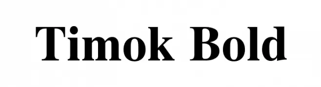
Herunterladen 2663 Downloads@WebFont -
![Timok Bold Frei Schriftart Herunterladen]() Herunterladen 2662 Downloads@WebFont
Herunterladen 2662 Downloads@WebFont -
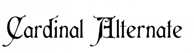
( Fonts by Dieter Steffmann )
An ornate, medieval-inspired font with intricate flourishes and sharp serifs.
![Cardinal Alternate Frei Schriftart Herunterladen]() Herunterladen 2662 Downloads@WebFont
Herunterladen 2662 Downloads@WebFont -
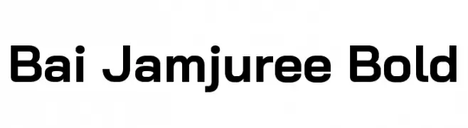
( Copyright 2018 Bai Jamjuree (https://github.com/cadsondemak/Bai-Jamjuree) )
A bold, modern sans-serif font with excellent readability and versatility.
![Bai Jamjuree Bold Frei Schriftart Herunterladen]() Herunterladen 2661 Downloads@WebFont
Herunterladen 2661 Downloads@WebFont -
( Iconian Fonts - Daniel Zadorozny - www.iconian.com )
A bold, geometric font with strong, even strokes and a modern aesthetic.
![Soloist Straight Frei Schriftart Herunterladen]() Herunterladen 2661 Downloads@WebFont
Herunterladen 2661 Downloads@WebFont -
![Falcon Frei Schriftart Herunterladen]() Herunterladen 2661 Downloads@WebFont
Herunterladen 2661 Downloads@WebFont -
![Zachary Frei Schriftart Herunterladen]() Herunterladen 2661 Downloads@WebFont
Herunterladen 2661 Downloads@WebFont -
Schriftart von danny91194. For commercial use please contact the owner.
![ANDROMEDA20 Frei Schriftart Herunterladen]() Herunterladen 2660 Downloads@WebFont
Herunterladen 2660 Downloads@WebFont -
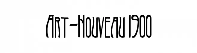
( Fonts by www.gliphmaker.com. Personal-use only. For commercial use please contact owner. )
An elegant, elongated font with Art Nouveau-inspired curves and fluidity.
![Art-Nouveau 1900 Frei Schriftart Herunterladen]() Herunterladen 2660 Downloads@WebFont
Herunterladen 2660 Downloads@WebFont -
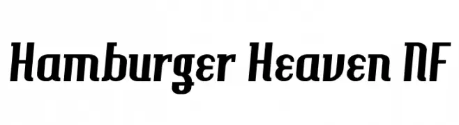
( Fonts by Nick Curtis - www.nicksfonts.com )
A bold, slanted font with a dynamic and energetic style.
![Hamburger Heaven NF Frei Schriftart Herunterladen]() Herunterladen 2660 Downloads@WebFont
Herunterladen 2660 Downloads@WebFont -
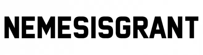
( Fonts by www.chequered.ink - Chequered Ink - Personal-use only. For commercial use please contact owner. )
A bold, geometric sans-serif font with a modern and assertive style.
![Nemesis Grant Frei Schriftart Herunterladen]() Herunterladen 2659 Downloads@WebFont
Herunterladen 2659 Downloads@WebFont -
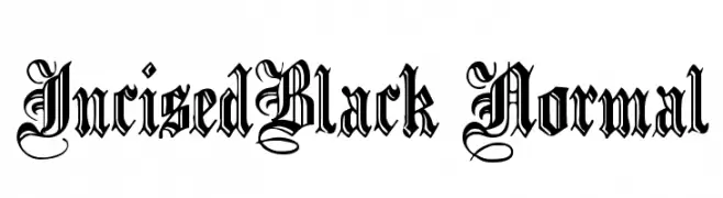
( Fonts by Paul Lloyd )
A decorative blackletter font with ornate flourishes and bold strokes.
![IncisedBlack Normal Frei Schriftart Herunterladen]() Herunterladen 2659 Downloads
Herunterladen 2659 Downloads -
Schriftart von spideraysfonts. For commercial use please contact the owner.
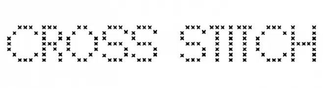
( CROSS STITCH )
A decorative font resembling cross-stitch embroidery with consistent 'x' patterns.
![CROSS STITCH Frei Schriftart Herunterladen]() Herunterladen 2658 Downloads@WebFont
Herunterladen 2658 Downloads@WebFont -
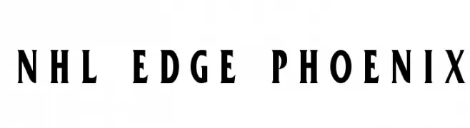
![NHL Edge Phoenix Frei Schriftart Herunterladen]() Herunterladen 2658 Downloads@WebFont
Herunterladen 2658 Downloads@WebFont -
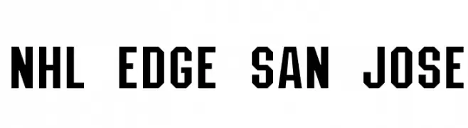
![NHL Edge San Jose Frei Schriftart Herunterladen]() Herunterladen 2658 Downloads@WebFont
Herunterladen 2658 Downloads@WebFont -
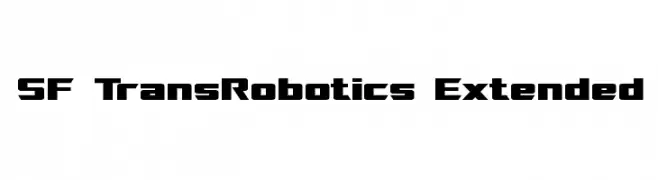
( Fonts by ShyFonts )
A bold, futuristic font with a geometric and angular design.
![SF TransRobotics Extended Frei Schriftart Herunterladen]() Herunterladen 2658 Downloads@WebFont
Herunterladen 2658 Downloads@WebFont -
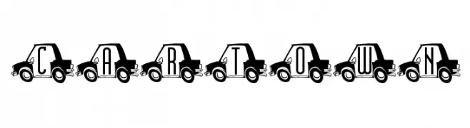
![CarTown Frei Schriftart Herunterladen]() Herunterladen 2658 Downloads@WebFont
Herunterladen 2658 Downloads@WebFont -
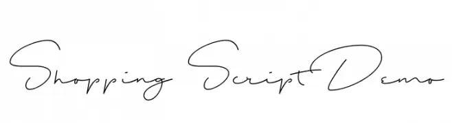
( Fonts by Runes & Fonts )
A flowing, cursive script with elegant, connected letters.
![Shopping Script Demo Frei Schriftart Herunterladen]() Herunterladen 2657 Downloads@WebFont
Herunterladen 2657 Downloads@WebFont -
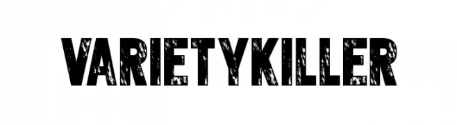
( Fonts by Andrew McCluskey - nalgames.com. Personal-use only. For commercial use please contact owner. )
A bold, distressed font with a rugged, vintage appearance.
![Varietykiller Frei Schriftart Herunterladen]() Herunterladen 2657 Downloads@WebFont
Herunterladen 2657 Downloads@WebFont -
( Copyright (c) 2011 by Anna GiedryÅ› (http://ancymonic.com) )
A modern, light sans-serif font with a clean and friendly appearance.
![Signika Light Frei Schriftart Herunterladen]() Herunterladen 2657 Downloads@WebFont
Herunterladen 2657 Downloads@WebFont -
![GurmukhiLys 010 Wide Frei Schriftart Herunterladen]() Herunterladen 2657 Downloads@WebFont
Herunterladen 2657 Downloads@WebFont -
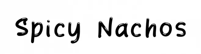
( Fonts by Khurasan )
A bold, handwritten font with playful, rounded strokes.
![Spicy Nachos Frei Schriftart Herunterladen]() Herunterladen 2656 Downloads@WebFont
Herunterladen 2656 Downloads@WebFont -
( Fonts by FreshtypeINK )
A playful, bold handwritten font with smooth curves and a lively character.
![Baby Boss Frei Schriftart Herunterladen]() Herunterladen 2656 Downloads@WebFont
Herunterladen 2656 Downloads@WebFont -
![Serbian-Courier Frei Schriftart Herunterladen]() Herunterladen 2656 Downloads@WebFont
Herunterladen 2656 Downloads@WebFont -
![DJ Web Frei Schriftart Herunterladen]() Herunterladen 2656 Downloads@WebFont
Herunterladen 2656 Downloads@WebFont -
( Fonts by a Emily Spadoni - http://creativemarket.com/emilyspadoni/. Personal-use only. For commercial use please contact owner. )
A whimsical and elegant script font with decorative curls and loops.
![Gardenia Frei Schriftart Herunterladen]() Herunterladen 2655 Downloads@WebFont
Herunterladen 2655 Downloads@WebFont -
Schriftart von defharo. For commercial use please contact the owner.
![Tabardo Frei Schriftart Herunterladen]() Herunterladen 2655 Downloads@WebFont
Herunterladen 2655 Downloads@WebFont -
( Free for personal use - www.vnbc.fr )
A modern, line-patterned font with a futuristic and dynamic style.
![Bonus Bling Bling Frei Schriftart Herunterladen]() Herunterladen 2655 Downloads@WebFont
Herunterladen 2655 Downloads@WebFont -
![Boopalam Regular Frei Schriftart Herunterladen]() Herunterladen 2655 Downloads@WebFont
Herunterladen 2655 Downloads@WebFont -
![Nano Frei Schriftart Herunterladen]() Herunterladen 2655 Downloads@WebFont
Herunterladen 2655 Downloads@WebFont -
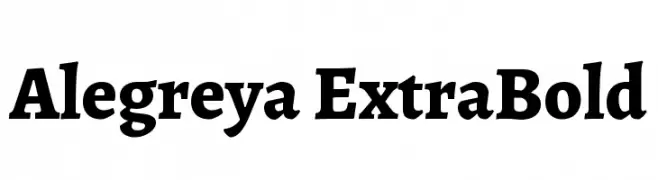
( Copyright 2011 The Alegreya Project Authors (https://github.com/huertatipografica/Alegreya) )
A bold serif typeface with dynamic strokes and elegant curvature.
![Alegreya ExtraBold Frei Schriftart Herunterladen]() Herunterladen 2654 Downloads@WebFont
Herunterladen 2654 Downloads@WebFont -
( Copyright 2016 The Sansita Project Authors (omnibus.type@gmail.com) )
A bold, italic font with smooth, rounded strokes and a dynamic style.
![Sansita ExtraBold Italic Frei Schriftart Herunterladen]() Herunterladen 2654 Downloads@WebFont
Herunterladen 2654 Downloads@WebFont -
( Fonts by Antrax - ja-fonts.iweb.pl )
A bold, intricate Blackletter font with a gothic, medieval aesthetic.
![Antraxja Goth 1938 Frei Schriftart Herunterladen]() Herunterladen 2654 Downloads@WebFont
Herunterladen 2654 Downloads@WebFont -
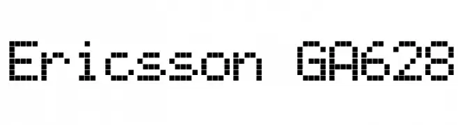
![Ericsson GA628 Frei Schriftart Herunterladen]() Herunterladen 2654 Downloads@WebFont
Herunterladen 2654 Downloads@WebFont


Welche Schriften sind gerade am populärsten?
Poppins, Roboto, Montserrat, Open Sans und Lato sind wegen ihrer klaren Formen und breiten Einsetzbarkeit sehr gefragt – von Markenauftritt über Landingpages bis hin zu Postern.
Welche Fonts eignen sich für Logos?
Geometrische Sans‑Serifs (z. B. Poppins, Familien im Gotham‑Stil) sind ein häufiger Griff für sauberes, skalierbares Branding. Für eine persönlichere Note bleiben Scripts und Handschrift‑Stile beliebt. Kombinieren Sie einen prägnanten Headline‑Font mit einer neutralen Brotschrift für Wiedererkennung und Harmonie.
Wie oft wird die Top‑Liste aktualisiert?
Regelmäßig – basierend auf realen Downloads und Interaktionen. Schauen Sie öfter vorbei, um aufstrebende Favoriten früh zu entdecken.
💡 Tipp: Seite bookmarken – Trends wechseln schnell, und heutige Top‑Schriften inspirieren morgen vielleicht das Rebranding.