Willkommen bei den Top‑Schriften – hier treffen Beliebtheit und Qualität aufeinander. Das sind die in diesem Jahr am häufigsten heruntergeladenen und genutzten Fonts. Wenn Sie sichere Optionen für Logo, Web oder Social suchen, starten Sie hier.
Jeder Top‑Font überzeugt durch Balance, Lesbarkeit und Vielseitigkeit. Sie finden moderne Sans‑Serifs, elegante Scripts, Vintage‑Serifs und minimalistische Displays.
-
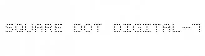
( Fonts by Style-7 - www.styleseven.com - Personal-use only. For commercial use please contact owner. )
A digital-style font made of square dots, evoking a retro tech feel.
 Herunterladen 838 Downloads@WebFont
 -
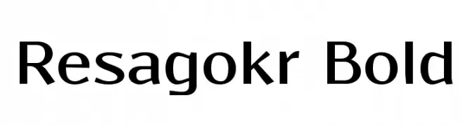
( Fonts by Grzegorz l - www.glukfonts.pl )
A bold, modern typeface with clean lines and a strong presence.
![Resagokr Bold Frei Schriftart Herunterladen]() Herunterladen 838 Downloads@WebFont
Herunterladen 838 Downloads@WebFont -
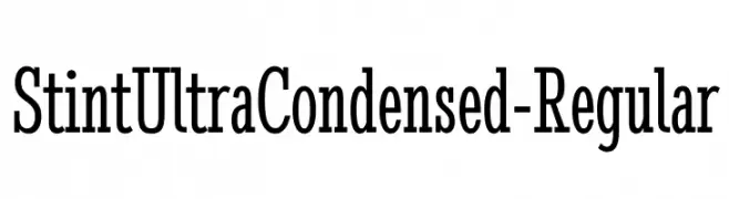
( Copyright (c) 2011 by Brian J. Bonislawsky DBA Astigmatic (AOETI) (astigma@astigmatic.com), with Reserved Font Names "Stint Ultra Condensed" )
A highly condensed and elegant font with tall, narrow letterforms and minimal contrast.
![StintUltraCondensed-Regular Frei Schriftart Herunterladen]() Herunterladen 838 Downloads@WebFont
Herunterladen 838 Downloads@WebFont -
![USN_Stencil Frei Schriftart Herunterladen]() Herunterladen 838 Downloads@WebFont
Herunterladen 838 Downloads@WebFont -
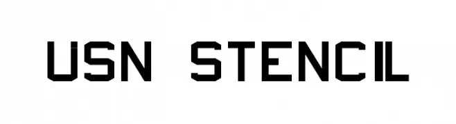
( Fonts by a Neale Davidson - www.pixelsagas.com. Personal-use only. For commercial use please contact owner. )
A bold, textured font with a rugged, hand-crafted appearance.
![Turtles Frei Schriftart Herunterladen]() Herunterladen 838 Downloads@WebFont
Herunterladen 838 Downloads@WebFont -
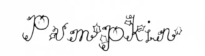
-
![Pumpkin Frei Schriftart Herunterladen]() Herunterladen 838 Downloads@WebFont
Herunterladen 838 Downloads@WebFont -
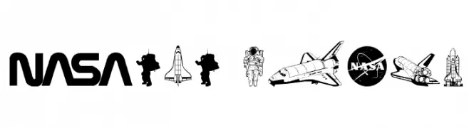
( Fonts by Daniel Zadorozny - www.iconian.com - Free for personal use )
A symbolic font featuring NASA and space exploration icons.
![NASA Dings Frei Schriftart Herunterladen]() Herunterladen 838 Downloads@WebFont
Herunterladen 838 Downloads@WebFont -
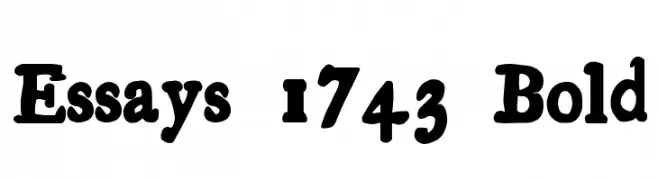
![Essays 1743 Bold Frei Schriftart Herunterladen]() Herunterladen 838 Downloads@WebFont
Herunterladen 838 Downloads@WebFont -
( Fonts by Bright Ideas )
A bold, gothic blackletter font with sharp, angular lines and dramatic flourishes.
![Griffin Frei Schriftart Herunterladen]() Herunterladen 838 Downloads@WebFont
Herunterladen 838 Downloads@WebFont -
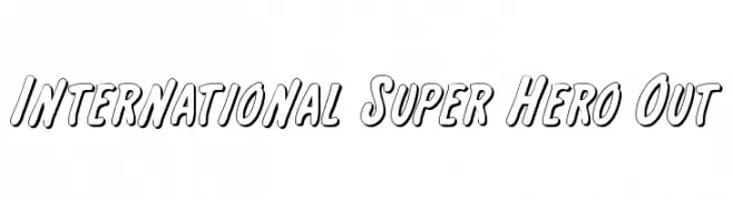
( Fonts by Daniel Zadorozny - www.iconian.com - Free for personal use )
A bold, outlined font with a playful, comic book style.
![International Super Hero Out Frei Schriftart Herunterladen]() Herunterladen 838 Downloads@WebFont
Herunterladen 838 Downloads@WebFont


Welche Schriften sind gerade am populärsten?
Poppins, Roboto, Montserrat, Open Sans und Lato sind wegen ihrer klaren Formen und breiten Einsetzbarkeit sehr gefragt – von Markenauftritt über Landingpages bis hin zu Postern.
Welche Fonts eignen sich für Logos?
Geometrische Sans‑Serifs (z. B. Poppins, Familien im Gotham‑Stil) sind ein häufiger Griff für sauberes, skalierbares Branding. Für eine persönlichere Note bleiben Scripts und Handschrift‑Stile beliebt. Kombinieren Sie einen prägnanten Headline‑Font mit einer neutralen Brotschrift für Wiedererkennung und Harmonie.
Wie oft wird die Top‑Liste aktualisiert?
Regelmäßig – basierend auf realen Downloads und Interaktionen. Schauen Sie öfter vorbei, um aufstrebende Favoriten früh zu entdecken.
💡 Tipp: Seite bookmarken – Trends wechseln schnell, und heutige Top‑Schriften inspirieren morgen vielleicht das Rebranding.