Willkommen bei den Top‑Schriften – hier treffen Beliebtheit und Qualität aufeinander. Das sind die in diesem Jahr am häufigsten heruntergeladenen und genutzten Fonts. Wenn Sie sichere Optionen für Logo, Web oder Social suchen, starten Sie hier.
Jeder Top‑Font überzeugt durch Balance, Lesbarkeit und Vielseitigkeit. Sie finden moderne Sans‑Serifs, elegante Scripts, Vintage‑Serifs und minimalistische Displays.
-
( Emily Penley Fonts - www.emilypenley.com )
A modern, geometric sans-serif font with clean lines and balanced proportions.
 Herunterladen 153 Downloads@WebFont
 -
( Fonts by nur khanifa subkhi - Personal-use only. For commercial use please contact owner. )
A bold, rounded font with a playful and informal style.
![MONOCROME Frei Schriftart Herunterladen]() Herunterladen 153 Downloads@WebFont
Herunterladen 153 Downloads@WebFont -
( Free for a personal use. For a commercial use please visit www.kevinandamanda.com )
A playful, bold handwritten font with an energetic and casual style.
![Pea Tequila Mockingbird Frei Schriftart Herunterladen]() Herunterladen 153 Downloads@WebFont
Herunterladen 153 Downloads@WebFont -
( Fonts by Daniel Zadorozny - www.iconian.com - Free for personal use )
A bold, futuristic font with geometric and angular design elements.
![Quark Storm Academy Regular Frei Schriftart Herunterladen]() Herunterladen 153 Downloads@WebFont
Herunterladen 153 Downloads@WebFont -
![lpromantic1 Frei Schriftart Herunterladen]() Herunterladen 153 Downloads@WebFont
Herunterladen 153 Downloads@WebFont -
-
( Fonts by Graham Meade - GemFonts )
A modern, oblique semi-bold font with geometric precision and low contrast.
![Walkway Upper Oblique SemiBold Frei Schriftart Herunterladen]() Herunterladen 153 Downloads@WebFont
Herunterladen 153 Downloads@WebFont -
( Fonts by Peax Webdesign - www.peax-webdesign.com. Personal-use only. For commercial use please contact owner. )
A sketch-like, hand-drawn font with overlapping strokes and a playful, artistic style.
![PWFilament Frei Schriftart Herunterladen]() Herunterladen 153 Downloads@WebFont
Herunterladen 153 Downloads@WebFont -
( Fonts by Dondon Nillo )
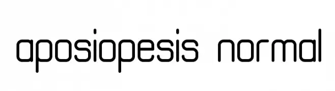
A modern, geometric font with rounded edges and a minimalist design.
![aposiopesis normal Frei Schriftart Herunterladen]() Herunterladen 153 Downloads@WebFont
Herunterladen 153 Downloads@WebFont -
( Fonts by Edric Studio www.creativefabrica.com/designer/edricstudio/ - Personal-use only. For commercial use please contact owner. )
A modern, geometric font with clean lines and uniform stroke widths.
![Exninja Frei Schriftart Herunterladen]() Herunterladen 153 Downloads@WebFont
Herunterladen 153 Downloads@WebFont -
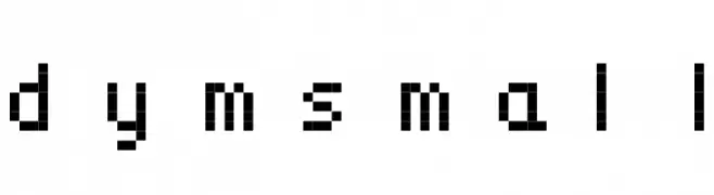
![dymsmall Frei Schriftart Herunterladen]() Herunterladen 153 Downloads
Herunterladen 153 Downloads -
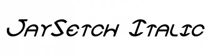
![JaySetch Italic Frei Schriftart Herunterladen]() Herunterladen 153 Downloads@WebFont
Herunterladen 153 Downloads@WebFont -
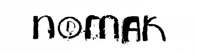
( Fonts by Chank Co. - www.chank.com )
A bold, distressed font with a grunge, vintage style.
![NoMak Frei Schriftart Herunterladen]() Herunterladen 153 Downloads@WebFont
Herunterladen 153 Downloads@WebFont -
( Fonts by Darcy Baldwin - darcybaldwin.com. Free for personal use only )
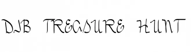
A whimsical, hand-drawn font with a playful, treasure map theme.
![DJB TREASURE HUNT Frei Schriftart Herunterladen]() Herunterladen 153 Downloads@WebFont
Herunterladen 153 Downloads@WebFont -
( Fonts by Manfred Klein. Free for private and charity use. Free for commercial with donation to organizations )
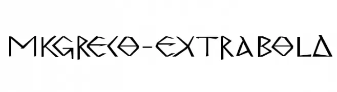
A bold, angular font with a Greek-inspired, geometric design.
![MKGreco-ExtraBold Frei Schriftart Herunterladen]() Herunterladen 153 Downloads@WebFont
Herunterladen 153 Downloads@WebFont -
( Fonts by Khurasan™ )
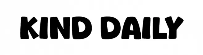
A bold, rounded font with a playful, hand-drawn appearance.
![Kind Daily Frei Schriftart Herunterladen]() Herunterladen 153 Downloads@WebFont
Herunterladen 153 Downloads@WebFont -
( Fonts by Iconian Fonts )
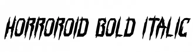
A bold, italicized font with sharp, jagged edges ideal for horror themes.
![Horroroid Bold Italic Frei Schriftart Herunterladen]() Herunterladen 153 Downloads@WebFont
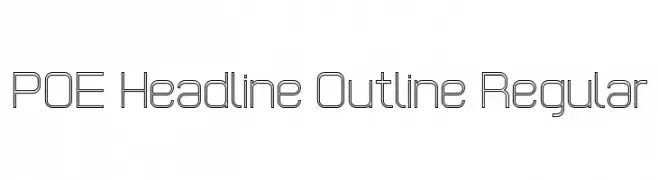
Herunterladen 153 Downloads@WebFont -
![POE Headline Outline Regular Frei Schriftart Herunterladen]() Herunterladen 153 Downloads@WebFont
Herunterladen 153 Downloads@WebFont -
( Iconian Fonts - Daniel Zadorozny - www.iconian.com )
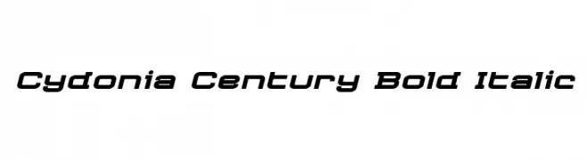
A bold, italic, and modern font with a futuristic and dynamic style.
![Cydonia Century Bold Italic Frei Schriftart Herunterladen]() Herunterladen 153 Downloads@WebFont
Herunterladen 153 Downloads@WebFont -
( Fonts by Michele Vannucchi MKT )
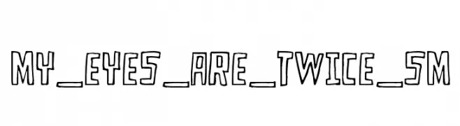
A playful, hand-drawn font with bold, irregular shapes and a casual style.
![MY_EYES_ARE_TWICE_SM Frei Schriftart Herunterladen]() Herunterladen 153 Downloads@WebFont
Herunterladen 153 Downloads@WebFont -
![ANIIKLA Frei Schriftart Herunterladen]() Herunterladen 153 Downloads@WebFont
Herunterladen 153 Downloads@WebFont -
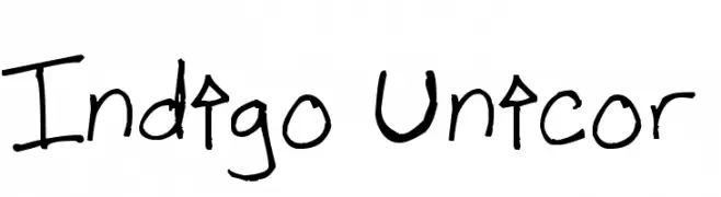
( Fonts by www.fontpanda.com. Personal-use only. For commercial use please contact owner. )
A playful, handwritten font with bold, irregular strokes.
![Indigo Unicor Frei Schriftart Herunterladen]() Herunterladen 153 Downloads@WebFont
Herunterladen 153 Downloads@WebFont -
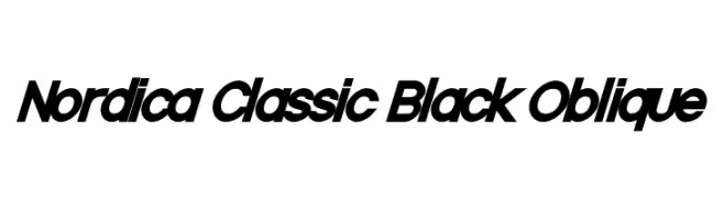
![Nordica Classic Black Oblique Frei Schriftart Herunterladen]() Herunterladen 153 Downloads@WebFont
Herunterladen 153 Downloads@WebFont -
( Måns Grebäck - www.mansgreback.com )
A modern, geometric font with clean lines and a futuristic look.
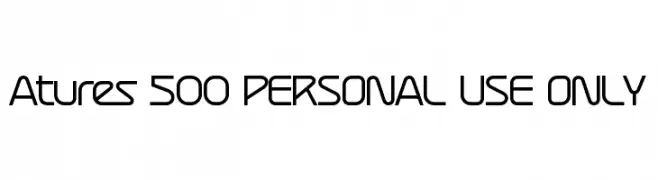
![Atures 500 PERSONAL USE ONLY Frei Schriftart Herunterladen]() Herunterladen 153 Downloads@WebFont
Herunterladen 153 Downloads@WebFont -
( Fonts by a Max Infeld - XEROGRAPHER FONTS - xerographer.blogspot.com . Personal-use only. For commercial use please contact owner. )
A bold, textured sans-serif font with a fading effect.
![Fadevetica Frei Schriftart Herunterladen]() Herunterladen 153 Downloads@WebFont
Herunterladen 153 Downloads@WebFont -
( Fonts by Dieter Steffmann )
Artistic monthly vignettes with blackletter text.
![Monats-Vignetten 1 Frei Schriftart Herunterladen]() Herunterladen 153 Downloads@WebFont
Herunterladen 153 Downloads@WebFont -
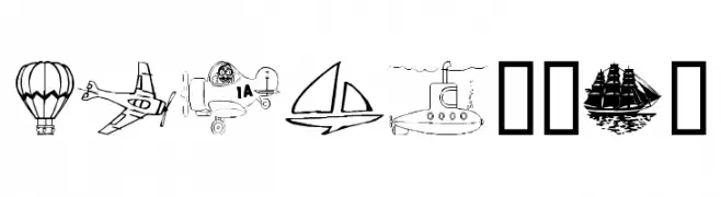
( Fonts by Graham Meade - GemFonts )
A decorative font with detailed vehicular illustrations for each character.
![Vehicular Frei Schriftart Herunterladen]() Herunterladen 153 Downloads@WebFont
Herunterladen 153 Downloads@WebFont -
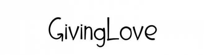
![Giving Love Frei Schriftart Herunterladen]() Herunterladen 153 Downloads@WebFont
Herunterladen 153 Downloads@WebFont -
( Fonts by Misti's Fonts )
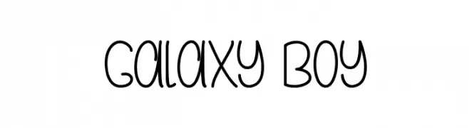
A playful, rounded font with a whimsical, handwritten style.
![Galaxy Boy Frei Schriftart Herunterladen]() Herunterladen 153 Downloads@WebFont
Herunterladen 153 Downloads@WebFont -
( Fonts by Balpirick Studio )
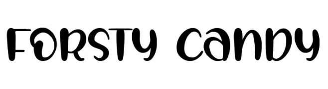
A playful, bold, and rounded font with a whimsical style.
![FORSTY CANDY Frei Schriftart Herunterladen]() Herunterladen 153 Downloads@WebFont
Herunterladen 153 Downloads@WebFont -
( Fonts by arukidz.fl )
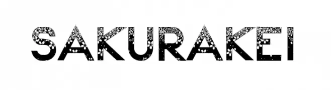
A decorative font with floral patterns, ideal for creative and elegant designs.
![Sakura Kei Frei Schriftart Herunterladen]() Herunterladen 153 Downloads@WebFont
Herunterladen 153 Downloads@WebFont -
Schriftart von NicholasJudy456. For commercial use please contact the owner.
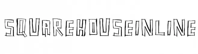
( Here's More of the House Fonts )
A bold, hand-drawn inline font with a sketch-like appearance.
![SquarehouseInline Frei Schriftart Herunterladen]() Herunterladen 153 Downloads@WebFont
Herunterladen 153 Downloads@WebFont -
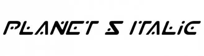
( Fonts by Daniel Zadorozny - www.iconian.com - Free for personal use )
A futuristic, italicized font with geometric and dynamic letterforms.
![Planet S Italic Frei Schriftart Herunterladen]() Herunterladen 153 Downloads@WebFont
Herunterladen 153 Downloads@WebFont -
( Fonts by The Font Emporium )
A bold, edgy font with irregular, jagged edges for a modern look.
![Modern Conformist Frei Schriftart Herunterladen]() Herunterladen 153 Downloads@WebFont
Herunterladen 153 Downloads@WebFont -
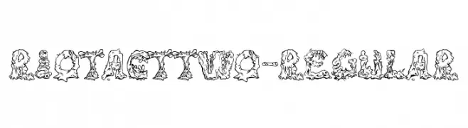
( Fonts by www.typodermicfonts.com - Ray Larabie )
A decorative, playful font with organic, fluid shapes and a whimsical, monstrous appearance.
![RiotActTwo-Regular Frei Schriftart Herunterladen]() Herunterladen 153 Downloads@WebFont
Herunterladen 153 Downloads@WebFont -
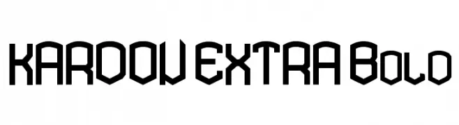
![KARDON EXTRA Bold Frei Schriftart Herunterladen]() Herunterladen 153 Downloads@WebFont
Herunterladen 153 Downloads@WebFont


Welche Schriften sind gerade am populärsten?
Poppins, Roboto, Montserrat, Open Sans und Lato sind wegen ihrer klaren Formen und breiten Einsetzbarkeit sehr gefragt – von Markenauftritt über Landingpages bis hin zu Postern.
Welche Fonts eignen sich für Logos?
Geometrische Sans‑Serifs (z. B. Poppins, Familien im Gotham‑Stil) sind ein häufiger Griff für sauberes, skalierbares Branding. Für eine persönlichere Note bleiben Scripts und Handschrift‑Stile beliebt. Kombinieren Sie einen prägnanten Headline‑Font mit einer neutralen Brotschrift für Wiedererkennung und Harmonie.
Wie oft wird die Top‑Liste aktualisiert?
Regelmäßig – basierend auf realen Downloads und Interaktionen. Schauen Sie öfter vorbei, um aufstrebende Favoriten früh zu entdecken.
💡 Tipp: Seite bookmarken – Trends wechseln schnell, und heutige Top‑Schriften inspirieren morgen vielleicht das Rebranding.