Willkommen bei den Top‑Schriften – hier treffen Beliebtheit und Qualität aufeinander. Das sind die in diesem Jahr am häufigsten heruntergeladenen und genutzten Fonts. Wenn Sie sichere Optionen für Logo, Web oder Social suchen, starten Sie hier.
Jeder Top‑Font überzeugt durch Balance, Lesbarkeit und Vielseitigkeit. Sie finden moderne Sans‑Serifs, elegante Scripts, Vintage‑Serifs und minimalistische Displays.
-
 Herunterladen 2616 Downloads@WebFont
 -
( Fonts by BLKBK - https://blkbk.ink - Personal-use only. For commercial use please contact owner. Sponsoren Schriftart )
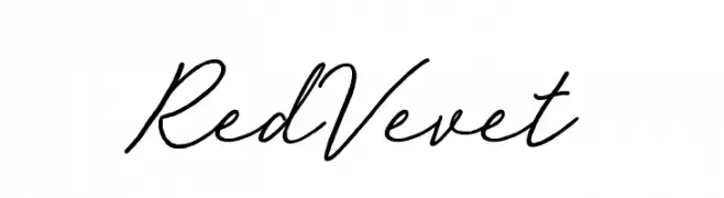
A flowing, elegant script font with smooth, connected strokes.
![Red Vevet Frei Schriftart Herunterladen]() Herunterladen 2615 Downloads
Herunterladen 2615 Downloads -
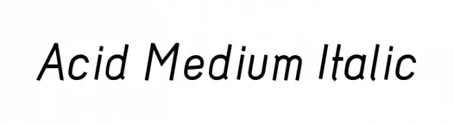
![Acid Medium Italic Frei Schriftart Herunterladen]() Herunterladen 2615 Downloads@WebFont
Herunterladen 2615 Downloads@WebFont -
( Fonts by Blue Vinyl - Jess Latham - www.bvfonts.com )
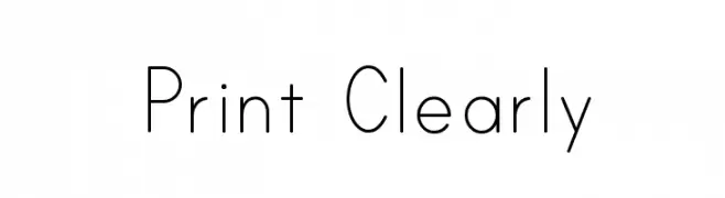
A clean, minimalist font with thin, uniform strokes and geometric shapes.
![Print Clearly Frei Schriftart Herunterladen]() Herunterladen 2615 Downloads@WebFont
Herunterladen 2615 Downloads@WebFont -
( Fonts by Khurasan )
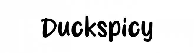
A playful, bold handwritten font with smooth, rounded edges.
![Duck spicy Frei Schriftart Herunterladen]() Herunterladen 2614 Downloads@WebFont
Herunterladen 2614 Downloads@WebFont -
( Copyright (c) 2012, Julia Petretta (julia.petretta@googlemail.com), with Reserved Font Name 'Text Me' )
A modern, rounded font with consistent stroke width and excellent legibility.
![Text Me One Frei Schriftart Herunterladen]() Herunterladen 2614 Downloads@WebFont
Herunterladen 2614 Downloads@WebFont -
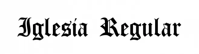
![Iglesia Regular Frei Schriftart Herunterladen]() Herunterladen 2614 Downloads@WebFont
Herunterladen 2614 Downloads@WebFont -
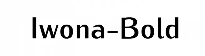
![Iwona-Bold Frei Schriftart Herunterladen]() Herunterladen 2613 Downloads@WebFont
Herunterladen 2613 Downloads@WebFont -
( Font by Ben Nathan - www.hafontia.com )
A modern, rounded sans-serif font with a friendly and approachable style.
![BN Pinky Frei Schriftart Herunterladen]() Herunterladen 2613 Downloads@WebFont
Herunterladen 2613 Downloads@WebFont -
![iCiel Kermel Frei Schriftart Herunterladen]() Herunterladen 2612 Downloads@WebFont
Herunterladen 2612 Downloads@WebFont -
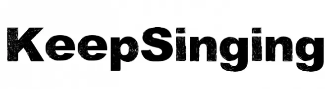
![Keep Singing Frei Schriftart Herunterladen]() Herunterladen 2612 Downloads@WebFont
Herunterladen 2612 Downloads@WebFont -
( Fonts by www.typodermicfonts.com - Ray Larabie )
A bold, geometric font with a strong, athletic appearance.
![Octin Sports Free Frei Schriftart Herunterladen]() Herunterladen 2612 Downloads@WebFont
Herunterladen 2612 Downloads@WebFont -
![PentaGram s Gothika Bold Italic Frei Schriftart Herunterladen]() Herunterladen 2611 Downloads@WebFont
Herunterladen 2611 Downloads@WebFont -
![DEATHE MAACH NCV Frei Schriftart Herunterladen]() Herunterladen 2611 Downloads@WebFont
Herunterladen 2611 Downloads@WebFont -
( Fonts by www.ajpaglia.com - FREE for personal or commercial usage )
A bold, geometric font with a strong, modern presence.
![Anchor Jack Frei Schriftart Herunterladen]() Herunterladen 2611 Downloads@WebFont
Herunterladen 2611 Downloads@WebFont -
![!PaulMaul Longs Bold Frei Schriftart Herunterladen]() Herunterladen 2611 Downloads@WebFont
Herunterladen 2611 Downloads@WebFont -
![FS Blok Regular Frei Schriftart Herunterladen]() Herunterladen 2611 Downloads@WebFont
Herunterladen 2611 Downloads@WebFont -
( Fonts by www.houseoflime.com )
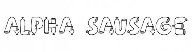
A playful, sausage-themed decorative font with bold, cartoonish characters.
![Alpha Sausage Frei Schriftart Herunterladen]() Herunterladen 2611 Downloads@WebFont
Herunterladen 2611 Downloads@WebFont -
( Chen Yining )
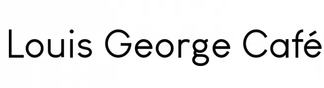
A modern, geometric sans-serif font with clean lines and uniform strokes.
![Louis George Café Frei Schriftart Herunterladen]() Herunterladen 2610 Downloads@WebFont
Herunterladen 2610 Downloads@WebFont -
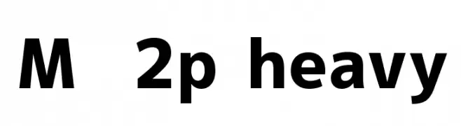
![M+ 2p heavy Frei Schriftart Herunterladen]() Herunterladen 2610 Downloads@WebFont
Herunterladen 2610 Downloads@WebFont -
![Becks Frei Schriftart Herunterladen]() Herunterladen 2610 Downloads@WebFont
Herunterladen 2610 Downloads@WebFont -
( Free for non-commercial use. www.johnmartz.com )
A bold, expressive brush-style font with a dynamic, artistic flair.
![Baloney Frei Schriftart Herunterladen]() Herunterladen 2610 Downloads@WebFont
Herunterladen 2610 Downloads@WebFont -
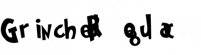
![Grinched Regular Frei Schriftart Herunterladen]() Herunterladen 2609 Downloads@WebFont
Herunterladen 2609 Downloads@WebFont -
![Rudiment Frei Schriftart Herunterladen]() Herunterladen 2609 Downloads@WebFont
Herunterladen 2609 Downloads@WebFont -
( K-Type Freebies (Free for Personal Use Only) FROM http://www.k-type.com )
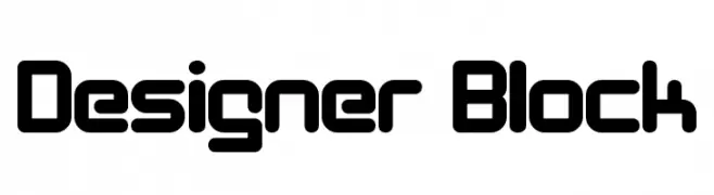
A bold, geometric font with rounded edges, offering a modern and futuristic look.
![Designer Block Frei Schriftart Herunterladen]() Herunterladen 2609 Downloads@WebFont
Herunterladen 2609 Downloads@WebFont -
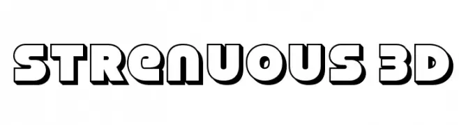
![Strenuous 3D Frei Schriftart Herunterladen]() Herunterladen 2609 Downloads@WebFont
Herunterladen 2609 Downloads@WebFont -
( Fonts by MadeType - Personal-use only. For commercial use please contact owner. )
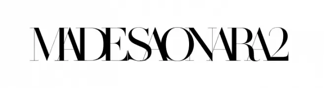
A high-contrast, elegant font with a modern and sophisticated style.
![MADESAONARA2 Frei Schriftart Herunterladen]() Herunterladen 2608 Downloads@WebFont
Herunterladen 2608 Downloads@WebFont -
Schriftart von HammerBro101. For commercial use please contact the owner.
![CoopHeavy Frei Schriftart Herunterladen]() Herunterladen 2608 Downloads@WebFont
Herunterladen 2608 Downloads@WebFont -
( Zetafonts - www.zetafonts.com )
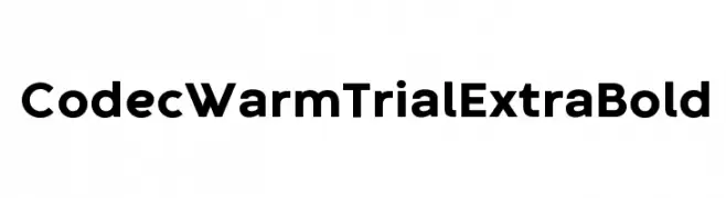
A bold, modern typeface with clean lines and geometric shapes.
![Codec Warm Trial ExtraBold Frei Schriftart Herunterladen]() Herunterladen 2608 Downloads@WebFont
Herunterladen 2608 Downloads@WebFont -
( Fonts by HENRIavecunK )
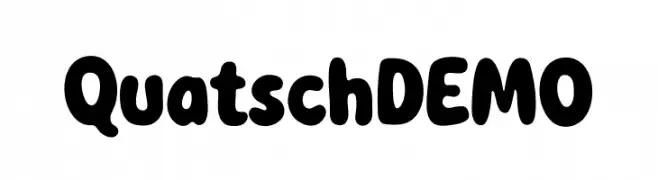
A playful, bold font with rounded, thick strokes and a friendly appearance.
![QuatschDEMO Frei Schriftart Herunterladen]() Herunterladen 2607 Downloads@WebFont
Herunterladen 2607 Downloads@WebFont -
( Nils Merkel )
A modern, condensed sans-serif font with clean lines and uniform stroke widths.
![HYPE Frei Schriftart Herunterladen]() Herunterladen 2607 Downloads@WebFont
Herunterladen 2607 Downloads@WebFont -
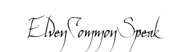
![ElvenCommonSpeak Frei Schriftart Herunterladen]() Herunterladen 2607 Downloads@WebFont
Herunterladen 2607 Downloads@WebFont -
( Fonts by Daniel Zadorozny - www.iconian.com )
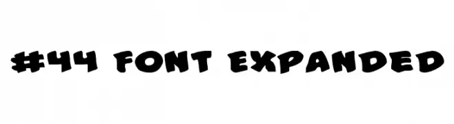
A bold, playful font with thick, exaggerated curves and a whimsical style.
![#44 Font Expanded Frei Schriftart Herunterladen]() Herunterladen 2607 Downloads@WebFont
Herunterladen 2607 Downloads@WebFont -
( Fonts by Dieter Schumacher )
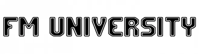
A bold, geometric outline font with a modern and futuristic style.
![FM University Frei Schriftart Herunterladen]() Herunterladen 2607 Downloads@WebFont
Herunterladen 2607 Downloads@WebFont -
( Copyright (c) 2015 Dan Reynolds. )
A bold, classic serif typeface with strong strokes and elegant serifs.
![Martel Bold Frei Schriftart Herunterladen]() Herunterladen 2606 Downloads@WebFont
Herunterladen 2606 Downloads@WebFont


Welche Schriften sind gerade am populärsten?
Poppins, Roboto, Montserrat, Open Sans und Lato sind wegen ihrer klaren Formen und breiten Einsetzbarkeit sehr gefragt – von Markenauftritt über Landingpages bis hin zu Postern.
Welche Fonts eignen sich für Logos?
Geometrische Sans‑Serifs (z. B. Poppins, Familien im Gotham‑Stil) sind ein häufiger Griff für sauberes, skalierbares Branding. Für eine persönlichere Note bleiben Scripts und Handschrift‑Stile beliebt. Kombinieren Sie einen prägnanten Headline‑Font mit einer neutralen Brotschrift für Wiedererkennung und Harmonie.
Wie oft wird die Top‑Liste aktualisiert?
Regelmäßig – basierend auf realen Downloads und Interaktionen. Schauen Sie öfter vorbei, um aufstrebende Favoriten früh zu entdecken.
💡 Tipp: Seite bookmarken – Trends wechseln schnell, und heutige Top‑Schriften inspirieren morgen vielleicht das Rebranding.