Willkommen bei den Top‑Schriften – hier treffen Beliebtheit und Qualität aufeinander. Das sind die in diesem Jahr am häufigsten heruntergeladenen und genutzten Fonts. Wenn Sie sichere Optionen für Logo, Web oder Social suchen, starten Sie hier.
Jeder Top‑Font überzeugt durch Balance, Lesbarkeit und Vielseitigkeit. Sie finden moderne Sans‑Serifs, elegante Scripts, Vintage‑Serifs und minimalistische Displays.
-
 Herunterladen 167 Downloads@WebFont
 -
( Fonts by Jeff Levine. FREEWARE )
A playful, hand-drawn display font with a cartoonish style.
![Road To Nowhere JL Frei Schriftart Herunterladen]() Herunterladen 167 Downloads@WebFont
Herunterladen 167 Downloads@WebFont -
( Fonts by Jecko Development - www.jeckodevelopment.com )
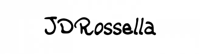
A playful, bold handwritten font with a casual and friendly style.
![JDRossella Frei Schriftart Herunterladen]() Herunterladen 167 Downloads@WebFont
Herunterladen 167 Downloads@WebFont -
( Free for a personal use. For a commercial use please visit www.kevinandamanda.com )
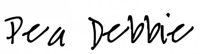
A casual, handwritten font with a playful and informal style.
![Pea Debbie Frei Schriftart Herunterladen]() Herunterladen 167 Downloads@WebFont
Herunterladen 167 Downloads@WebFont -
( Fonts by Aditya Rezki Apriyadi - Personal-use only. For commercial use please contact owner. )
A dynamic and fluid script font with elegant curves and a bold presence.
![Hardwork Free Frei Schriftart Herunterladen]() Herunterladen 167 Downloads@WebFont
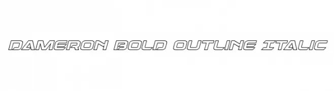
Herunterladen 167 Downloads@WebFont -
![Dameron Bold Outline Italic Frei Schriftart Herunterladen]() Herunterladen 167 Downloads@WebFont
Herunterladen 167 Downloads@WebFont -
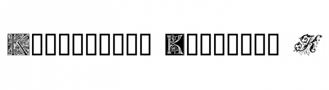
( Fonts by www.houseoflime.com )
A decorative font featuring ornate and intricate uppercase 'K' designs.
![Ornamental Initials K Frei Schriftart Herunterladen]() Herunterladen 167 Downloads@WebFont
Herunterladen 167 Downloads@WebFont -
( Fonts by Jeff Levine. FREEWARE )
A decorative, vintage-style font with a playful, stamp-like appearance.
![First Impression JL Frei Schriftart Herunterladen]() Herunterladen 167 Downloads@WebFont
Herunterladen 167 Downloads@WebFont -
( www.jeckodevelopment.com/ )
A dot matrix font inspired by LED displays, offering a modern digital look.
![JD LED7 Regular Frei Schriftart Herunterladen]() Herunterladen 167 Downloads@WebFont
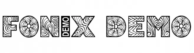
Herunterladen 167 Downloads@WebFont -
![Fonix Demo Frei Schriftart Herunterladen]() Herunterladen 167 Downloads@WebFont
Herunterladen 167 Downloads@WebFont -
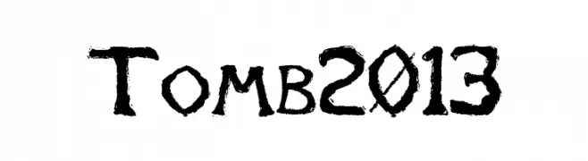
![Tomb2013 Frei Schriftart Herunterladen]() Herunterladen 167 Downloads@WebFont
Herunterladen 167 Downloads@WebFont -
( Fonts by Origin Type )
Handwritten, rounded sans-serif with playful, informal character shapes.
![Stereotype Frei Schriftart Herunterladen]() Herunterladen 167 Downloads@WebFont
Herunterladen 167 Downloads@WebFont -
( Fonts by Daniel Zadorozny - www.iconian.com - Free for personal use )
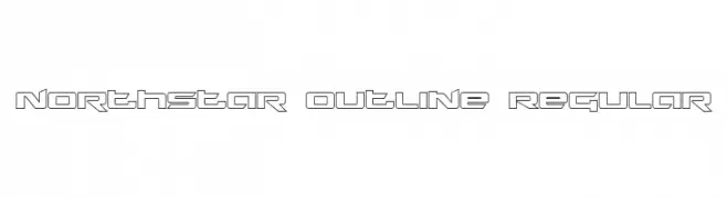
A futuristic, geometric outline font with sharp angles and clean lines.
![Northstar Outline Regular Frei Schriftart Herunterladen]() Herunterladen 167 Downloads@WebFont
Herunterladen 167 Downloads@WebFont -
( Fonts by Dan P. Lyons - Personal-use only. For commercial use please contact owner. )
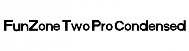
A bold, modern, and condensed typeface ideal for impactful headlines.
![FunZone Two Pro Condensed Frei Schriftart Herunterladen]() Herunterladen 167 Downloads@WebFont
Herunterladen 167 Downloads@WebFont -
( Fonts by Apostrophic Lab )
A sketch-style italic font with a three-dimensional, hand-drawn effect.
![Republikaps - Sketch Italic Frei Schriftart Herunterladen]() Herunterladen 167 Downloads@WebFont
Herunterladen 167 Downloads@WebFont -
( Fonts by Umar Daniala )
A playful, retro font with bold, rounded shapes and whimsical curves.
![Retro Cookies Frei Schriftart Herunterladen]() Herunterladen 167 Downloads@WebFont
Herunterladen 167 Downloads@WebFont -
( Fonts by Miss Tiina at www.misstiina.com (please check the website before use) )
A playful, handwritten font with a whimsical and friendly style.
![MTF Playtime Frei Schriftart Herunterladen]() Herunterladen 167 Downloads@WebFont
Herunterladen 167 Downloads@WebFont -
( Fonts by NihStudio )
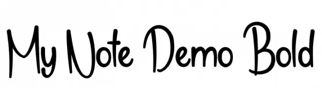
A playful, casual handwritten font with bold strokes and smooth curves.
![My Note Demo Bold Frei Schriftart Herunterladen]() Herunterladen 167 Downloads@WebFont
Herunterladen 167 Downloads@WebFont -
( Fonts by Rajesh Rajput - gumroad.com/rajputrajesh_448 - Personal-use only. For commercial use please contact owner. )
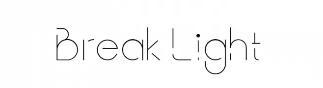
A modern, minimalist font with geometric shapes and clean lines.
![Break Light Frei Schriftart Herunterladen]() Herunterladen 167 Downloads@WebFont
Herunterladen 167 Downloads@WebFont -
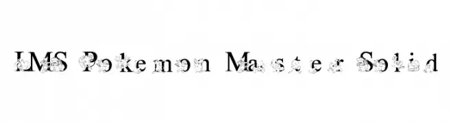
![LMS Poke'mon Master Solid Frei Schriftart Herunterladen]() Herunterladen 167 Downloads@WebFont
Herunterladen 167 Downloads@WebFont -
( Fonts by Pizzadude )
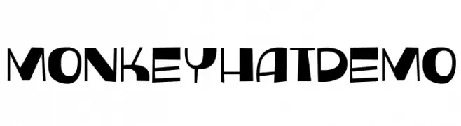
A playful and bold font with quirky, exaggerated curves and varying stroke widths.
![MonkeyHatDEMO Frei Schriftart Herunterladen]() Herunterladen 167 Downloads@WebFont
Herunterladen 167 Downloads@WebFont -
( Gaelleing )
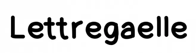
A playful, rounded font with smooth curves and a friendly appearance.
![Lettregaelle Frei Schriftart Herunterladen]() Herunterladen 167 Downloads@WebFont
Herunterladen 167 Downloads@WebFont -
( Fonts by Jonathan S. Harris - www.tattoowoo.com. Personal-use only. For commercial use please contact owner. )
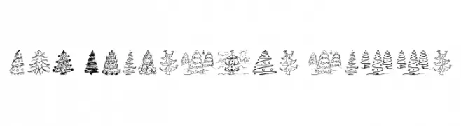
Hand-drawn, whimsical Christmas tree illustrations with playful details.
![Fun Christmas Trees Frei Schriftart Herunterladen]() Herunterladen 167 Downloads@WebFont
Herunterladen 167 Downloads@WebFont -
( Fonts by Spork Thug Typography - Josh Wilhelm - www.lifewithouttaffy.com/taffy/blog )
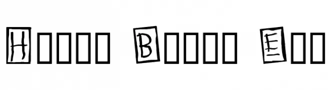
A playful, hand-drawn font with characters in uneven squares, ideal for creative projects.
![Human Brown Eye Frei Schriftart Herunterladen]() Herunterladen 167 Downloads@WebFont
Herunterladen 167 Downloads@WebFont -
( Fonts by Letterena Studios )
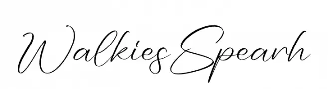
An elegant, flowing script font with graceful, cursive strokes.
![Walkies Spearh Frei Schriftart Herunterladen]() Herunterladen 167 Downloads@WebFont
Herunterladen 167 Downloads@WebFont -
( Fonts by Allouse Studio - Personal-use only. For commercial use please contact owner. )
A bold, rounded, and playful font with consistent stroke width.
![Marlrock Frei Schriftart Herunterladen]() Herunterladen 167 Downloads@WebFont
Herunterladen 167 Downloads@WebFont -
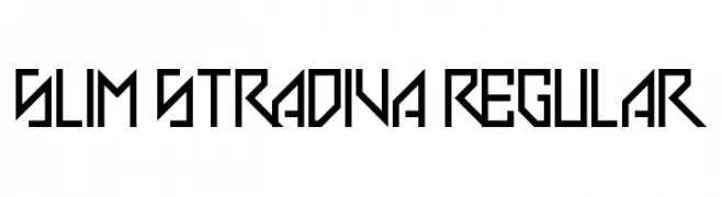
![Slim Stradiva Regular Frei Schriftart Herunterladen]() Herunterladen 167 Downloads@WebFont
Herunterladen 167 Downloads@WebFont -
( Fonts by www.iconian.com - Personal-use only. For commercial use please contact owner. )
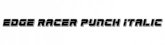
A bold, futuristic italic font with a sporty, dynamic style.
![Edge Racer Punch Italic Frei Schriftart Herunterladen]() Herunterladen 167 Downloads@WebFont
Herunterladen 167 Downloads@WebFont -
( Fonts by www.koenhachmang.com - Glitch )
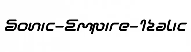
A futuristic, italicized font with rounded edges and a sleek, dynamic design.
![Sonic-Empire-Italic Frei Schriftart Herunterladen]() Herunterladen 167 Downloads@WebFont
Herunterladen 167 Downloads@WebFont -
( DaShiz )
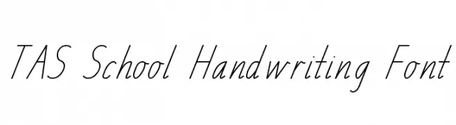
A clean, slanted handwriting font with a school script style.
![TAS School Handwriting Font Frei Schriftart Herunterladen]() Herunterladen 167 Downloads@WebFont
Herunterladen 167 Downloads@WebFont -
( Fonts by Khrys Bosland )
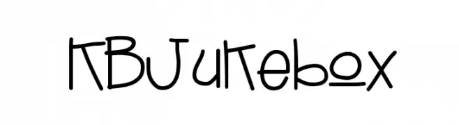
A playful, handwritten font with a casual and friendly style.
![KBJukebox Frei Schriftart Herunterladen]() Herunterladen 167 Downloads@WebFont
Herunterladen 167 Downloads@WebFont -
( Fonts by Manfred Klein. Free for private and charity use. Free for commercial with donation to organizations )
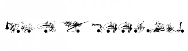
An abstract, artistic font with intricate, swirling designs.
![AndBullets Frei Schriftart Herunterladen]() Herunterladen 167 Downloads@WebFont
Herunterladen 167 Downloads@WebFont -
( Fonts by Daniel Zadorozny - www.iconian.com )
A futuristic, chrome-like italic font with dynamic parallel lines.
![4114 Blaster Chrome Italic Frei Schriftart Herunterladen]() Herunterladen 167 Downloads@WebFont
Herunterladen 167 Downloads@WebFont -
( Fonts by Zetafonts - Personal-use only. For commercial use please contact owner. )
A bold, modern font with thick strokes and strong geometric shapes.
![Asgard Trial Fat Frei Schriftart Herunterladen]() Herunterladen 167 Downloads@WebFont
Herunterladen 167 Downloads@WebFont -
( Fonts by Manfred Klein. Free for private and charity use. Free for commercial with donation to organizations )
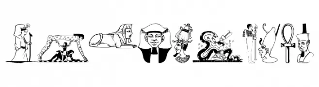
A collection of Egyptian-themed illustrative icons depicting gods, symbols, and scenes.
![Egypticons Frei Schriftart Herunterladen]() Herunterladen 167 Downloads@WebFont
Herunterladen 167 Downloads@WebFont


Welche Schriften sind gerade am populärsten?
Poppins, Roboto, Montserrat, Open Sans und Lato sind wegen ihrer klaren Formen und breiten Einsetzbarkeit sehr gefragt – von Markenauftritt über Landingpages bis hin zu Postern.
Welche Fonts eignen sich für Logos?
Geometrische Sans‑Serifs (z. B. Poppins, Familien im Gotham‑Stil) sind ein häufiger Griff für sauberes, skalierbares Branding. Für eine persönlichere Note bleiben Scripts und Handschrift‑Stile beliebt. Kombinieren Sie einen prägnanten Headline‑Font mit einer neutralen Brotschrift für Wiedererkennung und Harmonie.
Wie oft wird die Top‑Liste aktualisiert?
Regelmäßig – basierend auf realen Downloads und Interaktionen. Schauen Sie öfter vorbei, um aufstrebende Favoriten früh zu entdecken.
💡 Tipp: Seite bookmarken – Trends wechseln schnell, und heutige Top‑Schriften inspirieren morgen vielleicht das Rebranding.