Willkommen bei den Top‑Schriften – hier treffen Beliebtheit und Qualität aufeinander. Das sind die in diesem Jahr am häufigsten heruntergeladenen und genutzten Fonts. Wenn Sie sichere Optionen für Logo, Web oder Social suchen, starten Sie hier.
Jeder Top‑Font überzeugt durch Balance, Lesbarkeit und Vielseitigkeit. Sie finden moderne Sans‑Serifs, elegante Scripts, Vintage‑Serifs und minimalistische Displays.
-
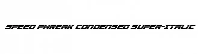
( Fonts by Daniel Zadorozny - www.iconian.com - Personal-use only. For commercial use please contact owner. )
A dynamic, condensed, and italicized font with a futuristic style.
 Herunterladen 166 Downloads@WebFont
 -
![Gyneric 3D BRK Frei Schriftart Herunterladen]() Herunterladen 166 Downloads@WebFont
Herunterladen 166 Downloads@WebFont -
( Fonts by Rantautype )
A lively, expressive handwritten font with fluid, dynamic strokes.
![Arthamyn Frei Schriftart Herunterladen]() Herunterladen 166 Downloads@WebFont
Herunterladen 166 Downloads@WebFont -
( Free for personal use - www.junkohanhero.com )
A bold, playful font with a whimsical, cartoonish style.
![Bad Pizza Frei Schriftart Herunterladen]() Herunterladen 166 Downloads@WebFont
Herunterladen 166 Downloads@WebFont -
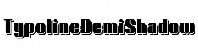
( Fonts by www.studiotypo.com - Personal-use only. For commercial use please contact owner. )
A bold, shadowed font with a strong, three-dimensional appearance.
![Typoline Demi Shadow Frei Schriftart Herunterladen]() Herunterladen 166 Downloads@WebFont
Herunterladen 166 Downloads@WebFont -
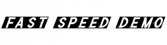
( Fonts by Noah Type - noahtype.com - Personal-use only. For commercial use please contact owner. )
A bold, italicized font with dynamic slashes, conveying speed and energy.
![Fast Speed Demo Frei Schriftart Herunterladen]() Herunterladen 166 Downloads@WebFont
Herunterladen 166 Downloads@WebFont -
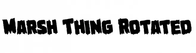
( Fonts by Daniel Zadorozny - www.iconian.com - Free for personal use )
A bold, rugged font with jagged edges and a distressed, organic appearance.
![Marsh Thing Rotated Frei Schriftart Herunterladen]() Herunterladen 166 Downloads@WebFont
Herunterladen 166 Downloads@WebFont -
( Fonts by Daniel Zadorozny - www.iconian.com )
A dynamic, 3D italic font with a futuristic and geometric design.
![Concielian Jet 3D Italic Frei Schriftart Herunterladen]() Herunterladen 166 Downloads@WebFont
Herunterladen 166 Downloads@WebFont -
( Fonts by Creaditive Design )
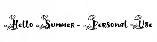
A playful, summer-themed font with beach motifs and a casual, handwritten style.
![Hello Summer - Personal Use Frei Schriftart Herunterladen]() Herunterladen 166 Downloads@WebFont
Herunterladen 166 Downloads@WebFont -
( Iconian Fonts - Daniel Zadorozny - www.iconian.com )
A bold, block-like font with slight curvature, ideal for impactful designs.
![Department H Title Bold Frei Schriftart Herunterladen]() Herunterladen 166 Downloads@WebFont
Herunterladen 166 Downloads@WebFont -
( SDFonts. http://www.angelfire.com/scifi2/sdfonts/index.html )
A decorative and imaginative font with unique ligatures and artistic flair.
![Aranea Imaginative Ligatures Frei Schriftart Herunterladen]() Herunterladen 166 Downloads@WebFont
Herunterladen 166 Downloads@WebFont -
( Fonts by www.selawetype.com - Personal-use only. FOR DONATION https://www.paypal.me/selawe . For commercial use please contact owner. )
A playful handwritten font with smooth, rounded strokes and a casual style.
![kidson Frei Schriftart Herunterladen]() Herunterladen 166 Downloads@WebFont
Herunterladen 166 Downloads@WebFont -
( Fonts by Daniel Zadorozny - www.iconian.com )
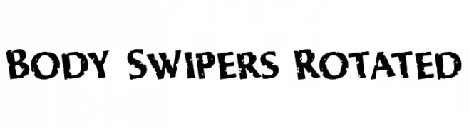
A bold, distressed font with a rugged, weathered appearance.
![Body Swipers Rotated Frei Schriftart Herunterladen]() Herunterladen 166 Downloads@WebFont
Herunterladen 166 Downloads@WebFont -
![Sherlon Frei Schriftart Herunterladen]() Herunterladen 166 Downloads@WebFont
Herunterladen 166 Downloads@WebFont -
( Fonts by Manfred Klein. Free for private and charity use. Free for commercial with donation to organizations )
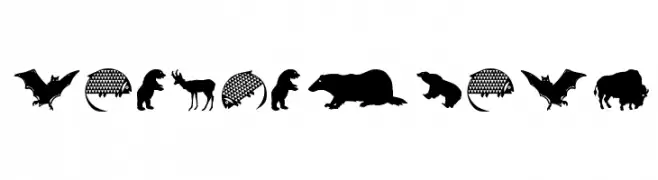
Bold animal silhouette icons with consistent solid fill.
![LandAnimals Frei Schriftart Herunterladen]() Herunterladen 166 Downloads@WebFont
Herunterladen 166 Downloads@WebFont -
( Fonts by www.houseoflime.com )
Whimsical, illustrated frames with playful and child-friendly designs.
![KiddyFrames Frei Schriftart Herunterladen]() Herunterladen 166 Downloads@WebFont
Herunterladen 166 Downloads@WebFont -
![CaslonAlternateSSK SemiBold Frei Schriftart Herunterladen]() Herunterladen 166 Downloads@WebFont
Herunterladen 166 Downloads@WebFont -
( Fonts by Alex Tomlinson - Skyhaven Fonts - shfonts.com )
A playful, casual handwritten font with smooth, flowing lines.
![ScrantonFancy-Regular Frei Schriftart Herunterladen]() Herunterladen 166 Downloads@WebFont
Herunterladen 166 Downloads@WebFont -
( Fonts by a Neale Davidson - www.pixelsagas.com. Personal-use only. For commercial use please contact owner. )
A bold, gothic-style font with sharp, angular edges and a dramatic flair.
![Skeksis Frei Schriftart Herunterladen]() Herunterladen 166 Downloads@WebFont
Herunterladen 166 Downloads@WebFont -
( Fonts by Nick Curtis - www.nicksfonts.com )
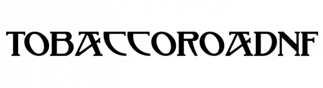
A bold, geometric font with decorative elements and high contrast.
![TobaccoRoadNF Frei Schriftart Herunterladen]() Herunterladen 166 Downloads@WebFont
Herunterladen 166 Downloads@WebFont -
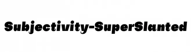
( Fonts by Alex Slobzheninov - Personal-use only. For commercial use please contact owner. )
A bold, slanted font with a dynamic and modern style.
![Subjectivity-SuperSlanted Frei Schriftart Herunterladen]() Herunterladen 166 Downloads@WebFont
Herunterladen 166 Downloads@WebFont -
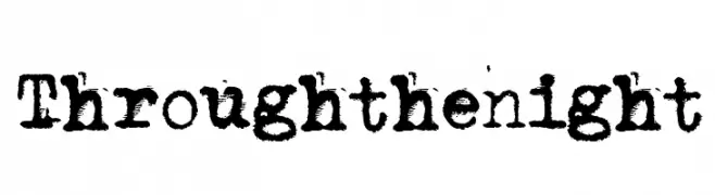
( Fonts by www.junkohanhero.com - Personal-use only. For commercial use please contact owner. )
A distressed, textured font with a vintage, typewriter-inspired style.
![Through the night Frei Schriftart Herunterladen]() Herunterladen 166 Downloads@WebFont
Herunterladen 166 Downloads@WebFont -
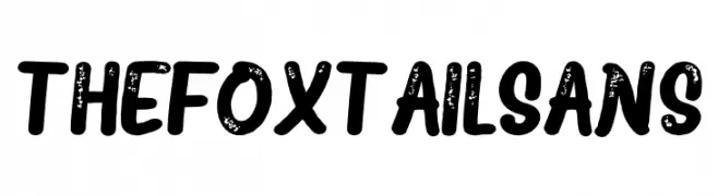
![The Fox Tail Sans Frei Schriftart Herunterladen]() Herunterladen 166 Downloads@WebFont
Herunterladen 166 Downloads@WebFont -
( www.junkohanhero.com )
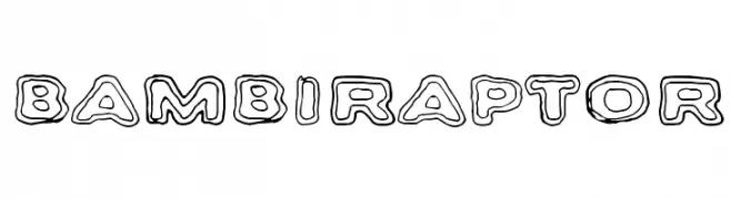
A playful, bold outline font with a three-dimensional effect.
![Bambiraptor Frei Schriftart Herunterladen]() Herunterladen 166 Downloads@WebFont
Herunterladen 166 Downloads@WebFont -
( Fonts by a Max Infeld - XEROGRAPHER FONTS - xerographer.blogspot.com . Personal-use only. For commercial use please contact owner. )
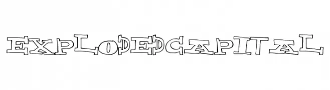
A playful, fragmented font with bold outlines and dynamic character design.
![ExplodedCapital Frei Schriftart Herunterladen]() Herunterladen 166 Downloads@WebFont
Herunterladen 166 Downloads@WebFont -
( Fonts by Daniel Zadorozny - www.iconian.com - Free for personal use )
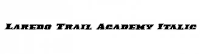
Bold, outlined, italic font with a strong and dynamic presence.
![Laredo Trail Academy Italic Frei Schriftart Herunterladen]() Herunterladen 166 Downloads@WebFont
Herunterladen 166 Downloads@WebFont -
( David Myriad Rosenbaum - davidmyriad.tripod.com/myriads.font.page.html )
A bold, angular typeface inspired by ancient scripts with a decorative and historical flair.
![PhoenicianMoabite Normal Frei Schriftart Herunterladen]() Herunterladen 166 Downloads@WebFont
Herunterladen 166 Downloads@WebFont -
( Fonts by Kong Font - https://fontkong.com/ - Personal-use only. For commercial use please contact owner. )
A playful and elegant script font with dynamic contrast and decorative flair.
![Varenthin Frei Schriftart Herunterladen]() Herunterladen 166 Downloads@WebFont
Herunterladen 166 Downloads@WebFont -
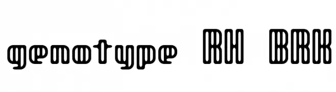
![genotype RH BRK Frei Schriftart Herunterladen]() Herunterladen 166 Downloads@WebFont
Herunterladen 166 Downloads@WebFont -
( Fonts by a Neale Davidson - www.pixelsagas.com. Personal-use only. For commercial use please contact owner. )
A bold, italicized font with high contrast and dynamic slant.
![Resavy Bold Italic Frei Schriftart Herunterladen]() Herunterladen 166 Downloads@WebFont
Herunterladen 166 Downloads@WebFont -
![CasOpenOutaControlSSK Bold Frei Schriftart Herunterladen]() Herunterladen 166 Downloads@WebFont
Herunterladen 166 Downloads@WebFont -
( Fonts by Daniel Zadorozny - www.iconian.com - Free for personal use )
A bold, distressed, condensed italic font with a rugged texture.
![Earthshake Condensed Italic Frei Schriftart Herunterladen]() Herunterladen 166 Downloads@WebFont
Herunterladen 166 Downloads@WebFont -
( Fonts by Edric Studio )
A playful, hand-drawn font with tall, narrow characters and a whimsical style.
![Cheeks Rosy Demo Frei Schriftart Herunterladen]() Herunterladen 166 Downloads@WebFont
Herunterladen 166 Downloads@WebFont -
( Fonts by Alex Tomlinson - Skyhaven Fonts - shfonts.com )
A casual, handwritten font with a dynamic and flowing style.
![ArtCenter-Regular Frei Schriftart Herunterladen]() Herunterladen 166 Downloads@WebFont
Herunterladen 166 Downloads@WebFont -
( Fonts by Des Gomez )
A playful, hand-drawn font with tall, narrow characters and whimsical symbols.
![DiamondAwareness Frei Schriftart Herunterladen]() Herunterladen 166 Downloads@WebFont
Herunterladen 166 Downloads@WebFont


Welche Schriften sind gerade am populärsten?
Poppins, Roboto, Montserrat, Open Sans und Lato sind wegen ihrer klaren Formen und breiten Einsetzbarkeit sehr gefragt – von Markenauftritt über Landingpages bis hin zu Postern.
Welche Fonts eignen sich für Logos?
Geometrische Sans‑Serifs (z. B. Poppins, Familien im Gotham‑Stil) sind ein häufiger Griff für sauberes, skalierbares Branding. Für eine persönlichere Note bleiben Scripts und Handschrift‑Stile beliebt. Kombinieren Sie einen prägnanten Headline‑Font mit einer neutralen Brotschrift für Wiedererkennung und Harmonie.
Wie oft wird die Top‑Liste aktualisiert?
Regelmäßig – basierend auf realen Downloads und Interaktionen. Schauen Sie öfter vorbei, um aufstrebende Favoriten früh zu entdecken.
💡 Tipp: Seite bookmarken – Trends wechseln schnell, und heutige Top‑Schriften inspirieren morgen vielleicht das Rebranding.