Willkommen bei den Top‑Schriften – hier treffen Beliebtheit und Qualität aufeinander. Das sind die in diesem Jahr am häufigsten heruntergeladenen und genutzten Fonts. Wenn Sie sichere Optionen für Logo, Web oder Social suchen, starten Sie hier.
Jeder Top‑Font überzeugt durch Balance, Lesbarkeit und Vielseitigkeit. Sie finden moderne Sans‑Serifs, elegante Scripts, Vintage‑Serifs und minimalistische Displays.
-
( Fonts by Alex Slobzheninov - Personal-use only. For commercial use please contact owner. )
A bold, modern typeface with thick strokes and clean lines.
 Herunterladen 2584 Downloads@WebFont
 -
( Fonts by BLKBK - https://blkbk.ink - Personal-use only. For commercial use please contact owner. Sponsoren Schriftart )
A bold, brush-style font with an energetic and artistic flair.
![Cosmic Rays Frei Schriftart Herunterladen]() Herunterladen 2584 Downloads
Herunterladen 2584 Downloads -
( Copyright (c) 2011, Thatcher Ulrich (http://tulrich.com), )
A bold, clean sans-serif font with geometric shapes and uniform strokes.
![Tuffy Bold Frei Schriftart Herunterladen]() Herunterladen 2584 Downloads@WebFont
Herunterladen 2584 Downloads@WebFont -
( Noto is a trademark of Google Inc. Noto fonts are open source. All Noto fonts are published under the SIL Open Font License, Version 1.1 )
A clean, modern font supporting the Myanmar script with balanced proportions.
![Noto Sans Myanmar Regular Frei Schriftart Herunterladen]() Herunterladen 2583 Downloads@WebFont
Herunterladen 2583 Downloads@WebFont -
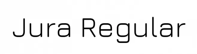
( Copyright 2016 The Jura Font Project Authors (daniel@danieljohnson.name) )
A modern, geometric sans-serif font with a clean and minimalist design.
![Jura Regular Frei Schriftart Herunterladen]() Herunterladen 2583 Downloads@WebFont
Herunterladen 2583 Downloads@WebFont -
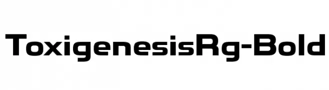
( Typodermic Fonts - Ray Larabie - www.typodermicfonts.com/ )
A bold, modern font with geometric shapes and clean lines.
![ToxigenesisRg-Bold Frei Schriftart Herunterladen]() Herunterladen 2582 Downloads@WebFont
Herunterladen 2582 Downloads@WebFont -
( Free on condition that you make a donation of 5€ favor of an organization dealing with global warming. http://www.sergiolelli.it )
A bold, modern sans-serif font with a condensed and uniform style.
![Stravinskij Frei Schriftart Herunterladen]() Herunterladen 2582 Downloads@WebFont
Herunterladen 2582 Downloads@WebFont -
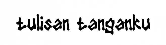
![tulisan tanganku Frei Schriftart Herunterladen]() Herunterladen 2580 Downloads@WebFont
Herunterladen 2580 Downloads@WebFont -
( Fonts by Miss Tiina at www.misstiina.com (please check the website before use) )
A bold, rounded font with a playful and friendly appearance.
![MTF Chubb Frei Schriftart Herunterladen]() Herunterladen 2579 Downloads@WebFont
Herunterladen 2579 Downloads@WebFont -
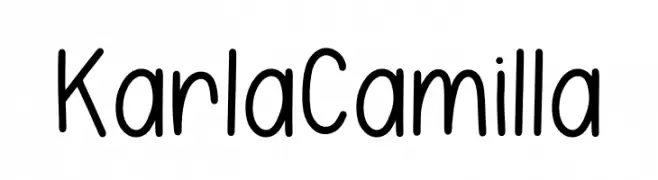
( Fonts by Dominique Demetz - ddemetz.com - Personal-use only. For commercial use please contact owner. )
A playful, handwritten font with rounded, casual letterforms.
![Karla Camilla Frei Schriftart Herunterladen]() Herunterladen 2578 Downloads@WebFont
Herunterladen 2578 Downloads@WebFont -
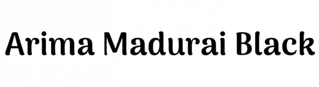
( Copyright 2015 The Arima Project Authors (info@ndiscovered.com) )
A bold, playful font with rounded edges and a friendly appearance.
![Arima Madurai Black Frei Schriftart Herunterladen]() Herunterladen 2578 Downloads@WebFont
Herunterladen 2578 Downloads@WebFont -
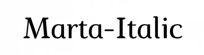
( Fonts by a www.fontfabric.com. Personal-use only. For commercial use please contact owner. )
A classic serif font with elegant curves and a slight italic slant.
![Marta-Italic Frei Schriftart Herunterladen]() Herunterladen 2578 Downloads@WebFont
Herunterladen 2578 Downloads@WebFont -
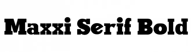
( Fonts by Galdino Otten - galdinootten.com )
A bold serif font with strong, thick strokes and pronounced serifs.
![Maxxi Serif Bold Frei Schriftart Herunterladen]() Herunterladen 2578 Downloads@WebFont
Herunterladen 2578 Downloads@WebFont -
![Supposedly Frei Schriftart Herunterladen]() Herunterladen 2577 Downloads@WebFont
Herunterladen 2577 Downloads@WebFont -
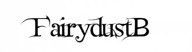
![FairydustB Frei Schriftart Herunterladen]() Herunterladen 2577 Downloads@WebFont
Herunterladen 2577 Downloads@WebFont -
( Zetafonts - www.zetafonts.com )
A modern, geometric sans-serif font with a clean and balanced design.
![Coco Gothic Frei Schriftart Herunterladen]() Herunterladen 2576 Downloads@WebFont
Herunterladen 2576 Downloads@WebFont -
![Bodrum Frei Schriftart Herunterladen]() Herunterladen 2576 Downloads@WebFont
Herunterladen 2576 Downloads@WebFont -
( Fonts by Billy Argel )
A bold, Gothic-style font with intricate, angular letterforms.
![TROUBLE Personal Use Frei Schriftart Herunterladen]() Herunterladen 2575 Downloads@WebFont
Herunterladen 2575 Downloads@WebFont -
( Copyright 2016 The Cabin Project Authors (impallari@gmail.com) )
A clean, modern sans-serif typeface with balanced proportions and medium weight.
![Cabin Medium Frei Schriftart Herunterladen]() Herunterladen 2575 Downloads@WebFont
Herunterladen 2575 Downloads@WebFont -
![AnmolLipiLight Frei Schriftart Herunterladen]() Herunterladen 2575 Downloads@WebFont
Herunterladen 2575 Downloads@WebFont -
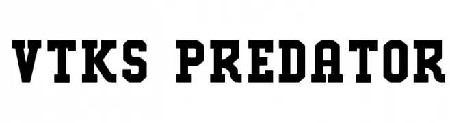
( Fonts by douglas vitkauskas - Personal-use only. For commercial use please contact owner. )
A bold, geometric font with an industrial and robust style.
![VTKS PREDATOR Frei Schriftart Herunterladen]() Herunterladen 2574 Downloads@WebFont
Herunterladen 2574 Downloads@WebFont -
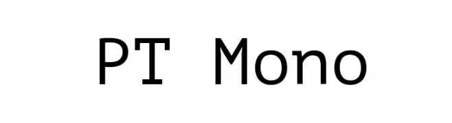
( Copyright (c) 2011, ParaType Ltd. (http://www.paratype.com/public) )
A clean, modern monospaced font with uniform character width and geometric design.
![PT Mono Frei Schriftart Herunterladen]() Herunterladen 2574 Downloads@WebFont
Herunterladen 2574 Downloads@WebFont -
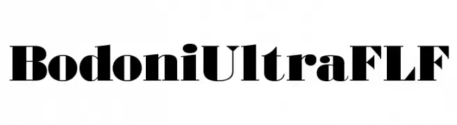
( Fonts by Casady & Greene )
A bold, high-contrast serif typeface with dramatic serifs and strong vertical emphasis.
![BodoniUltraFLF Frei Schriftart Herunterladen]() Herunterladen 2574 Downloads@WebFont
Herunterladen 2574 Downloads@WebFont -
( Fonts by Dieter Steffmann )
A bold, outlined font with a dynamic and playful style.
![Challenge Contour Frei Schriftart Herunterladen]() Herunterladen 2574 Downloads@WebFont
Herunterladen 2574 Downloads@WebFont -
![Wicca Script Frei Schriftart Herunterladen]() Herunterladen 2574 Downloads@WebFont
Herunterladen 2574 Downloads@WebFont -
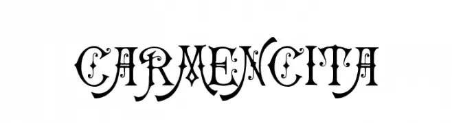
( Fonts by Klaus Johansen - www.listemageren.dK )
An ornate and decorative font with intricate flourishes and high contrast.
![Carmencita Frei Schriftart Herunterladen]() Herunterladen 2574 Downloads@WebFont
Herunterladen 2574 Downloads@WebFont -
( Fonts by Barry Bujol - theoriginal19.blogspot.com )
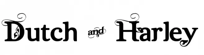
A bold, decorative font with ornate swirls and flourishes.
![Dutch & Harley Frei Schriftart Herunterladen]() Herunterladen 2573 Downloads@WebFont
Herunterladen 2573 Downloads@WebFont -
( Fonts by Nick Curtis - www.nicksfonts.com )
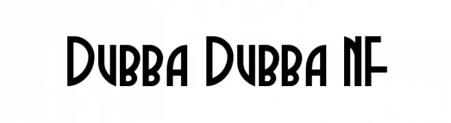
A bold, geometric font with Art Deco influences, featuring tall, narrow characters.
![Dubba Dubba NF Frei Schriftart Herunterladen]() Herunterladen 2573 Downloads@WebFont
Herunterladen 2573 Downloads@WebFont -
![4 Star Face Font Frei Schriftart Herunterladen]() Herunterladen 2573 Downloads@WebFont
Herunterladen 2573 Downloads@WebFont -
![DK Woolwich Regular Frei Schriftart Herunterladen]() Herunterladen 2572 Downloads@WebFont
Herunterladen 2572 Downloads@WebFont -
![Kittyspoon Frei Schriftart Herunterladen]() Herunterladen 2572 Downloads@WebFont
Herunterladen 2572 Downloads@WebFont -
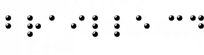
( Fonts by Philippe BLONDEL www.philing.net )
A 3D visual representation of Braille characters using raised spherical dots.
![Braille 3D Frei Schriftart Herunterladen]() Herunterladen 2572 Downloads@WebFont
Herunterladen 2572 Downloads@WebFont -
![Superman Last son of Krypton Super Frei Schriftart Herunterladen]() Herunterladen 2571 Downloads@WebFont
Herunterladen 2571 Downloads@WebFont -
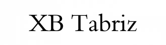
( Fonts by Behnam - Personal-use only. For commercial use please contact owner. )
A classic serif font with elegant strokes and refined proportions.
![XB Tabriz Frei Schriftart Herunterladen]() Herunterladen 2570 Downloads@WebFont
Herunterladen 2570 Downloads@WebFont -
( Fonts by a Youssef Habchi - youssef-habchi.com. Personal-use only. For commercial use please contact owner. )
An elegant script font with flowing, interconnected strokes and a graceful appearance.
![DistantStroke Frei Schriftart Herunterladen]() Herunterladen 2570 Downloads@WebFont
Herunterladen 2570 Downloads@WebFont


Welche Schriften sind gerade am populärsten?
Poppins, Roboto, Montserrat, Open Sans und Lato sind wegen ihrer klaren Formen und breiten Einsetzbarkeit sehr gefragt – von Markenauftritt über Landingpages bis hin zu Postern.
Welche Fonts eignen sich für Logos?
Geometrische Sans‑Serifs (z. B. Poppins, Familien im Gotham‑Stil) sind ein häufiger Griff für sauberes, skalierbares Branding. Für eine persönlichere Note bleiben Scripts und Handschrift‑Stile beliebt. Kombinieren Sie einen prägnanten Headline‑Font mit einer neutralen Brotschrift für Wiedererkennung und Harmonie.
Wie oft wird die Top‑Liste aktualisiert?
Regelmäßig – basierend auf realen Downloads und Interaktionen. Schauen Sie öfter vorbei, um aufstrebende Favoriten früh zu entdecken.
💡 Tipp: Seite bookmarken – Trends wechseln schnell, und heutige Top‑Schriften inspirieren morgen vielleicht das Rebranding.