Willkommen bei den Top‑Schriften – hier treffen Beliebtheit und Qualität aufeinander. Das sind die in diesem Jahr am häufigsten heruntergeladenen und genutzten Fonts. Wenn Sie sichere Optionen für Logo, Web oder Social suchen, starten Sie hier.
Jeder Top‑Font überzeugt durch Balance, Lesbarkeit und Vielseitigkeit. Sie finden moderne Sans‑Serifs, elegante Scripts, Vintage‑Serifs und minimalistische Displays.
-
( Fonts by Letterena Studios )
A fluid, cursive script font with a natural handwritten style.
 Herunterladen 164 Downloads@WebFont
 -
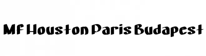
![Mf Houston Paris Budapest Frei Schriftart Herunterladen]() Herunterladen 164 Downloads@WebFont
Herunterladen 164 Downloads@WebFont -
( Fonts by Haksen Studio - Sarwo Edhi Prayitno - Personal-use only. For commercial use please contact owner. )
A lively and expressive script font with bold, flowing cursive letterforms.
![Mango Salsa - Personal Use Frei Schriftart Herunterladen]() Herunterladen 164 Downloads@WebFont
Herunterladen 164 Downloads@WebFont -
( Twicolabs Fontdation - Fahrizal Tawakkal - fontdation.com )
A bold, italic font with elongated, condensed letterforms and sharp serifs.
![Highwind-Italic Frei Schriftart Herunterladen]() Herunterladen 164 Downloads@WebFont
Herunterladen 164 Downloads@WebFont -
( Fonts by Daniel Zadorozny - www.iconian.com - Free for personal use )
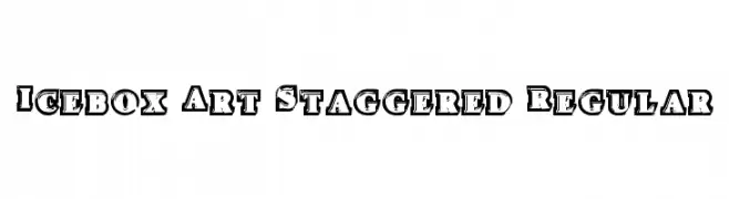
A bold, decorative font with a staggered, shadowed effect for a 3D appearance.
![Icebox Art Staggered Regular Frei Schriftart Herunterladen]() Herunterladen 164 Downloads@WebFont
Herunterladen 164 Downloads@WebFont -
( Fonts by Zetafonts - Personal-use only. For commercial use please contact owner. )
A bold, italicized, and condensed font with a modern style.
![Eastman Cnd Trial XBold Ita Frei Schriftart Herunterladen]() Herunterladen 164 Downloads@WebFont
Herunterladen 164 Downloads@WebFont -
( Fonts by Haksen Studio - Sarwo Edhi Prayitno - Personal-use only. For commercial use please contact owner. )
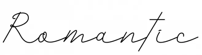
A graceful script font with flowing, interconnected strokes.
![Romantic Frei Schriftart Herunterladen]() Herunterladen 164 Downloads@WebFont
Herunterladen 164 Downloads@WebFont -
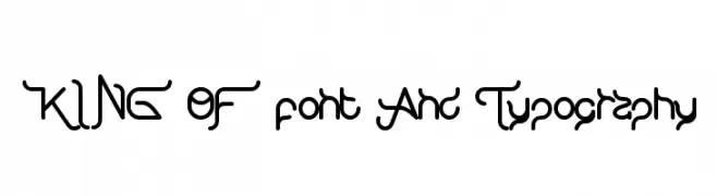
( Fonts by weknow - Wino S Kadir )
A futuristic and abstract font with smooth, flowing lines and a dynamic style.
![KING OF font And Typography Frei Schriftart Herunterladen]() Herunterladen 164 Downloads@WebFont
Herunterladen 164 Downloads@WebFont -
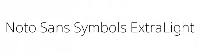
( Noto is a trademark of Google Inc. Noto fonts are open source. All Noto fonts are published under the SIL Open Font License, Version 1.1 )
A clean, minimalist sans-serif font with a modern, geometric design.
![Noto Sans Symbols ExtraLight Frei Schriftart Herunterladen]() Herunterladen 164 Downloads@WebFont
Herunterladen 164 Downloads@WebFont -
![Term-RegGgg Frei Schriftart Herunterladen]() Herunterladen 164 Downloads@WebFont
Herunterladen 164 Downloads@WebFont -
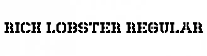
( Fonts by Andrew McCluskey - nalgames.com )
A bold, stencil-like font with a modern, industrial aesthetic.
![Rick Lobster Regular Frei Schriftart Herunterladen]() Herunterladen 164 Downloads@WebFont
Herunterladen 164 Downloads@WebFont -
( Fonts by Manfred Klein. Free for private and charity use. Free for commercial with donation to organizations )
A geometric, abstract font with angular, fragmented characters enclosed in squares.
![Typotraces-Four Frei Schriftart Herunterladen]() Herunterladen 164 Downloads@WebFont
Herunterladen 164 Downloads@WebFont -
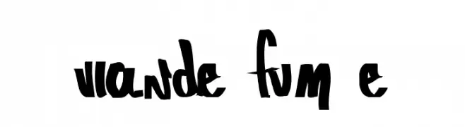
( johnbigsby.com )
A bold, expressive font with brush-like strokes and dynamic flow.
![Viande Fumée Frei Schriftart Herunterladen]() Herunterladen 164 Downloads@WebFont
Herunterladen 164 Downloads@WebFont -
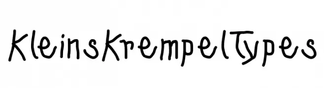
( Fonts by Manfred Klein. Free for private and charity use. Free for commercial with donation to organizations )
A playful, handwritten font with a casual and informal style.
![KleinsKrempelTypes Frei Schriftart Herunterladen]() Herunterladen 164 Downloads@WebFont
Herunterladen 164 Downloads@WebFont -
( Fonts by Mr.Soon Design )
A playful, bold handwritten font with rounded, smooth curves.
![Sweet Signature Frei Schriftart Herunterladen]() Herunterladen 164 Downloads@WebFont
Herunterladen 164 Downloads@WebFont -
( Fonts by Maelle.K - Thomas Boucherie )
A playful and dynamic script font with flowing, interconnected letters.
![J'aime bien le Dimanche ! Frei Schriftart Herunterladen]() Herunterladen 164 Downloads@WebFont
Herunterladen 164 Downloads@WebFont -
( Fonts by Daymarius )
A clean, modern monospaced font with uniform character width and minimalist design.
![Natural Mono Alt Regular Frei Schriftart Herunterladen]() Herunterladen 164 Downloads@WebFont
Herunterladen 164 Downloads@WebFont -
![KR Witchyrella Frei Schriftart Herunterladen]() Herunterladen 164 Downloads@WebFont
Herunterladen 164 Downloads@WebFont -
![Elliot Sans Light Italic Frei Schriftart Herunterladen]() Herunterladen 164 Downloads@WebFont
Herunterladen 164 Downloads@WebFont -
( Fonts by LetterStock )
A bold, geometric font with a modern and dynamic style.
![Radicalyps Frei Schriftart Herunterladen]() Herunterladen 164 Downloads@WebFont
Herunterladen 164 Downloads@WebFont -
( Fonts by Daniel Zadorozny - www.iconian.com - Free for personal use )
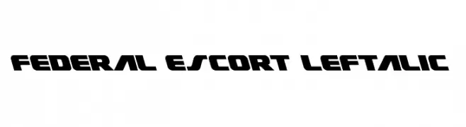
A bold, futuristic font with angular, geometric shapes and a strong presence.
![Federal Escort Leftalic Frei Schriftart Herunterladen]() Herunterladen 164 Downloads@WebFont
Herunterladen 164 Downloads@WebFont -
( Fonts by Riyadh Rahman )
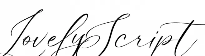
Elegant and flowing script font.
![Lovely Script Frei Schriftart Herunterladen]() Herunterladen 164 Downloads@WebFont
Herunterladen 164 Downloads@WebFont -
( Fonts by Gartype Studio - Gartype Studio - Personal-use only. For commercial use please contact owner. )
A bold, playful handwritten font with rounded, energetic letterforms.
![History Walker GT Demo Frei Schriftart Herunterladen]() Herunterladen 164 Downloads@WebFont
Herunterladen 164 Downloads@WebFont -
( Iordanis Passas - http:/ip-art.info )
A modern, geometric font with a double-line, hollow design.
![mia Frei Schriftart Herunterladen]() Herunterladen 164 Downloads@WebFont
Herunterladen 164 Downloads@WebFont -
![Tabaquera Frei Schriftart Herunterladen]() Herunterladen 164 Downloads@WebFont
Herunterladen 164 Downloads@WebFont -
( Please check www.otlab.ru before you use this font! )
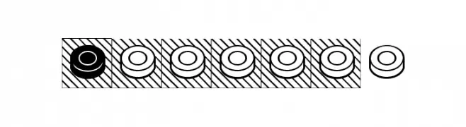
Decorative font featuring checker-like circular game pieces in filled and outlined styles.
![Shashki Frei Schriftart Herunterladen]() Herunterladen 164 Downloads@WebFont
Herunterladen 164 Downloads@WebFont -
( Fonts by Pen Culture - Revo Farisky - Personal-use only. For commercial use please contact owner. )
A fluid and elegant script font with a handwritten feel.
![Otamendi Frei Schriftart Herunterladen]() Herunterladen 164 Downloads@WebFont
Herunterladen 164 Downloads@WebFont -
( Denis Serikov - www.otlab.ru )
A modern, decorative font with elegant strokes and playful flourishes.
![Dacha Frei Schriftart Herunterladen]() Herunterladen 164 Downloads@WebFont
Herunterladen 164 Downloads@WebFont -
( Fonts by Daniel Zadorozny - www.iconian.com )
A bold, futuristic font with geometric outlines and a three-dimensional effect.
![Outrider Academy Regular Frei Schriftart Herunterladen]() Herunterladen 164 Downloads@WebFont
Herunterladen 164 Downloads@WebFont -
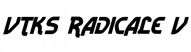
![Vtks Radicale v2 Frei Schriftart Herunterladen]() Herunterladen 164 Downloads@WebFont
Herunterladen 164 Downloads@WebFont -
![Blanket Black Outline Oblique Frei Schriftart Herunterladen]() Herunterladen 164 Downloads@WebFont
Herunterladen 164 Downloads@WebFont -
( Font Monger - www.fontmonger.com )
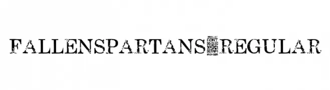
A rugged, distressed serif font with a bold, vintage appearance.
![FallenSpartans-Regular Frei Schriftart Herunterladen]() Herunterladen 164 Downloads@WebFont
Herunterladen 164 Downloads@WebFont -
( Fonts by Daniel Zadorozny - www.iconian.com - Free for personal use )
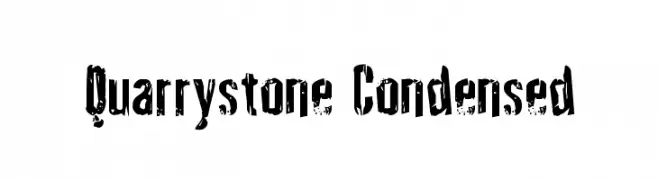
A bold, distressed font with a rugged, stone-like texture and condensed style.
![Quarrystone Condensed Frei Schriftart Herunterladen]() Herunterladen 164 Downloads@WebFont
Herunterladen 164 Downloads@WebFont -
( Fonts by dustBUST - Andreas Nylin )
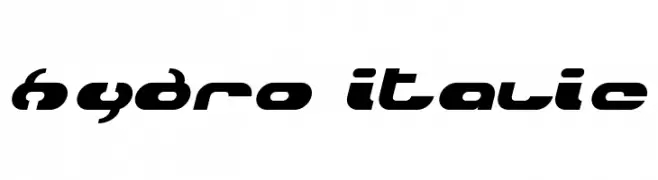
A futuristic, bold italic font with geometric shapes and smooth curves.
![Hydro Italic Frei Schriftart Herunterladen]() Herunterladen 164 Downloads@WebFont
Herunterladen 164 Downloads@WebFont -
( Fonts by Israel Dias de Oliveira )
A bold, distressed font with a vintage, textured style.
![Fidalga Regular Frei Schriftart Herunterladen]() Herunterladen 164 Downloads@WebFont
Herunterladen 164 Downloads@WebFont


Welche Schriften sind gerade am populärsten?
Poppins, Roboto, Montserrat, Open Sans und Lato sind wegen ihrer klaren Formen und breiten Einsetzbarkeit sehr gefragt – von Markenauftritt über Landingpages bis hin zu Postern.
Welche Fonts eignen sich für Logos?
Geometrische Sans‑Serifs (z. B. Poppins, Familien im Gotham‑Stil) sind ein häufiger Griff für sauberes, skalierbares Branding. Für eine persönlichere Note bleiben Scripts und Handschrift‑Stile beliebt. Kombinieren Sie einen prägnanten Headline‑Font mit einer neutralen Brotschrift für Wiedererkennung und Harmonie.
Wie oft wird die Top‑Liste aktualisiert?
Regelmäßig – basierend auf realen Downloads und Interaktionen. Schauen Sie öfter vorbei, um aufstrebende Favoriten früh zu entdecken.
💡 Tipp: Seite bookmarken – Trends wechseln schnell, und heutige Top‑Schriften inspirieren morgen vielleicht das Rebranding.