Willkommen bei den Top‑Schriften – hier treffen Beliebtheit und Qualität aufeinander. Das sind die in diesem Jahr am häufigsten heruntergeladenen und genutzten Fonts. Wenn Sie sichere Optionen für Logo, Web oder Social suchen, starten Sie hier.
Jeder Top‑Font überzeugt durch Balance, Lesbarkeit und Vielseitigkeit. Sie finden moderne Sans‑Serifs, elegante Scripts, Vintage‑Serifs und minimalistische Displays.
-
( Fonts by www.abecedarienne.com )
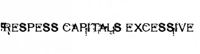
A distressed, grunge-style font with a bold, textured appearance.
 Herunterladen 161 Downloads@WebFont
 -
( Fonts by a Max Infeld - XEROGRAPHER FONTS - xerographer.blogspot.com . Personal-use only. For commercial use please contact owner. )
A playful and energetic handwritten font with fluid, connected strokes.
![QuickRodeo Frei Schriftart Herunterladen]() Herunterladen 161 Downloads@WebFont
Herunterladen 161 Downloads@WebFont -
( Fonts by Darcy Baldwin - darcybaldwin.com. Free for personal use only )
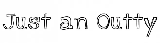
A playful, hand-drawn outlined font with a whimsical and creative style.
![Just an Outty Frei Schriftart Herunterladen]() Herunterladen 161 Downloads@WebFont
Herunterladen 161 Downloads@WebFont -
( Fonts by Ditatype )
A bold, pixelated font inspired by classic video game graphics.
![Pixel Gamer Personal use Frei Schriftart Herunterladen]() Herunterladen 161 Downloads@WebFont
Herunterladen 161 Downloads@WebFont -
( Thor Christopher Arisland - www.tcarisland.com )
A modern, geometric font with tall, narrow characters and consistent stroke weight.
![Sullivan Frei Schriftart Herunterladen]() Herunterladen 161 Downloads@WebFont
Herunterladen 161 Downloads@WebFont -
( Fonts by Philatype )
A bold, modern font with geometric lines and strong presence.
![Sen ExtraBold Frei Schriftart Herunterladen]() Herunterladen 161 Downloads@WebFont
Herunterladen 161 Downloads@WebFont -
( Fonts by Em Nazar - Personal-use only. For commercial use please contact owner. )
A futuristic, geometric font with clean lines and angular shapes.
![Redriver Frei Schriftart Herunterladen]() Herunterladen 161 Downloads@WebFont
Herunterladen 161 Downloads@WebFont -
( Fonts by Blambot Comic Fonts - Personal-use only. For commercial use please contact owner. )
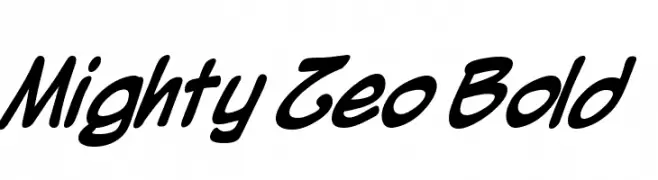
A bold, dynamic script font with smooth curves and a modern flair.
![Mighty Zeo Bold Frei Schriftart Herunterladen]() Herunterladen 161 Downloads@WebFont
Herunterladen 161 Downloads@WebFont -
( Fonts by www.dcoxy.com )
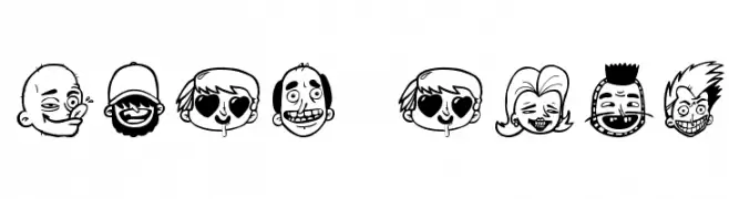
Cartoonish, expressive font made of illustrated faces.
![sick crew Frei Schriftart Herunterladen]() Herunterladen 161 Downloads@WebFont
Herunterladen 161 Downloads@WebFont -
![Sughayer Separates 15 Frei Schriftart Herunterladen]() Herunterladen 161 Downloads@WebFont
Herunterladen 161 Downloads@WebFont -
![LaMorte6 Frei Schriftart Herunterladen]() Herunterladen 161 Downloads@WebFont
Herunterladen 161 Downloads@WebFont -
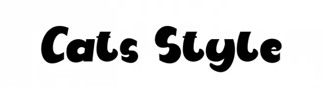
( Fonts by FallenGraphic Studio )
A bold, playful font with rounded edges and a whimsical, retro style.
![Cats Style Frei Schriftart Herunterladen]() Herunterladen 161 Downloads@WebFont
Herunterladen 161 Downloads@WebFont -
( - www.hoboart.org )
A pixelated, retro-style font with a blocky, digital appearance.
![Hoboart Frei Schriftart Herunterladen]() Herunterladen 161 Downloads@WebFont
Herunterladen 161 Downloads@WebFont -
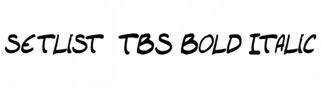
( Fonts by Press Gang Studios - Andeh Pinkard - www.pressgang-studios.com )
A bold, italicized handwritten font with a dynamic and modern style.
![setlist TBS Bold Italic Frei Schriftart Herunterladen]() Herunterladen 161 Downloads@WebFont
Herunterladen 161 Downloads@WebFont -
Schriftart von spideraysfonts. For commercial use please contact the owner.
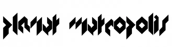
( PLANET METROPOLIS )
A bold, futuristic font with sharp, angular lines and geometric shapes.
![PLANET METROPOLIS Frei Schriftart Herunterladen]() Herunterladen 161 Downloads@WebFont
Herunterladen 161 Downloads@WebFont -
( Fonts by Lettersiro Studio )
A playful, bold font with rounded, bubbly characters.
![Cupcake Factory Frei Schriftart Herunterladen]() Herunterladen 161 Downloads@WebFont
Herunterladen 161 Downloads@WebFont -
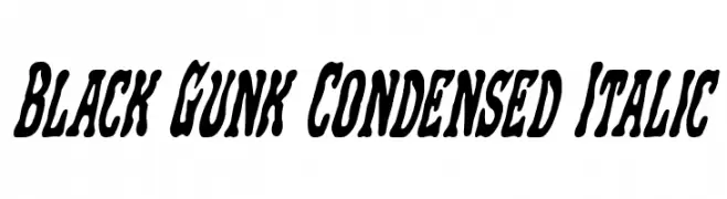
( Fonts by Iconian Fonts )
Bold, condensed, and italic with a dynamic, fluid style.
![Black Gunk Condensed Italic Frei Schriftart Herunterladen]() Herunterladen 161 Downloads@WebFont
Herunterladen 161 Downloads@WebFont -
( Fonts by imagex )
A modern, geometric font with tall, narrow characters and a clean design.
![Extros Backstage Frei Schriftart Herunterladen]() Herunterladen 161 Downloads@WebFont
Herunterladen 161 Downloads@WebFont -
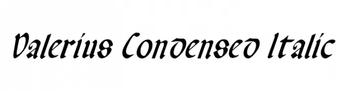
( Fonts by Daniel Zadorozny - www.iconian.com - Free for personal use )
A dynamic, italicized, and condensed font with a calligraphic style.
![Valerius Condensed Italic Frei Schriftart Herunterladen]() Herunterladen 161 Downloads@WebFont
Herunterladen 161 Downloads@WebFont -
( Fonts by a Max Infeld - XEROGRAPHER FONTS - xerographer.blogspot.com . Personal-use only. For commercial use please contact owner. )
A playful, hand-drawn font with an organic and artistic style.
![PlainLines Frei Schriftart Herunterladen]() Herunterladen 161 Downloads@WebFont
Herunterladen 161 Downloads@WebFont -
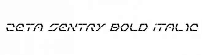
( Fonts by Daniel Zadorozny - www.iconian.com )
A bold, italic, futuristic font with angular, geometric shapes.
![Zeta Sentry Bold Italic Frei Schriftart Herunterladen]() Herunterladen 161 Downloads@WebFont
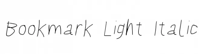
Herunterladen 161 Downloads@WebFont -
![Bookmark Light Italic Frei Schriftart Herunterladen]() Herunterladen 161 Downloads@WebFont
Herunterladen 161 Downloads@WebFont -
![Bad Ice Cream Demo Regular Frei Schriftart Herunterladen]() Herunterladen 161 Downloads@WebFont
Herunterladen 161 Downloads@WebFont -
( Fonts by Manfred Klein. Free for private and charity use. Free for commercial with donation to organizations )
Minimalist cartoon figures form each glyph in a playful, illustrative style.
![LogoModelsBowToBoss Frei Schriftart Herunterladen]() Herunterladen 161 Downloads@WebFont
Herunterladen 161 Downloads@WebFont -
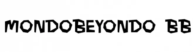
( Fonts by www.blambot.com )
A bold, angular font with a geometric and edgy style.
![MondoBeyondo BB Frei Schriftart Herunterladen]() Herunterladen 161 Downloads@WebFont
Herunterladen 161 Downloads@WebFont -
( Fonts by Graphix Line Studio )
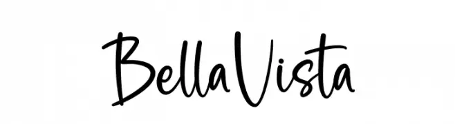
A playful, casual handwritten font with smooth, flowing strokes.
![Bella Vista Frei Schriftart Herunterladen]() Herunterladen 161 Downloads@WebFont
Herunterladen 161 Downloads@WebFont -
( Fonts by Muksal Creative - Personal-use only. For commercial use please contact owner. )
A classic serif font with modern elements and elegant proportions.
![Bondjlo Frei Schriftart Herunterladen]() Herunterladen 161 Downloads@WebFont
Herunterladen 161 Downloads@WebFont -
( Fonts by Saridezra - Personal-use only. For commercial use please contact owner. )
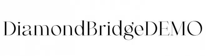
A high-contrast serif font with elegant, sharp serifs and a modern classic style.
![DiamondBridgeDEMO Frei Schriftart Herunterladen]() Herunterladen 161 Downloads@WebFont
Herunterladen 161 Downloads@WebFont -
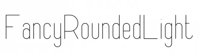
![FancyRounded Light Frei Schriftart Herunterladen]() Herunterladen 161 Downloads@WebFont
Herunterladen 161 Downloads@WebFont -
( Fonts by Zetafonts - Personal-use only. For commercial use please contact owner. )
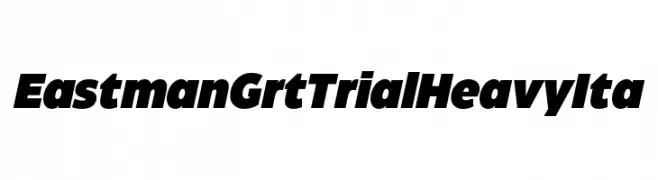
A bold, italicized font with thick strokes and a modern, impactful style.
![Eastman Grt Trial Heavy Ita Frei Schriftart Herunterladen]() Herunterladen 161 Downloads@WebFont
Herunterladen 161 Downloads@WebFont -
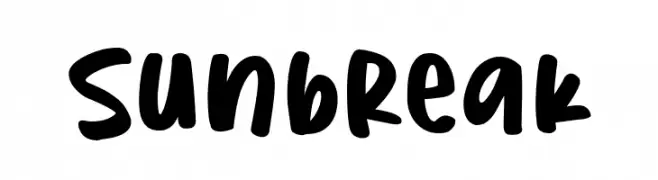
( Fonts by olivetype )
Playful, bold handwritten font.
![Sunbreak Frei Schriftart Herunterladen]() Herunterladen 161 Downloads@WebFont
Herunterladen 161 Downloads@WebFont -
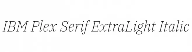
( Copyright © 2017 IBM Corp. with Reserved Font Name "Plex" )
An elegant, extra light italic serif font with a refined and sophisticated style.
![IBM Plex Serif ExtraLight Italic Frei Schriftart Herunterladen]() Herunterladen 161 Downloads@WebFont
Herunterladen 161 Downloads@WebFont -
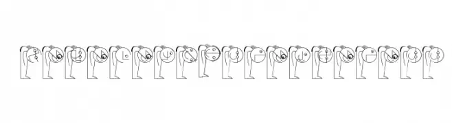
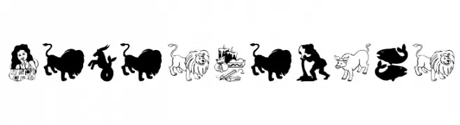
( Fonts by Manfred Klein. Free for private and charity use. Free for commercial with donation to organizations )
Whimsical zodiac-themed display font with illustrated glyphs.
![HorosCopies Frei Schriftart Herunterladen]() Herunterladen 161 Downloads@WebFont
Herunterladen 161 Downloads@WebFont -
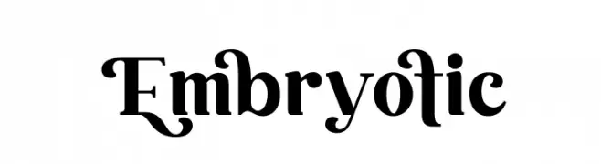
( Fonts by Aluyeah Studio - Personal-use only. For commercial use please contact owner. )
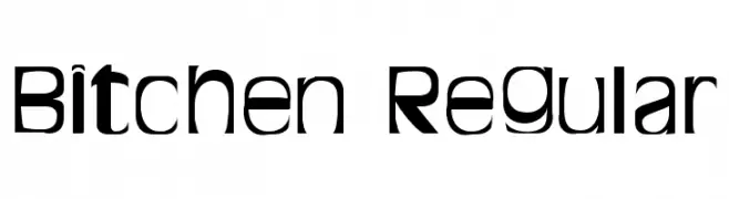
A bold, decorative font with classic and modern elements, featuring sharp serifs and elegant curves.
![Embryotic Frei Schriftart Herunterladen]() Herunterladen 161 Downloads@WebFont
Herunterladen 161 Downloads@WebFont -
( Free for personal use )
A bold, modern font with dynamic angles and smooth curves.
![Bitchen Regular Frei Schriftart Herunterladen]() Herunterladen 161 Downloads@WebFont
Herunterladen 161 Downloads@WebFont


Welche Schriften sind gerade am populärsten?
Poppins, Roboto, Montserrat, Open Sans und Lato sind wegen ihrer klaren Formen und breiten Einsetzbarkeit sehr gefragt – von Markenauftritt über Landingpages bis hin zu Postern.
Welche Fonts eignen sich für Logos?
Geometrische Sans‑Serifs (z. B. Poppins, Familien im Gotham‑Stil) sind ein häufiger Griff für sauberes, skalierbares Branding. Für eine persönlichere Note bleiben Scripts und Handschrift‑Stile beliebt. Kombinieren Sie einen prägnanten Headline‑Font mit einer neutralen Brotschrift für Wiedererkennung und Harmonie.
Wie oft wird die Top‑Liste aktualisiert?
Regelmäßig – basierend auf realen Downloads und Interaktionen. Schauen Sie öfter vorbei, um aufstrebende Favoriten früh zu entdecken.
💡 Tipp: Seite bookmarken – Trends wechseln schnell, und heutige Top‑Schriften inspirieren morgen vielleicht das Rebranding.