Willkommen bei den Top‑Schriften – hier treffen Beliebtheit und Qualität aufeinander. Das sind die in diesem Jahr am häufigsten heruntergeladenen und genutzten Fonts. Wenn Sie sichere Optionen für Logo, Web oder Social suchen, starten Sie hier.
Jeder Top‑Font überzeugt durch Balance, Lesbarkeit und Vielseitigkeit. Sie finden moderne Sans‑Serifs, elegante Scripts, Vintage‑Serifs und minimalistische Displays.
-
( Kanda )
A playful, hand-drawn font with a whimsical and informal style.
 Herunterladen 158 Downloads@WebFont
 -
( Fonts by Tup Wanders )
A bold, playful script font with a casual handwritten style.
![Wanders Frei Schriftart Herunterladen]() Herunterladen 158 Downloads@WebFont
Herunterladen 158 Downloads@WebFont -
( Fonts by Haslinda Adnan - Personal-use only. For commercial use please contact owner. )
A bold, geometric font with playful, angular characters.
![Asam Kelubi Frei Schriftart Herunterladen]() Herunterladen 158 Downloads@WebFont
Herunterladen 158 Downloads@WebFont -
![Kuppel Ultra-condensed Bold Italic Frei Schriftart Herunterladen]() Herunterladen 158 Downloads@WebFont
Herunterladen 158 Downloads@WebFont -
( Nght's Place - www.crosswinds.net/~nghtmvs/font/fonts1.html )
A bold, decorative font with rose illustrations on each character.
![101! A Rose fer U Frei Schriftart Herunterladen]() Herunterladen 158 Downloads@WebFont
Herunterladen 158 Downloads@WebFont -
![Frantic Italic Frei Schriftart Herunterladen]() Herunterladen 158 Downloads@WebFont
Herunterladen 158 Downloads@WebFont -
![Tabaquera Frei Schriftart Herunterladen]() Herunterladen 158 Downloads@WebFont
Herunterladen 158 Downloads@WebFont -
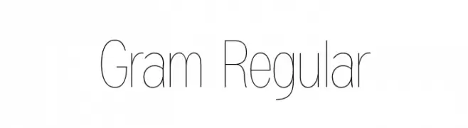
( Scott Simpson )
A sleek, minimalistic font with thin, elongated characters for a modern look.
![Gram Regular Frei Schriftart Herunterladen]() Herunterladen 158 Downloads@WebFont
Herunterladen 158 Downloads@WebFont -
( Fonts by Daniel Zadorozny - www.iconian.com )
A bold, rugged font with a distressed, textured appearance.
![King Commando Expanded Frei Schriftart Herunterladen]() Herunterladen 158 Downloads@WebFont
Herunterladen 158 Downloads@WebFont -
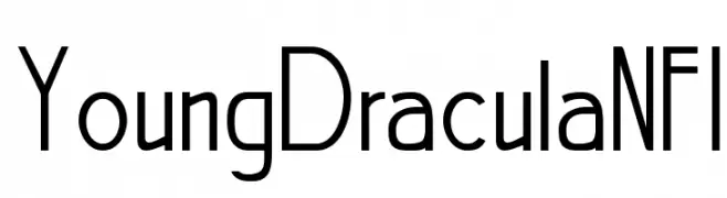
( Fonts by www.norfok.com - Norfok® Incredible Font Design - Thomas W. Otto )
A modern, geometric font with unique character designs and a hint of retro charm.
![YoungDraculaNFI Frei Schriftart Herunterladen]() Herunterladen 158 Downloads@WebFont
Herunterladen 158 Downloads@WebFont -
( Noto is a trademark of Google Inc. Noto fonts are open source. All Noto fonts are published under the SIL Open Font License, Version 1.1 )
Placeholder glyphs indicating unsupported characters.
![Noto Sans Armenian Thin Frei Schriftart Herunterladen]() Herunterladen 158 Downloads@WebFont
Herunterladen 158 Downloads@WebFont -
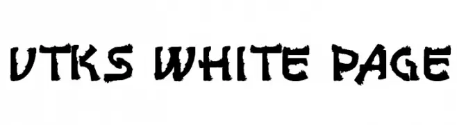
( Fonts by Douglas Vitkauskas - www.vtksdesign.com. Personal-use only. For commercial use please contact owner. )
A bold, rugged font with a hand-drawn, textured appearance.
![vtks white page Frei Schriftart Herunterladen]() Herunterladen 158 Downloads@WebFont
Herunterladen 158 Downloads@WebFont -
( Fonts by Manfred Klein. Free for private and charity use. Free for commercial with donation to organizations )
A classic serif font with balanced proportions and moderate contrast.
![LittleRock Frei Schriftart Herunterladen]() Herunterladen 158 Downloads@WebFont
Herunterladen 158 Downloads@WebFont -
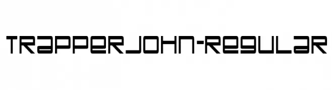
( Fonts by www.typodermicfonts.com - Ray Larabie )
A geometric, futuristic font with sharp angles and clean lines.
![TrapperJohn-Regular Frei Schriftart Herunterladen]() Herunterladen 158 Downloads@WebFont
Herunterladen 158 Downloads@WebFont -
( Iconian Fonts - Daniel Zadorozny - www.iconian.com )
A bold, dynamic font with angular letterforms and star motifs, perfect for impactful designs.
![Rocket Pop Punch Frei Schriftart Herunterladen]() Herunterladen 158 Downloads@WebFont
Herunterladen 158 Downloads@WebFont -
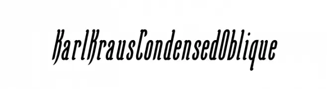
( Free on condition that you make a donation of 5€ favor of an organization dealing with global warming. http://www.sergiolelli.it )
A condensed oblique font with sleek, elongated letterforms and moderate stroke contrast.
![KarlKrausCondensedOblique Frei Schriftart Herunterladen]() Herunterladen 158 Downloads@WebFont
Herunterladen 158 Downloads@WebFont -
![SquareDance00 Frei Schriftart Herunterladen]() Herunterladen 158 Downloads@WebFont
Herunterladen 158 Downloads@WebFont -
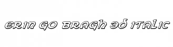
( Fonts by Daniel Zadorozny - www.iconian.com )
A bold, 3D italic font with a playful and dynamic style.
![Erin Go Bragh 3D Italic Frei Schriftart Herunterladen]() Herunterladen 158 Downloads@WebFont
Herunterladen 158 Downloads@WebFont -
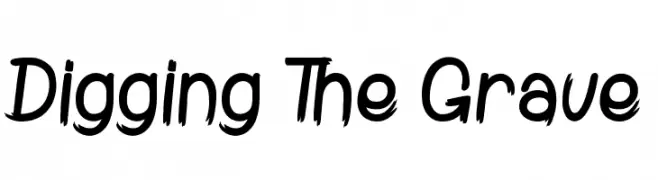
( Fonts by www.dcoxy.com )
A bold, brush-style font with sharp, jagged edges and a dynamic appearance.
![Digging The Grave Frei Schriftart Herunterladen]() Herunterladen 158 Downloads@WebFont
Herunterladen 158 Downloads@WebFont -
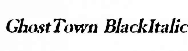
![GhostTown BlackItalic Frei Schriftart Herunterladen]() Herunterladen 158 Downloads@WebFont
Herunterladen 158 Downloads@WebFont -
![Squalor Frei Schriftart Herunterladen]() Herunterladen 158 Downloads@WebFont
Herunterladen 158 Downloads@WebFont -
![Twenty Twenty Frei Schriftart Herunterladen]() Herunterladen 158 Downloads@WebFont
Herunterladen 158 Downloads@WebFont -
( Fonts by Graphix Line Studio )
A playful, handwritten script font with smooth, flowing lines.
![Marshmallow Frei Schriftart Herunterladen]() Herunterladen 158 Downloads@WebFont
Herunterladen 158 Downloads@WebFont -
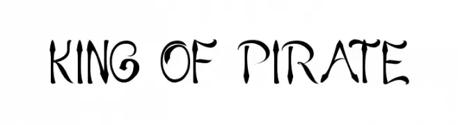
![KING OF PIRATE Frei Schriftart Herunterladen]() Herunterladen 158 Downloads@WebFont
Herunterladen 158 Downloads@WebFont -
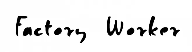
( Fonts by Roland Huse - rolandhuse.com )
A playful, handwritten font with uneven strokes and a casual vibe.
![Factory Worker Frei Schriftart Herunterladen]() Herunterladen 158 Downloads@WebFont
Herunterladen 158 Downloads@WebFont -
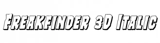
( Fonts by Daniel Zadorozny - www.iconian.com - Free for personal use )
A bold, 3D italic font with a dynamic and shadowed style.
![Freakfinder 3D Italic Frei Schriftart Herunterladen]() Herunterladen 158 Downloads@WebFont
Herunterladen 158 Downloads@WebFont -
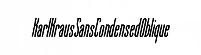
( Free on condition that you make a donation of 5€ favor of an organization dealing with global warming. http://www.sergiolelli.it )
A sleek, condensed oblique font with consistent stroke weight and dynamic style.
![KarlKrausSansCondensedOblique Frei Schriftart Herunterladen]() Herunterladen 158 Downloads@WebFont
Herunterladen 158 Downloads@WebFont -
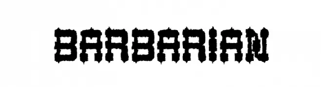
![BARBARIAN Frei Schriftart Herunterladen]() Herunterladen 158 Downloads@WebFont
Herunterladen 158 Downloads@WebFont -
( Hanoded - David Kerkhoff - www.hanodedfonts.com )
An expressive, cursive script font with elegant flourishes and a handwritten feel.
![Don Quixote Frei Schriftart Herunterladen]() Herunterladen 158 Downloads@WebFont
Herunterladen 158 Downloads@WebFont -
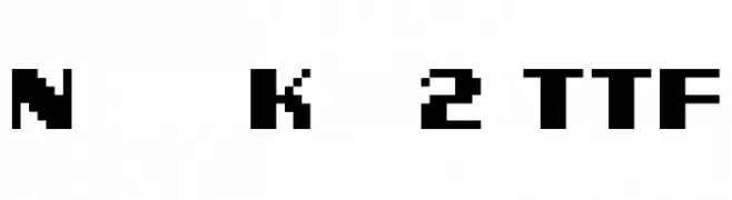
( Genshichi Yasui - www.jttk.zaq.ne.jp/babwp701/hpfont/font.html )
A bold, pixelated font with a retro arcade game style.
![Ninja Kid 2 TTF Frei Schriftart Herunterladen]() Herunterladen 158 Downloads@WebFont
Herunterladen 158 Downloads@WebFont -
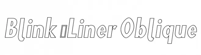
![Blink 'Liner Oblique Frei Schriftart Herunterladen]() Herunterladen 158 Downloads@WebFont
Herunterladen 158 Downloads@WebFont -
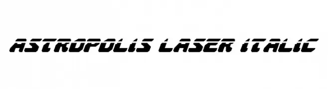
( Fonts by Daniel Zadorozny - www.iconian.com - Free for personal use )
A bold, futuristic italic font with angular, geometric letterforms.
![Astropolis Laser Italic Frei Schriftart Herunterladen]() Herunterladen 158 Downloads@WebFont
Herunterladen 158 Downloads@WebFont -
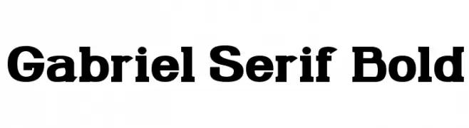
( Gabriel Mark Perida - www.theborkyperidaproject.weebly.com )
A bold serif font with strong, thick strokes and prominent serifs.
![Gabriel Serif Bold Frei Schriftart Herunterladen]() Herunterladen 158 Downloads@WebFont
Herunterladen 158 Downloads@WebFont -
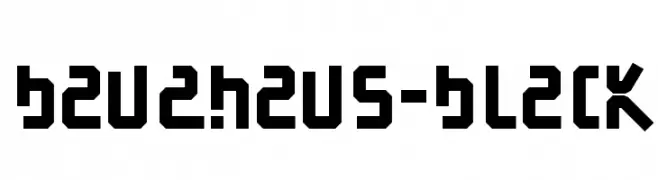
( Fonts by Manfred Klein. Free for private and charity use. Free for commercial with donation to organizations )
A bold, geometric font with angular shapes and a modern, industrial style.
![BauAHaus-Black Frei Schriftart Herunterladen]() Herunterladen 158 Downloads@WebFont
Herunterladen 158 Downloads@WebFont -
( Zetafonts - www.zetafonts.com )
A bold, italic typeface with a modern, dynamic style and tight character spacing.
![Sugo Pro Classic Trial Bold Italic Frei Schriftart Herunterladen]() Herunterladen 158 Downloads@WebFont
Herunterladen 158 Downloads@WebFont


Welche Schriften sind gerade am populärsten?
Poppins, Roboto, Montserrat, Open Sans und Lato sind wegen ihrer klaren Formen und breiten Einsetzbarkeit sehr gefragt – von Markenauftritt über Landingpages bis hin zu Postern.
Welche Fonts eignen sich für Logos?
Geometrische Sans‑Serifs (z. B. Poppins, Familien im Gotham‑Stil) sind ein häufiger Griff für sauberes, skalierbares Branding. Für eine persönlichere Note bleiben Scripts und Handschrift‑Stile beliebt. Kombinieren Sie einen prägnanten Headline‑Font mit einer neutralen Brotschrift für Wiedererkennung und Harmonie.
Wie oft wird die Top‑Liste aktualisiert?
Regelmäßig – basierend auf realen Downloads und Interaktionen. Schauen Sie öfter vorbei, um aufstrebende Favoriten früh zu entdecken.
💡 Tipp: Seite bookmarken – Trends wechseln schnell, und heutige Top‑Schriften inspirieren morgen vielleicht das Rebranding.