Willkommen bei den Top‑Schriften – hier treffen Beliebtheit und Qualität aufeinander. Das sind die in diesem Jahr am häufigsten heruntergeladenen und genutzten Fonts. Wenn Sie sichere Optionen für Logo, Web oder Social suchen, starten Sie hier.
Jeder Top‑Font überzeugt durch Balance, Lesbarkeit und Vielseitigkeit. Sie finden moderne Sans‑Serifs, elegante Scripts, Vintage‑Serifs und minimalistische Displays.
-
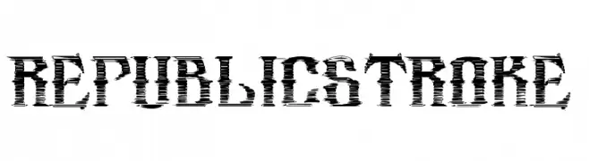
( Fonts by DesignStation - designstation.deviantart.com - Personal-use only. For commercial use please contact owner. )
A bold, dynamic font with horizontal strokes creating a sense of movement.
 Herunterladen 159 Downloads@WebFont
 -
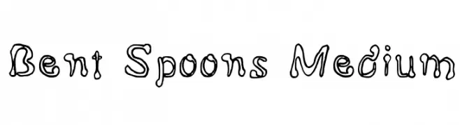
![Bent Spoons Medium Frei Schriftart Herunterladen]() Herunterladen 159 Downloads@WebFont
Herunterladen 159 Downloads@WebFont -
( Fonts by Sizimon.id )
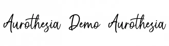
Elegant handwritten script with tall, flowing characters.
![Aurothesia Demo Aurothesia Frei Schriftart Herunterladen]() Herunterladen 159 Downloads@WebFont
Herunterladen 159 Downloads@WebFont -
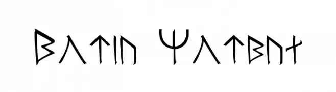
![Moria Normal Frei Schriftart Herunterladen]() Herunterladen 159 Downloads@WebFont
Herunterladen 159 Downloads@WebFont -
![Kolkhety-ITV Frei Schriftart Herunterladen]() Herunterladen 159 Downloads
Herunterladen 159 Downloads -
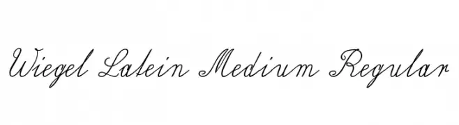
( Fonts by Peter Wiegel - www.peter-wiegel.de - Personal-use only. For commercial use please contact owner. )
An elegant, cursive font with flowing, intricate designs.
![Wiegel Latein Medium Regular Frei Schriftart Herunterladen]() Herunterladen 159 Downloads@WebFont
Herunterladen 159 Downloads@WebFont -
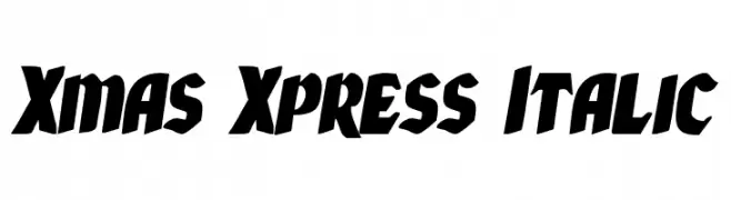
( Fonts by Daniel Zadorozny - www.iconian.com - Free for personal use )
Bold, italic font with a dynamic and energetic style.
![Xmas Xpress Italic Frei Schriftart Herunterladen]() Herunterladen 159 Downloads@WebFont
Herunterladen 159 Downloads@WebFont -
![Kruti Dev 060 Italic Frei Schriftart Herunterladen]() Herunterladen 159 Downloads@WebFont
Herunterladen 159 Downloads@WebFont -
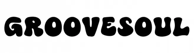
( Fonts by MJType )
A bold, playful font with rounded, bubbly characters perfect for creative projects.
![Groove Soul Frei Schriftart Herunterladen]() Herunterladen 159 Downloads@WebFont
Herunterladen 159 Downloads@WebFont -
( Fonts by Darren Hassett )
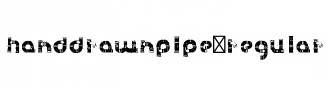
A hand-drawn, pipe-like font with bold, interconnected lines and a playful style.
![HanddrawnPipe-Regular Frei Schriftart Herunterladen]() Herunterladen 159 Downloads@WebFont
Herunterladen 159 Downloads@WebFont -
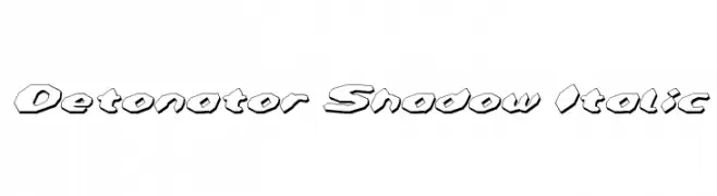
![Detonator Shadow Italic Frei Schriftart Herunterladen]() Herunterladen 159 Downloads@WebFont
Herunterladen 159 Downloads@WebFont -
( Fonts by Daniel Zadorozny - www.iconian.com - Free for personal use )
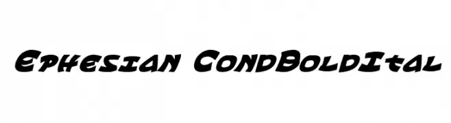
A bold, condensed, and italic font with high contrast and dynamic style.
![Ephesian CondBoldItal Frei Schriftart Herunterladen]() Herunterladen 159 Downloads@WebFont
Herunterladen 159 Downloads@WebFont -
( Fonts by Daniel Zadorozny - www.iconian.com - Free for personal use )
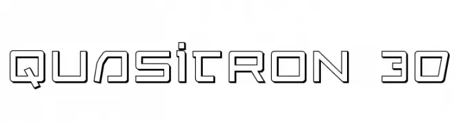
A futuristic, geometric font with a 3D effect and bold outlines.
![Quasitron 3D Frei Schriftart Herunterladen]() Herunterladen 159 Downloads@WebFont
Herunterladen 159 Downloads@WebFont -
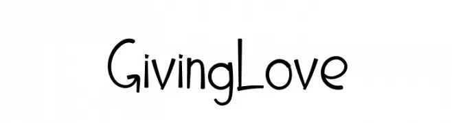
![Giving Love Frei Schriftart Herunterladen]() Herunterladen 159 Downloads@WebFont
Herunterladen 159 Downloads@WebFont -
( Fonts by Daniel Zadorozny - www.iconian.com - Free for personal use )
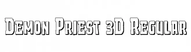
A bold, 3D geometric font with a vintage flair.
![Demon Priest 3D Regular Frei Schriftart Herunterladen]() Herunterladen 159 Downloads@WebFont
Herunterladen 159 Downloads@WebFont -
( Fonts by fsuarez913 )
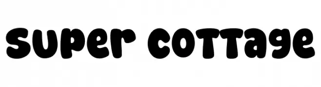
A bold, playful font with rounded, bubbly characters perfect for fun and whimsical designs.
![Super Cottage Frei Schriftart Herunterladen]() Herunterladen 159 Downloads@WebFont
Herunterladen 159 Downloads@WebFont -
( Fonts by Iconian Fonts )
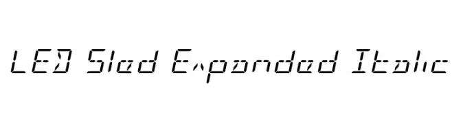
A futuristic, digital-style font with an italicized, expanded design.
![LED Sled Expanded Italic Frei Schriftart Herunterladen]() Herunterladen 159 Downloads@WebFont
Herunterladen 159 Downloads@WebFont -
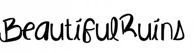
( Fonts by Des Gomez )
A playful, handwritten font with a bold and whimsical style.
![BeautifulRuins Frei Schriftart Herunterladen]() Herunterladen 159 Downloads@WebFont
Herunterladen 159 Downloads@WebFont -
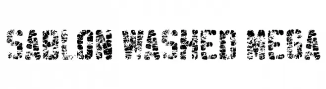
( Fonts by youssef-habchi.com - Personal-use only. For commercial use please contact owner. )
A bold, distressed font with a textured, vintage appearance.
![Sablon Washed Mega Frei Schriftart Herunterladen]() Herunterladen 159 Downloads@WebFont
Herunterladen 159 Downloads@WebFont -
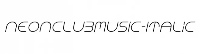
( Fonts by Manuel Viergutz - Typo Graphic Design - www.typographicdesign.de )
A sleek, modern italic font with a futuristic design and continuous line style.
![NEONCLUBMUSIC-Italic Frei Schriftart Herunterladen]() Herunterladen 159 Downloads@WebFont
Herunterladen 159 Downloads@WebFont -
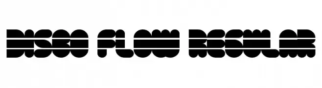
( Fonts by Geronimo )
A bold, geometric font with a retro, disco-inspired design.
![Disco Flow Regular Frei Schriftart Herunterladen]() Herunterladen 159 Downloads@WebFont
Herunterladen 159 Downloads@WebFont -
( Fonts by GGBotNet - Personal-use only. For commercial use please contact owner. )
A pixelated, blocky font with a retro digital aesthetic.
![Pixeloid Sans Frei Schriftart Herunterladen]() Herunterladen 159 Downloads@WebFont
Herunterladen 159 Downloads@WebFont -
( Fonts by a Neale Davidson - www.pixelsagas.com. Personal-use only. For commercial use please contact owner. )
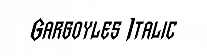
A bold, angular italic font with a dynamic and modern style.
![Gargoyles Italic Frei Schriftart Herunterladen]() Herunterladen 159 Downloads@WebFont
Herunterladen 159 Downloads@WebFont -
( Fonts by Mycandythemes )
A whimsical script font with flowing, curly strokes and playful loops.
![Dality Frei Schriftart Herunterladen]() Herunterladen 159 Downloads@WebFont
Herunterladen 159 Downloads@WebFont -
( Fonts by Mans Greback - Personal-use only. For commercial use please contact owner. )
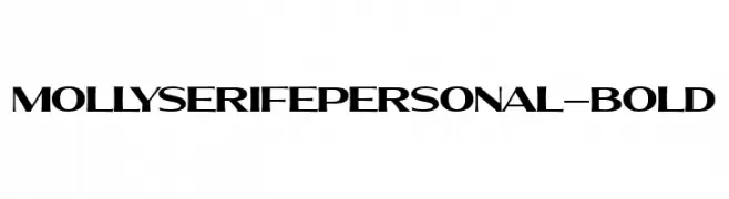
A bold, modern serif font with high contrast and angular serifs.
![MollySerifEPERSONAL-Bold Frei Schriftart Herunterladen]() Herunterladen 159 Downloads@WebFont
Herunterladen 159 Downloads@WebFont -
( Fonts by Jacob Fisher - www.pizzadude.dk )
A bold, geometric font with rounded edges and a modern, futuristic style.
![Retaliator Frei Schriftart Herunterladen]() Herunterladen 159 Downloads@WebFont
Herunterladen 159 Downloads@WebFont -
( Iconian Fonts - Daniel Zadorozny - www.iconian.com )
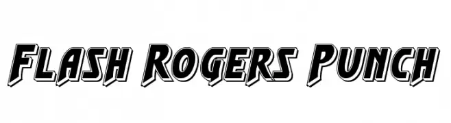
A bold, dynamic font with a 3D effect and strong comic book style.
![Flash Rogers Punch Frei Schriftart Herunterladen]() Herunterladen 159 Downloads@WebFont
Herunterladen 159 Downloads@WebFont -
( Fonts by Alde Saputro - aldedesign - https://www.creativefabrica.com/product/the-crafty-holiday-font-bundle/ref/125925/ - Personal-use only. For commercial use please contact owner. )
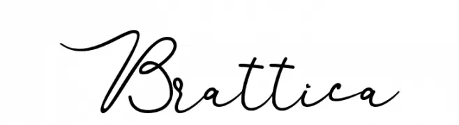
An elegant, cursive font with flowing lines and sophisticated style.
![Brattica Frei Schriftart Herunterladen]() Herunterladen 159 Downloads@WebFont
Herunterladen 159 Downloads@WebFont -
Schriftart von typotopia. For commercial use please contact the owner.
( Fonts bt Typotopia - Typotopia.co - Personal Use Only, for Commercial Use, please contact us )
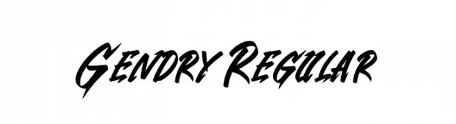
A bold, dynamic script font with flowing, cursive letterforms and dramatic flair.
![Gendry Regular Frei Schriftart Herunterladen]() Herunterladen 159 Downloads@WebFont
Herunterladen 159 Downloads@WebFont -
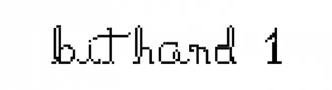
![bithand 1 Frei Schriftart Herunterladen]() Herunterladen 159 Downloads@WebFont
Herunterladen 159 Downloads@WebFont -
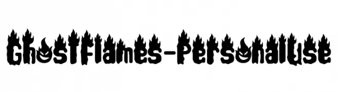
( Fonts by Letterafa Studio - Ahmad Afandi - Personal-use only. For commercial use please contact owner. )
A bold, flame-themed font with a dynamic and energetic style.
![Ghost Flames - Personal Use Frei Schriftart Herunterladen]() Herunterladen 159 Downloads@WebFont
Herunterladen 159 Downloads@WebFont -
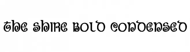
( Fonts by Daniel Zadorozny - www.iconian.com - Free for personal use )
A bold, condensed, and decorative font with whimsical curls and loops.
![The Shire Bold Condensed Frei Schriftart Herunterladen]() Herunterladen 159 Downloads@WebFont
Herunterladen 159 Downloads@WebFont -
( Fonts by www.woodcutter.es - woodcutter Manero - Personal-use only. For commercial use please contact owner. )
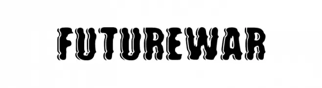
A bold, dripping font with a liquid-like, horror-inspired style.
![future war Frei Schriftart Herunterladen]() Herunterladen 159 Downloads@WebFont
Herunterladen 159 Downloads@WebFont -
![Genius Jempolan Royal Frei Schriftart Herunterladen]() Herunterladen 159 Downloads@WebFont
Herunterladen 159 Downloads@WebFont -
( Fonts by Daniel Zadorozny - www.iconian.com - Free for personal use )
A whimsical, decorative italic font with intricate swirls and curls.
![The Shire Italic Frei Schriftart Herunterladen]() Herunterladen 159 Downloads@WebFont
Herunterladen 159 Downloads@WebFont


Welche Schriften sind gerade am populärsten?
Poppins, Roboto, Montserrat, Open Sans und Lato sind wegen ihrer klaren Formen und breiten Einsetzbarkeit sehr gefragt – von Markenauftritt über Landingpages bis hin zu Postern.
Welche Fonts eignen sich für Logos?
Geometrische Sans‑Serifs (z. B. Poppins, Familien im Gotham‑Stil) sind ein häufiger Griff für sauberes, skalierbares Branding. Für eine persönlichere Note bleiben Scripts und Handschrift‑Stile beliebt. Kombinieren Sie einen prägnanten Headline‑Font mit einer neutralen Brotschrift für Wiedererkennung und Harmonie.
Wie oft wird die Top‑Liste aktualisiert?
Regelmäßig – basierend auf realen Downloads und Interaktionen. Schauen Sie öfter vorbei, um aufstrebende Favoriten früh zu entdecken.
💡 Tipp: Seite bookmarken – Trends wechseln schnell, und heutige Top‑Schriften inspirieren morgen vielleicht das Rebranding.