Willkommen bei den Top‑Schriften – hier treffen Beliebtheit und Qualität aufeinander. Das sind die in diesem Jahr am häufigsten heruntergeladenen und genutzten Fonts. Wenn Sie sichere Optionen für Logo, Web oder Social suchen, starten Sie hier.
Jeder Top‑Font überzeugt durch Balance, Lesbarkeit und Vielseitigkeit. Sie finden moderne Sans‑Serifs, elegante Scripts, Vintage‑Serifs und minimalistische Displays.
-
( koeiekat - koeiekat.com )
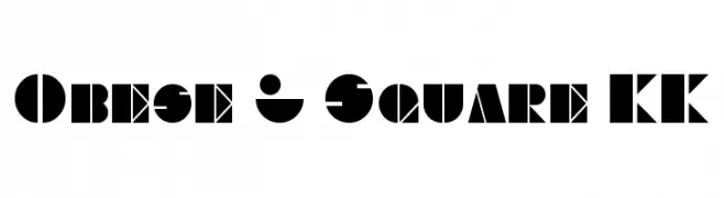
A bold, geometric font with angular shapes and solid fills, ideal for impactful designs.
 Herunterladen 159 Downloads@WebFont
 -
( Matias Romero - matiasromero.deviantart.com )
A bold, modern serif font with strong, thick strokes and a dynamic presence.
![Antibios Frei Schriftart Herunterladen]() Herunterladen 159 Downloads@WebFont
Herunterladen 159 Downloads@WebFont -
![Sughayer Separates 14 Frei Schriftart Herunterladen]() Herunterladen 159 Downloads@WebFont
Herunterladen 159 Downloads@WebFont -
( Fonts by Paul Lloyd )
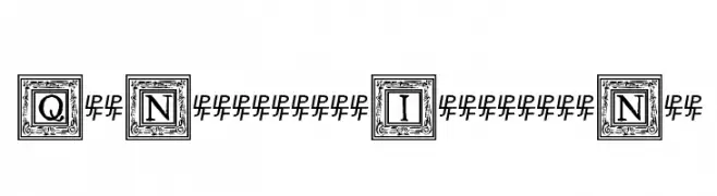
A decorative and ornate font with uppercase letters in intricate square frames, exuding vintage elegance.
![QuaNauticale_Initials_No1 Frei Schriftart Herunterladen]() Herunterladen 159 Downloads@WebFont
Herunterladen 159 Downloads@WebFont -
( Fonts by BeauType Studio - beautique.vn - Personal-use only. For commercial use please contact owner. )
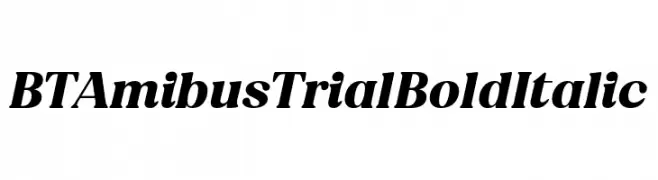
A bold, italic serif font with strong, dynamic strokes and pronounced serifs.
![BT Amibus Trial Bold Italic Frei Schriftart Herunterladen]() Herunterladen 159 Downloads@WebFont
Herunterladen 159 Downloads@WebFont -
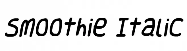
![Smoothie Italic Frei Schriftart Herunterladen]() Herunterladen 159 Downloads@WebFont
Herunterladen 159 Downloads@WebFont -
![Blaise Gothic Regular Frei Schriftart Herunterladen]() Herunterladen 159 Downloads@WebFont
Herunterladen 159 Downloads@WebFont -
![Charger Sport SemiBold Narrow Frei Schriftart Herunterladen]() Herunterladen 159 Downloads@WebFont
Herunterladen 159 Downloads@WebFont -
![Fucsimile Frei Schriftart Herunterladen]() Herunterladen 159 Downloads@WebFont
Herunterladen 159 Downloads@WebFont -
( Fonts by Jecko Development - www.jeckodevelopment.com )
A playful handwritten font with fluid, connected strokes.
![JDJerk Frei Schriftart Herunterladen]() Herunterladen 159 Downloads@WebFont
Herunterladen 159 Downloads@WebFont -
![Spaceship Bullet Frei Schriftart Herunterladen]() Herunterladen 159 Downloads@WebFont
Herunterladen 159 Downloads@WebFont -
( imagex - www.imagex-fonts.com )
A bold, three-dimensional collegiate-style font with strong outlines and shadow effects.
![Campus Relief Frei Schriftart Herunterladen]() Herunterladen 159 Downloads@WebFont
Herunterladen 159 Downloads@WebFont -
( Fonts by Pizzadude )
A playful, hand-drawn font with whimsical swirls and curls.
![StrawberryGossipDEMO Frei Schriftart Herunterladen]() Herunterladen 159 Downloads@WebFont
Herunterladen 159 Downloads@WebFont -
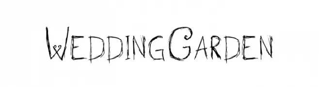
( Fonts by Fran Fernandez - Personal-use only. For commercial use please contact owner. )
A whimsical, nature-inspired font with hand-drawn, twig-like characters.
![Wedding Garden Frei Schriftart Herunterladen]() Herunterladen 159 Downloads@WebFont
Herunterladen 159 Downloads@WebFont -
![SA_Fussy Frei Schriftart Herunterladen]() Herunterladen 159 Downloads@WebFont
Herunterladen 159 Downloads@WebFont -
( Fonts by Apostrophic Lab )
A modern, digital-inspired font with geometric and linear elements.
![Republika II Exp - Haze Frei Schriftart Herunterladen]() Herunterladen 159 Downloads@WebFont
Herunterladen 159 Downloads@WebFont -
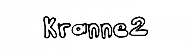
![Kranne2 Frei Schriftart Herunterladen]() Herunterladen 159 Downloads@WebFont
Herunterladen 159 Downloads@WebFont -
( Fonts by Fikry Alif - Fikryal studio - https://www.creativefabrica.com/designer/mfikryalif/ref/222304/ - Personal-use only. For commercial use please contact owner. )
A bold, flowing script font with a handwritten, calligraphic style.
![amartha Frei Schriftart Herunterladen]() Herunterladen 159 Downloads@WebFont
Herunterladen 159 Downloads@WebFont -
( Fonts by Graphix Line Studio - Personal-use only. For commercial use please contact owner. )
A playful, flowing script font with a handwritten style.
![Autumn Calling Frei Schriftart Herunterladen]() Herunterladen 159 Downloads@WebFont
Herunterladen 159 Downloads@WebFont -
( Font Bureau - beinghairless.com )
A bold, geometric font with a three-dimensional outline and playful numerals.
![Sonic Chaos Frei Schriftart Herunterladen]() Herunterladen 159 Downloads@WebFont
Herunterladen 159 Downloads@WebFont -
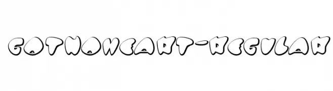
( Fonts by www.typodermicfonts.com - Ray Larabie )
A playful, bubbly font with thick outlines and a cartoonish style.
![GotNoHeart-Regular Frei Schriftart Herunterladen]() Herunterladen 159 Downloads@WebFont
Herunterladen 159 Downloads@WebFont -
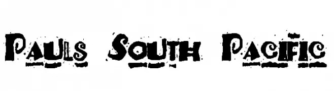
( Fonts by Paul - viciousink.net )
A bold, decorative font with artistic, swirling elements and intricate details.
![Pauls South Pacific Frei Schriftart Herunterladen]() Herunterladen 159 Downloads@WebFont
Herunterladen 159 Downloads@WebFont -
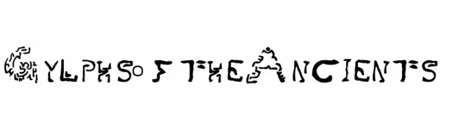
![Gylphs of the Ancients Frei Schriftart Herunterladen]() Herunterladen 159 Downloads@WebFont
Herunterladen 159 Downloads@WebFont -
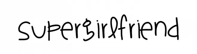
( Fonts by Des Gomez )
A playful, whimsical handwritten font with a casual and lively style.
![SuperGirlfriend Frei Schriftart Herunterladen]() Herunterladen 159 Downloads@WebFont
Herunterladen 159 Downloads@WebFont -
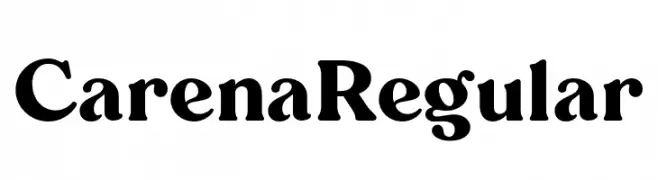
( Fonts by BrandSemut - A Sidiq - Personal-use only. For commercial use please contact owner. )
A bold serif font with strong, classic features and pronounced serifs.
![Carena Regular Frei Schriftart Herunterladen]() Herunterladen 159 Downloads@WebFont
Herunterladen 159 Downloads@WebFont -
( Fonts by Vultype - Candra Hamdani - Personal-use only. For commercial use please contact owner. )
A dynamic and flowing script font with elegant cursive letterforms.
![The Bredan Frei Schriftart Herunterladen]() Herunterladen 159 Downloads@WebFont
Herunterladen 159 Downloads@WebFont -
( Fonts by Manfred Klein. Free for private and charity use. Free for commercial with donation to organizations )
An abstract, glitch-inspired font with fragmented, pixelated characters.
![Pixelsoup Frei Schriftart Herunterladen]() Herunterladen 159 Downloads@WebFont
Herunterladen 159 Downloads@WebFont -
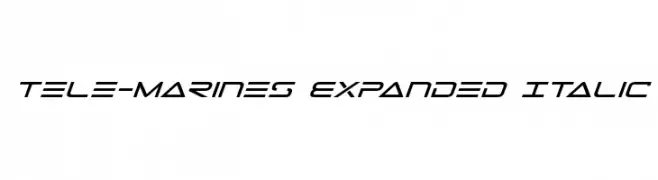
( Fonts by Daniel Zadorozny - www.iconian.com - Free for personal use )
A futuristic, italicized font with sleek, angular letterforms and an expanded width.
![Tele-Marines Expanded Italic Frei Schriftart Herunterladen]() Herunterladen 159 Downloads@WebFont
Herunterladen 159 Downloads@WebFont -
( Fonts by Timo Kuilder - Personal-use only. For commercial use please contact owner. )
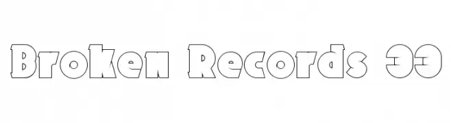
A bold, geometric font with a playful and decorative style.
![Broken Records 33 Frei Schriftart Herunterladen]() Herunterladen 159 Downloads@WebFont
Herunterladen 159 Downloads@WebFont -
( Fonts by Manfred Klein. Free for private and charity use. Free for commercial with donation to organizations )
A playful, bold font with characters enclosed in rounded shapes, perfect for creative projects.
![WhyMar Frei Schriftart Herunterladen]() Herunterladen 159 Downloads@WebFont
Herunterladen 159 Downloads@WebFont -
( Fonts by Måns Grebäck )
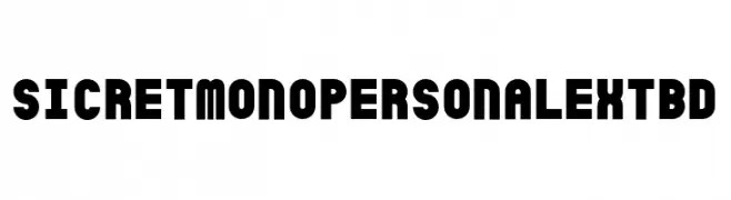
A bold, geometric font with a strong, modern presence.
![SicretMonoPERSONALExtBd Frei Schriftart Herunterladen]() Herunterladen 159 Downloads@WebFont
Herunterladen 159 Downloads@WebFont -
![Sassy snowflake Medium Frei Schriftart Herunterladen]() Herunterladen 159 Downloads@WebFont
Herunterladen 159 Downloads@WebFont -
( Fonts by Darrell Flood )
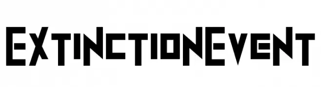
A bold, geometric font with a futuristic and industrial design.
![ExtinctionEvent Frei Schriftart Herunterladen]() Herunterladen 159 Downloads@WebFont
Herunterladen 159 Downloads@WebFont -
( Fonts by Manfred Klein. Free for private and charity use. Free for commercial with donation to organizations )
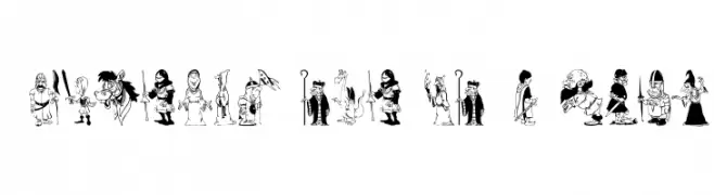
Cartoonish, illustrated medieval character font with playful, detailed figures.
![TafelrundeKnights Frei Schriftart Herunterladen]() Herunterladen 159 Downloads@WebFont
Herunterladen 159 Downloads@WebFont -
( Fonts by Red Hat )
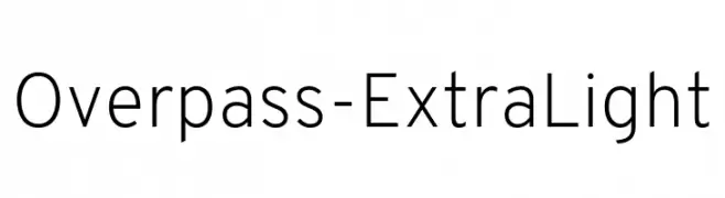
A clean, modern sans-serif font with uniform strokes and excellent readability.
![Overpass-ExtraLight Frei Schriftart Herunterladen]() Herunterladen 159 Downloads@WebFont
Herunterladen 159 Downloads@WebFont


Welche Schriften sind gerade am populärsten?
Poppins, Roboto, Montserrat, Open Sans und Lato sind wegen ihrer klaren Formen und breiten Einsetzbarkeit sehr gefragt – von Markenauftritt über Landingpages bis hin zu Postern.
Welche Fonts eignen sich für Logos?
Geometrische Sans‑Serifs (z. B. Poppins, Familien im Gotham‑Stil) sind ein häufiger Griff für sauberes, skalierbares Branding. Für eine persönlichere Note bleiben Scripts und Handschrift‑Stile beliebt. Kombinieren Sie einen prägnanten Headline‑Font mit einer neutralen Brotschrift für Wiedererkennung und Harmonie.
Wie oft wird die Top‑Liste aktualisiert?
Regelmäßig – basierend auf realen Downloads und Interaktionen. Schauen Sie öfter vorbei, um aufstrebende Favoriten früh zu entdecken.
💡 Tipp: Seite bookmarken – Trends wechseln schnell, und heutige Top‑Schriften inspirieren morgen vielleicht das Rebranding.