Willkommen bei den Top‑Schriften – hier treffen Beliebtheit und Qualität aufeinander. Das sind die in diesem Jahr am häufigsten heruntergeladenen und genutzten Fonts. Wenn Sie sichere Optionen für Logo, Web oder Social suchen, starten Sie hier.
Jeder Top‑Font überzeugt durch Balance, Lesbarkeit und Vielseitigkeit. Sie finden moderne Sans‑Serifs, elegante Scripts, Vintage‑Serifs und minimalistische Displays.
-
( Fonts by Letterflow - Personal-use only. For commercial use please contact owner. )
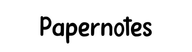
A playful, handwritten-style font with rounded, consistent strokes.
 Herunterladen 158 Downloads@WebFont
 -
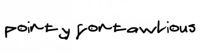
![pointy fontawlious Frei Schriftart Herunterladen]() Herunterladen 158 Downloads@WebFont
Herunterladen 158 Downloads@WebFont -
( Font by Jonathan Harris - www.tattoowoo.com )
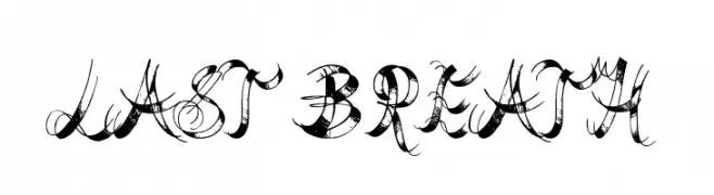
An ornate and decorative font with intricate flourishes, perfect for artistic projects.
![Last Breath Frei Schriftart Herunterladen]() Herunterladen 158 Downloads@WebFont
Herunterladen 158 Downloads@WebFont -
( Muhammad Fathi Al Ghazi - creativemarket.com/fathialghazi )
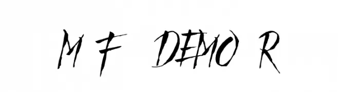
A bold, dynamic font with sharp, angular strokes and a modern, edgy style.
![Mad Faith - DEMO Regular Frei Schriftart Herunterladen]() Herunterladen 158 Downloads@WebFont
Herunterladen 158 Downloads@WebFont -
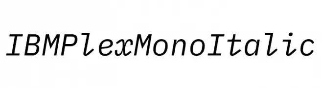
( Fonts by IBM )
A modern, italic monospaced font with a clean and balanced design.
![IBM Plex Mono Italic Frei Schriftart Herunterladen]() Herunterladen 158 Downloads@WebFont
Herunterladen 158 Downloads@WebFont -
( Fonts by Scratchones )
A playful, bold font with rounded edges and a slightly condensed form.
![Staywork Frei Schriftart Herunterladen]() Herunterladen 158 Downloads@WebFont
Herunterladen 158 Downloads@WebFont -
( Fonts by Regulerstudio )
A playful, handwritten font with bold, rounded characters.
![Rainbow You Frei Schriftart Herunterladen]() Herunterladen 158 Downloads@WebFont
Herunterladen 158 Downloads@WebFont -
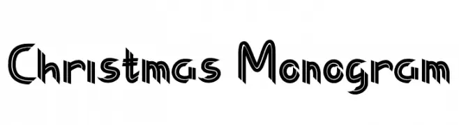
( Fonts by Farz Studio - Lian Felani - Personal-use only. For commercial use please contact owner. )
A bold, decorative font with a festive, angular design.
![Christmas Monogram Frei Schriftart Herunterladen]() Herunterladen 158 Downloads@WebFont
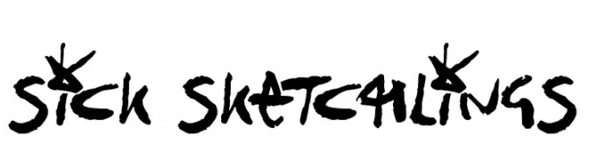
Herunterladen 158 Downloads@WebFont -
![Sick Sketchlings Frei Schriftart Herunterladen]() Herunterladen 158 Downloads@WebFont
Herunterladen 158 Downloads@WebFont -
( Fonts by Miss Tiina at www.misstiina.com (please check the website before use) )
A whimsical, handwritten font with playful swirls and loops.
![MTF Dreamie Frei Schriftart Herunterladen]() Herunterladen 158 Downloads@WebFont
Herunterladen 158 Downloads@WebFont -
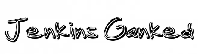
( Fonts by www.fontalicious.com )
A bold, graffiti-inspired font with a dynamic and playful style.
![Jenkins Ganked Frei Schriftart Herunterladen]() Herunterladen 158 Downloads@WebFont
Herunterladen 158 Downloads@WebFont -
( Fonts by Kong Font - https://fontkong.com/ - Personal-use only. For commercial use please contact owner. )
A fluid and elegant handwritten script font with a cursive style.
![Wish Good Orin Frei Schriftart Herunterladen]() Herunterladen 158 Downloads@WebFont
Herunterladen 158 Downloads@WebFont -
( Fonts by wepfont - Wahyu Eka Prasetya - Personal-use only. For commercial use please contact owner. )
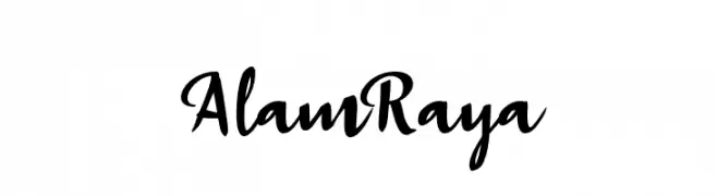
A lively, flowing script font with elegant connections and a personal touch.
![Alam Raya Frei Schriftart Herunterladen]() Herunterladen 158 Downloads@WebFont
Herunterladen 158 Downloads@WebFont -
( Fonts by Daniel Zadorozny - www.iconian.com )
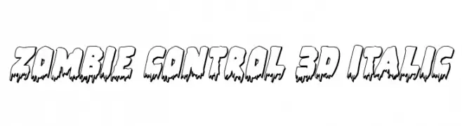
A bold, dripping font with a 3D effect, perfect for horror-themed designs.
![Zombie Control 3D Italic Frei Schriftart Herunterladen]() Herunterladen 158 Downloads@WebFont
Herunterladen 158 Downloads@WebFont -
( Fonts by David Tessier )
An elegant and ornate script font with flowing, high-contrast strokes.
![Jeannette Frei Schriftart Herunterladen]() Herunterladen 158 Downloads@WebFont
Herunterladen 158 Downloads@WebFont -
( Fonts by Neale Davidson - www.pixelsagas.com )
Geometric decahedron dice symbol font with numbers and dot patterns.
![Decahedron Frei Schriftart Herunterladen]() Herunterladen 158 Downloads@WebFont
Herunterladen 158 Downloads@WebFont -
![Written In My Heart College Updated Frei Schriftart Herunterladen]() Herunterladen 158 Downloads@WebFont
Herunterladen 158 Downloads@WebFont -
( Fonts by Dayan Marquina )
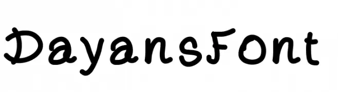
A playful, hand-drawn font with rounded, bold characters.
![DayansFont Frei Schriftart Herunterladen]() Herunterladen 158 Downloads@WebFont
Herunterladen 158 Downloads@WebFont -
![SF Florencesans Outline Italic Frei Schriftart Herunterladen]() Herunterladen 158 Downloads@WebFont
Herunterladen 158 Downloads@WebFont -
( Fonts by Alejandro Zapata )
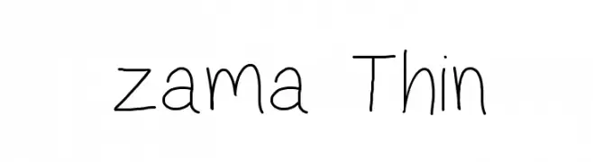
A thin, handwritten font with a playful and informal style.
![zama Thin Frei Schriftart Herunterladen]() Herunterladen 158 Downloads@WebFont
Herunterladen 158 Downloads@WebFont -
Schriftart von danny91194. For commercial use please contact the owner.
( tricky )
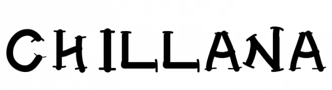
A bold, dramatic serif font with unique, theatrical serifs and strong presence.
![CHILLANA Frei Schriftart Herunterladen]() Herunterladen 158 Downloads@WebFont
Herunterladen 158 Downloads@WebFont -
![MECCHA_GO Frei Schriftart Herunterladen]() Herunterladen 158 Downloads@WebFont
Herunterladen 158 Downloads@WebFont -
( Fonts by Divide By Zero! - fonts.tom7.com )
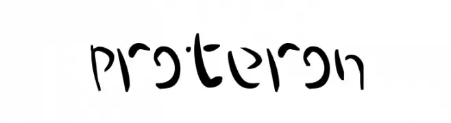
A whimsical, calligraphic font with fluid, curvilinear forms.
![Proteron Frei Schriftart Herunterladen]() Herunterladen 158 Downloads@WebFont
Herunterladen 158 Downloads@WebFont -
( Fonts by wepfont - Wahyu Eka Prasetya - Personal-use only. For commercial use please contact owner. )
A modern-vintage font with tall, narrow letterforms and unique curved strokes.
![Aidilfitri Frei Schriftart Herunterladen]() Herunterladen 158 Downloads@WebFont
Herunterladen 158 Downloads@WebFont -
( Fonts by a Des Gomez. Personal-use only. For commercial use please contact owner. )
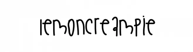
A playful, handwritten font with rounded, irregular characters.
![LemonCreamPie Frei Schriftart Herunterladen]() Herunterladen 158 Downloads@WebFont
Herunterladen 158 Downloads@WebFont -
( Fonts by a Max Infeld - XEROGRAPHER FONTS - xerographer.blogspot.com . Personal-use only. For commercial use please contact owner. )
A bold, dynamic font with diagonal line patterns for a modern, textured look.
![SolidWaste Frei Schriftart Herunterladen]() Herunterladen 158 Downloads@WebFont
Herunterladen 158 Downloads@WebFont -
( Fonts by Vladimir Nikolic - www.creativefabrica.com/designer/vladimirnikolic/ - Personal-use only. For commercial use please contact owner. )
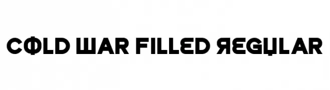
A bold, geometric font with a mid-20th-century aesthetic.
![Cold War Filled Regular Frei Schriftart Herunterladen]() Herunterladen 158 Downloads@WebFont
Herunterladen 158 Downloads@WebFont -
![sicapcus Frei Schriftart Herunterladen]() Herunterladen 158 Downloads@WebFont
Herunterladen 158 Downloads@WebFont -
( Donationware )
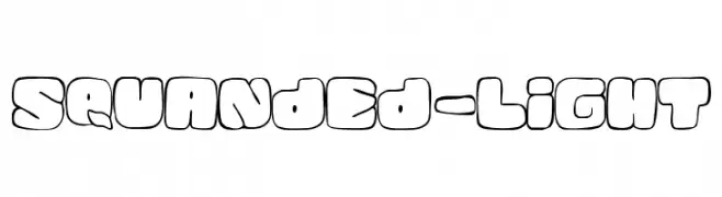
A playful, bubble-like font with thick outlines and rounded characters.
![Squanded-Light Frei Schriftart Herunterladen]() Herunterladen 158 Downloads@WebFont
Herunterladen 158 Downloads@WebFont -
( Fonts by Daniel Zadorozny - www.iconian.com - Personal-use only. For commercial use please contact owner. )
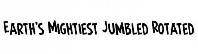
A bold, dynamic font with playful, slanted characters.
![Earth's Mightiest Jumbled Rotated Frei Schriftart Herunterladen]() Herunterladen 158 Downloads@WebFont
Herunterladen 158 Downloads@WebFont -
( Nght's Place - www.crosswinds.net/~nghtmvs/font/fonts1.html )
A decorative font with bold uppercase letters inside gift box designs.
![101! Gift Frei Schriftart Herunterladen]() Herunterladen 158 Downloads@WebFont
Herunterladen 158 Downloads@WebFont -
( Fonts by NubeFonts - nubefonts.blogspot.com - Personal-use only. For commercial use please contact owner. )
A bold, geometric font with sharp, angular characters.
![Noobees Frei Schriftart Herunterladen]() Herunterladen 158 Downloads@WebFont
Herunterladen 158 Downloads@WebFont -
( Fonts by Timur Type )
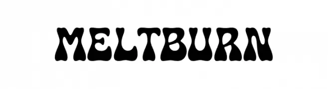
A bold, wavy, and playful font.
![Meltburn Frei Schriftart Herunterladen]() Herunterladen 158 Downloads@WebFont
Herunterladen 158 Downloads@WebFont -
( imagex - www.imagex-fonts.com )
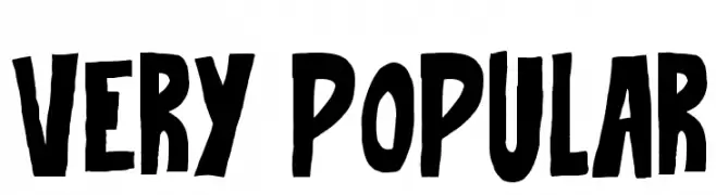
A bold, hand-drawn font with a playful and energetic style.
![Very Popular Frei Schriftart Herunterladen]() Herunterladen 158 Downloads@WebFont
Herunterladen 158 Downloads@WebFont -
![karebear Frei Schriftart Herunterladen]() Herunterladen 158 Downloads@WebFont
Herunterladen 158 Downloads@WebFont


Welche Schriften sind gerade am populärsten?
Poppins, Roboto, Montserrat, Open Sans und Lato sind wegen ihrer klaren Formen und breiten Einsetzbarkeit sehr gefragt – von Markenauftritt über Landingpages bis hin zu Postern.
Welche Fonts eignen sich für Logos?
Geometrische Sans‑Serifs (z. B. Poppins, Familien im Gotham‑Stil) sind ein häufiger Griff für sauberes, skalierbares Branding. Für eine persönlichere Note bleiben Scripts und Handschrift‑Stile beliebt. Kombinieren Sie einen prägnanten Headline‑Font mit einer neutralen Brotschrift für Wiedererkennung und Harmonie.
Wie oft wird die Top‑Liste aktualisiert?
Regelmäßig – basierend auf realen Downloads und Interaktionen. Schauen Sie öfter vorbei, um aufstrebende Favoriten früh zu entdecken.
💡 Tipp: Seite bookmarken – Trends wechseln schnell, und heutige Top‑Schriften inspirieren morgen vielleicht das Rebranding.